
Between 1966 and 1967, San Francisco rock poster artist Wes Wilson designed posters and handbills for the first Trips Festival, the last show by The Beatles, and dozens of concerts at the Avalon Ballroom and Fillmore Auditorium featuring everyone from The Association to Frank Zappa. Along the way, he defined the psychedelic poster, in which blocks of letters were used to create shapes, which seemed to bend and vibrate in place. In this freewheeling and candid interview, Wilson describes how he got into rock posters, what it was like to meet a deadline in the days before computers and the Internet, and which bands were his favorites back in the day. For more about Wes Wilson, visit his website at wes-wilson.com.
Collectors Weekly: How did you get started in the rock-poster world of the early 1960s?
Wes Wilson: I was living in this artsy place called the Wentley Hotel on Polk and Sutter in San Francisco. An artist friend of mine named Kent Chapman was living there, too. Any artist who had any money whatsoever could afford a room there; the rent was 28, 30 bucks a month. I’ve heard that Mort Sahl and Allen Ginsberg once lived in the Wentley. Lots of really interesting, unusual, and creative people were living on the edge of the Tenderloin at that time.
“Normally I had to design and deliver printed posters in a matter of a week, or even days.”
Kent and I were both interested in art, Vedanta, Buddhism, all kinds of different ideas. We’d go down to Foster’s Cafeteria and talk about everything under the sun. Kent had a friend named Bob Carr, who was looking for somebody to design a logo and work at a small commercial printing company. Kent suggested I meet him, and when I showed Bob my drawings, he was impressed.
Bob was employed running a company print shop for a large San Francisco insurance firm. Bob hired me to work under him at the insurance company, but after a few months, we both quit and went into business for ourselves as Contact Printing. I was the in-the-shop working partner doing the presswork and graphic layouts while Bob went out and got the accounts and did the business end of the company.
We did that for a couple of years, and then Bob inherited some money. He said, “You can keep the business if you want, I’ll just sell it to you.” I was doing the printing, the artwork, everything, but I decided to become a freelance artist. So Bob went about selling the company.

Wes Wilson designed and printed the flyer for the Trips Festival in San Francisco in January of 1966 (a reprint from 1991 is shown here). The event is considered the link between the acid tests of 1965 and the dance concerts that followed in 1966 at the Fillmore and Avalon.
For a short while before the shop was actually sold, I was able to get smaller jobs like posters. I could get them printed and delivered quite quickly, much faster and much more cheaply than most any other print shop. That capability gave me a leg up as a freelance event poster artist. Bob soon sold off all the equipment and accounts and went off to visit India with his good friend Conrad.
I had already started doing my first rock posters about the time Bob left. We had a very funky older 17-by-22-inch press that I printed the original Family Dog 14-by-20-inch posters on. I had also designed and printed some handbills for Ken Kesey and the Trips Festival folks.
Collectors Weekly: Where does “Are We Next?” fit into this chronology?
Wilson: In 1965, before I made any dance-concert posters, and while Bob was still at Contact Printing, I designed and published my poster called “Are We Next?” as a personal project. It was a symbolic anticipation of what could happen if our government adopted military power tactics over traditional American ethical and humanitarian principles. That was the basis for “Are We Next?” If you’re going to have a decent world, people have to treat one another with, number one, equal respect.
“Allen Ginsberg thought ‘Are We Next’ was ‘too paranoid.'”
I’m a real, basic American guy. My great-great-great-uncle on my mother’s side was Charles Thomson, the first Secretary to the Continental Congress. He is depicted in the famous painting showing the signing of the Declaration of Independence, standing next to the seated John Hancock, with his thumb upon the Bible and his gaze fixed on Thomas Jefferson. We go way back in our family. I fulfilled my military obligation in the Army.

“Are We Next?” from 1965 was a self-published poster printed at West Coast Litho to express, among other things, Wilson’s opposition to the Vietnam War.
At the time, I knew Communism was a threat; I realized that. But I got upset with the whole Bay of Pigs thing under Kennedy, and the war in Vietnam was the last straw. It was an example of the military-industrial business community taking on Communism instead of dealing with it as an ideological problem. Of course, I studied philosophy and I’m kind of abstract on these things, but ideas lead to actions, there’s no question about it. We’re still on the same course today.
In any case, when I first showed “Are We Next?” to Ivor Powell, the pressman at West Coast Litho, it just said “Be Aware” at the bottom. He felt that the words “Be Aware” were not enough, that people would be shocked by the swastika. His reasoning made such good sense that at his strong suggestion, I added the words “Are We Next?” at the top. That’s how that wording came about, and I’m still thankful for Ivor’s fine suggestion.
I had it printed and took it over to Berkeley for an anti-war rally that fall. It got plenty of attention during the march that day. Allen Ginsberg was there and said he thought it was “too paranoid.” I said, “No, it isn’t.” Later, the Anti-Defamation League folks came to visit me at my place in San Francisco—nice folks, they were—just to talk. They were very concerned about the “Are We Next?” image. “Is this anti-Semitic? What’s your deal?” I said, “No, it’s not, and I’m not, either. Here’s my wife: She’s Jewish. I love her dearly. We’re having a baby soon. Her father was a screenwriter, one of the blacklisted Hollywood Ten.” It was quite a deal to make that point with these fellows, but when they left, they seemed satisfied. They smiled and we shook hands.
Collectors Weekly: What impact did the poster have on your career?
Wilson: Well, the interesting thing about the “Are We Next?” poster was that it’s what Chet Helms of the Family Dog liked about my work (in addition to the good price for my services) when he first asked me to do posters for him. He perhaps said something like, “Who is that guy? He’s something.” It just so happened I could also draw and do lettering well, too. Our whole family could draw—we just took it as an everybody-does-it type of thing. But that’s how I started doing posters for Chet. It got me introduced to posters and, at the same time, expressed one of my big political concerns.
Collectors Weekly: What was it like to work for Chet Helms?
Wilson: Chet was very nice but discombobulated, organization-wise. Chet was good on getting the right bands and had good taste in music. But Chet didn’t even have a driver’s license. Chet had great ideas, which meant Chet was into everything, including the posters. He was so critical about the art part of it.

Wilson produced the first few posters for the Family Dog (#1 on the left, #3 on the right) for about $60 each, in print runs of about 300. Today, surviving copies sell for four or five figures.
For example, Chet Helms brought me the image of the Indian Chief smoking a cigarette for the Family Dog logo. I never knew the man’s name or exactly why Chet had chosen it. Chet had also found a picture in a book by Bernarr Macfadden about how to laugh—“how to live the happy life” was probably more what the title was about. It was kind of like a “Mechanix Illustrated” magazine on how to be happy, about how you have to move your body a certain way to laugh. We laughed up a storm over that one.
That picture became the main image for one the most interesting posters I did for Chet; it was for the Paul Butterfield Blues Band. It was one of the easiest posters I’d ever done. I printed it and got like 60 bucks for the whole thing. That would be printing, delivery, artwork, everything—60 bucks. A couple of years ago, somebody bought one of the first posters I did for Chet, the Tribal Stomp poster, for like $24,000 at auction. If only I had saved a few of the scuffed-up ones.
Collectors Weekly: How did the poster for The Beatles in 1966 come about?
Wilson: One of the radio guys, Tom Donahue of KYA, contacted me. They put on that concert. The Beatles, I think, were wore out by the time they got there. They were on their way back to England. But somehow KYA talked them into doing a concert at Candlestick Park, and I ended up doing their last concert poster, which I’ve always been very proud of.

In 1966, Wes Wilson designed this poster for what turned out to be the last concert by The Beatles.
Collectors Weekly: What was it like working for Bill Graham?
Wilson: When Bill saw a poster I did for Chet, he gave up his poster artist and hired me. Bill was consistent, a hands-on, on-the-ground type of guy. He’d go out and put up the posters by himself on his motor scooter, stuff like that. I ended up getting a better deal, I think, working with Bill. I really liked working for him. He’d just say, “Get a poster. I like what you’re doing. Get it done by a certain date.” We got along great for quite a while.
Collectors Weekly: What caused the breach in your relationship?
Wilson: I had signed a contract with Bill. I’d been copyrighting my posters, so he said, “We’ve got to work out a contract.” By that time, people were starting to collect posters, so we sat down and worked out a deal. We signed and initialed it. His attorney was supposed to clean it up, make a copy, and then we were going to re-sign it. It was all officially approved, but it was kind of messy because it had all these handwritten notes on it.

Wilson’s early Fillmore posters used type and color to create mass and shapes.
I was going to get a 6 percent royalty on it, which was pretty good. I knew what was going on at that point. But then he broke the agreement right away. An article came out in “Time” magazine reporting that he’d sold 100,000 posters. So I said, “Look, Bill, I want to see more of my royalties. I’m due $6,000, just for that one thing.” He got all upset, and we went from being friends in the morning to being enemies that afternoon.
I was with a couple other people when we went to confront him that day. We were ready to see the books. When things went badly, we agreed to go and fight it out outside. Bill Graham said okay to that, and as we walked out the door onto the sidewalk, Bill quickly turned around, locked the door behind him, and disappeared up the stairs. From that day on, he continued to cheat me out of lots of money by not honoring our honestly agreed-to and mutually signed agreement. Of course, I went to a lawyer, then a couple of lawyers, and they all basically said, “Oh, my God. You left your signed contract in Bill’s trust. You don’t even have a copy of your own; you might as well just forget it.”
On the last poster I did for him at that time, I was so mad that I added a snake with a dollar sign in its mouth. Bill had shown himself to be a lying crook rather than an honest person. That was an unfortunate choice on his part, but it was his choice nonetheless. That’s how I lost all of my respect for Bill Graham.
Collectors Weekly: What was the average time frame from when you were given the band names to when the poster was due?
Wilson: Normally I had to design and deliver printed posters in a matter of a week, or even days. Within three or four days of getting the billing, I had to have the poster at the shop getting printed. For producers like Chet Helms and Bill Graham, that was usually as quick as they could get these bands scheduled. It was just tough to schedule two or three bands way in advance for some reason. I don’t know why, but that was just the way it was. Once in a while, I remember Bill would be real happy if he had over a week in advance and would perhaps have photos for a poster. That was a big deal. It was a pretty fast-moving business in those early days.

The Big Five poster artists of the San Francisco scene, circa 1967. From left to right, Alton Kelley, Victor Moscoso, Rick Griffin, Wes Wilson, Stanley Mouse. Photo: Bob Seidemann
As a result, I had to find somebody who could print these posters quickly. Marty Balin, who was in the Jefferson Airplane, his dad was a printer. He was one of the first guys I went to see. He said, “Oh, no, Wes, we can’t do posters in less than a couple of weeks.” The printing also had to be cheap. Bill would charge $2.50 at the door—Chet, too—and there’d be three bands that had to get their share. Everybody had to get paid. So there wasn’t a lot of money. A lot of people like me, some musicians, and the light show guys were just happy to get enough money to get by and have a good time. That was actually an important part of the whole early scene—nobody was super demanding about money, so events seemed to move right along without too many money hitches.
“Bill had shown himself to be a lying crook rather than an honest person.”
Eventually, I located one or two small printers who could print my posters on time, but it was not an easy thing. One of the best printers I had was West Coast Litho. They were too big for us when I first started doing posters because our budget was too small for a big-presses printing company. After a while, I got more money from Bill for printing expenses, and we were able to expand into color bleeds and printing multiple posters with handbills and tickets even, all on one press sheet. By that time, I had pretty much perfected the whole printing process, and it could be done fairly quickly, but the lead-time was still most often only a matter of days.
For me, the travel logistics were tough. I moved to Mill Valley at one point. So I used to have to design the poster, and then run the art in my Volkswagen van down Highway 101 to San Francisco. Then I had to get the posters and deliver them when printed on Fridays. When I lived in the city, I just drove down Bush Street to the printer and then back to the Fillmore. It’s so different now with the Internet and computers compared to the old days, so much more convenient.
Collectors Weekly: Once things got going at the Fillmore, what was the print run and budget for a typical poster?
Wilson: For the early posters it was as low as $60 for 300 or so posters, for everything. Later ones printed at West Coast Litho, it would’ve been somewhere in the area of about a thousand or a couple of thousand printed posters weekly. Finally, I think, it got up to about 3,000 posters for a first printing. The printing budget grew to around 800, 900 bucks, something like that, for the printing. I’d bill out a hundred bucks more for my artwork during 1967.

By the end of 1966, Wilson was on a roll, producing some of his most iconic images.
By the time I stopped making posters for Bill in 1967, things were set up. The budget for printing was really high compared to the early days, and posters were so popular that lithography production in the Bay Area went up four-, five-, 600-percent over what it had been before. Posters were a big deal. One printer even changed the name of their company to Toulouse Lautrec Litho—or Tea Lautrec Litho, actually—because they were making so many posters.
Collectors Weekly: Your poster for The Association in 1966 is regarded as the first true psychedelic poster. How did it come about?
Wilson: That was the Flames poster [see image at top of this interview], also printed by Ivor Powell at West Coast Litho. At the time I was doing two or three posters a week. I was pretty busy, so it was something I had to come up with fast. I had to wake my wife up in the middle of the night so she could fill it in because I was working on another poster at the same time. Every night I had to meet these deadlines.
I was living in Mill Valley when I did that one. One day, Ivor called up to say that when his boss made the plate, he forgot to put an acetate base on it to fill in the image. And when the guys started printing it, they noticed these little white lines here and there. I asked him more about it, and it got me thinking. I said, “You know, that’s probably going to help it. Just make it like it’s a highlight on one side of the lettering and not on the other, if you can. Move the plate around a little bit on the image.” And when I saw the first copies of it later that day, I could tell it was a neat poster.
Collectors Weekly: How were the split-fountain posters produced?

Wilson used an image taken from a Northwest Coast Indian mask as the dominant element in this split-fountain Moby Grape poster from March of 1967.
Wilson: Being a printer, I knew about the split fountain and how it could happen. I think the first successful split fountain I ever saw was at the Psychedelic Shop on Haight Street. It was a handbill from New York by Peter Max, and it was just a beautiful split fountain. And I figured, “Boy, that’s something. I think I’m going to try that.” So it was off to West Coast Litho again. I told Ivor, “We’re going to try something different today.” And he goes, “Oh no, what is it this time?” He was a funny fellow.
I said, “We need to leave the occilating rollers on, and then the ink colors will blend and spread like a rainbow.” And he said, “No, that’ll make it mix into one mud color. We’ve got to disconnect the occilating rollers.” I could not convince him otherwise so the first split fountain for a Jefferson Airplane show turned out with ribbons rather than rainbow mixes. Later we would do more split fountains, and Ivor would do them right; they turned out as they should. I found them a bit too complicated, though, because I had to coax a reluctant Ivor the pressman into it each time.
Collectors Weekly: When did you get interested in the Jugendstil artists?

This poster for a show headlined by Captain Beefheart (misspelled on the poster), reflects Wilson’s fondness for the Viennese Secessionists.
Wilson: I had always been interested in that work, but I got especially interested in it when I started doing posters. I liked the Jugendstil artists, the Viennese Secessionists, as well as the French Art Nouveau artists like Alphonse Mucha. I was doing posters, so I familiarized myself with what artists in the past had done with posters as best I could.
The female form was a big part of that. It represents some of the best things about our culture, this loving acceptance and mothering, the spirit of the earth. That’s what I see in the female figure. Art has always been involved in developing that image, going back to the Greeks and even before. I think the female form is always going to be an interesting and fascinating image.
I had other influences, too, though. One of those split fountains we were talking about has a Northwest Coast Indian mask that I doctored in there. The Northwest Coast artists did some fantastic stuff, as did some of the Eskimos working on whalebone. Really interesting graphic designs.
Collectors Weekly: Who were your favorite bands of the late 1960s?
Wilson: Well, I’ve always liked the early Jefferson Airplane, I’ve never been, hardly ever, a fan of the Grateful Dead, but I liked Jerry Garcia. Jerry was just a wonderful fellow. I loved talking with him. He was always full of positive, inventive ideas. Fun to talk with, a good guy. I think Jerry was one of the most wonderful people in that whole scene.

Though not a big fan of the Grateful Dead, Wilson loved talking to Jerry Garcia. This poster includes a photo of Garcia by Herb Greene.
But in the beginning, the Jefferson Airplane played just great stuff. Later, by the time Grace Slick got in there, they got a little bit, you know, tougher, harder-edged, or something. But early Jefferson Airplane? I loved that bunch. The first time I heard that Dino Valenti song, “Get Together,” was when the Jefferson Airplane played it at California Hall; it was a spiritual thing with me to hear them perform that song at that time. For me, that song became the anthem of the time.
So I’ve always liked them, and Quicksilver Messenger Service was good. I also loved Big Brother and the Holding Company, Chet’s band with Janis Joplin, from their beginnings at the Tribal Stomp. But probably the best band I can remember at the Fillmore was The Doors. I won’t ever forget them that night. I went there one evening, and The Doors were the third-bill band. What a wonderful surprise they were! Jimi Hendrix was super-good, too.
Collectors Weekly: How does it feel to be returning to the Hall of Flowers in Golden Gate Park for the upcoming TRPS Festival of Rock Posters?
Wilson: I actually put on a couple of poster expos in the same place back in the early ’90s. We had three different expos on different years in the Hall of Flowers there in San Francisco. People that had been involved in posters would help me put it on. For example, a fellow named Ron Schaeffer was really helpful in the beginning.

Recent Wilson posters include one for the Poster Expo in Golden Gate Park in 1992 (left) and another for a 2011 show in Budapest (right).
It was neat, but it became too big. We had so many people the last year that we had two rooms, and then some people complained that they wanted to be in the other room, and there wasn’t enough parking, and people were afraid to carry things through the park after dark. The next year, we moved over to Herbst Pavilion at Fort Mason. I had very ambitious plans, probably too ambitious, and that venue just didn’t work out. After that, The Rock Poster Society was formed to fill that void.
“That was an important part of the early scene—nobody was super demanding about money.”
When we were doing the event posters, we had a thing called the Poster Project. I still think that is a viable way to put some progressive ideas out there. There are so many things that events and event posters can do to pay for important things, like health care clinics where they’re needed, that type of thing. Even today, TRPS uses its Festival to raise money for an artist’s trust.
Back in the old days, we used to throw benefits, like when poster artist Alton Kelley’s apartment burned up. There was a big fire benefit for him to buy back some of what he lost—poor guy, he lost so much stuff. Also when poster artist Bob Fried died. He had a wife, Penelope, and two kids and then, Bang! All of a sudden he died at 37. I went and asked Bill Graham if he would help Bob’s widow (I could talk to Bill about this because it had nothing to do with posters), and he let us use Winterland for Fried’s benefit, which raised $8,000 for Penelope. So there are a lot of ways to do good things with benefit events and posters.
(All images from Wes Wilson except The Beatles poster, which is courtesy classicposters.com)

 A Quiet Voice in the Noisy World of Rock
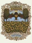
 Was Levon Mosgofian of Tea Lautrec Litho the Most Psychedelic Printer in Rock?
 A Quiet Voice in the Noisy World of Rock
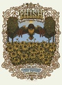 The Storybook-Psychedelic Rock Posters of Marq Spusta
 Music and Concert PostersFor jazz fans, a poster of Chet Baker almost seems to come with its own sou…
 Posters and PrintsPosters and prints enjoy a number of obvious similarities. For example, bot…
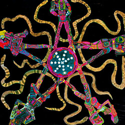 Mari Tepper: Laying it on the Line
 Nice Ice: Valerie Hammond on the Genteel Charm of Vintage Canadian Costume Jewelry
 How Jim Heimann Got Crazy for California Architecture
 Modernist Man: Jock Peters May Be the Most Influential Architect You've Never Heard Of
 Meet Cute: Were Kokeshi Dolls the Models for Hello Kitty, Pokemon, and Be@rbrick?
 When the King of Comedy Posters Set His Surreal Sights on the World of Rock 'n' Roll
 How One Artist Makes New Art From Old Coloring Books and Found Photos
 Say Cheese! How Bad Photography Has Changed Our Definition of Good Pictures
 Middle Earthenware: One Family's Quest to Reclaim Its Place in British Pottery History
 Fancy Fowl: How an Evil Sea Captain and a Beloved Queen Made the World Crave KFC
A very insightful and well written article. Thank you!
Wes Wilson has a one of a kind life and really needs to write a book. I’ve read several articles by Wes, but the whole story would be amazing!
The stuff about Bill Graham doesn’t surprise me at all. As a fan of the Grateful Dead I lost my respect for Graham watching him personally cruise the parking lots in the Bay Area at shows busting people for vending. He just didn’t get it. He was going to make tons of cash regardless of the grass roots economy that surrounded the Dead. In fact, I suspect that his bottom line was improved by the movement itself. I never understood why he was so anti-vending.
I wonder if someone could explain what graphic principles are creating the illusion of dimension in the Beatles poster. After looking at it for a while and letting the eyes relax, the “Here come the Beatles” panel seems to retreat to the back of the frame, yet the US/UK yin/yang seems to float above the surface. The faces of the Beatles seem to be on a flat plane, but that seems suspended well in front of the pattern behind them.
this is amazing! luv the story and am truly fascinated by the art. being an old (has it really happened?) hippie a lot of memories came rushing back! thanx for the wonderful website
Carol, their photo is done in a color halftone rather than with the standard black, and that’s why it seems to be set back in space. The high contrast of the yin-yang (with its solid black) pops it out in front, because our eyes are naturally drawn to high contrast. Excellent question … Cheers! :)
Thanks for this swell interview, Collectors Weekly. I love seeing the photo of all those poster artists from back in the day … Rick Griffin is a personal fave. Shame to hear that Graham was such a scumsucker…
Wow. What an excellent Q&A, Ben! Wes Wilson is incredible and all present-day poster artists owe him gratitude for paving the way. I was lucky enough to sit down with him recently in Brooklyn and we chatted for about a half hour. He’s got some fantastic stories to tell. Cheers!
A great narrative illustrated by impressive art work.
Great posters and write up :)
Let it not get unsaid that every person has some detractors, difficulties..great people have even more. The positives about Bill Graham are basically he kept the electricity on, the bills paid, innovated by mixing genres awakening people to new music, made it possible for others to do the same, made tasteful the experience in his halls, charged very little at the door compared to opera, defended this music in the press, was hard to deal with..but personally got me my start in music business. In the end, he was outbid by the big hucksters..because Bill wouldn’t compromise quality and the fans experience.
Here’s an interview I did with Bob Carr, who owned Contact Printing, the shop that did the first poster with Wes… And the lead up to the first poster.
https://www.youtube.com/watch?v=kyBUyUrI2vI
Just read your story and for a kid that grew up in the bay area during the 60s and 70s we were so lucky to have someone like bill around the ass he was was legendary but the music he brought to the bay made all of us young kids the envy of every kid the the USA whish the were living the dream of being a bay area kid so happen the summer of love thank God for bill legendary a___ hole
just a note to thank wes for his contributions to all that some of us hold dear. was relating earlier today that wes was almost like an uncle, always happy to see you, and always interested in your world and always with the compliments. i’m going to miss that big wide smile. rest in paradise and pass regards on to mr griffin and mr kelley… and ben, thanks for doing the interview and making it available still.
Now those posters seem so glorious but at the time just a day’s work?