
The first time I met John Moehring was in a bar in Seattle, even though Moehring doesn’t drink. Sitting next to this mild-mannered gentleman—his gray hair cut short, Elvis Costello eyeglasses perched on his nose, a brush of a mustache crowning his perpetual smile—I wondered if this could really be the same guy who routinely created fantastically trippy posters for some of the biggest music acts of the 1960s, such as The Doors, Donovan, Frank Zappa, Country Joe McDonald, Jefferson Airplane, and the Grateful Dead. Moehring’s art was famous among a small-but-enthusiastic cadre of rock-poster collectors for pushing color and composition to the edge of legibility and beyond, but the sweet old man sitting next to me didn’t look the least bit psychedelic at all.
“The bottom dropped out when Boyd Grafmyre stopped promoting shows at Eagles.”
Almost half a century earlier, Moehring had fallen off the face of the Earth, or so it seemed to the 50 or so rock-poster fans who’d heard rumors that on this particular night in the fall of 2015, Moehring might be spotted in this particular Seattle bar. The occasion was the release of a book by Scott McDougall about the psychedelic concert posters that flowered in the Seattle area from 1966 to 1969. On a whim, Moehring had flown in from his home outside Houston to attend this minor literary event, but it wasn’t until he entered the bar that he got his first glimpse of the publication itself, a sizable percentage of which was devoted to his work.
As he sipped a Perrier and absorbed the kind words of people holding their books out for his autograph, Moehring thumbed the glossy pages to find a suitable spot for his scrawl. Occasionally he’d stop and shake his head, clearly amazed to be looking upon yet another forgotten image from another lifetime. Some prompted stories about a band that had cancelled at the last minute, forcing him to get creative fast with his hand-lettering. Others dredged up memories of the endless hours he’d spent at a print shop in Seattle’s University District—the name escapes him now—to achieve his eye-boggling effects. To be sure, Moehring was touched by the affection of his fans, but the impact of the images on the pages was just as apparent, as if he was sitting down for a long-overdue visit with dear old friends.

Top: One of John Moehring’s most illegible psychedelic posters was created in 1968 for a show by the Strawberry Alarm Clock. Above: Moehring in the late 1960s and more recently with his dog, Ronnie. (Portraits via John Moehring’s Facebook page)
Moehring had not seen some of these two-dimensional friends for more than 40 years, a span of time that roughly coincides with his disappearing act at the end of the 1960s. In fact, Moehring hadn’t vanished at all after his career as Seattle’s premier psychedelic-rock-poster artist. He’d simply moved around like a lot of us do, juggling the preoccupations of work and family. And through it all, he never stopped making art.
Like many artists, Moehring’s training began when he was a little kid. “My dad was a really good portrait artist,” he tells me during one of our many conversations over the phone and via email after our initial encounter in Seattle. “I could draw a circle so I created the ‘Pea’ family, with Henry Pea, Henrietta Pea, and so forth. Eventually, I attached ping-pong balls to wires, built a little stage, and put on performances of my Pea family figures. My cousins tell me I would amuse them endlessly.”
In addition to the portraits painted by his father, Bruce, who worked as an installer for the phone company, Moehring admired the art of Albrecht Durer, N.C. Wyeth’s paintings for Treasure Island, and just about anything by Arthur Rackham, whose illustrations helped generations of children—Moehring among them—imagine Aesop’s Fables, Grimm’s Fairy Tales, and Alice’s Adventures in Wonderland.
“I loved Arthur Rackham’s stuff,” Moehring says. “His illustrations were wonderful, and it was all fantasy, which I gravitated to. He’d hide faces in trees and whatnot. That influenced me a lot.”

Late Victorian Era illustrator Arthur Rackham was one of Moehring’s earliest influences. (Via Fairyist.com)
Another early influence was his late friend Walt Crowley, who Moehring met in 1964 when the two boys were entering their senior year at Nathan Hale High School in Seattle’s north end. “He had a scooter, an old Lambretta 150, I think, and I had a little Honda 90, the sport model. After school, we’d ride all over the place.”
They also regularly descended into the Crowley family basement, where they’d listen to music and sketch together, “just madly kicking away at pen and ink,” as Moehring puts it. “I always felt Walt had tremendous talent,” he adds. “It just flowed naturally for him.”
Occasionally, their shared interest in illustration would get them into trouble at Nathan Hale. “I remember one time during lunch, we went into a classroom for whatever was next—math or something—and drew a chalk rendition of the Battle of Thermopylae on the chalkboard. We had all the Spartans on one side and the Persians on the other. We hadn’t quite finished when the teacher came in and made us erase it all. We did a lot of crazy things like that.”
Moehring’s senior year in high school was also when he joined the Naval Reserves. “I did it because my father had served in World War II,” he says. “I joined on my 17th birthday in October of 1964 and went to boot camp for two weeks over Christmas break. After that, it was one weekend a month.”

The Monarch Apartments, where Moehring shared a one-bedroom apartment with his best friend, Walt Crowley, in the mid-1960s. (Via MyNorthwest.com)
After graduating high school in 1965, Moehring and Crowley enrolled at the University of Washington, sharing a one-bedroom apartment in Seattle’s University District. “It was in the old Monarch Apartments up on Brooklyn Avenue,” Moehring says. “Walt took the bedroom, and I slept in a hallway near the bathroom. It was pretty rustic, but it was something we could afford.”
To say that Moehring was not a diligent college student would be an understatement. “I attended on and off for about a year and a half,” he says. “I took some classes, but it just wasn’t for me. I decided to become a self-educated student of the earth, I guess.”
Also not for him was the Naval Reserves, whose raison d’etre seemed wildly at odds with the growing sentiment against the Vietnam War on campuses like the UW. “Nobody wanted to fight in that war,” Moehring says, which is why, in 1966, while still in school, he made an appointment with a Navy doctor out at the Sand Point Naval Air Station in Seattle, where Moehring’s Reserves unit was based, to confide his concerns. Against all odds, the young man made an impression on the Navy doc. “He was just a real kind guy,” Moehring says. “We had a couple long chats, and he could see that I just wasn’t suited to service. Eventually, in the fall of ’66, the Naval Reserves gave me an honorable discharge. I kind of skated through.”
If that sounds glib, it might help to know that even today, the mention of the Vietnam War causes Moehring to wince. “I had many friends, believe me, from high school and beyond, who went over there and came back as heroin addicts or were just really messed up in their heads. Some didn’t come back at all. It wasn’t their fault they were put into such a horrible situation, but it also wasn’t right that when people came back from the war, anti-war protesters would spit on them. There was a lot of conflict in those days,” he says with a sigh. Moehring’s decision to leave the Naval Reserves also caused a rift between him and his father. “We didn’t talk for about three years,” he says.

A 1966 visit to the Haight-Ashbury neighborhood in San Francisco made a big impression on Moehring. This photo of the I & Thou, circa 1967, is courtesy of the San Francisco History Center, San Francisco Public Library.
Music and art must have seemed an inviting refuge from such pressures, and so, at some point in 1966, Moehring took a road trip to San Francisco. “I went down to see a couple girls I knew from high school,” he says. “They happened to live close to Haight-Ashbury, so I started walking around and seeing all these people with their long hair, smoking pot, doing whatever they were doing. I remember going to a coffee shop on Haight Street called the I & Thou. It was right at the beginning of the whole hippie thing, and it made a huge impression on me. When I returned to Seattle, I brought those feelings and thoughts with me.”
“My poster for the ‘Quick and the Dead’ tour with the Grateful Dead and Quicksilver Messenger Service had an insane border around it but was otherwise fairly legible.”
Back in Seattle, with no commitments to the Naval Reserves and a waning interest in school, Moehring had plenty of time to linger in places where like-minded souls at loose ends congregated. Often he’d pull out a pen or pencil and occupy his time by sketching. Favorite haunts included the Pamir House on University Way, which had opened in the early 1960s as an Indian restaurant but was mostly a coffee house with folk music on Friday and Saturday nights by the time Moehring started going there. A block north was the Eigerwand, an even smaller caffeine dispensary that had the advantage of being open in the afternoons. And at night, flashing his weathered student ID card and winking at friends manning the door, Moehring attended concerts at the UW’s Hub Ballroom, which was run by a student named Chuck Trimble, who created a lot of the posters for Hub shows headlined by bands with names like Daily Flash and Magic Fern.
That’s probably where Moehring met an up-and-coming concert promoter named Trips Lansing. “I was just hanging out, meeting a lot of people,” Moehring says, “but the specifics of when and where I met Lansing elude me.” However it happened, the contact was fortuitous. Seeing the growing counterculture movement in Seattle, Lansing had decided to leverage his first name and the legacy of the 1966 Trips Festival in San Francisco to produce a Trips Festival of his own, which was held on March 19, 1967, at Eagles Auditorium downtown. The headlining act was a Los Angeles band called the Seeds, with support from Pacific Northwest stalwarts Daily Flash, Emergency Exit, P.H. Phactor Jug Band, West Coast Natural Gas, and Magic Fern.

Moehring’s poster for Seattle’s first Trips Festival in 1967 featured a layer of florescent ink that glowed under a black light.
Moehring was tapped to do the poster, which was essentially an elaborate doodle, whose baroque composition was marked by swirling, organic, tendril-like shapes, with blank spaces in between for the hand-lettering—band names, and the like. More importantly, the poster also featured a layer of florescent ink. “There were lots of black light posters in those days, so the florescent ink just gave that Trips Festival poster an added dimension,” Moehring says. “Generally speaking, at those early concerts, and undoubtedly at the Trips Festival, there were black lights. It was infinitely amazing to see someone under a black light wearing white. People’s teeth always looked really good, and you could suddenly see how much lint everyone was carrying around on their clothes.”
A few months later, on Memorial Day, Lansing presented a second Trips Festival, and again the promoter turned to Moehring for the image. This time, though, Lansing booked the larger Seattle Center Arena for the affair in anticipation of the crowds expected for The Byrds and Jefferson Airplane, who were the headliners. And instead of a doodle, Moehring drew a Cheshire cat, whose grinning teeth, paws, and fur were crammed with hand-lettering. “I had been drawing some pretty intricately detailed pictures,” he says of his work in the spring of 1967, “and one of them had been a cat. I remember giving a similar cat drawing to Terry London, who I was dating before she ended up marrying novelist Tom Robbins. They divorced later.”

Moehring’s poster for Seattle’s second Trips Festival, also in 1967, invited patrons to pay for entry with a matchbox full of marijuana.
One of the poster’s most telling details is the price, which is listed as “$3.00 or 1 matchbox.” “In those days, you bought weed in a little matchbox,” Moehring explains. “How many people came to the door and paid their way in with weed? I have no idea.” Drugs, though, were an obvious and pervasive part of the culture, especially marijuana and LSD. “Generally speaking, the people who were taking acid were pretty benign,” he says. “It all seemed very innocent to me.”
On March 23, between the two Trips Festivals, a critical future catalyst of the budding Seattle rock scene hit the streets. It was a newspaper called the “Helix.” In his 1995 book, Rites of Passage: A Memoir of the Sixties in Seattle, Walt Crowley claims to be the first person to pay 15 cents for a copy of the paper’s 12-page debut. A few issues later, after an initial bout of skepticism that Crowley later chalked up to mild jealousy on his part, the budding young radical joined the staff.
Founded by Paul Dorpat and a few others, the “Helix” was a vehicle for writers to rail against the war in Vietnam, report on campus unrest, pick apart the details of a new crime bill, and update readers on the struggles of the Delano Farm Workers (“Boycott Grapes!”) and the Black Panthers (“Free Huey!”). In the back of the paper were the record and concert ads that kept the enterprise afloat, along with the always entertaining “Un-classifieds,” which included everything from ads offering photos of “BUTCH GROOVY GUYS!” to this plea from someone named Soul Sue: “Wanted: Hip cat for husband by girl who is splitting unhappy home situation. Divorce will be granted later if wanted.”

The “Helix” was the voice of the Seattle counterculture in the late 1960s.
In retrospect, it was almost as if the “Helix” came into being to give Crowley a platform for both his politics and his pen. Putting his drawing skills to work, he became the paper’s “Rapidograph in residence,” illustrating everything from articles to advertisements. Before the ’60s had ended, he would also become a leading political figure of the Seattle counterculture, at one point running unsuccessfully for state office as a candidate for the Peace and Freedom Party.
“Walt was getting involved in the ‘Helix,’” Moehring remembers, “so I just tagged along in case I might be asked to do something. It wasn’t like I was gainfully employed at the time.”
To be clear, it also wasn’t like the “Helix” was a financial gravy train, either. “I don’t remember exactly if we got paid,” Moehring says of the compensation received by people like him who helped lay out the paper, “but if nothing else they fed us. Somehow we always had enough money,” he says. “Our rent was super cheap, and I had a girlfriend who worked at a pizza joint—she’d feed us but only charge us for a cup of coffee. So we didn’t have a lot of money, but it didn’t really matter because people took care of each other.”

Eric Clapton performing with Cream at the Eagles Auditorium on May 29 or 30, 1968. The fabric behind the musician was the canvas for light shows created by Retina Circus, of which Moehring was a member. (Via Eagles Auditorium Facebook page)
In a weird coincidence, Moehring had a family connection to the “Helix”—founding editor Paul Dorpat’s father, whom Moehring had met about a decade earlier. “When I was 7, my dad was transferred by Ma Bell to Spokane, Washington, where we lived for a few years,” he recalls. “Dorpat’s dad was minister at the Lutheran church my folks dragged me to. Paul was older than me by maybe 10 years, so he would have been a teenager. We may have met in passing in Spokane, but years later, when we realized the connection, neither of us could remember if we actually had.”
At the “Helix,” Moehring learned the mechanics of printing by laying out pages for the paper and designing ads. “Walt and I designed some stuff together, we called ourselves Aard-Vark Arts, and by default, we met the people who were promoting concerts. They would come by the office, find you there, and ask you to do something. It was like, ‘Oh, hey, can you crank out a little flyer for us?’ That’s how I started, drawing really rudimentary borders on things, trying to find a style. I never went out looking to be a poster artist,” he adds, “I just kind of fell into it.”
For a while, the “Helix” was both the publicity machine for shows at Eagles as well as its booker, but Dorpat soon realized that he and his team could not do both at the same time—at least not well—so they handed over booking duties to another rising rock impresario named Boyd Grafmyre, for whom Moehring would design at least 20 posters between 1967 and 1969.

Moehring’s first poster for Eagles promoter Boyd Grafmyre was for a pair of Grateful Dead concerts in 1967. The handbill version is shown here. Moehring would eventually design more than 20 posters for Grafmyre.
According to Grafmyre, the first Eagles Auditorium poster Moehring designed for him advertised a pair of Grateful Dead concerts on September 8 and 9, 1967, which also happened to be the first shows Grafmyre says he made any money at. Moehring’s last assignment was for Grafmyre’s Seattle Pop Festival, a three-day outdoor concert held in a park just northeast of town from July 25 to 27, 1969, a few weeks before Woodstock.
In the intervening years, Moehring produced posters for Grafmyre that resembled everything from the pen-and-ink wizardry of his childhood hero, Arthur Rackham, to the psychedelic color experiments of San Francisco poster artist Victor Moscoso. Which is not to say Moehring’s work was merely derivative. Rather, Moehring was more like a sponge, soaking up ideas and reworking them until they were his own. “Eventually, you kind of fall into something that’s yours,” Moehring says.
In fact, Moehring admired a number of the San Francisco poster artists, feeling the strongest sense of kinship to Wes Wilson. “I loved Wes’s work,” he says. “He was probably one of my biggest influences in terms of lettering and his brevity of line when drawing figures. Wes also used a lot Pacific Northwest Indian art elements in his work, which I really liked. Later, when I met Wes and went to his house in Marin County, I saw a book about Northwest Indian art sitting on a table in his living room—it was the same book I had!”

Stylistically, Moehring’s art could range from Arthur Rackham influenced drawings (above, left) to Victor Moscoso-esque posters (above right).
Though Moehring’s style varied during the two years he made posters for Grafmyre, his reputation as a perfectionist didn’t. Moehring was rarely early with his assignments, usually working right up to the last minute, unfazed by the presence of Grafmyre’s assistants hovering about and nervously glancing at their watches to see if they still had time to get his creation to the printer. More often than not, Moehring would join them, and then it would be his turn to look over the shoulder of the printer, to make sure the particular cacophony of color he had in mind was realized to his satisfaction.
Sometimes the results were all but illegible, as in a horizontal poster he designed for a concert at Eagles in January of 1968 (see top photo). The main image was a field of strawberries, an obvious nod to the headliner, a psychedelic-pop outfit from Los Angeles called Strawberry Alarm Clock.
In 1967, the band’s smash hit, “Incense and Peppermints,” had charted at No. 1, which probably made them a promising booking prospect to Grafmyre. Unfortunately, Moehring says, “The attendance for the show wasn’t very good—in Seattle in 1968, ‘Incense and Peppermints’ wasn’t what people really wanted to hear. Still, Boyd couldn’t read my lettering, so he told me, ‘OK, the next poster you do has to be black-and-white, and it has to be readable.’ So, my poster for the ‘Quick and the Dead’ tour with the Grateful Dead and Quicksilver Messenger Service had an insane border around it but was otherwise fairly legible. That was the only direction I ever got in two years of working with Boyd.”

In response to a request from Grafmyre to try and make his Eagles posters more legible, Moehring created this design for two weekends worth of shows in 1968.
Moehring’s Strawberry Alarm Clock poster was one of several he designed between the fall of 1967 and spring of 1968 that employed a process suggested by one of the pre-press guys who prepared film for the litho house where Boyd Grafmyre did his printing. “In traditional printing on a single-color press, you would have made a film negative, burned a plate, and then started printing,” Moehring says. But Moehring had learned that one could also burn a plate from the film positive. “By doing a two-color run using one film positive and one film negative of what had been a black-and-white image, you’d get 100-percent ink coverage on the sheet.”
The poster Moehring designed for a show by The Doors in November of 1967 is a good example of how the process worked. The image Moehring supplied to pre-press was black and white, from the face of the woman at the center of the poster to Moehring’s lettering below. Collaged into an orb in her hand was a publicity photo of The Doors, also in black and white. When the two plates went on press, the positive was inked green while the negative was inked a pinkish color called Rhodamine red. Because the red and the green are equiluminant, meaning neither is totally dominant, the eye doesn’t quite know where to focus, causing the colors to vibrate. “It was a collaborative effort,” Moehring says of posters such as this one, “especially when you were working with a pressman who really understood what you were trying to do. They could be very accommodating.”

Posters such as these from late 1967 were produced by inking both the positive and negative printing plates, thus filling 100 percent of the design with rich color.
Occasionally, Moehring’s posters caught the eyes of performers, who sometimes reached out to compliment the artist on his work. “I remember when Donovan played at the Seattle Center Arena, somebody came up to me and said ‘Donovan wants to meet you.’ So I went backstage and there was this guy, sitting in the lotus position and floating about 20 inches above a cushion—at least that was the impression he gave off. We shook hands—he had a limp, little handshake—and chitchatted a bit. He said he liked my poster and wanted to meet the guy who made it.”
Other musicians were more grounded. “Probably one of the nicest people I ever met was Neil Young,” Moehring says, remembering the singer-songwriter-guitarist during his Buffalo Springfield days. “He was a gentle soul—kind of tormented, like most of us get at times, but a good guy.”
Moehring met a lot of musicians during the late 1960s, but not because they were lining up to tell him how much they liked his posters. In addition to being one of Seattle’s most prolific rock-poster artists, Moehring was also a member of one of the area’s premier light shows, Retina Circus, which had been co-founded in San Francisco by a friend of Wes Wilson’s named Bob Carr, before Carr moved it north. Retina Circus did most of the light shows for Grafmyre at Eagles and elsewhere, making Moehring’s role in the Seattle music scene doubly pivotal.

Moehring designed several posters for Donovan concerts—the second one prompted the English musician to call Moehring back into his dressing room so he could thank him personally for his work.
Not coincidentally, as he became more entrenched in the music scene, Moehring found that he had less and less in common with Walt Crowley, his high-school buddy and roommate at the Monarch. “Walt had started reading Marx and Engels, and that heavily influenced him,” Moehring says. “He went pretty far left, while I was always more of a centrist. We just kind of diverged.”
Too far to the left for his father but too far to the right for Crowley, Moehring moved out of the Monarch and bounced around a bit before settling into the basement of a house rented by a few members of Retina Circus. And it was there that Moehring met many of the musicians who would be booked into Eagles or the Arena by Grafmyre.
“Lots of bands playing at Eagles came to the house to partake of the Alice B. Toklas-inspired chewies and hang out before or after concerts,” Moehring says. “It was a safe environment for rock ’n’ roll road warriors often quite a distance from home.”
Naturally, Moehring had his favorites. “I have special memories of Pink Floyd’s visits,” he says. “They were fun people to spend some time with. And Alice Cooper, in spite of his appearance, was just a down-to-earth guy who liked to play golf. Go figure. People weren’t really stuck-up about their fame back then,” Moehring adds. “Everybody was interested in meeting new people and hearing what they thought and had to say.”

This Moehring collaboration with one of his rock-poster heroes, Wes Wilson, was first printed in 1968 to promote the Retina Circus light show. Moehring reworked it the following year as a drawing.
One of Moehring’s fondest memories is of an evening spent with English rocker Marc Bolan of Tyrannosaurus Rex—his second band, T-Rex, and its big hit, “Bang a Gong (Get It On),” were still a few years away. Accompanying Bolan on this particular evening was his then-girlfriend and future wife, June Child.
“Marc wanted to go out and have some real American French fries,” Moehring recalls, “so we piled into whatever ramshackle vehicle I had at the time and drove to a restaurant, where we ate French fries and just talked and talked. Eventually Marc got tired, so I drove him back to where they were staying, but June was still raring to go. We stayed up the entire night driving all over Seattle. I showed her all my favorite little places.” For example, one stop on this after-midnight tour was an old water tower way out on the Magnolia Bluffs overlooking Puget Sound. “The tower had these real cool cross braces all around it,” Moehring says, “and if you shook one of the braces that was down close to the ground, the whole thing would start to vibrate and reverberate. It was just a lovely, lovely evening.”
Against this backdrop of hobnobbing and hijinks with rock stars and their girlfriends, Moehring’s art was quickly evolving. By the spring of 1968, having wrenched all of the psychedelia he could from the process he’d employed for posters advertising concerts by The Doors, Strawberry Alarm Clock, and others, Moehring returned to drawing, as seen in the interlocking arms he penned for a Phil Ochs poster in late March.

One of Moehring’s first politically charged posters was for a show by folk singer Phil Ochs, who was known for his anti-Vietnam War activism.
Even more profound than this aesthetic shift, though, was the introduction of overtly political content into his work—events in the real world were now proving impossible for Moehring to ignore.
Consider these news items from the first half of 1968: In late January, North Vietnamese troops and the Viet Cong launched their morale-sapping Tet Offensive, souring the U.S. public’s sentiment for the war and prompting the nation’s most respected television news anchor, Walter Cronkite, to tell his millions of viewers that it was time for the United States to head to the bargaining table and negotiate a speedy end to the deepening quagmire. And then in quick succession, between March 16 and April 4, Robert Kennedy announced he was challenging Lyndon Johnson for the presidency, Johnson announced he no longer wanted the job, and Dr. Martin Luther King, Jr. was assassinated in Memphis. Two months later to the day, Kennedy would also be murdered, becoming the second member of his family in less than five years to be gunned down in public.
Thus, Moehring’s demonstration of his ability to draw arms was hardly the most important aspect of the Ochs poster. Rather, it was the peace symbol within the encircling limbs, a nod to both the politics of the performer and Moehring’s willingness to wear his politics a bit more prominently on his sleeve.

Two more examples of concert posters from Moehring’s anti-war period in the spring of 1968.
A week and a half later, this political trend continued with a poster for a show at Eagles headlined by a power trio called Blue Cheer. With band names and the show’s date in contrasting colors of vivid red and electric blue acting as a frame, the central image featured a reproduction of an illustration of Lady Liberty, wrapped in an American flag and crying out “Bring Back My Boys!” A week later, for a poster advertising a Friday night concert by The Byrds, the illustrated birds flying in an almost M.C. Escher pattern above the band’s name were all doves, obvious symbols of peace.
Then, in a poster dated April 26 and 27, 1968, Moehring went even further. Headlining the bill was the most political rock band of the era, Country Joe & the Fish. Predictably, perhaps, a peace sign was an important part of the visual mix, but this time it hovered over a photo by Forest Goodwin of anti-war protesters flashing the peace sign. Bordering the composition was a collage of news headlines—“War Puts Strain On U.S.,” “40 Negroes Protesting Are Jailed,” “Hippies Can’t Be Curbed”—giving voice to the issues consuming the minds of the nation’s youth, including a poster artist named John Moehring.

Moehring drew, used collage, and incorporated photography into this poster for a pair of Country Joe & the Fish concerts in April of 1968.
That fall, Moehring’s art continued to morph. By the end of 1968, for a Christmas poster published by Grafmyre to spread the traditional, but now politically charged, sentiment of “Peace on Earth,” Moehring returned to his positive and negative plates, this time inking three of each to produce all the colors of the rainbow.
“I realized that if you could get two colors like, say, blue and yellow to give you green by pairing plates, then more pairs would result in more colors,” he says. “So I started using three film positives and three film negatives on the posters. It was a lot of work to figure out which positive would be for the yellow, when the yellow needed to overlap with the cyan to produce the green, what to mask with an opaque ink to get the straight cyan, and on and on. And it wasn’t like I had a computer program that would remember all this stuff,” he adds. “I had to do it all in my head.”

In December of 1968, the traditional Christmas sentiment of “Peace on Earth” was suddenly political. This poster was designed by Moehring for Grafmyre.
In many respects, the poster Moehring created for an April 1969 show at the Seattle Center Arena featuring the Mothers of Invention, the Guess Who, and Alice Cooper represents the zenith of his rock-poster work in the late 1960s. Anchoring the composition was a yellow-tinted black-and-white photo of lead Mother, Frank Zappa, appropriated from the back cover of the band’s “Cruising with Ruben & the Jets” album. Surrounding Zappa are Egyptian icons, frogs, clasped hands, sliced oranges, Hokusai-like waves, a character resembling Humpty-Dumpty, and scores of tiny triangles in pink, yellow, green, and blue. Did I mention the shape at the bottom of the poster that resembles the meteor-pocked surface of a small moon?
“When I look back on that Mothers of Invention poster,” Moehring says today, “I mostly think about working out all those little triangle shapes and wondering if they’d actually line up. I guess they kind of did. I know I got a bit carried away at times, but I wanted to learn new things, experience life, and have some fun. It was exciting to me.”

By the spring on 1969, Moehring’s posters had become extraordinarily complex, both in terms of their appearance and what it took to produce them.
As the 1960s stumbled to a close, Moehring didn’t so much as walk away from the Seattle music scene as it walked away from him. Simply put, the economics of producing shows at Eagles worked fine when you were paying a band like The Doors $2,500, which was their fee in 1967. But by 1969, when The Doors were the headliners at the Seattle Pop Festival, their going rate was $50,000. Ticket sales at Eagles were now too small to support bands like that.
“The bottom dropped out when Boyd Grafmyre stopped promoting shows at Eagles,” Moehring says. “I give him a lot of credit because he was able to bring so many good bands and musicians into that place. But after Eagles, we all kind of went our own ways.”

Moehring with Seattle mayor Wes Uhlman in front of Moehring’s hand-painted People Bus.
For Moehring, that meant seeing if he could leverage his intensive on-the-job design training of the previous two years into something more than the $100 to $300 per assignment he’d been eking out as a rock-poster artist. He could, but barely. “At the end of 1970, I started doing some advertising work for King County Metro Transit,” he says. “They wanted to hire an artist to paint the outside of a bus, as part of a campaign to promote ridership—the ‘People Bus’, I think they called it. I started sketching animals, making a fairy tale out of the whole thing. I remember on one part I drew a little toad with his tongue sticking out.”
Next came a series of psychedelic posters for a regional beer brewer called Heidelberg. For this assignment, Moehring broke out a new tool, an airbrush, whose reservoir he filled with lurid, fluorescent inks. “They wanted to do the 12 months of the year. I think we did six. Every so often I see one hanging in a bar someplace.”

In the 1970s, Moehring added the airbrush to his artistic arsenal, creating several posters for a regional beer brand called Heidelberg.
For a short period of time, Moehring co-owned a costume shop called American Artistic Costume, which made animal heads and other costumes, mostly as rentals for individuals. Even more briefly, for all of a month, Moehring helped run an organization called the Moore Theatre Film Society, which showed old, full-length, 16mm movies in Seattle’s Moore Theater—in the 1980s, the Moore would replace Eagles as a place to hear rock ’n’ roll. “One of our first showings featured Walt Disney’s ‘Alice’s Wonderland’ from 1923. That brought the families in, old grandpas and stuff. It’s a short, so it was one of a number of cartoons on the program. But we also screened Tod Browning’s 1932 movie about sideshow performers, ‘Freaks,’ that day. Needless to say, a lot of the families freaked out. But I enjoyed having different types of films juxtaposed, and I thought ‘Freaks’, for all its shocking elements, had a wonderful message.”
Of interest to fans of Moehring’s art is the little-known fact that he created a poster for one of the Film Society’s screenings, although his signature was disguised. “I did a poster, but I wanted to remain incognito, so I signed it ‘C. Alucard’, which was Dracula spelled backwards.”
After the costume shop went bust, Moehring reached out to a customer who moonlighted as a clown. He got Moehring a gig doing electrical diagrams and schematics for aircraft (“I knew mechanical drawing from high school,” Moehring says), and that stint was followed by a run of advertising work for a company called Warn, which still makes the little knobs that are installed at the ends of a car’s axle, so it can be manually put into four-wheel drive.
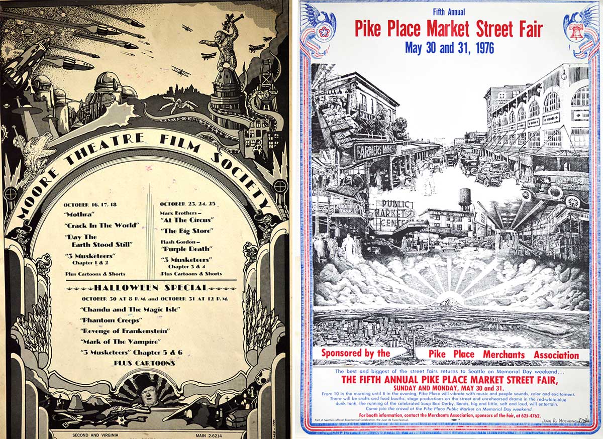
At left, a poster Moehring created for the Moore Theatre Film Society, signed “C. Alucard.” At right, his bicentennial poster for the Pike Place Market. (Click to enlarge)
Not very psychedelic, to be sure, but a guy’s got to eat. “I bounced around doing advertising jobs for a bit,” Moehring says, “and then, in 1976, I did a poster for a bicentennial celebration at the Pike Place Market. I took a long time on that one, photographing different views at the market, checking the historical records at the library. I loved learning about new things, to keep that sense of wonderment. Research was an important part of my process in those days. After that, the execution was always pretty free flowing.”
Here, though, Moehring’s story becomes the opposite of free flowing. At some point during his second career in advertising, Moehring divorced, remarried, and then had two children in the late 1980s—Hunter, who plays guitar in a rock band, and his older sister, Heather, who’s a registered nurse and mother of Moehring’s only grandchild, Chance. For a few years in the 1990s, work pulled him to Los Angeles, separating him for periods of time from his family, but eventually Moehring settled in Texas, where he continues to live with his dog, Ronnie, and is close enough to see his kids.
Through it all, Moehring found time to visit Seattle every now and again, mostly because his older sister, Linda, still lives there. In 1995, for example, he returned to Seattle specifically to say hello his old pal Walt Crowley, whose book, Rites of Passage, had just been published. “He was doing a book signing at the University Book Store, so I flew up. I bought my copy of his book and waited in line like everybody else. When I got to Walt and opened the book for him to sign, he looked up and was kind of startled. We hadn’t seen each other for several years, so it was a nice reunion.”

Moehring used a lot of purple in his late-1960s rock posters, but this one advertising a show in April of 1969 headlines by Jeff Beck seems—in retrospect, anyway—an homage to the band at the bottom of the bill.
Although Moehring is not the sort of person who’s preoccupied with the good old days, he did manage to hold onto a few of his posters from his psychedelic years. “I guess I kept them because I enjoyed making them,” he says, “but I never thought of preserving them for future posterity, or that they’d be of interest to anyone.” In fact, some of Moehring’s posters are more difficult to find than many of the most-sought pieces by San Francisco’s most famous poster artists, with prices to match. Today, 60 of Moehring’s posters and examples of graphic art are in the collection of the Museum of Pop Culture in Seattle.
That’s fine with Moehring, but these days he’s more focused on the present. Yes, he still draws, “scribblings and whatnot when I have the time.” And now that he’s working less, he derives a great deal of pleasure from volunteering in his community. “Not having to punch a clock gives me the opportunity to do a few things,” he says, “like working with younger people struggling with substance abuse. I also go down to the local animal shelter and walk the dogs, to get them out of puppy prison for a few minutes. It’s just a good time for me to be giving back since I’ve been given so much in my life.”
Of course, fans of Moehring’s rock posters would probably like to see him return to the genre for which he was once so acclaimed, which got me wondering: Since his son’s in a band, wouldn’t it be cool if dad could knock one out for the kid? “He’s alluded to that,” Moehring says of Hunter’s interest in his work. “I’ll probably pull something together for him one of these days.”
(All photos via Split Fountain Hieroglyphics unless indicated. If you buy something through a link in this article, Collectors Weekly may get a share of the sale. Learn more.)

 Rainy Day Psychedelia: Seattle’s 1960s Poster Scene Gets Its Day in the Sun
 At the First Rock Festival, Pianos Fell From the Sky
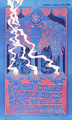 Rainy Day Psychedelia: Seattle’s 1960s Poster Scene Gets Its Day in the Sun
 Was Levon Mosgofian of Tea Lautrec Litho the Most Psychedelic Printer in Rock?
 Music and Concert PostersFor jazz fans, a poster of Chet Baker almost seems to come with its own sou…
 Mari Tepper: Laying it on the Line
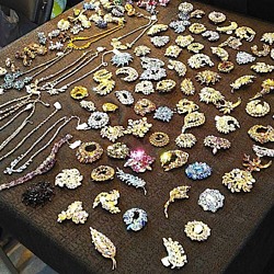 Nice Ice: Valerie Hammond on the Genteel Charm of Vintage Canadian Costume Jewelry
 How Jim Heimann Got Crazy for California Architecture
 Modernist Man: Jock Peters May Be the Most Influential Architect You've Never Heard Of
 Meet Cute: Were Kokeshi Dolls the Models for Hello Kitty, Pokemon, and Be@rbrick?
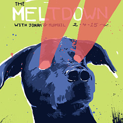 When the King of Comedy Posters Set His Surreal Sights on the World of Rock 'n' Roll
 How One Artist Makes New Art From Old Coloring Books and Found Photos
 Say Cheese! How Bad Photography Has Changed Our Definition of Good Pictures
 Middle Earthenware: One Family's Quest to Reclaim Its Place in British Pottery History
 Fancy Fowl: How an Evil Sea Captain and a Beloved Queen Made the World Crave KFC
Love the work
as a history collector I collect. rock Posters to pass on to the next generations. I feel it is important and have wrote all about the times, my travels and the influence lof the music. Is it possible to know where might I be able to view and ultimately purchase some of these posters?
What an amazing selection of posters by Mr. Moehring. Detroit’s poster artist made it into Paul Grushkin’s book, but I don’t remember seeing any of these. I’m sure the rest of the book is of the same quality. Seeing these are really like stumbling upon another pyschedelic poster community – which we have, in Seattle, collected here in this book!
This will be a volume to own and enjoy. Posters from this era have always made me smile!
FAR OUT MAN!!
I found four of these treasures in a trunk my mother has, from the shows my uncle attended in his youth. I had them framed and have always enjoyed them without ever knowing about the artist. Definetly interested in learning more about him.
I was enthralled on every word I read here!! A wonderful Gentleman Mr. Moehring!!
Thomas(Brunswick).
Awesome history of the man! Thank you!
Just heard from a good friend that John passed away this month; we worked with John years ago in the legal graphics field. I went out to Seattle one time to learn from him about PCs, codes, paths, etc.; I learned more about the local brews thanks to him. Our biggest moment during those two weeks was finding his daughter’s missing rabbit, which was in a closed drawer in the bathroom (the rabbit was fine by the way). I haven’t seen him since those times but never forgot what an amazing guy he was and funny as hell. God Bless you John.