
Nobody had to tell J.C. Leyendecker that sex sells. Before the conservative backlash of the mid-20th century, the American public celebrated his images of sleek muscle-men, whose glistening homo-eroticism adorned endless magazine covers. Yet Leyendecker’s name is almost forgotten, whitewashed over by Norman Rockwell’s legacy of tame, small-town Americana.
Rockwell was just an 11-year old kid when Leyendecker created the legendary “Arrow Collar Man” in 1905, used to advertise the clothing company’s miraculous detachable collars. One of America’s first recognizable sex symbols, this icon of masculinity was defined by his poise and perfection, whether on the sports field or at the dinner table. Like the Gibson Girl, the Arrow Collar Man developed a singular identity, equal parts jock and dandy, who supposedly received more fan letters than silent film heartthrob Rudolph Valentino. To top things off, Leyendecker’s men were often modeled after his lover and lifetime companion, Charles Beach, making their secret romance a front-page feature across the U.S.
Born in 1874, Joseph Christian Leyendecker emigrated with his family from Germany to Chicago in 1882 and soon began apprenticing with illustrators. After a brief stint studying art in Paris, Leyendecker returned to Chicago, where he established relationships with renowned magazines like “Collier’s” and “The Saturday Evening Post,” for whom he would ultimately design 322 covers. (To view more Leyendecker images, see our slideshow.)
While Leyendecker was also known for his depictions of apple-cheeked children and elegant women, it was his stern, brooding men who created the greatest impact. With their strong jaws and perfectly tailored clothes, Leyendecker’s men were featured in the pages of newspapers and magazines across the globe, selling everything from luxury automobiles to socks. Leyendecker’s fictional world of affluence and beauty influenced other pop-culture touchstones, like the fantastic setting of F. Scott Fitzgerald’s “The Great Gatsby.”
As fashions changed and the U.S. entered World War II, Leyendecker’s career slumped, curbing his extravagant lifestyle. After his death of a heart attack in 1951, Leyendecker left few assets for his partner, Charles Beach, and many of his original paintings were sold at a rummage sale for $75 each. Alfredo Villanueva-Collado, a former literature professor at the City University of New York and established collector of Bohemian art glass, filled us in on his J.C. Leyendecker collection and the fascinating story behind this oft-neglected male image maker.

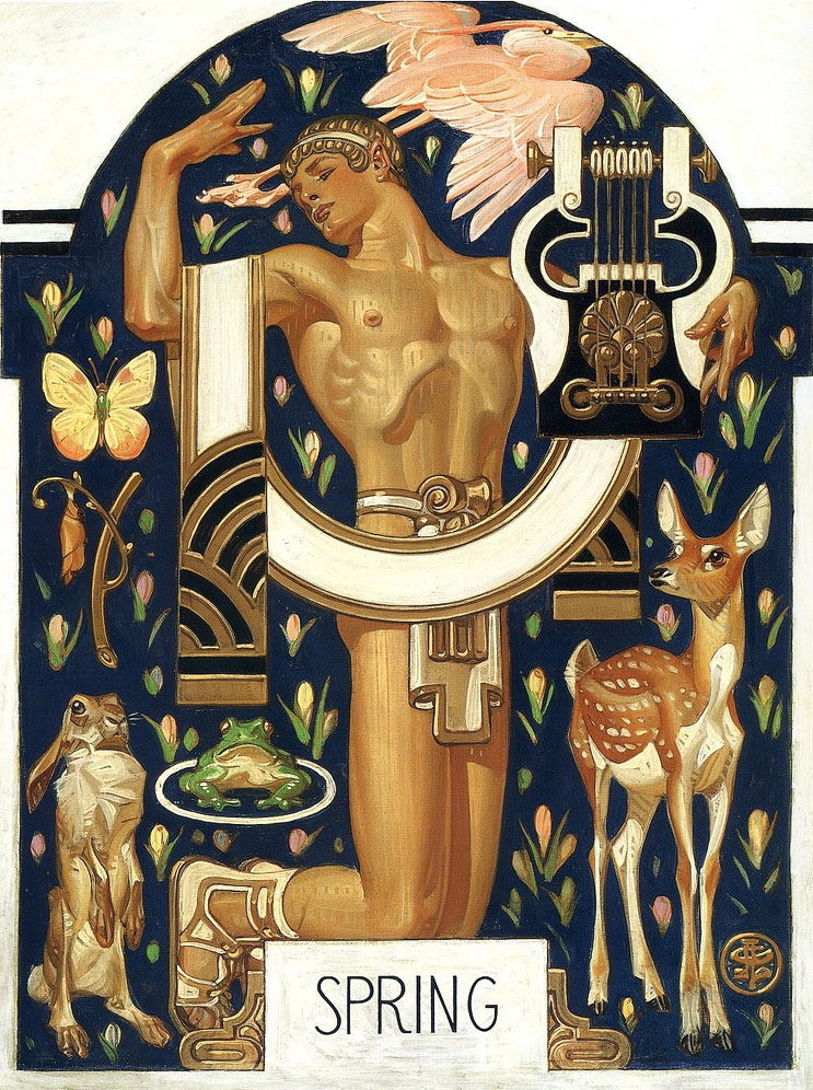
This 1932 Leyendecker cover image for the “Saturday Evening Post” literally puts the near-naked male on a pedestal.
Collectors Weekly: How did you first discover J.C. Leyendecker?
Villanueva-Collado: My partner was a graphic artist, and when we first arrived to the U.S. we were really into the Arts and Crafts movement. But, of course, his thing was graphics, and when we started researching, we found out there was life before Norman Rockwell. And then we found out what kind of life, and we went, “What? Leyendecker’s gay? No, it can’t be.” It freaked me out, and I’ve never been in the closet.
“This man had the gall to make his lover the icon of American masculinity.”
I first realized Leyendecker was gay from the subtext, and then went looking for evidence through my research, and the evidence was there. It was often mentioned in passing, since the intimate details only came out later. Leyendecker knew very well he couldn’t break barriers; he could only suggest the subject.
As a literature professor, I was fascinated by the semiotics of Leyendecker’s images, because I know a lot of gay artists had to use what I call the “palimpsest technique.” Palimpsest refers to the fact that parchment used to be so expensive they would have to paint it over to write something new, and that is the essence of semiotics, the text that is hidden beneath the visible text. Especially in literature, in anything having to do with gays, it’s been done to perfection. You have to hide it, not expose it like you can today.
Leyendecker had a fascination with asses, with muscles, and it was so evident. I kept wondering, how come nobody else says this? It’s right in your face, for heaven’s sake. I found it extremely interesting that there were three brothers–of which both Frank and J.C. turned out gay–and a sister, Augusta, who never married.
Both of the Leyendecker brothers were in Paris at a very crucial moment in 1884. They absorbed the academic French way of drawing, but it was also the time when Baron Von Gloeden’s photographs were all over the place. Von Gloeden was gay and also idolized the masculine body. This went contrary to the contemporary worshipping of the female body as a siren or as a vampire, and foretold–I hate to say–the Nazi aesthetic, the worship of the male body. But they didn’t know that, and that was not their intention.
When I first started collecting Leyendecker, I bought whatever was offered; I wanted the image. In fact, many times I bought the entire magazine. Most people do not realize it, but the “Saturday Evening Post” was an extremely right-wing publication. You should see the articles against the New Deal. But they have fascinating images.
I wasn’t buying Leyendecker’s work because I knew it would go up in price; I was buying it because I became obsessed with this man who had the gall to make his lover the icon of American masculinity. I was very interested in the construction of the masculine subject, and it gave me no end of tickles that the man who created icons like the Arrow man and the Chesterfield man was gay.
But I think that the ultimate finger in the eye was the Lady Liberty poster from World War I [see slideshow]. Beach is both the lady and the Boy Scout, and considering what’s going on today with the Boy Scouts, it’s amazing. Paul Ryan would be a Leyendecker boy!
Collectors Weekly: When did Leyendecker first paint Charles Beach?
Villanueva-Collado: J.C. was 29, but Beach, who must have been quite a hunk, was only 17. For the first few years, the brothers kept an apartment here in New York, and Beach had some kind of residence nearby. But then when the Leyendeckers moved to their mansion in New Rochelle in 1914, which J.C. had built, Beach moved in with them. Their sister, Augusta, apparently hated him from the moment she saw him. Beach not only became Leyendecker’s favorite model but also the man who ran the household, and their relationship lasted 50 years.
They hosted these crazy 1920s Belle Epoch parties that Beach organized, and the crème de la crème of New York society went there. I was totally flabbergasted when I found references in “The Great Gatsby.” Then I found out that people like Fredric March, George Hamilton, and a lot of other very famous males posed for Leyendecker.
And then, of course, Leyendecker’s sexuality should have been very clear with his Interwoven Sock ads, which Beach posed for. When I first posted these images on Collectors Weekly, I said “I’m going to get into real trouble now” because you don’t debunk an idol. But this is not debunking; this is what he was.

Left, an early Arrow advertisement circa 1910 and right, a 1915 painting for Cooper Union Suits, both modeled by Leyendecker’s partner, Charles Beach.
What were some of Leyendecker’s other major advertising campaigns?
Villanueva-Collado: Leyendecker also did Kellogg’s; he did Karo Syrup; he did Maxwell’s Coffee. He did some hysterical advertising for Gillette [see slideshow]. And Kuppenheimer clothing, of course, that was enormous. He did Chesterfield cigarettes and then posters for both wars.

Cleanliness is next to godliness: This atypical Ivory Soap advertisement from 1922 features a priest.
In his Ivory Soap commercials, there are these languid column-like figures, very statuesque pseudo-brothers or priests. This monk is holding up a bar of soap. The text reads, “Ivory Soap: It floats.” Since when do you use a man to sell soap?
There’s one ad that I adore, a fabric called “Trojan Weave” created for Kuppenheimer, which appeared on April 29, 1927. In this ad, there’s a Greek warrior for strength and a Greek maiden for beauty. For the longest time, I was puzzled by the “Trojan Weave” advertisement, and I was specifically intrigued by the “Trojan” warrior on the left, since Trojans are also condoms.
A friend of mine found a fascinating Internet posting called Leyendecker Studies, which included originals for both sides of the Kuppenheimer ad. In the Trojan warrior study, I noticed the helmet bore no crest. But in the finished Kuppenheimer advertisement for “Trojan Weave,” it does feature a crest, immediately below the word “Trojan.” While researching the history of Trojan condoms I found out they hit the market at the beginning of 1927. One detail caught my attention: the maker’s stated purpose to eschew overt or offensive sexual references, so the logo was to be a simple Trojan helmet, implying strength and protection. I looked for images of the packaging. Even today, a crested helmet is their logo!
Therefore, it can be assumed that in 1927 Leyendecker changed his Trojan warrior’s helmet, adding the crest as a sly reference to the new latex condom that had just hit the market. Talk about semiotics and palimpsests.
I’m amazed that this particular artist was able to get away with so much, as the foremost male image maker of the ’20s and ’30s. The American people swore by these images, and the Arrow Collar Man received fan letters by the ton from women. But the gays were probably petrified.

Some of Leyendecker’s most monumental works were for the Kuppenheimer clothing company. The men in this 1929 ad, all resembling Charles Beach, seem to be paying more attention to each other than their gorgeous mermaid friend.
Collectors Weekly: What was the connection between Norman Rockwell and J.C. Leyendecker?
Villanueva-Collado: Norman Rockwell worshipped Leyendecker, but bad-mouthed him to death in his own biography. He was especially cruel to Beach, whom everybody seemed to hate because he was too good-looking, too prepossessing.
In terms of my research, I’ve been trying to find illustrators that were doing covers at the same time Leyendecker was. And it’s very interesting; all of the Leyendecker landmarks were copied by the other illustrators, including Rockwell. Somebody ought to dethrone Rockwell and do a study of Leyendecker’s influence on him.

J.C. Leyendecker’s illustration for Interwoven Socks from 1921 and Norman Rockwell’s “G.I. Bill” from 1947 show striking similarities.
Collectors Weekly: Is there a larger art-world stigma against illustration?
Villanueva-Collado: There definitely is a stigma. The Met has never touched so-called commercial art. I find it totally insulting that the American wing of the Met does not have him anywhere. The American wing of the Met does not have anything relating to American illustration, and if they do, it’s not out, not even Rockwell. This is such an important part of American art.
These were all paintings. Leyendecker did not work from photographs, like Maxfield Parrish did. He had a live model in his studio, adjusted the light, painted the canvas and then the canvas was reproduced. Forget about today’s technology. He was a painter, an illustrator.
Collectors Weekly: How would you describe Leyendecker’s imagery?
Villanueva-Collado: Well, it’s very interesting because President Roosevelt called these images of American males “the commoner.” But this is not the commoner. This is the American macho male before his aggrandizement as a killing machine. His soldiers, beautiful as they are, are always shown helping others, saving others. It was the Doughboy image, the World War II image.

Leyendecker’s painting of Mercury, the god of speed, for Collier’s in 1907 draws from classical sculpture.
His sportsmen aren’t really competitors. They were an image of the American male as huge and beautiful, but not threatening. Even in those incredible World War I posters, especially the ones with sailors, there was a real subtext of sexuality there. It seems that the Navy has had this reputation for all of its existence.
But there was no coarseness. These people were not tattooed. They had no piercings. They were normal people blown to heroic Greek proportions. His cover for “Collier’s” of the God of Speed is totally Roman. You look at these people and you are also looking their connection with the heroes or the gods of antiquity.
His females are always funny: In classic marriage pictures, the male is traditionally standing up and the woman is sitting down. His are exactly the opposite. She’s always standing up with her hand on his shoulder. The 1931 cover for the 4th of July, which I love, is this woman talking and this patriot with his hands up and yarn tied around them. He stood common images on their heads.
His pictures of black people are fascinating. He never went overboard with sympathy–they were still submissive–but it would send a clear message. Nothing sadder than the little boy dressed up in military garb being dusted off by a black porter [see slideshow]. Who is the boy in this picture? Porters were called “boys,” so the boy is the old black man. The images hurt once you really read them.

Leyendecker’s distinct cross-hatch style is seen in this 1911 painting for Cluett Dress shirts, featuring a particularly intimate gaze between two gentlemen.
Collectors Weekly: Do you think all the nudity shocked people?
Villanueva-Collado: No, because that was seen as Art. Many sculptures of the period by American artists trained in France have these massive masculine bodies. What you do not find in Leyendecker’s work is the naked female body. It is never shown anywhere. And it’s interesting because one of his influences was Alphonse Mucha, who did many semi-exposed women, but Leyendecker did not. I’ve looked at enough of his work to say this with a degree of certainty.
Interestingly enough, nudity in art was far more accepted in that early period than it would be by the American puritans in the robotic period of the ’50s. Women had a lot of freedom during World War II, but once their husbands came back home, they were housewives again. It was not until the ’60s that the thing exploded.
Probably my favorite magazine cover is this picture of this monster of a puritan, this fat pilgrim with a wig, and carrying a gun and a Bible [see slideshow]. You couldn’t say it clearer. He portrayed the Tea Party 70 years before it became a reality. It’s there for all of us to see. And I know that a lot of my friends, even the most liberal ones kind of say “Oh my god, did he actually do that?”
Collectors Weekly: What kind of long-term influence have his images had?
Villanueva-Collado: He definitely changed advertising. He broke with the rectangular format. Before, the lettering had to be at the top, but he broke the lettering with these circles that he borrowed from Japanese design.
I’m not a graphic artist, but I know Leyendecker did something to these covers that nobody else had done. Covers had a format and he did away with it. He put provocative covers on these magazines. Leyendecker’s four last war covers are obscene.
To me, to have a naked baby with a helmet and a bayonet going after a swastika is–I don’t want to sound prudish–but it’s too much. That was actually the very last cover ever created for “Saturday Evening Post.” It tells you more than you want to know about how he viewed American culture.




 Digging Up the Weirdest Old Books and Comics From the Thrift-Store Bargain Bins
 Hello Sailor! The Nautical Roots of Popular Tattoos
 Digging Up the Weirdest Old Books and Comics From the Thrift-Store Bargain Bins
 Jockeying for Position: How Boxers and Briefs Got Into Men's Pants
 AdvertisingFrom colorful Victorian trade cards of the 1870s to the Super Bowl commerci…
 Mari Tepper: Laying it on the Line
 Nice Ice: Valerie Hammond on the Genteel Charm of Vintage Canadian Costume Jewelry
 How Jim Heimann Got Crazy for California Architecture
 Modernist Man: Jock Peters May Be the Most Influential Architect You've Never Heard Of
 Meet Cute: Were Kokeshi Dolls the Models for Hello Kitty, Pokemon, and Be@rbrick?
 When the King of Comedy Posters Set His Surreal Sights on the World of Rock 'n' Roll
 How One Artist Makes New Art From Old Coloring Books and Found Photos
 Say Cheese! How Bad Photography Has Changed Our Definition of Good Pictures
 Middle Earthenware: One Family's Quest to Reclaim Its Place in British Pottery History
 Fancy Fowl: How an Evil Sea Captain and a Beloved Queen Made the World Crave KFC
bravo alfredo and hunter! wonderful, thought-provoking article! like all good pieces, i want it to go on and on – as if it is just the beginning of a much longer conversation. i’m so intrigued by leyendecker and this article raises so many more questions than answers, which is indicative of a lack of serious attention he [and gay people in general] have been given by historians. alfredo has made some very astute observations which i hadn’t realized – the lack of nude women in his work for one! although it seems misogynist at the outset, it was during a time when female bodies were always THE symbol of beauty, luxury, inactivity, and passivity which is also repressive/limiting. by showing the beauty of the male figure, he opens the door for everyone to question stereotypical roles. his use of classical themes – combined w/ irony – is brilliant. his images always make me stop and ask ‘is he for real?’ even after nearly 100 years! this article makes me want to learn so much more!
another observation: the interwoven socks ad reminds me alot of many maxfield parrish illustrations from the same time – much more than the rockwell image. i wonder who influenced who – leyendecker or parrish? i’d love to do a side-by-side comparison w/ dates. i also wonder what kind of optical tools leyendecker used. parrish used photographic techniques as an optical tool – as did many painters – possibly all the way back to renaissance times [according to david hockney].
another thing i find fascinating is leyendecker’s hands – sometimes hidden away, but usually embarrassingly in-your-face or caught-in-the-act or even awkwardly vulnerable.
once again, bravo to alfredo and hunter for publishing a really thought-provoking piece. [i’ve posted it to fb, and emailed it to several friends]
Hi there,
Loved this article. Just want to point out something though….about the Lady Liberty image? Actually it’s not Beach who modeled for that.
Check out the artist’s reference photo here.
http://www.flickr.com/photos/x-ray_delta_one/5467006133/
Gorgeous, iconic early 20th-century art. Thanks for sharing!
Great article- however, in regards to the marriage photos- there was a period of time in the early 20th century that the marriage photos where the trend was with the woman standing up and the males sitting down- I have a picture of my great-grandparents that reflect this, and it was explained by my grandmother.
freaking awesome!
Really enjoyed the article! Thanks!
Now-a-days, who makes an effort to dress? Leyendecker hawked silk shirts that, at least, had be ironed, cotton shirts that required starching and ironing; trousers that needed a crease down the front (thanks to Prince Albert); shoes thar had to be polished. Even in war, the soldiers wore spats! Those were the social protocols. What a bother! But, for all the trouble, oh how good a person must have felt.
The Leyendecker images pushed things too far. The Kuppenheimer men are not just suited-up; they are upholstered. Even undressed, the Leyendecker athletes sweated testosterone. Like all extremes, his images are so serious that they are close to being caricatures of a joyless world.
Now, the pendulum has swung to its apogee. People are dressing down. But, how far down can a person dress and still be wearing clothes? Jeans are down to half-assed. How handy it is to wear canvass footwear; there is no need for Interwoven socks; just put the trainers in the wash. Pull-on tops are advertising billboards (By-the-way, I saw the one printed with “69 R U 1-2?”).
Where is the happy medium (Yeah, I know–Mme. Lazonka is vacationing in Sinemorets, on the Black Sea coast)?
Cheers, all,
–R.T. Thomes (Amsterdam)
wow, many thanks for the thoughtful interview and wonderful images. love the range of fluidity and formality in his work. especially liked Villanueva-Collado insights answering how he’d describe Leyendecker’s imagery–the soft machismo. More please, a book? JT
How can I get a photograph of the Lady Liberty image? After I looked at it it immediately thought: “The model may have been a woman, but in the poster Lady Liberty has a totally different male face”. Anyone interested in Leyendecker can write me at alfavil@aol.com . As a result of my postings and this interview I have been invited to give a talk at a gallery in NYC.
As to the trends in clothing, practicality and comfort on the one hand, extreme bad “popular culture” taste on the other. The notion of “elegance” has all but disappeared. Only the 1% can afford tailoring and craftsmanship.
Beach may not have modeled for the Lady Liberty image but she surely bares his visage.
Very interesting article. Your article mentions that Rockwell badmouthed Leyendecker to death in his(Rockwell’s) autobiography.
I think you may be incorrect making that comment. From the very, very little I read Rockwell mentions in a positive sense his respect and admiration for Leyendecker. There is a hilarious recount of Rockwell inviting Leyendecker and his brother, also an illustrator to dinner at Rockwell’s home and after preparing a complete Thanksgiving-like meal, the maid tripped on the rug and the turkey rolled after the platter under the table. Rockwell recounts that he and Leyendecker met under the table, Leyendecker tasting some stuffing that had spilled out, commenting that it was delicious. Rockwell added after that the dinner was filled with laughter and good times. The firsthand account is much better relayed by Rockwell himself. Rockwell also mentioned that he used to follow Leyendecker from his office to his home just to get a glimpse of him, unbenounced to Leyendecker. Rockwell did mention of Charles Beach that he felt he never heard an intelligent comment from him. Rockwell was a pall bearer at Leyendecker’s funeral in Leyendecker’s home.
Leyendecker, from many, many professional artists perspective was the better artist between the two. But I would like to believe that Leyendecker was the type of individual that did not want his own reputation defended at the expense of another, especially one that I believe Leyendecker as a fellow artist would equally appreciate.
There is little that is “new” or original in art in general, but this is especially true in commercial art where a language or vocabulary is developed and shared by a community of artists responsible for a style of the times.
Leyendecker then Rockwell share those times with a multitude of others, who like Leyendecker for a time, are all but forgotten now.
I started out this evening looking at wigs and somehow ended up on this site. And I’m so glad I did. Thank you for sharing an absolutely wonderful interview.
The spinning-wheel scene does not show a man with his hands “tied;” he is holding newly-spun wool yarn so it can be wound into a ball. It’s a standard courting situation.
I don’t think Leyendecker has been, or ever will be forgotten as time marches on, at least for those of us who love the history of American illustration. We won’t forget Leyendecker, Penfield, or Rockwell. We won’t forget the illlustrators of children’s books. We also won’t forget the fantastic illustrators of the “Golden Age” who illustrated the beautiful women of magazine advertising and novelette book covers of of the 1950s and 1960s. America has such a rich history of exquisite artists from the late 1800s through the 1960s before computer generated art took over. Hail to these great artists. Bring back hand-rendered illustration!
that was fabulous; thank you so much
I would have to agree with J. Bush in his comment above– I recently read Rockwell’s autobiography, and it didn’t seem at all like he bad-mouthed Leyendecker at all. He talked fondly of him, and sympathetically when he mentioned how things ended up. Indeed, if he bad-mouthed anybody, it was Beach.
But even when he talked about the negatives in Leyendecker’s life later on, he seemed to be trying to defend him, even rescue him– not badmouth him.
Great article, by the way, even though I raise a slight objection. I did enjoy the article, and I love the images you include with it as well.
Thanks.
Another point about Rockwell’s autobiography.
I found it a bit odd that Rockwell didn’t even seem to ponder whether or not Mr. Leyendecker was gay or not.
Not only did Rockwell not mention it (or anyone around Lendecker perhaps speculating about Leyendecker and Beach’s relationship during the time), but also he sounds as if it didn’t even enter his mind.
What do you make of that?
Brilliant! I had been a fan for years and this has rekindled my interest. Thank you.
That seated figure in the first illustration looks like a self portrait.
Mmmm. Nice taste in men. Who knew they looked so nice back then?
So frustrating to see you miss connecting some of the dots.
The whole “he sees the US as a baby fighting Nazis! So obscene!” thing? Check the date on the cover: January 2, 1943. As in, Baby New Year will defeat the Nazis; we’ll win the war in 1943.
The “patriot with his hands tied”? That guy is a Redcoat. A patriot, maybe, but a British patriot (hint: the bad guy). And it’s 1776, and he is oblivious, killing time flirting and courting (as someone said above, a woman winding yarn from a man’s hands is very, very common). The revolution is about to happen under his nose (see the rosette in the girl’s cap?) and he’s doofing around.
The priest is because Ivory’s slogan at the time was “99 44/100% pure.” What’s purer than a priest? Not a sexy half-naked lady, so it’s not surprising they didn’t want one of those.
Calling the Pilgrim a “monster” is reading way too much into Leyendecker, in my opinion. Apparently SEP Thanksgiving covers were a huge tradition for him, so he did a whole bunch of Pilgrims, including beefcakes like this:
http://www.rockwell-center.org/wp-content/uploads/2010/11/leyendecker-cover.jpg
as well as neutral guys:
http://www.saturdayeveningpost.com/wp-content/uploads/satevepost/pilgrim-stalking-the-turkey-by-j-c-leyendecker.jpg
See the whole gallery here: http://www.pinterest.com/satevepost/jc-leyendeckers-thanksgiving-covers/
I see no reason not to conclude that the 1924 Thanksgiving wasn’t just an “everyman” Pilgrim, especially paired with the “everywoman” Pilgrim in 1925.
There’s more going on with that porter, too. (Hint: not a lot of armchairs on trains.)
The art is stunning, so thanks for sharing it. The interpretation is just really misguided.
I agree with FYI’s comments — fabulous collection of Leyendecker illustrations; pity about the interpretation. How is Mr. Villanueva-Collado so clueless about American history that he does not recognize a British redcoat when he sees one? And what about that “obscene” Baby New Year? It makes me wonder about all of Villanueva-Collado’s interpretations when the ones that I’m familiar with are so off.
Great article, and in essence I think he’s absolutely correct.
I have to say though (alas, I’m only commenting because I disagree! what an internet nerd I am!) that the interviewees theories are often far too speculative.
For instance, the aspect of a crested Trojan helmet? I see no evidence that Leyendecker’s use of such a helmet was a reference to condoms. Rather, it seems to me to simply be a choice of design.
Thank you for posting the images, I too am a fan of Leyendecker’s work. I would also like to point out that the August 1932 Saturday Evening Post cover comment: ‘Leyendecker….literally puts the near-naked male on a pedestal,’ is subjective to the point of ignorance. The Summer Olympics were held in Los Angeles July 30-August 14, 1932. USA won the Gold medal for Rowing in the Mens’ Eight with Coxswain (8+), hence the Olympic pedestal and gold overtones in the cover art. This Leyendecker Saturday Evening Post August 1932 cover illustration is of the winning USA Mens’ Rowing team. USA Mens’ Rowing also won Gold in Mens’ Double Sculls, and Mens’ Paired Shell with Coxswain (2+).
“What you do not find in Leyendecker’s work is the naked female body. It is never shown anywhere. ”
and this? ↓
http://pictify.com/304201/study-by-jc-leyendecker-18741951
btw: amazin article.
Absolutely agree with FYI on the misinterpretations. The interviewee may be a devotee, but certainly not an expert. J.C. and F.X. were most certainly not in Paris at the Academie Julian in 1884. J.C. would have been ten years old. Also, it’s Maxfield, not Maxwell, Parrish.
In the third illustration, comment is made that ‘all eyes are on the dapper man in brown’, in support of the claim that there is a gay subtext in the work. For a start, the man on the left looks completely absorbed in his reading. Perhaps, in the situation dramatised as a context, the dapper man is engaged in a conversation with all three of the others and they are intent on what he is saying, not scoping him as a prospective sexual conquest.
My father attended that “rummage sale” following JC’s death. For $40 he bought 5 canvasses, and set some others aside to get later when he could amass another $40. As a poor art student, he never got back for the second helping, but I grew up admiring the paintings he did buy. Two were sold for some ridiculous sums at Guernsey’s a few years back. I still have the rest. None have been seen since 1951.
I have to concur with J. Bush.
Everything I have read about Rockwell’s feelings for Leyendecker are based in esteem, affection, and borderline hero worship. There is an amazing story about Rockwell. When he did his 322nd Saturday Evening Post cover, he was still much in demand by the publishers. He did not, however, do another cover for the Saturday Evening Post because he did not want to exceed Leyendecker’s total and dethrone him in any way.
Beach was very controlling especially in the last decade of Leyendecker’s life. He was not liked by most of Leyendecker’s friends and family because he wasn’t a very likable man.
I have to add, I’ve never heard that his brother, Francis, was also gay.
I love Leyenecker and I appreciate your enthusiastic testimonial – but reader be aware – there are inaccuracies in this article and, as FYI pointed out, some rather misguided interpretations.
My two cents, to agree with both FYI and J. Bush. I strongly disagree with the idea that the Trojan visual references had anything to do with condoms. Condoms weren’t pushed as a need for gay men back in the day the way they are now, because no one needed them to prevent AIDS.
And Rockwell really adored JC, he just wasn’t comfortable with the relationship he had with Beach. This would not have been an uncommon reaction at the time. Almost everyone who commented on Beach thought he had enormous emotional control over Leyendecker.
Strong agreement with FYI over the image of the priest as a symbol of purity, not gay subtext.
One of the most annoying things about retrofitting out modern yes to old art is we bring a lot of our baggage and a lack of understanding to the imagery of the past.
You know, sometimes a picture of a man by a gay man is just a picture of a man, not a picture of someone to have sex with. Everything gay men do isn’t a subversive push for gay content.
AS AN OLDER GAY PERSON I ENJOYED VILLANUEVA’S ARTICLE BUT ALSO MOST EVERYONE’S COMMENTS AND INPUT. IT SOUNDS LIKE ROCKWELL RESPECTED JCL, OTHERWISE ‘HIS EGO’.. ROCKWELL’S .. WOULD HAVE PUSHED HIM TO GO OVER HIS 322ND ..SEP COVER LIMIT. PLEASE EXCUSE THE CAPS … CAN ONLY TYPE STANDING DUE TO RECENT SURGERY. .. RJC ..
I first found out about Leyendecker from a pretty weird place – video games. His art style was the primary inspiration for the visual design of Valve Software’s game Team Fortress 2. I wonder how he would feel about people using his style for a game about killing each other using rocket launchers.
I’m so lucky to have found your article and could live happily on Portrait of Two Men, which should readily takes its place next to Singer-Sargent or Whistler. It occurs to me that Leyendecker didn’t presage the Nazi glorification of masculine beauty at all, but that both aesthetics—along with Leni Riefenstahl’s—were partaking of a much larger phenomenon. Before the fear of male nudity instilled during the last 3 decades, as in the phrase “no homo,” boys swam without bathing suits together at the YMCA and men would be thought sissys who were embarrassed around other naked men.
More importantly, the physically demanding jobs on docks and farms were left behind by men moving into office jobs previously done by women in secretarial roles. Compensation for a feeling of suspect sexual adequacy associated with less traditionally masculine work came vicariously through exulting sports idols, adventurers, swash-buckling actors, and millionaire playboys. Leyendecker’s subjects play football, win races, court beautiful women in glamorous settings, and are happy being men together. These idealized forms become even more important as middle-classes distanced their ordered lives from the sweat and squalor of working class pasts. And unlike the crudeness and stupidity popularly associated with men now, these men in their Harvard sweaters are having none of the anti-intellectualism afflicting the US currently.
I see nothing of von Gloeden’s merely pederastic reveries in Leyendecker’s work anymore than I see Teddy Roosevelt’s fostering the healthy idealism of masculine pursuits as more than another aspect of its European expression. Just as Arts and Crafts was a world-wide movement of many facets, the celebration of Man as the beauty of all nature was part of the zeitgeist, fulfilling variously the multitudes. In Leyendecker’s extraordinary contribution I fancy I see his love, wonder, and hope.
And now that I’m warmed up, tomorrow I’m calling the National Portrait Gallery to find out why Two Men isn’t on its walls.
This is fascinating. Leyendecker must have had a private collection. I wonder what happened to it.
Fascinating, indeed! I was researching an advertising image of a kneeling guy pulling up his sock from a 1927 publication, “Achievement in Photo Engraving and Letter Press Printing” that appeared to be a Leyendecker and found the article to be very helpful in confirming this (illustration #8 in slideshow, from an A. Stein & Co. ad for Paris Garters.)
However, the image appears much earlier than the 1920’s; I found one from 1913, and another possibly from 1909…
To the Norman Rockwell issue, why Norman didn’t talk about JC’s relationship to Charles Beach, is I think it was beyond his comprehension of what sex WAS, by comparison, Rockwell was buttoned up and somewhat conservative. JC’s gayness was the elephant in the room and Norman didn’t want to talk about it. Remember, these are times very different from now and being gay would have been unseemly and rude to talk about. He would have been embarrassed. In so much as Norma’s treatment of Charles Beach, I think subconsciously he knew what they were and many felt Beach kept JC away from people in general and didn’t hesitate to use his authority to do so, Beach sounds as if he was controlling which clearly, others including JC’s sister, saw from the start. However, JC’s output and his oeuvre would not be what it is now had it not been for Mr. Beach, his inspiration, and his muse.
“What you do not find in Leyendecker’s work is the naked female body. It is never shown anywhere.”
That mermaid up there looks pretty naked and female to me…
Did Leyendecker illustrate for the National Tailoring Co. Chicago? I have a 1922 Fall Winter Catalog that has illustrations very similar to JCL. None of the illustrations are signed. The catalog is a large swatch book with fabrics and illustrations for customers to mail order.
It’s ironic to think back to 1987, I was an art director for a small ad firm in Toronto, and one of my sketches was rejected because it might have been interpreted as leaning gay. The ad was for Arrow shirts and their company ad gurus told me, putting black and white type together indicated gayness. OMG. I was stunned at the stupidity of some well paid ad people of the time.
I am surprised that the covers Leyendecker produced for the Inland Printer, a printing trade magazine, are never mentioned. That work preceded everything discussed here. In addition to the cover, each issue used more of his artwork as head pieces, stylized from that issue’s cover theme, to open the editorial section. The IP promoted his work heavily in the late 1890s. He was also active in producing posters that enjoyed quite a craze for collecting during the same time period.
Amazing artist….just brilliant!
And two points struck me in what I’ve read. The first is what an incredibly lovely gesture by Rockwell to decide not to exceed Leyendecker’s total of covers for The Saturday Evening Post. What a cool decision…so sweet.
The other is that the Met has none of his work, nor Rockwell’s, or if they have it’s not on show. I’m stunned as each of them is a genius in my eyes. I can’t get over it! How un-American!
Although these illustrations are still, when I study them; I see movement in the eyes, I see facial movement and pick up on the subjects emotions the same as I would with someone I just was introduced to.
I am so relieved to read through all the comments and I hope everyone who reads this article, filled with conjecture and some errors, does so, as well. I have always imagined that the “Redcoat” was being played by the Revolutionary Patriot woman, who was a spy! I have an active imagination.
” Then I found out that people like Fredric March, George Hamilton, and a lot of other very famous males posed for Leyendecker.” George Hamilton was 12 in 1951 – he posed for the artist?
Anyone here knows where I can see all the 322 cover magazine in person? I wonder if any publisher are gonna compile all of JC Leyendecker’s works in a single art book dedicated to him for anyone who just admire his works and for artist that would love to study his art style.
Loved this article! As another commenter noted–the George Hamilton reference is probably an error. Perhaps Villanueva-Collado meant George Raft. Raft was already famous as a young dancer in the 1920’s, and later became a film star.
“the text that is hidden beneath the visible text” Which “text” is a metaphor in this sentence? Hidden by whom? Discovered by whom? Does “text” mean “meaning.” Is it the author’s meaning or the beholder’s meaning? Is it both? How does one know? In semiotics, understanding of artistic communication is confusing, facile, and automatic. Semiotics results in a description, not an analysis or interpretation of any kind of communicative media. It is a house of cards.
I too, am fascinated by the era of the “Golden years of Illustration,” the 1st half of the 20th century, going back into the 1800’s. As one of the Wyeth artists said, we give Europe a run for it’s money.
It was a time when the American Illustrator was a celebrity, coming into the homes via publications that the consumer depended upon for their societal connections. The talented Artists were numerous and varied, and you couldn’t count the numbers of those locals who plied their trade remaining nameless to the world.
I see V.Collado is a little over-eager in micro-examining Leyendecker’s work to get inside his head, looking for what he is wishing to find. Commercial artists work in the fast world of advertising, always trying out new formats to make the public take notice, and yes, influenced by other artists.
As for the controversial overtones & poking at conservative values some look for in his work, I believe the people of the day weren’t always on the look out to hype the next frivolous societal order. Today, we obsess on shock, more accurately, schlock.
Not taking away from Leyendecker’s excellent illustrative technique, but there is a definite effeminate quality with his male images. ‘Pretty Boys’, with voluptuous lips, long eyelashes, smooth lines.
One might imagine Leyendecker with a wicked little smile as he works, contemplating the idea America is falling for his creation of the new ‘perfect male’ image.
what a great article!!!!!