
William Hamilton Page was not the first American to earn a living cutting slabs of end-grain sugar maple into precisely ornate blocks of wood type, but he was definitely the first American to push this once-ubiquitous printing format into the realm of fine art. The proof of Page’s artistry can be found in Specimens of Chromatic Wood Type, Borders, &c., an 1874 sales catalog of wooden fonts and graphic flourishes manufactured by Wm. H. Page & Co. Considered by typography nerds to be “The Most Beautiful Book in the World,” Page’s 14-by-18-inch catalog has just been reprinted by Rizzoli in a glorious, if smaller, new edition edited by Esther K. Smith of Purgatory Pie Press.
“It’s a very rare book,” Smith says, who is also the author of How to Make Books and several other titles. “Around 1,000 copies were printed at the time, but only 10 to 15 are known to exist today.” Those copies can be found in hallowed repositories like the New York Public Library; the Huntington Library in Pasadena, California; the Metropolitan Museum of Art; and the Historical Society in Hartford, Connecticut, the state where Page’s factory made its wooden type from local maple trees.

Top: Two colors, red and green, overlap in the “shadow” sections of the words “IMPEACHED,” “GROUND,” and “BIRCH” to create a third color, brown. Above: The word “SIN” is used to show off Page’s Belgian Ornamented No. 2 font. Both images via Specimens of Chromatic Wood Type, Borders, &c. from Rizzoli.
Smith saw her first copy of Page’s catalog in 2013 at the Newberry Library in Chicago. “The paper in the original was the best that money could buy in 1874,” she says. In fact, the production cost of Specimens was $10 per copy, which is more than $200 when adjusted for inflation. But the smooth stock used in the catalog, which showed off the precision of the type and the beauty of its colors by only being printed on one side, meant that almost 150 years later, the paper is extremely fragile. “As I turned the pages, flakes came off of the binding,” Smith recalls.
Immediately, Smith wanted to share this treasure with the world, but its fragility precluded flat-scanning. Eventually, Smith got permission to use photographs of the book taken by Columbia University, which also owns a copy. The color was perfect, but there was a serious problem. “The book had been shot without being unbound,” Smith says, “so there were curves on every page, those little curves that occur when you open a book.” After several false starts to rectify this problem, Smith finally found a City College of New York student named Aaron Schoenfelder to work the required Photoshop magic to remove the curves—”he spent a huge amount of time on that for next to nothing,” Smith says gratefully. “The Most Beautiful Book in the World” was now ready for Rizzoli, whose 120-page version is printed front and back.

Two pieces of French Clarendon Ornamented wood type are required to achieve the three colors on display in this page from Specimens of Chromatic Wood Type, Borders, &c.
For Smith and other Page admirers, this obscure, commercial catalog earns its “Most Beautiful” designation thanks to its straightforward organization, the amazing detail of the fonts and borders offered for sale, and above all, the color combinations on display.
“When I first looked at the book in the Newberry Library, it just felt operatic to me.”
In the context of wood type, “chromatic” is the SAT word for “highly colored.” To be sure, in the 1870s, it was hardly unheard of for fonts to show off their serifs, shoulders, and arms in rainbows hues, but black-on-white was the rule. Not so in the Page catalog, whose title page is composed of no fewer than nine different colors, which means each sheet took nine trips to the letterpress to achieve its effect. (Incredibly, despite this repetition, no one caught the typo in the word “Type” in the center of the page.)
Throughout the rest of Specimens, individual letters—offered for sale at a nickel to 80 cents each, depending mostly on their size—show off their capabilities in two and three colors. In fact, color was so important to Page’s products that just about every page of his company’s catalog features a plug for Wade Inks, which supplied ink to none other than the U.S. Bureau of Engraving and Printing.

Although fonts are the stars of Specimens of Chromatic Wood Type, Borders, &c., the 1874 catalog also included numerous examples of borders. This 12-line example is Border No. 51, which cost $3 per foot.
Wade Inks, particularly its “transparent” inks, were key to the printed appearance of type cut by Page—transparent inks remain a staple of rock-poster screenprinters today. In the context of printing, the word “transparent” means that when one color was printed on top of another, the color below would affect the appearance of the color printed on top of it, creating a third color where the two overlapped. To help ensure that the registration between the two pieces was as precise as possible, blank pieces of maple destined for pairing were cut with a router at the same time. Then, voids would be carved out and outlining “shadows” would be cut away. When the finished pieces of type were subsequently swapped in the press, the colors would align, differentiate, and overlap cleanly.
By all accounts, Page had all of this down to a science. “William Hamilton Page was the ultimate wood-type manufacturer,” Smith says. “He sold his type all over the world. The book was basically a promo piece.” Quality may have been the reason why Page’s wood type was in high demand, but in 1874, wood type, in general, was a vibrant printing format. Until offset lithography became widespread toward the end of the century, setting wood type in a letterpress was one of the best ways to print announcements on large posters—in Specimens, some of the type is sold in sizes up to 120 lines, which is about 20 inches tall. “At the time,” Smith says, “posters were how people got the word out.” Advertisers certainly bought space in newspapers, but a poster on a fence could reach lots and lots of readers for free.

Purple and yellow, which combine to produce brown, give this Victorian-Era font, Corinthian No. 1, an almost psychedelic appearance.
Page’s customers wouldn’t just buy an alphabet of letters, plus numbers and characters such as periods, commas, and exclamation points: They’d buy a single font within a typeface, which most of us know today as that list of weird names found in a pull-down menu in software like Microsoft Word or Google Docs. “In the United States version of English, E is the most common letter,” Smith says. “So a 3A or 4A font, as it’s called, will have more Es and other letters, too. The exact numbers of each letter in a font is based on a strange formula that I don’t completely understand,” she adds.
Fortunately, Geri McCormick does understand what makes a collection of letters a font. McCormick runs Virgin Wood Type of Rochester, New York, which makes its wood type, including some of Page’s fonts from Specimens, using a pantograph router—the same method Page used. Purgatory Pie Press, which Smith runs with her husband, Dikko Faust, is one of Geri’s satisfied customers. “She’s manufactured a Page font called Chromatic Ornate, which is on page 55 of the Rizzoli book,” Smith says. “We’re buying the 4A font, and even though it’s only in one size, the price is around $4,000.”

This graphic from Virgin Wood Type shows how two colors and pieces of wood type can be combined to produce a third color and give a letter depth on a page.
That cost is partly due to materials. “End-grain maple is crazy expensive,” Smith says. In fact, one of the reasons why William Hamilton Page may have sold his Connecticut type company to Hamilton Manufacturing Company (the “Hamilton” duplication is confusing, but there’s no relation) of Wisconsin in 1891 may have been related to the cost of maple. Yes, Page was beginning what would be a successful career manufacturing a steam-heat radiator he had designed and patented. But Connecticut maples were disappearing. “They’d logged a lot of local trees,” Smith says. “Wisconsin had a lot of old-growth maple at that time. Maple is a hardwood, so it takes a long time to grow.” Indeed, by time Specimens was published, New England forests that had been cleared for farms earlier in the century were coming back as those farms were starting to be abandoned. Trouble is, the empty fields, meadows, and pastures were filling in with soft, white pine, a useless resource if you are in the wood-type business.
The other reason for the steep cost of a new set of Page Ornate from Virgin Wood Type is labor. “Geri told me that each letter pair has to be made by the same person,” Smith says. “If different people make them, they don’t register properly, so they have to be made by one person, and at the same time.”
Still, while perfection in wood type is attainable—or almost so—it’s not always what Smith’s clients want. “We had a customer whose name had a B in it,” she says. “We had two B’s in the font he wanted, one of which had a major gouge out of it. We had done a job for him before, but when we showed him a proof of a second job, he was like, ‘No, I want the one with the major gouge out of it!’ He wanted us to print his job really dark red on white paper, so there would be no question that you would see the gouge. For him, the imperfection was what he was going for, whereas my instinct as a printer was to try and hide it.”

It takes two pieces of wood type to achieve the three colors in each letter of Chromatic Mexican. Note that the wooden pieces are reversed so that the printed orientation of the letters is correct on the page. Additionally, for some reason, the top-left “S” has been photographed upside-down. Type examples are from the collection of the Center for Book, Paper & Print, Columbia College, Chicago. Photo: R. Clarke-Davis
A final curiosity, and charm, of Specimens has nothing to do with end-grain maple, transparent inks, or the place of wood type in printing history. It concerns the sample words used to show off Page’s products, which are often weirdly and unexpectedly poetic. “GEOGRAPHICAL EXCURSION KNIVES HOME” proclaims a page of Caxton No. 4, “HANDSOME PICTURE DARK FORESTS RADIANCE MOSAIC” murmurs a sheet of Etrusean No. 2. On page 58, we face nothing but 50 lines of black-on-white “SIN” in Belgian Ornamented No. 2. Later, on page 105, 60 lines of Chromatic Belgian Ornamented in purple and tan command us to “BE.”
“When I first looked at the book in the Newberry Library, it just felt operatic to me—an over-the-top, take no prisoners, insane, absurd, crazy thing,” Smith says. “So I began talking to people about doing the book as an opera. My idea was that it wouldn’t have a plot or a hero, but that you’d use the words, perhaps in the style of ‘Carmen,’ or something like that. Nobody took me seriously, and then one person, a composer named Michal Dzitko, kind of did. He’s doing something quite different with it than what I had in mind, but he’s using all the words, and he’s organizing them according to their colors—a green section, a red section, a blue section. People just love the colors.”

Specimens of Chromatic Wood Type, Borders, &c. is available now from Rizzoli and bookstores everywhere. (If you buy something through a link in this article, Collectors Weekly may get a share of the sale. Learn more.)

 Was Levon Mosgofian of Tea Lautrec Litho the Most Psychedelic Printer in Rock?
 Preservation Through Production at Hatch Show Print
 Was Levon Mosgofian of Tea Lautrec Litho the Most Psychedelic Printer in Rock?
 Artisanal Advertising: Reviving the Tradition of Hand-Painted Signs
 Printing EquipmentMetal and wood type, the cabinets designed to hold these blocky letters and…
 PostersIn 1867, Jules Cheret, inspired by Japanese woodcuts, used the newly-develo…
 Woodblock PrintsWoodblocks are the oldest form of prints—historians believe woodcutting ori…
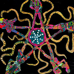 Mari Tepper: Laying it on the Line
 Nice Ice: Valerie Hammond on the Genteel Charm of Vintage Canadian Costume Jewelry
 How Jim Heimann Got Crazy for California Architecture
 Modernist Man: Jock Peters May Be the Most Influential Architect You've Never Heard Of
 Meet Cute: Were Kokeshi Dolls the Models for Hello Kitty, Pokemon, and Be@rbrick?
 When the King of Comedy Posters Set His Surreal Sights on the World of Rock 'n' Roll
 How One Artist Makes New Art From Old Coloring Books and Found Photos
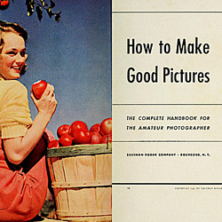 Say Cheese! How Bad Photography Has Changed Our Definition of Good Pictures
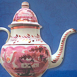 Middle Earthenware: One Family's Quest to Reclaim Its Place in British Pottery History
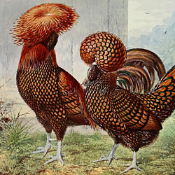 Fancy Fowl: How an Evil Sea Captain and a Beloved Queen Made the World Crave KFC
Thanks a lot Ben for sharing this gorgeous discovery! There is another insightful article about chromatic type on http://ilovetypography.com/2017/04/03/the-evolution-of-chromatic-fonts/
And for those interested in using or making chromatic fonts in their own projects, there is an online resource dedicated to color fonts: https://www.colorfonts.wtf (FYI, our team at Fontself is behind this project).