Everybody hates wallpaper. From the red flocked-velvet damasks that once darkened the walls of Wild West bordellos to the garish supergraphics that give cheap motel rooms their trademark aura of tawdriness, wallpaper is an offense to good design. Almost worse, it is hopelessly out of date, a creaky cliché of decoration practiced by lazy interior designers, who only recommend paper wall coverings to the clueless rubes on their client lists.
“From its inception, wallpaper was a copy, an imitation, a fraud.”
Bruce Bradbury and Steve Bauer love wallpaper. As the founder and lead designer, respectively, of Bradbury & Bradbury Art Wallpapers, Bradbury and Bauer are unabashed champions of this maligned element of interior design (in 2005, Bruce Bradbury sold his namesake business to Steve Bauer and his wife, Lisa, but Bradbury’s enthusiasm for the form remains undiminished). For Bradbury and Bauer, the hand screen-printed wallpaper produced at B&B is an important tool of historic preservation, as vital to the restoration of a vintage Victorian home as choosing the right colors for the finials and spandrels. The fact that their wallpaper also happens to be gorgeous is icing on the gingerbread.
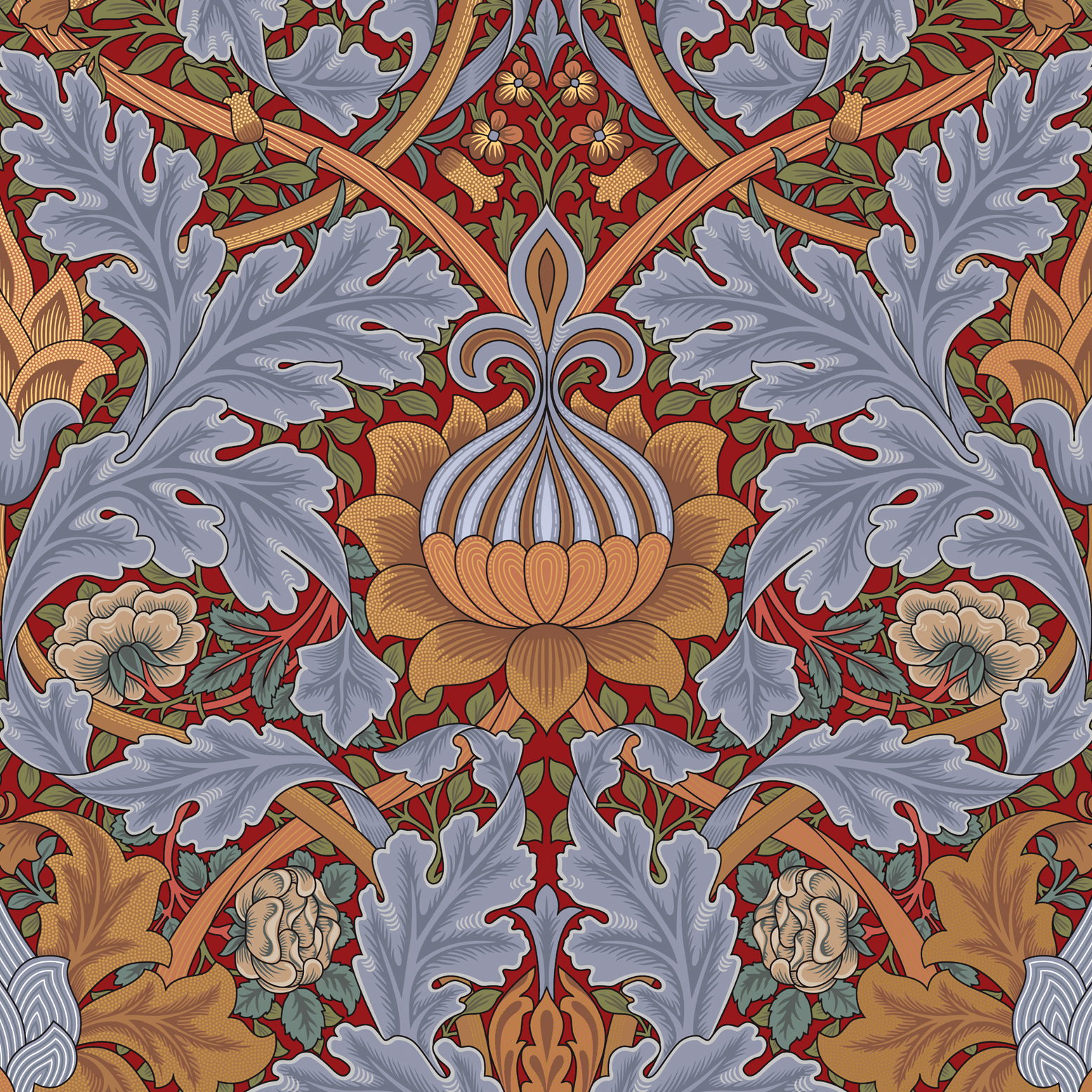
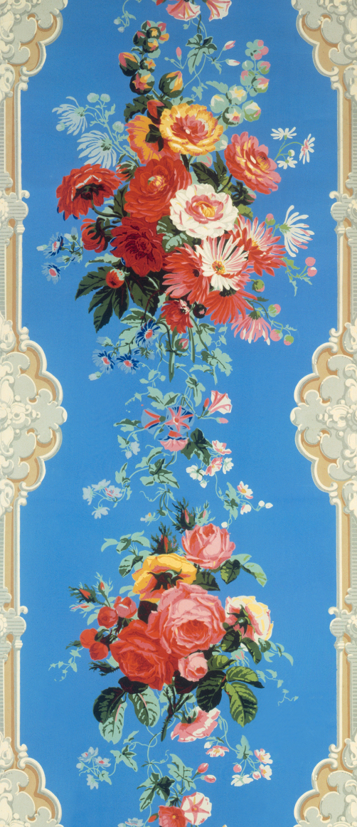
Top: Bradbury & Bradbury’s “St. James” is a 17-color damask originally designed in 1881 by William Morris for Queen Victoria’s Throne Room at St. James’ Palace. Above: A time-lapse video shows “St. James” being screen-printed at the company’s factory in Benicia, California.
Thanks to Bruce Bradbury, the Bauers, and the company they and a handful of highly skilled employees have nurtured over the course of almost four decades, artisanal wallpapers, particularly those devoted to Victorian- and Arts and Crafts-era designs, are enjoying a mini-renaissance, even as the wallpaper industry as a whole has shrunk to roughly half of what it was in the years since Bruce Bradbury first pulled a squeegee across a width of blank wallpaper in 1979. Because of their high quality and meticulous attention to historical sources and graphic detail, Bradbury wallpapers have been featured on influential home-remodeling shows such as “This Old House” and in movies that take set design extremely seriously—Guillermo del Toro has used Bradbury wallpaper in many of his films, including his 2018 Academy Award-winner, “The Shape of Water.”
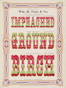
Still, despite its acclaim, Bradbury wallpaper is a tough sell for those who tend to fill their homes with disposable furnishings from Wayfair and Ikea. Such consumers generally balk at spending $51 a yard to apply an 18-inch wide ribbon of “Kelmscott Frieze” below the cove in their children’s bedrooms (plan on spending around $700, plus installation, for that little detail), or $249 per roll to paper a living room in “St. James,” a 17-color damask originally designed in 1881 by William Morris for Queen Victoria’s Throne Room at St. James’ Palace (you’ll probably need about $6,000 worth of this showstopper to complete the job).
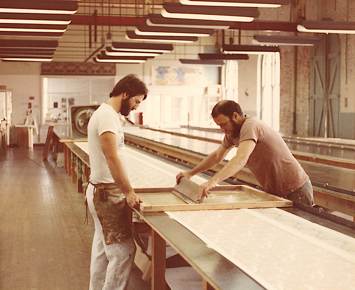
Bruce Bradbury (right) printing with an early Bradbury & Bradbury employee named Jeff Williams.
Fortunately, Bradbury and Bauer did not grow up to be Wayfair and Ikea shoppers. Each had their own wallpaper epiphany in the 1970s—on separate continents—well before they became colleagues and friends.
“As a kid, I was fascinated by Victorian architecture,” Bruce Bradbury tells me when we spoke over the phone. “Actually, it was architecture in total, but Victorian in particular. I used to plead with my parents to drive me around to see the houses wherever we were living. My dad was an airline pilot, so I grew up all over—in Massachusetts, New Hampshire, Long Island, North Carolina. For whatever reason, I was just fascinated by domestic architecture.”
Part of Bradbury’s childhood was spent in boarding schools, where he was groomed for the Ivy League, but Bradbury came of age in the 1960s, so he was having none of that. At 19, in the spring of 1967, he made his way to California, at first to try his hand as an L.A. surf bum—“In boarding school, I’d listened to the Beach Boys,” he explains—before making his way to San Francisco and the fabled Haight-Ashbury neighborhood. “I had $13 in my pocket and some clothes in a pillowcase, but I looked around and thought, ‘These are my peeps. I’m home.’”
This “Iris” frieze by Bradbury & Bradbury was inspired by the wallpaper patterns of British illustrator Walter Crane. Here, a sample with all seven colors is shown on a sheet of uncut wallpaper stock with only the first color printed.
Over the next few years, Bradbury made ends meet by working as a janitor in a window-shade factory, which eventually earned him enough to fund a trip to London. “The minute meth and heroin came into the Haight,” Bradbury says, “I wanted out. So I went to London, where I met a fellow who told me I could get to New Delhi for $72—over land. He even drew me a map of how to do it. I had $72, so I figured, ‘I’ll take a look.’ When I got to India, I fell in love with the place, and ended up spending a couple of years there, on and off.”
“I mean, who would want to work in a wallpaper factory?”
Between trips to India, Bradbury often found himself back in London, where he’d head to the Victoria and Albert Museum. Invariably, he’d make his way to the V&A’s print room to rekindle an early infatuation with Dante Gabriel Rossetti and other Pre-Raphaelite artists of the mid-19th century. And once he was in the print room, he was inadvertently introduced to the museum’s wallpaper collections.
“I was smitten, absolutely smitten,” he says. “The best of the best wallpapers that had ever been printed were all there, kept in these big old dusty cartons that not many people looked at.” Bradbury was such a regular at the V&A that he got to know one of the custodians. “One day, the guy says to me, ‘You should see what’s in the attic.’ The V&A curators at the time had no use for wallpaper—I think they were slightly embarrassed by it—so a lot of the collection was lying around in the attic in a state of neglect. But the custodian had access and took me up there. It excited me so much—I can hardly explain it.”

This Arts and Crafts room features a frieze and border of “Apple Tree.” The “fill” below is “Glenwood.” Both from Bradbury & Bradbury.
Back in San Francisco, sometime in the mid-1970s, Bradbury returned to the Haight and taught himself how to screen-print. “The Haight had totally bottomed out, so I could afford to live there,” he says. “I taught myself how to mix a few colors, and I did silkscreen prints for artists like Toby Klayman. Then I heard about a wallpaper company out in Benicia, about an hour north of the city. This was in 1976. I begged them for a job, but the owner, Wayne Carlson, a wonderful man, thought I was nuts. I mean, who would want to work in a wallpaper factory? But I kept going back and asking for a job until he broke down and gave me one. It was low-paying and horrible, but I was finally working in a wallpaper factory!
“I found a better job at a bigger wallpaper factory in San Francisco,” Bradbury continues, “at Winfield Design Associates, which actually paid a living wage. They were a ‘thing’ in the ’70s because they were doing all this very ’70s stuff on Mylar. I worked there for a couple of years, as a commercial color mixer, which means I learned to mix every color known to man, rapidly and in quantity. Once I had enough skills, I went back to Wayne Carlson to work for him, and, eventually, he let me print my own stuff on his tables at night and on weekends. That’s when I started my first business.”

“Raspberry Bramble,” drying on the 90-foot-long tables at Bradbury & Bradbury. In the background is printer Jules Valdez.
Bradbury’s first wallpapers were homages to William Morris, C. F. A. Voysey, Christopher Dresser, and his other Victorian-era design heroes. In the mid-1970s, there was a nascent market for such wallpapers as increasing numbers of homeowners in Victorian-rich cities like San Francisco were restoring these grand, old structures, which were threatened by both decay and scorched-earth urban renewal. Unwittingly, Bradbury was making the right product in the right place at the right time. “When I finally decided to become a Victorian wallpaper maker in 1976,” he says, “I realized that the walls and ceilings of the Haight and the Western Addition homes I had been seeing since 1967 were blank canvases, ready and waiting for us.” Which is not to say he was immediately successful. “It still hadn’t occurred to me to sell anything,” Bradbury recalls, “because I was so in love with what I was doing. I made it and gave it away.”
That overly generous approach helps explain why Bradbury went bust twice between 1979 and 1981, before he finally got his company off the ground. “It was the happiest I had ever felt in my life,” he says of those early years when he was working nights and weekends at Carlson’s factory in Benicia. “But I was always broke. I couldn’t figure out how I could love something so much and not be able to make a success of it. Going out of business twice was painful and humiliating, but it forced me to learn a few things.”

“Eastlake Dado,” shown here in Dove Blue, was one of eight Bradbury & Bradbury wallpapers used by director Guillermo del Toro in his 2018 Academy Award winner, “The Shape of Water” (others include “Chicago,” “Volute,” and “Honeysuckle“).
Like, you know, exchanging his hand-printed paper for another, more conventional form of printed matter known as currency. “Eventually I learned that if I charged money for the wallpaper I was printing, I could buy more materials and make better and more complex wallpaper. As dumb as I was, the lights finally came on.”
Bradbury also learned that a little of bit of marketing would not be a terrible thing. So, he did exactly that—a little bit of marketing. “Some friends of mine who were graphic artists had an early Apple computer,” he says. “They made a little black-and-white mail-order brochure for me, which is kind of an absurd way to sell colorful wallpaper. But I felt that mail order would be sensible because the market was spread all across the U.S. There were always a couple of great Victorians in every little town in America—mail order was the only way to reach them.”

Bradbury & Bradbury’s first catalog in 1981 included about a dozen wallpapers, including a re-creation of a Christopher Dresser pattern from 1862 called “Bachelor’s Button” and a William Morris pattern called “Bird & Anemone.”
That first catalog featured about a dozen historically accurate, public-domain wallpaper designs, which were hand screen-printed by Bradbury (and sometimes an assistant or two) on commercial wallpaper stock using thick, oil-based inks. Then, in 1982, shortly after he had started his business for the third time and had moved into a 19th-century former Army arsenal in Benicia, a building which B&B still calls home, Bradbury got a different kind of ink. “I was still struggling when the ‘New York Times’ found out about me and wrote a really flattering article,” he says. “I was very lucky I had my little brochure to send to people. That got things rolling.”
Almost overnight, Bradbury learned an important lesson about marketing. “The press reads the press,” he says. “People in the interior-design press read the article in the ‘New York Times,’ so we were getting inquiries from all over. Because our work was visual,” he adds, “it made a good article. The colors were bold, and the design was not something people were used to seeing.”
It was amid Bradbury’s first brush with success that Bauer, who’s younger than Bradbury by about a decade and a half, arrived in Benicia. Unlike Bradbury who, as a youth, had admired Victorians from afar, Bauer actually grew up in one. “It wasn’t a fancy Victorian,” he told me when we met one day at B&B. “It was just a farmhouse in Indiana.” By the time he turned 10, Bauer and his 11 brothers and sisters (he’s number nine) had moved to Southern California, and a few years after that, the family took a formative sightseeing trip to San Francisco.
“I was bouncing around in our station wagon,” Bauer remembers, “going up and down the hills, amazed by all the Victorians. I had never seen anything like them before. I couldn’t believe their scale, their intricacy, the variety. That’s what gave me this frenzy and passion for Victorian design—and the whole era.”

Both Bruce Bradbury and Steve Bauer were fans of books published by John and Judy Freeman of the American Life Foundation, including “Late Victorian Interiors & Interior Details” by William B. Tuthill, who designed Carnegie Hall.
Soon, the teenager was drawing Victorian houses, almost obsessively. “It started out as a hobby,” Bauer says, “but I was very passionate about it. My dad encouraged me and bought me some books from the American Life Foundation, which reproduced design books from the 19th century for scholars and historians.” As it turned out, the American Life Foundation’s publications were on the cutting edge of the architectural-preservation movement happening in the 1960s and ’70s, and one of the foundation’s most devoted readers was Bruce Bradbury.
Around the same time that Bradbury was moving into the Benicia Arsenal, as it came to be called, Steve Bauer was struggling with his studies at Cal State Fullerton. “The university’s library had all of these wonderful bound volumes from the 19th century,” he says, “so I was spending more time in the library than in my classrooms. That’s when I really started to learn about William Morris, the Arts and Crafts movement, and Walter Crane. I was so excited by it, but I had no idea what to do with it.”
Eventually, Bauer dropped out of Fullerton and tried to get into the Fashion Institute of Design and Merchandising, which wasn’t a perfect fit for his interest, but was at least in the ballpark. “My parents didn’t have the money to send me to the prestigious art schools like Otis Parsons or CalArts—they were way above my pay grade. So I took my portfolio over to FIDM and got their interest right away. The director was like, ‘Wow, I’ve never seen anybody draw like that, and it’s not contemporary.’ So I started working, trying to make the money for tuition.”
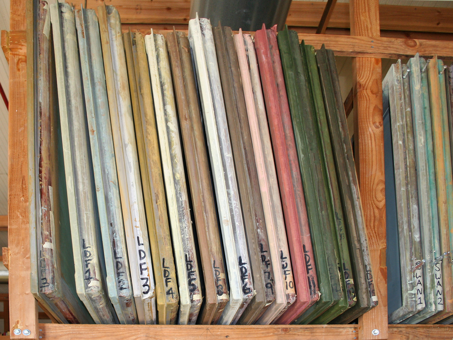
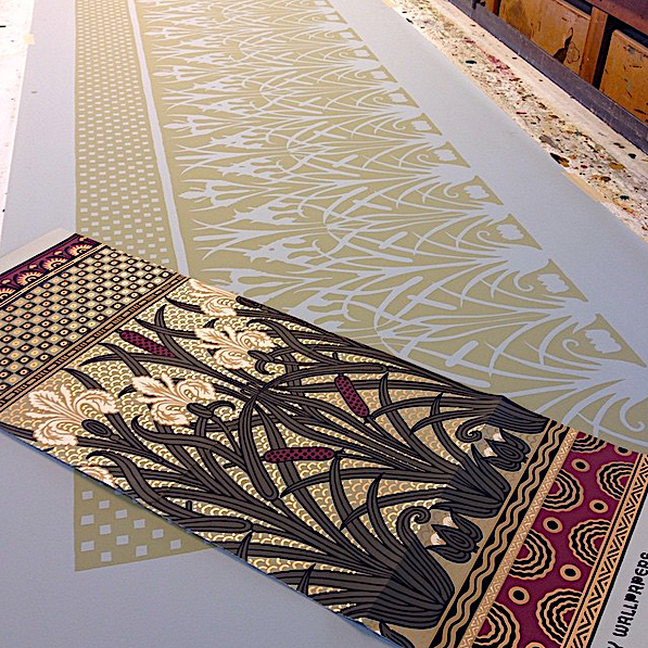
The screens shown here whose labels begin with the letters “LDF” are all used in Bradbury’s “Lion and Dove” frieze, which was originally designed by Walter Crane, circa 1900.
Bauer was also corresponding with John Crosby Freeman and his wife, Judy, who ran the American Life Foundation in upstate New York. “I had developed a friendship with them,” he says. “I would write to them, telling them how excited I was about the 19th century, and how great their books were. At some point, I thought they might know of scholarships in Britain for geeky kids like me. I wrote them and asked. Well, they didn’t respond directly to me, but they did forward my letter to a good friend of theirs who was starting a wallpaper company.”
That friend, of course, was Bruce Bradbury, who was so taken by Bauer’s letter and the Freeman’s description of their young pen pal that, in the spring of 1982, he sent Bauer a manila envelope full of his latest wallpaper samples, a round-trip plane ticket, and a job offer.
“There I was, 19 years old, a college dropout, working some job, and out of the blue I get this envelope crammed with all this cool stuff. I’m like, ‘What’s this? Who’s this from?’ I liked that the samples were silkscreened because I’d done that before. Of course, when I told my parents I wanted to go work for this guy who was all about the 19th century, they said, ‘You don’t even know this person.’ But off I went. Bruce had rented the space we’re still in today in November of ’81. I showed up in June of ’82. It was just me and Bruce and a guy named John Burrows, who would leave Bradbury to start his own company in ’85.”
Ink still life, Bradbury & Bradbury, 2018.
Bradbury may have sent Bauer a ticket, but upon Bauer’s arrival in Benicia, Burrows proved to be the one to give the kid a chance. “Bruce looked at my portfolio,” Bauer recalls, “and I had tons of drawings in there, but nothing in color. At one point, he says to me, ‘Your drawings are amazing. You draw like Louis Sullivan, but there’s no color. I don’t know if I can use you.’ That’s when John took Bruce aside and said, ‘This guy’s a draftsman. He gets what we’re doing; he loves the 19th century. Hire him. We can teach him about color.’ So Bruce hired me, showed me how to mix colors, and taught me the principles of color theory, the whole bit.”
“If the company was built on my passion,” Bradbury says, “it was built even more so on Steve’s skills.” Bauer, though, was every bit as passionate. Along with the rest of the small crew at B&B, he lived and breathed Victorian design. In fact, in the early days, Bauer actually slept at B&B, setting up a modest apartment for himself in what is now his small office.
Naturally, William Morris’ work was at the top of the list of historic wallpapers they wanted to reproduce, but they were also huge fans of Christopher Dresser, who was influenced by his extensive travels in Japan; Scottish designer B. J. Talbot, who was a key figure in the British Aesthetic Movement; and Christian Herter, whose New York interior-design firm decorated the Gilded Age mansions of American plutocrats such as William Henry Vanderbilt and Jay Gould.

Herter Brothers of New York designed interiors for many of the titans of the Gilded Age.
Of course, the Victorians were hardly the first to obey the urge to decorate one’s walls. That impulse goes back some 40,000 years, when cave dwellers in Sulawesi, Indonesia, and Cueva de El Castillo, Spain, independently decided to decorate their natural shelters with stencils and paintings. Obviously the inventories of animals and depictions of hunts on the walls of these caves were vastly different in style from the 19th-century wallpaper of Morris and his crowd, but it might not be an accident that the work of both was rooted in patterns and motifs pulled from nature. The desire to bring the outside world into our interior spaces apparently runs deep.
During the Victorian era, Bauer says, there was also a deep appreciation for the natural world. “It was part of what the Pre-Raphaelites and the Arts and Crafts movement were about,” he says, “a reaction to the mechanization and factories of the Industrial Revolution. Remember, London in those days was black from soot, so the idea of walking into a Morris room that was just full of birds and flowers and plants, like an indoor garden, must have been very appealing.”

Neoclassicism was part of the Renaissance Revival, which was popular in England in the 1860s.
After cave paintings, the next great advance in wall coverings arrived with the woven tapestries of Hellenistic Greece (323-146 BC), where the storytelling aspects of some of those cave paintings—depictions of a hunt, for example—became more complex and sophisticated. Tapestries would become the wall coverings of choice among kings, popes, and aspiring oligarchs for almost the next 2,000 years, and by the beginning of the 15th century, woven and embroidered tapestries were joined by printed and painted leather wall coverings.
The 15th century was also when an influential antecedent of wallpaper made its debut. In 1401, the Italian word domino was first used to describe the output of Italian and French printers producing sheets of paper bearing repeated designs and motifs—the word was taken from the name of an article of clothing worn by the printers. The domino papers made by these dominotiers included playing cards, marbled endpapers for books, and paper to line the insides of drawers and chests.

The Bayeaux Tapestry, which is actually an embroidery, is an example of the elaborate cloth wall coverings that were popular between Hellenistic Greece and the 15th century. Photo by Myrabella, via Wikimedia Commons.
By 1540, French dominotiers were forced to join a guild created by Louis XI, whose terms stipulated that their work would remain confined to small sheets, roughly 20 by 14 inches, and that they could not make use of lettering, lest they give unwanted competition to members of other guilds. Then, in 1597, the terms were loosened somewhat to permit the dominotiers to create sheets for use on walls, which led to the practice of papiers raboutés, or joined papers, about a century later. When the small sheets were placed side by side to paper entire walls, they created tapestry-like scenes or landscapes called tableaux-tentures.
Concurrently, some dominotiers experimented with papers that imitated the various types of fabrics that had been used as wall coverings. In particular, dominotiers did their best to produce paper versions of an imported Indian fabric called calico, whose texture and weight is somewhere between muslin and canvas. Traditionally, calico had been decorated with small flowers—today we associate the word “calico” with this delicate floral pattern rather than the material itself—so the papier des tapisseries produced by the dominotiers did, too. When the import of Indian calico into France was banned in 1686, the budding European wallpaper industry got a boost.

During much of the 19th century, wallpaper designers in England and France made it their dubious goal to duplicate the look of pictures at an exhibition, complete with fake framing. Via the V&A.
From its inception, then, wallpaper was a copy, an imitation, a fraud, although throughout most of the 18th century and even into the 19th, wallpaper remained relatively expensive to produce, if more affordable than an actual tapestry. As a luxury item, this early wallpaper was still not common. But between 1820 and 1841, all that changed when two machines were invented, making wallpaper cheap. The first produced an “endless” sheet of paper, which was perfect for applications such as wallpaper. The second machine was devised to print those endless sheets, which were stored and sold in rolls, as they are today.
Suddenly, the master of the most humble farmhouse could afford to paper the walls of his sitting room with a profusion of incredibly busy trompe l’oeil floral patterns, so that at the end of a long day he could put his feet up, light his favorite pipe, and pretend for a moment that he wasn’t actually in the business of slopping and slaughtering swine. Obligingly, companies cranked out overly ornate wallpaper designs for this new class of customer, although the historical record suggests that they might have actually been designing for the hogs.

Other misguided 19th-century wallpaper designers did not give enough thought to the impact of repeating the same image (in this case, London’s Crystal Palace) over and over again. Via the V&A.
“Ugly wallpaper was produced by the truckload throughout the Industrial Revolution,” Bauer says of this meritless dreck, which were sometimes no more than poor copies of portraits and landscape paintings found in the wallpaper printer’s local museum. “It wasn’t always that they were ugly in the sense of being poorly drawn or colored,” Bauer clarifies, “but poor in their overall concept, considering the large flat surfaces they were meant to decorate. Many were very illusionistic, overworked, and brightly colored, as though they were meant to be confined to a frame rather than repeated hundreds of times. The whole reason why Morris, Talbert, Crane, and Jeffrey & Co. decided to produce such beautiful papers in England was really as a response to all the ugly papers that were on the market.”
Even at the time, especially after the Great Exhibition of 1851 in London, which was a catalytic event in the British design-reform movement that followed, such wallpaper was openly reviled in the popular press, as in this snippet from an 1852 article by Henry Morley titled “A House Full of Horrors.” Describing an exhibition called “False Principles in Design,” Morley bemoans the sad state of mid-19th-century wallpaper:
“Flowers were not made with a direct view to paper-hanging, and if a wall paper be covered with direct imitations of these or any other natural objects, the chances are ten thousand to one that the whole effect of the colouring will be inharmonious and bad. The designer is compelled to use the paints wanted by this rose and that lily in constant violence to the principles by which he should be guided, if he remembered that he was working to produce a harmonious design of decoration for so many square yards of flat wall.”
Almost-but-not-quite-realistic wallpaper like this prompted designers in the second half of the 19th century to decree that because walls are flat, their decorations should be, too. Via the V&A.
Thus, one of the tenets of the design-reform movement as it applied to wallpaper was that only flat patterns should adorn flat surfaces such as walls. Trompe l’oeil with lots of artificial shadowing was out; flat, layered graphics such as those produced by screen-printing was in.
Of course, these new, beautiful papers designed by Morris and his crowd—the same ones that specialty companies like Bradbury & Bradbury work so hard to faithfully emulate—spurred cheap imitations of their own. Colors were often muddy, darkened in response—at least in part—to the advent of gas lamps, which suddenly threw more light into a room than before.
“The muddiness was also an attempt to tone down colorings,” Bauer adds, “and to introduce more hues from the natural world, although most manufacturers didn’t bother to go outside to actually view them. The Aesthetic Movement in the second half of the 19th century, which was ignited by all things Japanese, gave rise to so-called ‘greenery-yallery’ colorings, a term coined by Gilbert & Sullivan. Morris loathed these greenish, muddy colorings, and was offended by the suggestion that his work was their inspiration. The pendulum had swung the other way.”
As a student and practitioner of wallpaper design, Bauer has made numerous pilgrimages to see all of this for himself. “My wife and I went to the National Archives in Britain a couple of years ago,” he says. “We were looking through book after book of 19th-century patent-office wallpaper samples, and we could not believe the reams and reams of really ugly wallpapers that came out at that time. They were obvious knockoffs of Bruce Talbert, Walter Crane, and William Morris. The wallpapers by those designers were winning medals at the expositions, but the stuff the manufacturers were producing dragged the whole industry down. The good papers ended up in the homes of the elites, though, which is why you can still find some of those historic papers in restored homes of the period.”

Steve Bauer, with Bradbury & Bradbury’s “St. James,” 2018. Photo by the author.
Today, as the price of a roll of “St. James” suggests, Bradbury & Bradbury wallpaper is also being produced for a well-heeled audience, and while B&B is not the only game in town, the community of like-minded companies is small. “John Burrows has a nice collection of 19th-century hand-printed papers,” Bauer says. “Mason & Wolf is another good one. I think Trustworth Studio might still be screening some their patterns, while Adelphi Paper Hangings, a wonderful company, block-prints its papers rather than screening them. There aren’t a lot of us. Aside from Adelphi, we’re the only company I know of that prints its own product—most companies do the design but outsource the production work to someone else. That’s one of the things that’s been unique to us over the years. We design, manufacture, print, and ship under one roof. Bruce always felt that was important in order to maintain quality control.”
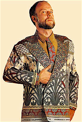
Bruce Bradbury in the 1990s, wearing a jacket and tie made from his company’s wallpaper. Photo by Jock McDonald, via Bruce Bradbury.
As for the modern preservation movement that got started in the 1960s and ’70s, Bauer says it’s still strong, but tastes have changed. “Right now in San Francisco, they’re ripping out a lot of the original interiors in the old Victorians. They’re doing the same thing in London, New York, everywhere. I don’t understand why anyone would want to take a 19th-century interior and turn it into a plain, 21st-century white-filled space, but that’s what people are doing.” Authentic Victorian exteriors, it seems, are one thing, but many people still can’t bring themselves to cover their walls with authentic Victorian wallpaper. “The best Victorian wallpapers tended to be the most flamboyant,” Bauer says, “so they’re the first things to get in the crosshairs of people who want to be modern and new.”
“People assume I must feel badly when someone buys a Victorian in San Francisco today and paints over the wallpaper,” Bradbury says. “But Oscar Wilde was a big influence on us, and he said it best, something like, ‘Nothing goes out of style like style.’ Sure, it’s a thrill to be in style and have your passion shared with other people around the country. But you can’t control that; you’re just lucky if you happen to show up in that window of time. That’s how I view it. And then, if you wait long enough, your passion may come back into style.
“I have this amusing fantasy,” Bradbury confesses, “that one day in the future, maybe 50 years from now, someone in San Francisco will be scraping paint off a wall and find one of our wallpapers underneath it. I imagine them going absolutely bananas.”
(All photography and video courtesy Bradbury & Bradbury, unless otherwise indicated.)
 To Hell With Helvetica: Is an 1874 Type Catalog the World's Most Beautiful Book?
 Think You Know Ugly? Think Again
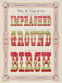 To Hell With Helvetica: Is an 1874 Type Catalog the World's Most Beautiful Book?
 Dissecting the Dream of the 1890s: My Skype Date With Those Curious Neo-Victorians
 Victorian EraThe Victorian Era, named after the prosperous and peaceful reign of England…
 Arts and Crafts EraThe Arts and Crafts movement that swept the United States and Great Britain…
 Mari Tepper: Laying it on the Line
 Nice Ice: Valerie Hammond on the Genteel Charm of Vintage Canadian Costume Jewelry
 How Jim Heimann Got Crazy for California Architecture
 Modernist Man: Jock Peters May Be the Most Influential Architect You've Never Heard Of
 Meet Cute: Were Kokeshi Dolls the Models for Hello Kitty, Pokemon, and Be@rbrick?
 When the King of Comedy Posters Set His Surreal Sights on the World of Rock 'n' Roll
 How One Artist Makes New Art From Old Coloring Books and Found Photos
 Say Cheese! How Bad Photography Has Changed Our Definition of Good Pictures
 Middle Earthenware: One Family's Quest to Reclaim Its Place in British Pottery History
 Fancy Fowl: How an Evil Sea Captain and a Beloved Queen Made the World Crave KFC
I’ve seen these folks advertised in Old Home Journal. Their products are very lush! Living in a 1895 home myself I was pulled to do a bit of papering in a few rooms. Luckily I found Spoonflower that does any print on any material (wallpaper, cloth, etc). I did a William Morris type print in my bedroom and a vintage 1940s print in my sunroom. Though much less expensive than Bradbury it was still a big cost! Not to mention the guy who installed it. He did an amazing job but he admits he is a dying breed. Wallpaper is gorgeous if done correctly and in the right amount. The 70s and 80s did some damage to wallpaper’s image. But I’m all in favor of finding some creativity to bring it back.
I think its sad but also typical that you can write a whole article about a revival in wallpaper and fail to mention Florence Broadhurst, who brought about the first revival in wallpaper, without which anyone since would not have a wallpapered wall to lean on. I guess when women do it, it just doesn’t count?
in late 1980 and early 1990 the upscale builders used wall paper extensively for interiors… in the 2000 when you tired of them, to your dismay when they were removed the wallboard was stripped of its out coverving… It was never painted. this required major repairs by professional… trends will be the death of us all…
Women do the wallpapering in homes! To say that a farmer wallpapered his room is so much codswallop. Schoolteacher friends would wallpaper one room per summer vacation. A requirement of engaged couples should be according to certain wallpapering friends that they wallpaper a bathroom before the wedding.
I LOVE wallpaper!! Not everyone hates it! I still use it even if the selections are not what they used to be. I believe it will come back! It does not have to be flamboyant. It can be quite simple and used on one or two walls in a room to set it off. Does everyone do “what is in”? Not me.
Back in the 70s – early 80s my dad and I were constantly wallpapering every house we lived in. (Okay, he wallpapered while I tried to “help” – come to think of it, the man must’ve had the patience of saint to tolerate all of my “help”.) Today, its not a job I’d tackle myself – as Clint Eastwood once noted “a man’s got to know his limitations – but I would paper half the walls in my house (if the wife agreed, natch) and use wood paneling on the other half. White walls, ecru walls, single color walls…booooring.
I love wallpaper. Bought a 1910 vintage house with faded wallpaper and started improving. I replaced the old plaster in the dining room with wallboard and the job, in spite of plastic hung to prevent it, laid dust down everywhere. From that moment on I patched the plaster and put down wallpaper whose patterns were chosen to hide the uneven walls. Turns out I could pick patterns that would cover an 8’8″ X 15′ wall and not be too bright or garish. The house became the extended families convention hall because of the warmth and variety that wallpaper offers.
I’m all in favor of anything that will address this plague of interiors that look like they’ve been dipped in bleach.
To start your article with “Everybody hates Wallpaper” is insulting.
I love wallpaper – always have, always will. Never start an article with a negative,
especially one that highlights the brilliance of an art form.
It turned me off to your article and your writing.
The problem with wallpaper is getting it off your walls when you get tired of it. Better to choose good paint and invest in good art.
Love this article. As a young child in the 50s, I was exposed to many wallpapered rooms, some wallpapered every two or three years. My mother hated her 1950s house, so she covered the walls with wallpaper to ease the blandness of the modest house. She didn’t realize it, but it was the non-nurtured artist in her coming out. Raising 8 children was her art at the time and wallpapering filled that need. Six of us slept in one small room, but the walls always changed and kept it from being mundane and prison like. One year it was big white puffy hibiscus flowers, lining up repetitiously across the wall. I loved lying in bed viewing the wallpaper above my little head, counting the flowers and design in each row. I learned to wallpaper from her and helped her at an early age. I can still smell the lumpy wallpaper paste and see the wide brush she so skillfully sloshed across the paper, as she folded at the half, paste side to paste side together. I also went with her to the store and help pick out new wallpaper from the hundreds of books available. I used this skill in the 70s and 80s to wallpaper my own house. I was always drawn to the Victorian copies and patterns of past. My 70s home had wall paper everywhere, the bedroom, the bathroom, the kitchen and living room, with ferns sweeping across the entryway. I was in my wallpaper glory. Then, just a few years ago, my husband and I built a beautiful craftsman house, with all the opulent woodwork. Did I put wallpaper on the walls? No, sadly, did I want wallpaper? Of course…..but the times have changed and the walls were painted jewel colors. The painted walls are striking, but not adorned as I would want them. So, as a self-taught artist, I adorn them with my framed artwork and that is my new wallpaper. I still get tempted.
Wallpaper made more sense back-in-the-day when walls were made of plaster & easily cracked without an easy, or pretty, fix. A busy wallpaper covers a multitude of sins. Errr…. which is one of the reasons buying a home which is wallpapered always makes a buyer cringe (Or, should.)
In my opinion, wallpaper has a proper place on vintage buildings, but personally wouldn’t install it within my more modern home. Mostly because once it’s up, which in itself costs a small fortune, but taking it down…. Ugh! Paint is so much more practical and can be changed on a whim.
In the right context, wallpaper is gorgeous. It was a bit overdone and made everyone want to vomit in the 80s. I think that’s our main problem with it! What I don’t like is white walls. But I also don’t like too much busyness. A Victorian home is just missing something without its gorgeous wallpaper at least in some spots. My ideal is beautiful, slightly neutral, but absolutely NOT white, wall paint with one accent wall of gorgeous wallpaper. OR a mural. I love murals too. I would very much love that wallpaper you called “misguided” with the crystal palace, but instead of repeating images I would want it huge so one image took up the entire wall. :)
I’m a pro paperhanger for the last 31 years. I have had the privileged of installing many of B&B’s wallpapers throughout coastal South NJ. Their product is of exceptional quality from the substrate used to the richness of the ink. Each install takes on a life of its own and completely transforms the Victorian home to is rightful state. Many of my clients speak words of praise for the job, but the praise I give always goes to B&B Thank you for the product you make and the passion to make it!
!
I’ve always loved wallpaper. Still do.
I agree with SnancyKat that Wallpaper is gorgeous if done correctly. I love wallpaper and am glad its coming back. Just finished putting a beautiful, but quite expensive, paper up in our RV!
I love wallpaper, and I adore Bradbury and Bradbury! I can’t begin to afford to get proper wallpaper hung, but I use their samples for crafts like bookbinding – their papers are very heavy and high quality, and their patterns are obviously exquisite…
I reject the first sentence of the article. One of the things holding me back from a bathroom remodel is that I love my wallpaper, and doubt that I can get more of the same.
I’m sorry, those patterns are headache inducing. I don’t understand how someone could spend that much money to install a permanent patter, and stare at it for years and years.
Fashions change, the pattern of clouds in the sky changes, and my computer desktop wallpaper changes every 5 minutes.
Variety is the spice of life.
ha! i’ve a thing for 1970s england. ironic that doing up a house/apartment in that style would mean victorian style, or at least rather old fashioned looking wall paper!
apropos oscar wilde, his very last words were purported to have been, “robbie, either this wallpaper goes or i do.”
Haha to springborn who said, “A requirement of engaged couples should be…that they wallpaper a bathroom before the wedding.” My husband and I learned a great truth when installing wallpaper 20 or more years ago: there can only be one boss, one head. Decide who it is before you start wallpapering and you’re golden. The other person is there only from the neck down. Works for us every time.
I would love to get my hands on sample books of all time periods!!!
I love wallpaper and older homes. You can keep your cold / modern taste.
My husband and I renovated an arts and crafts home in Pittsburgh. The walls in the dining room were covered in a gorgeous metallic wall cloth that we couldn’t salvage because it was covered in layers and layers of paint and so we had to strip it off. We were trying to stay authentic to the style but weren’t sure what direction to take. And then we found Bradbury and Bradbury. The wallpaper we ordered was so over the top! Quality and style. We loved it. I wanted to live in the dining room :) Sorry to say we’ve moved from Pittsburgh and we sold our beautiful home. I miss the dining room. I wish I could post a picture.
Love wallpaper, but do not love the job. I find if you can find the right one, design and colors, it ads a certain flair to a room
A long narrow space can look more spacious, a bedroom more cozy, a kitchen more kitchy, the possibilities are endless.
I found mine on Ebay, often vintage leftovers.
Wanted to ad that Scandinavia has a much sparser mordern light colored palette. Large windows, earth tone furniture with glass and pale wood. Very few textiles or wall decorations, except maybe one large modern painting.
I find that approach cold and impersonal. Thanks for the great article and images especially.
I’m looking for wallpaper with sheep or cattle. I’ve found Komodo dragons, elephants, frogs, turtles…. Does anyone know where I can find pastoral wallpaper?
There are some with animals here: https://bradbury.com/vintage_fifties.html