
“How To Make Good Pictures” (Rochester, NY: Eastman Kodak Co., 1943). Source: Collection of the Prelinger Library (detail)
“Art is like a joke, either you get it or you don’t.” So it was explained to me in the late 1970s by photographer Randy Eriksen, whose cheeky observation about the importance of context to one’s appreciation of either comedy or art could have been a parenthetical second subtitle for author and educator Kim Beil’s “Good Pictures: A History of Popular Photography” (Stanford University Press, 2020).
Beil’s episodic and highly readable book identifies 50 photographic trends—illustrated by hundreds of vintage and contemporary photographs—that have guided the aesthetics of photography since 1851, when a group of American daguerreotypes made a splash at the Crystal Palace Exhibition in London. Back in 1851, context mostly equaled 1851, as the latest photo technology of the day played a major role in how Victorians decided that one picture was good and another was not.
“For Beil, failure comes in at least two flavors.”
The tech in question at that time, Beil writes in “Good Pictures,” was “the American process,” a procedure in which bromine, iodine, chlorine, and silver, when applied to a polished copper plate, produced daguerreotypes of greater clarity and tonal range than those of British or even French photographers, which was saying a lot since the dominant photographic form of the mid-19th century took its name from its French inventor.
The debut of the American process at the Crystal Palace showed how a single advance in photography technology at a particular moment in history could instantly define what people considered a good picture. In 1851, if you had become used to looking at daguerreotypes that were dark and blurry, you immediately “got” that the ones imported from the former colonies were better. You now had taste.

Example of the American process. John Jabez Edwin Mayall , “The Crystal Palace at Hyde Park, London,” 1851. Daguerreotype, 12″ × 9 11/16″. Source: J. Paul Getty Museum, Los Angeles. Digital image courtesy of the Getty’s Open Content Program.
Beil’s own context began in Albany, New York, where she grew up. “My mom was into photography,” Beil tells me over the phone. “She was the one who took the pictures in my family. When my parents got me my first camera, a Nikon FE, they made me attend a class offered by the camera store. I remember it was held in this dark ballroom at an Albany hotel. It was me and a bunch of middle-aged men. That’s where I learned about 35mm cameras, f-stops, and shutter speeds.”
Beil also learned from various “How to Make Good Pictures” manuals published by Kodak, which also hailed from upstate New York. “I’m pretty sure I internalized the advice I read in ‘How to Make Good Pictures,’” Beil says of her early aesthetic indoctrination, “things like avoiding centering your subject in the frame, the rule of thirds, shooting during ‘golden hour,’ all that conventional wisdom.”
These days, as her own “Good Pictures” so capably shows, Beil is the teacher, although she’s only interested in explaining “how” inasmuch as it sheds light on “why”—to put it in the language of Eriksen’s axiom—we either get it or we don’t. To that end, Beil uses the techniques and trends embraced by photographers and photography fans to help us understand how “good” has evolved. Revealing her inner heretic, Beil measures good by its popularity, which, in Beil’s telling, deepens rather than cheapens our understanding of photographic practices of the past century and a half. “I had mostly been looking at photographs according to their processes,” Beil admits, “but the pictures began to look different to me when I started doing the research for the book. Suddenly, I was focusing on the poses, the lighting, and all those elements implied.”
Related: The 11 Most Expensive Photographers
![Example of the use of a prop. William Hardy Kent, "Untitled [Seated Elderly Woman Wearing Plaid Dress and Bonnet]," ca. 1854-1860. Daguerreotype.](https://d3h6k4kfl8m9p0.cloudfront.net/uploads/2021/07/27131640/kent_seated_old_woman_1840.jpeg)
Example of the use of a prop. William Hardy Kent, “Untitled [Seated Elderly Woman Wearing Plaid Dress and Bonnet],” ca. 1854-1860. Daguerreotype. Source: Metropolitan Museum of Art.
Today, many of us look at photographs from this era and are immediately prompted by the uniform placement of their subject’s arms to date them from the mid-19th century. The context is clear, we get it, and we’re maybe even a little bit grateful for the visual cue.
Back in the day, however, such uniformity was met with derision, at least in some quarters. In “Good Pictures,” Beil quotes British photographer Henry Peach Robinson: “A person unacquainted with photography… on looking over the specimens of many portrait photographers, would suppose there was only one position in which a sitter could be placed,” Robinson huffed. Some modern viewers are equally judgmental, interpreting the rigid poses of the sitters in these photographs as evidence of unyielding Victorian rectitude. In their daily lives and personal habits, many Victorians were no doubt stiff as boards, but their poses in early photographs, Beil shows, are more properly read as a factor of technology rather than an indication of character.

Example of a carbon print. William James Stillman, “The Acropolis of Athens, plate 21,” 1869/1870. 9 1/2″ x 7 5/16″ (image). Source: National Gallery of Art, Robert B. Menschel Fund.
A small table to steady an elbow was a simple corrective. Most other failings of the nascent technology of photography, and there were many, required more ingenuity. In fact, the story of early photography is riddled with failure, which is why failure is a repeated theme in “Good Pictures.”
For Beil, failure comes in at least two flavors. The first concerns failures that led to advances like the American process, which was devised to correct the predominance of dark and blurry images in early photography. But bromine, iodine, chlorine, and silver could not fix an even greater failing of early photographs, their impermanence. Whether dark and blurry or sharply Americanized, early photographs tended to fade, virtually before one’s eyes.
The solution to that failure turned out to be carbon, which had been used by photographers for this purpose since 1856 but was only popularized in 1867, when a Boston photographer named Frank Rowell figured out how to make carbon tissue paper in order to print photographs that, in Rowell’s words, “will hereafter be as permanent as the engravings which adorn the walls of our dwellings.” As Beil points out, it was not until photographic permanence arrived that the medium’s impermanence was decried.

Example of a carbon print with red pigment. Julia Margaret Cameron, “My Niece and God Child (Julia) Mrs. Herbert Duckworth/A Beautiful Vision,” 1872. 13″ x 9 13/16″. Source: J. Paul Getty Museum, Los Angeles. Digital image courtesy of the Getty’s Open Content Program.
From the context of 1867, carbon was a scientific solution to a technical problem, but almost immediately it also became an aesthetic choice for photographers, who combined carbon with pigments to, for example, replicate the reddish hues of Old Masters drawings. All of a sudden, here were photographs that truly deserved a place next to the engraving on the wall of one’s dwelling, an obvious improvement over far more common tintypes, cabinet cards, and cartes-de-visites, the snapshots of their day. By the 20th century, decades-old carbon techniques were embraced all over again by a new generation of art photographers, who valued the element—number 6 in the periodic table—for the smoky softness it gave their subjects.
A second type of failure concerns effects that largely began as mistakes produced by legions of amateur photographers shooting pictures with their new, boxy, Kodak cameras, which made their debut in 1888. Foremost among these failures were motion blur and lens flare. Once upon a time, both were frowned upon by the authors of the “How to Make Good Pictures” books. Thus, a blurry background while trying to capture a moving object, or a blurry object moving across an in-focus background, were considered mistakes that a few simple techniques could help you correct.

Example of poorly cropped early Kodak photograph. Photographer unknown, “Snapshot: Dog and Man,” ca. 1890. Gelatin silver print, 3 7/16″ x 5 1/16″ (card). Source: Metropolitan Museum of Art, Horace W. Goldsmith Foundation Gift, through Joyce and Robert Menschel, 1993.
Shooting into a light source and thus drenching precious photographic real estate in overexposed rays of light was also considered a no-no. But just as sports photographers would eventually have a ball with motion blur, fashion and advertising photographers would eventually go crazy for lens flare. Intention created context.
“Intention is central to the way I think about art, and maybe even how we define it,” Beil agrees. “Take lens flare: I think the power of lens flare comes from its initial unintentional use by people who were just taking casual pictures without any premeditation, without much intention.” In these sorts of photographs, Beil says, lens flare was an amateur mistake that conferred “a kind of authenticity to an image.” That’s why advertisers find lens flare so appealing. “Because we still associate it with authenticity,” Beil says, “it makes an advertising photo seem more real, maybe even spontaneous.”

Example of motion blur. “This is the Austin Healey 3000” advertisement, Road and Track, September, 1963. Source: Kim Beil Collection.
Today, lens flare is so widely used, so intentional, that billions of smartphone cameras offer multiple variations of this former failing in the form of filters, which can be activated with a click or a swipe. “Everything can be achieved and there are no more accidents,” Beil says of photography in the 2020s, “so photographers look to things that happened before to reinsert some kind of authenticity into their pictures.” Thanks to technology, photographers can now pretend to take pictures as if they lacked the tools to make their pictures, well, good.
The problem, of course, is that technology is intrusive, inserting itself into aesthetics and even cultural paradigms without being invited to do so. “We have a situation today,” Beil says, “in which our smartphone cameras are producing pictures according to the criteria of software designers, who have made a lot of egregious assumptions about the tonality of skin color.” According the Beil, because the sample sets used by software designers have historically included more pictures of light skin tones than dark skin tones, the colors captured by our smartphone cameras do a better job of reproducing the lighter skin tones. “People with darker skin aren’t represented in the way that they want to be,” she says, “or even in the way that’s accurate. Google has promised that the Pixel 6 camera coming out in October 2021 is going to deal with that problem,” she adds, but Beil doesn’t sound like she’s expecting much more than an incremental improvement.

Example of lens flare. digitalpimp, “The Last Hurrah,” February 13, 2010. Flickr. CC BY-ND 2.0
Not surprisingly, getting skin tones right is not a new problem, as Beil explains in her brief discussion of “Shirley” cards, named for the first white woman whose smiling face graced these small pieces of paper in the 1950s. Produced and distributed by Kodak, the cards were intended to help film labs calibrate the colors of their prints to the capabilities of Kodak film. Sounds straightforward enough, but as Beil quotes communications scholar Lorna Roth in “Good Pictures,” “Kodak color film stocks long privileged the light end of the spectrum, sacrificing detail in dark image areas to achieve the accurate rendering of lighter areas, especially white skin.”
In their privileging of white skin tones over darker ones, the Shirley cards exposed Kodak’s “unconscious bias” when it came to race. Unconscious or not, though, the bias appears to have run deep. How else to explain the fact that the company did not prioritize the manufacturing of film stocks that did a better job of capturing darker complexions until after it had received complaints from, among other commercial customers, wood-products manufacturers, who fretted that their darker-grained products were not showing up properly when shot with Kodak film—in print advertisements, the faces of white models would be clear and sharp, but the wooden sofas upon which these models reclined would be dark, indistinct, and muddy. Kodak eventually developed new film stocks to solve this problem, agreeing, it would seem, to place a premium on skin-tone accuracy only when its financial interests were at stake.
Other responses to photography failures have been less fraught. Because early photographs lacked color, photo studios hired artists to hand tint them. Because early cameras did a poor job of capturing landscapes and clouds at the same time, photographers would sometimes use two negatives for a final print, one for the earth and another for the sky. To combat deep shadows creasing a sitter’s face, photographers would introduce shadows they could control, creating what was called the Rembrandt effect. And by the end of the 20th century, as amateur photographers finally mastered the blinding effects of built-in on-camera flash units, fashion photographers embraced the amateur look of overexposed faces set against deep shadows to give their photographs the same sense of authenticity that was conferred by other “errors” such as lens flare.
By the end of “Good Pictures” and its 50 photographic trends, many readers may find themselves wondering about trend number 51. I know I did. My vote would be for what I call the Sunset Pointing Photograph, which I learned about when I was an editor at Sunset magazine from 1992 to 1998. By the time I arrived to take my desk in a corner of the company’s famous Menlo Park headquarters, there was an unofficial but nonetheless well-articulated “ban” in place forbidding the publication of photographs featuring people standing in scenic settings and pointing. Apparently, pointing photos had been a thing at Sunset in the 1960s, ’70s, and even into the ’80s, when untold numbers of travel articles were accompanied by untold numbers of photographs depicting lots and lots of people pointing.

“The Human Interest Element,” from “How to Make Good Pictures” (Rochester, NY: Eastman Kodak, 1936), 74-75. Source: Kim Beil Collection.
Memories of former colleagues are fuzzy on the finer details of the ban, as are my own. For example, it may or may not have been essential that the person in the photo was pointing at something that readers could see in the photo—standing, say, in the left third of the photo and pointing to something in the right third. One admittedly tortured explanation for the ubiquity of these photos was the high value Sunset placed on realistically representing the reader’s experience; previous editors may have felt that depicting a reader pointing was perfectly acceptable since that is what the magazine’s readers were most likely to do when released into the wild. At some point, though, the pointing photograph was deemed enough of a cliche that Sunset itself, which was generally quite comfortable with its often ham-fisted sense of style, put a stop to the practice, lest “The Magazine of Western Living” be accused of self-parody.
Beil is of two minds about her number 51. “I expect we’re going to see a lot of intentional pixelation and degraded images,” she says, “all of that stuff that was bad about early smartphone cameras around 2010. That’s probably going to be popular in five or 10 years,” she sighs.
Her other vote would be for a new genre she calls the “Plandid,” a portmanteau for “planned candid.” “It’s like when you’re looking away from the camera, but you’re very much aware that someone is taking your photo,” she explains. “These are really popular on social media right now. Women will have hair all over their face. They’ll be pulling down their sunglasses and looking at the ground, clearly posing for the camera but not looking directly at it. Plandid would probably be my chapter 51.”

These days Beil still takes photographs, although she no longer carries around her childhood Nikon FE. “I still love looking through camera lenses and taking pictures,” she says, “but I wouldn’t say my pictures are very interesting. My Instagram is dominated by photos of my how-to book collection, so I’m mostly taking pictures of other people’s pictures.” Turns out, according to “Good Pictures,” there’s precedent for that, too. Beil has a whole chapter on a 1950s trend in which people took pictures of the programs on their television sets, and then pasted those pictures into scrapbooks. Instagram, scrapbooks, get it?
(“Good Pictures: A History of Popular Photography,” is available in paperback. If you buy something through a link in this article, Collectors Weekly may get a share of the sale. Learn more.)

 Found Photos: When Rock Lost Its Innocence
 Take That, Instagram: The Enduring Allure of Vintage Snapshots
 Found Photos: When Rock Lost Its Innocence
 True West: Searching for the Familiar in Early Photos of L.A. and San Francisco
 PhotographsFrom Mathew Brady's Civil War photos to Ansel Adams' landscapes to Irving P…
 Mari Tepper: Laying it on the Line
 Nice Ice: Valerie Hammond on the Genteel Charm of Vintage Canadian Costume Jewelry
 How Jim Heimann Got Crazy for California Architecture
 Modernist Man: Jock Peters May Be the Most Influential Architect You've Never Heard Of
 Meet Cute: Were Kokeshi Dolls the Models for Hello Kitty, Pokemon, and Be@rbrick?
 When the King of Comedy Posters Set His Surreal Sights on the World of Rock 'n' Roll
 How One Artist Makes New Art From Old Coloring Books and Found Photos
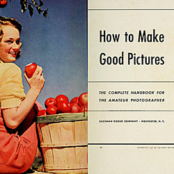 Say Cheese! How Bad Photography Has Changed Our Definition of Good Pictures
 Middle Earthenware: One Family's Quest to Reclaim Its Place in British Pottery History
 Fancy Fowl: How an Evil Sea Captain and a Beloved Queen Made the World Crave KFC
Perhaps, this is why pre-70’s images of Black people were often in black and white. I expect they had a larger dynamic range than the full-color film.
What a bunch of hacks. This is such garbage. Find some people who actually understand fine art photography.
You should empty out your trash can and then through this in it …lol I don’t need to jump in the weeds with you other then to say your thread is plain and simple hogwash, I back up Ethel 100%
Ethel and Roy need to spend more time in the library and less online in trite photography forums where they tout their photographic ‘wisdom’ while critiquing yet another photo of their local farmers market.
Roy should also work on his spelling.
There are several salient points brought up in the article and your lack of understanding is made quite plain. Learn more and talk less.
The absurd curveball this article takes from talking about Photography to hyperventilating over imagined racism is tedious and dull. If the author wishes to throw a temper tantrum about inequality, do so in a political setting and leave it out of an esteemed international pastime. We have no interest in reading self-serving drivel.
This was an excellent article. And it’s especially evident by the fact that it’s made white supremacists angry! Bravo.
What a wonderful, enlightening article. I learned a lot from it. The video about the relationship between photography and skin tones was particularly interesting. When I was a kid, I would feel disappointed whenever, in group photos, my dark-skinned friends’ features didn’t show up as well as those of my light-skinned friends. I never imagined photography companies actually had the ability to do something about this problem but simply didn’t bother. Good thing the wood manufacturers began to complain about the poor photographic quality of their dark-grain products, otherwise the photo companies would never have bothered to improve their picture-taking methods and materials. I’m glad that nowadays, there are makeup kits and other items specifically designed to show the beauty of dark skin.
Let’s rise above the hatred demonstrated in the comments section. Then and only then can we have a constructive discussion on the merits of this opinion laden commentary.
Interesting take! It’s true that with the rise of casual photography, our standards for ‘good’ photos have shifted. Sometimes the authenticity and imperfection tell a better story than perfection. Embracing the flaws might just redefine what we consider beautiful in photography.