
When photographer Arthur Tress purchased a “Little Lulu” coloring book in 2008, he didn’t know it would lead to a charming series of photocollages a few years later.
When it comes to coloring techniques, some kids always stay within the lines while others grab the nearest crayon, grip it like a dagger, and stab it repeatedly into the rough surface of coloring-book page, slashing their colorful weapon back and forth before reaching for another slender tube of wax—any hue will do—and attacking the same sheet with equal abandon. “Take that, Mr. Binney!” “Take that, Mr. Smith!”
“Coloring-book paper is difficult to work with because it’s so crumbly.”
Then there are kids like photographer Arthur Tress, who rediscovered coloring books when he was in his 60s, and continues to be fascinated by them as an octogenarian. In general, Tress does not color inside or outside of the black lines printed in the used coloring books he buys at flea markets and second-hand shops. After all, the empty spaces within those lines are already packed with Crayola. Instead Tress pairs pages from this uniquely interactive form of children’s literature with discarded snapshots, which he has collected for years. The resulting photocollages are often dreamlike, but they can also be simple and sweet, even when his pairings call attention to the mildly homoerotic and explicitly normative subtexts common to many coloring books.

This photocollage from 1880s was inside an album Tress purchased in London in 1987, and inspired his subsequent photocollages using pages from used coloring books.
Tress credits the idea for his photocollages to a circa 1880s art and photography album he purchased at a London photo fair in 1987. On one of that album’s 11-by-14-inch pages, an illustrated woman in green walks amid a leafless stand of illustrated trees. In her hand is a flowering branch, also hand drawn, but follow her eyes; they are fixed upon a collaged photograph of a mutton-chopped, mustachioed, top-hatted gentleman, who glares back at her disapprovingly.
More than 20 years later, in 2008, Tress took his first step toward creating similar collages when he purchased a “Little Lulu” coloring book. “I was struck by how lovely it was as an object,” Tress says, “and also by the fine and careful coloring on every page. Plus, it was only eight dollars!” That may seem like a lot of money for a cast-off coloring book, but for Tress, that spur-of-the-moment purchase led to a charming body of work created roughly between 2010 and 2013.

These crayoned pages from Tress’ collection of flea-market coloring books await snapshots from his collection of found photos.
“It would be an evening’s recreation to match up coloring-book pages with photographs,” Tress says of the photocollages he made during those years. “It became sort of a game, almost like Old Maid.”
The game was played as follows: “I’d put a coloring-book page on a table and then pull a photograph from one of my little white envelopes,” he says of the everyday containers he uses to organize his collection of hundreds of found photographs into categories such as children playing games, animals, buildings with geometric shapes, and World War I. “A lot of the pairings ended up being by chance, depending on what I happened to pull,” he says, “but I did have the choice of doing the collages in a surrealistic way, where there would be dissonance between the found photos and the coloring-book subjects, or in a way where the photos and subjects would be similar. I decided to make the pairings congruous.”

Arthur Tress holds a found photograph from his collection, 2021.
Once he had his pairing, Tress did one more thing, inspired by an artist friend and collagist named Mark Garrett: he carefully sliced into the coloring-book page, cutting around some of the hand-colored elements. This allowed him to insert an edge or corner of a found, randomly selected, congruous photograph behind part of the coloring-book image, creating an illusion of depth that went one better than the photograph pasted into that 1880s album. “Sometimes you hate to do that,” he says, “because when you cut into one side to create your collage, you have to destroy whatever is on the other side. Coloring-book paper is difficult to work with because it’s so crumbly,” he adds. “It sort of bunches up on one side as you cut it.” After many evenings of coloring-book recreation, though, Tress got pretty good at this new specialized skill.

“Woman with Coin Operated Binoculars, Coit Tower, San Francisco, 1964” is an example of congruous shapes paired together. Tress would take the same approach with his coloring-book photocollages almost half a century later.
That Tress took seriously the idea of pairing pages from used coloring books with found photographs should not be too surprising to anyone who has followed Tress’ work. Throughout his career, Tress has treated photography—and, by extension, art—as more than a discipline inflexibly limited by a one’s facility with a camera in the wild, as if his only path as a photographer was to bow at the altar of Henri Cartier-Bresson’s “decisive moment” and then, perhaps, goose his captured moment with a few tricks in the darkroom. To be sure, Tress did his share of that during the course of his long career, but he also produced photographs whose compositions had been carefully choreographed in advance, as in his Teapot Opera series from 1988 and Fish Tank series from 1989. In those series and others, the decisive moments were entirely of his own making.
Tress credits his friend and fellow photographer Duane Michals with opening his eyes to the possibilities of his chosen medium in the 1960s, back when Tress’ photographs hewed more closely to the prevalent “documentary” style of the day. “He said a photograph can be anything,” Tress says, describing Michals’ approach. “It can be a sequence, you can write on the photograph, paint on it, make collages, tell a story. In the ’60s, that was revolutionary.”

In this photograph from 1969, Tress asked a man in Appalachia to basically frame himself, poking fun, perhaps, at the inherent artificiality of documentary photography.
As it turned out, Tress was a receptive audience for Michals’ manifesto. By the time the Brooklyn native had secured his breakthrough assignment in 1969 to photograph what he describes as the “endangered folk cultures” of Appalachia, Tress was already pushing against the dispassion of the documentary style. In one portrait, he framed the weathered face of a man in overalls within an actual, empty, ornate wooden picture frame, which the man rests on his knees and holds steady for the camera. “Like this?” his eyes seem to ask.
I did not encounter this photograph in 1969, so I can’t speak to the reaction to it at the time, but from the vantage point of 2021, it seems to have less in common with the stylistically similar Farm Security Administration photographs of Dorothea Lange shot 30 years earlier than it does a celebrity portrait by Annie Leibovitz, whose career, in 1969, had yet to take off. In fact, the portrait is not wholly either. Instead, it feels like something new. One puts Tress’ work into this or that box at their peril.

In 1989, Tress shot a series of staged color photographs that used a fish tank as a recurring prop. The photos were published years later as “Fish Tank Sonata” (Bulfinch, 2000).
These days, ironically, Tress’ photocollages are stored in a literal box, which he opened for me when I visited his home recently. “I never thought these works would be taken that seriously,” he says, placing a collage on a metal table that looks like it, too, had been picked up at one of the same flea markets or second-hand shops where he finds his vintage coloring books and old photos. “They were done more for fun,” he says of the body of work spread out before us. “The first ones I did, I was just playing around. ‘Here’s a picture of a little boy with big ears, and here’s a picture of Mighty Mouse. He kind of looks like the little boy, right?’ But later on, as I saw the wealth and variety of coloring books, I began to realize that the themes had changed over the decades, so I began to think more about the sociological aspects of coloring books.” Tress was also interested in some of the research that had been conducted about the way people pose in snapshots, and what their poses say about what they’re trying to convey about themselves.
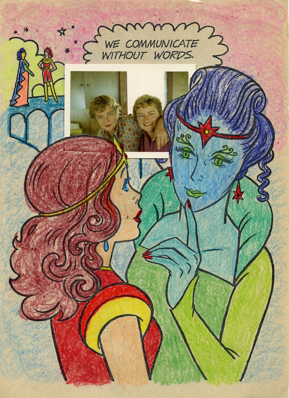
Tress is not the first artist to notice the sexual innuendo that was so common to so many postwar coloring books. When paired with a congruous photograph, the innuendo is amplified.
“My original plan,” Tress continues, “was to produce some of them as archival pigment prints and sell them that way, but the prints didn’t have the quality of the originals.” Those qualities include the tactile crumbliness of the cheap paper used in older coloring books, their difficulty to cut with an X-Acto knife notwithstanding, as well as the unintended intimacy of the found photos—looking at them can be an invitation to attend a child’s birthday party, or to tag along with a family on their summer vacation. A beautifully produced archival print would bury those physical and emotional qualities in mere production values.
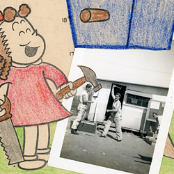
A finished piece from that first “Little Lulu” coloring book shows what Tress was after. In it, we see Lulu in a red dress, laughing as she holds a hammer and saw. She’s just built a connect-the-dots birdhouse, which has been secured somehow in a tree. I say “somehow” because Tress has covered up everything below the birdhouse with a found photo of three workmen, one of whom is looking at the camera and holding a hammer above his head, as if to demonstrate the art of hammering. Tress has positioned the photo so that Lulu’s hammer is in the path of the man’s hammer, which, in Tress’ collage, now appears to be the new cause of her laughter, assuming a coloring-book cause that we cannot see is secreted behind the photo. Simple and sweet.
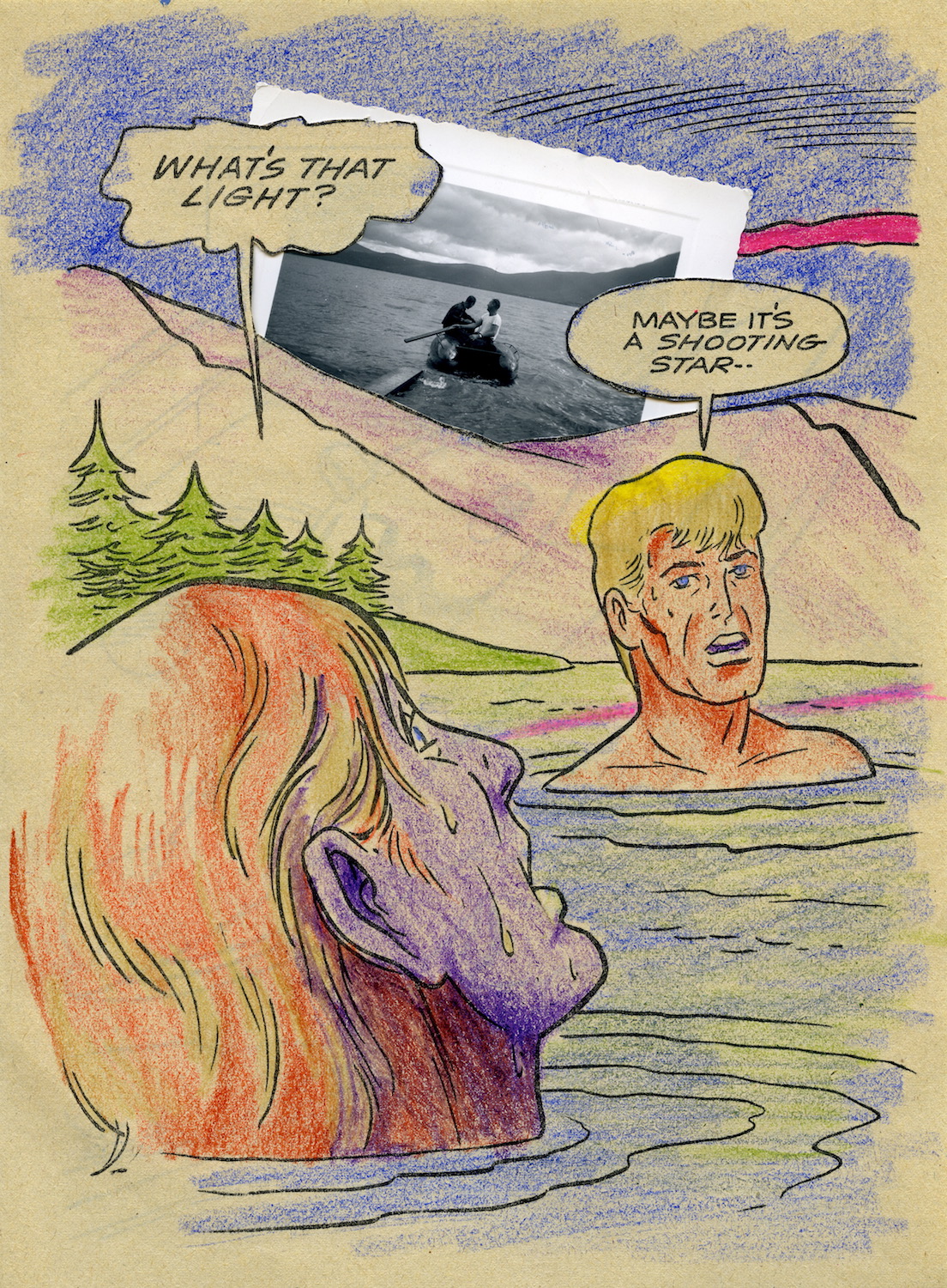
In this photocollage, Tress again amplifies the implicit sexual tension of a scene in a coloring book, while also showing off his light but sure touch when it comes to composition and design.
In another photocollage, two men are swimming in a mountain lake, their heads and the shoulders of one are all that we can see. The trees are green, the sky and water are blue, and the hair of one man is yellow, presumably to identify him as a blond. The other man’s face, though, is purple, and the water dripping from his hair reads as nervous perspiration, for he is looking at the sky and exclaiming, “WHAT’S THAT LIGHT?”
“MAYBE IT’S A SHOOTING STAR,” his blond friend replies, and now we notice that his face appears worried, too, no doubt because of the streak across the sky behind him, a streak rendered in red and artfully reflected in lighter, fuzzier tones on the lake’s surface. But as with Lulu’s birdhouse, we only see a portion of the streak because Tress has covered it up with a photograph of two more men on a similar lake in a boat, about to head out for a paddle or perhaps on their way back in. We can’t tell which, but by now we’re mostly wondering why so many strapping men are swimming and paddling in so many mountain lakes. Suddenly, their dialogue (“WHAT’S THAT LIGHT?” “MAYBE IT’S A SHOOTING STAR”) seems tinged with sexual innuendo, a question and answer about something other than the streak of red in the sky and its watery reflection.
As a gay man who’s produced his own homoerotic bodies of work, Tress was obviously aware of all of this when he was making this particular collage, but as with his 1969 photograph of the Appalachian man in overalls holding up a picture frame, which looks like a Lange but behaves like a Leibovitz, putting Tress in a box labeled “gay artist,” a designation that means different things to different people, seems needlessly limiting. For example, what do we make of his decision to have the child-artist’s red streak, the shooting star, line up perfectly with the outline of a mountain in the background of the photograph of the two men in the boat? Is that a gay-artist choice or just a choice?

Jane Powell is one of many mid-century actresses—Rita Hayworth, Betty Grable, and June Allyson are among the others—who were depicted in coloring books as role models for little girls.
If coloring books were unwitting when it came to revealing the unspoken urges of some of their subjects, they were more deliberate when it came to teaching children, especially little girls, what was expected of them when they grew up to be, in the case of those little girls, wives and mommies. Based on Tress’ collection, this indoctrination appears to have been particularly strong in mid-century coloring books starring Hollywood actresses like Jane Powell. In one Tress collage, the star of “A Date With Judy” (1948) has been colored in bright red lips and she wears a cheerful yellow-flowered hat that matches the wallpaper behind her. Perched on her right shoulder is a found photograph of a prototypical male—the presumed reason for her attention to her appearance—whose right arm descends in parallel to hers because Tress has angled the photo on the page to make it so. While the expression on the man’s face is definitely not one of head-over-heels infatuation, his gaze is approving, albeit in a ‘I’ll take that one’ sort of way. ‘Be like Jane, girls,’ the coloring-book illustration seems to say, ‘and if you’re lucky,’ adds Tress’ found photo, ‘you’ll get a man, if not the guy of your dreams then someone who’s dependable and looks OK in a necktie.’ In this photocollage, the composition manages to be as simple and sweet as the one with Little Lulu, but it’s also, truth told, a bit bleak. Tress’ choices make it both.
Other photocollages carry no heavy baggage at all, such as the coloring-book page in which a green horse and her pink colt have been paired with a black-and-white photo of the same animals. Still others are somewhere in between, as in the handsomely colored silhouette of a tan wolf howling at a yellow moon, which have been paired with a color snapshot of a young, smiling Cub Scout dressed in full uniform and holding his “Wolf” handbook. “The puppy was part wolf.” reads the text on the page, which thanks to Tress’ intervention now seems a comment on his found photograph.

When the caption for this coloring-book page was written, it was meant to relate to the drawing above it, but when Arthur Tress added a found photograph of a Cub Scout holding a “Wolf” handbook to the page, the caption was suddenly redirected.
In a few cases, Tress breaks his own rules and seeks out a specific photograph to collage on a coloring-book page, as he did with a snapshot of himself in his 20s relaxing at a beach. Tress paired this shot with a colored drawing of military man—his stern blue eyes offset by a single pink cheek—who sits before a microphone and the lens of a TV camera, his fist on the table, as if in mid-pound. The caption on the page reads, “The Army sends out a call for help.” which, Tress tells me, was precisely the call he was trying not to answer when the photo of him was taken.
Just as rarely, Tress colors a page himself. “Sometimes you get a great page that isn’t colored,” he says, “so I trained myself to do it myself, kid-style. There’s an almost universal way of coloring in a coloring book, like highlighting the heavy outlines occasionally, certain scribble effects. Sometimes I’d sign them with fake kids’ names—I felt like a forger—but not too often. I got so good at it that I don’t remember which ones I actually did anymore. Like this one,” he says, holding up a photocollage, “I’m saying to myself right now, ‘Did I color this one?’ I kind of remember doing it, but maybe not.”
In the end, Tress’ photocollages draw us in because of his early decision to make his pairings of coloring-book pages and found photographs congruous rather than surreal. It’s easy to produce pictures that will shock, amuse, or titillate due to the dissonance of their elements. It’s much tougher to do the same, or even more, when everything is in ostensible harmony. In this way, Tress could be said to be coloring both within and outside the lines, melding the sweet with the subversive. “Yeah,” Tress says, “that’s me.”

In this photocollage, Tress broke his rule of only working with found photographs when he added a picture of himself in his 20s to this coloring-book page. At the time, he was trying to avoid being drafted to serve in Vietnam.
(To learn more about Arthur Tress, visit his website or the Arthur Tress Photograph Collection at Stanford. To learn more about Victorian Era photocollage, visit the “Playing with Pictures” page at The Met. All images copyright Arthur Tress Archive LLC.)

 From Little Fanny to Fluffy Ruffles: The Scrappy History of Paper Dolls
 Take That, Instagram: The Enduring Allure of Vintage Snapshots
 From Little Fanny to Fluffy Ruffles: The Scrappy History of Paper Dolls
 In Their Own Words: Unpublished Children's Notebooks Reveal Poignant View of History
 Childrens BooksIt wasn’t until the 18th century that books were written specifically for c…
 Art PhotographyIt shouldn’t be a surprise that photography became a vehicle for art and op…
 Mari Tepper: Laying it on the Line
 Nice Ice: Valerie Hammond on the Genteel Charm of Vintage Canadian Costume Jewelry
 How Jim Heimann Got Crazy for California Architecture
 Modernist Man: Jock Peters May Be the Most Influential Architect You've Never Heard Of
 Meet Cute: Were Kokeshi Dolls the Models for Hello Kitty, Pokemon, and Be@rbrick?
 When the King of Comedy Posters Set His Surreal Sights on the World of Rock 'n' Roll
 How One Artist Makes New Art From Old Coloring Books and Found Photos
 Say Cheese! How Bad Photography Has Changed Our Definition of Good Pictures
 Middle Earthenware: One Family's Quest to Reclaim Its Place in British Pottery History
 Fancy Fowl: How an Evil Sea Captain and a Beloved Queen Made the World Crave KFC
I don’t see any mention of anything like RAW which I find refreshing … nice thread you have tho …
“snip”
Established in 2017, .RAW Journal of Art & Design is a student-run quarterly digital and print magazine published by the Art & Design Department students at Cal Poly San Luis Obispo showcasing current student work in photography, video, graphic design and studio art. .RAW’s mission is to inspire, inform and facilitate a collaborative opportunity for students to self-publish their work and create portfolio building materials and experiences. Annual issues are published with the support of the College of Liberal Arts Department of Art & Design and University recognition for Instructionally Related Activities at Cal Poly
The concept of transforming old coloring books and found photos into new art is both innovative and deeply nostalgic. It’s fascinating how this artist reimagines and repurposes everyday materials to create something entirely new and meaningful. This approach not only breathes new life into forgotten or discarded items but also weaves together personal history and artistic expression.