
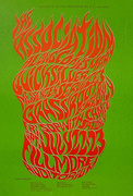
Donna Wallace-Cohen’s last poster for San Francisco Sound in Seattle, March 15-16, 1968 (detail)
In 1967, LIFE magazine sent Jon Borgzinner, a trusted contributing editor at Time magazine, to San Francisco to write about the “psychedelic phantasmagoria” that characterized the “far-out” posters being designed for rock concerts at “hippie hangouts” like the Fillmore Auditorium and Avalon Ballroom. “Such posters,” Borgzinner wrote, “are tacked up in public places as were the lithos of Toulouse-Lautrec touting the Moulin Rouge in the Gay ’90s. But as fast as they go up, collectors—mostly teenagers—tear them down to keep, and those who prefer to buy them without tack holes flock to the poster shops.”
“Owsley would come by sometimes and hand out free acid. It was pretty good stuff.”
In many respects, Borgzinner, who died too young at 42 in 1980, was an excellent choice for the assignment. Not only was he comfortable comparing the rock posters of 1967 with the Art Nouveau masterpieces of Toulouse-Lautrec, he also understood their connection to more contemporary artistic expressions—in a 1964 article for Time, Borgzinner coined the term “op art” to describe an exhibition of “Optical Paintings” by Julian Stanczak.

“Obsession 1,” a 1965 painting by Julian Stanczak, is a work of op art that seems to anticipate the psychedelic art that followed it.
Borgzinner’s recognition of op art as a credible movement within the mostly aesthetically conservative art world no doubt contributed to his appreciation of an artist like Victor Moscoso, who deliberately saturated his “movie-palace Moorish calligraphy” in contrasting, incompatible hues, causing his posters for concerts by Quicksilver Messenger Service and Big Brother and the Holding Company to shimmer and shake.
Unfortunately, Borgzinner was saddled—as are we all—by the conventional wisdom of his day. In 1967, that meant that when he looked around the San Francisco poster scene, he saw only the usual suspects. Naturally he spoke with Moscoso (they both attended Yale), along with Rick Griffin (counterintuitively, the king of psychedelic surfer art told Borgzinner that 19th-century French illustrator Gustave Doré was a major influence), and Wes Wilson, whose quote in the article was a disappointing cliché: “The best poster is the most dynamic.”

In the caption for this 1967 LIFE magazine photograph of Wes and Eva Wilson, only Wes was identified.
Stanley Mouse was also singled out, which meant that Mouse’s partner, Alton Kelley, the fifth member of the so-called Big Five, did not get the credit he deserved for the posters scattered on the floor in the LIFE photograph of Mouse—these days, one of the posters at Mouse’s stockinged feet brings six figures at auction.
Borgzinner also missed the opportunity to acknowledge the contributions of the photographers who were documenting the San Francisco scene, his most glaring omission being Bob Seidemann, whose black-and-white photographs of local rock stars were themselves made into concert and head-shop posters, several examples of which were sprinkled throughout Borgzinner’s LIFE piece and given prominent placement on the magazine’s cover.
Worst of all, though, was Borgzinner’s treatment of women, or, rather, his ignorance of their existence other than as props in a few of the article’s photos, as scantily clad decoration on posters produced by men, or as decorators themselves, as seen in a shot of actress Janet Leigh brightening up “her playroom” with “posters that include portraits of other movie stars.” In one of the article’s photographs, Eva Wilson sits with her husband, Wes, but the caption below the couple bears only his name.

Donna Wallace-Cohen’s most collected poster is this one from 1967, advertising the Grateful Dead’s first appearance at Winterland.
Little wonder, then, that accomplished women rock-poster artists such as Bonnie MacLean and Mari Tepper did not make the cut. Donna Wallace-Cohen, whose last name in those days was Herrick after growing up answering to Everist, didn’t either, although she was photographed for the article thanks to the posters she had designed for shows featuring the Grateful Dead at Winterland and The Doors’ two-week residency at the San Francisco branch of L.A.’s Whisky A-Go-Go (reportedly, Jim Morrison and company only played the first two nights of the run).
“We all went into San Francisco for a photo session with LIFE magazine at the trolley barn,” Wallace-Cohen remembers, referring to the Cable Car Barn & Powerhouse at the corner of Mason and Washington in San Francisco. The names of those who made up the “we” have long since vanished from Wallace-Cohen’s memory banks, but her recollection of her attire that day is vivid. “I wore knee-high, yellow-vinyl, high-heeled boots with the big, squarey look that was popular back then, plus a short skirt,” she tells me. As a part-time model at I. Magnin, a high-end, conventionally fashionable clothing store of the day, Wallace-Cohen knew how to attract the attention of a photographer. But when the group photo of perhaps 10 or more rock-poster artists, including Wallace-Cohen, landed on the desk of a LIFE magazine editor in New York, patriarchy triumphed over sex appeal—the photo never ran.

Donna Wallace-Cohen’s first poster for the Love Conspiracy Commune advertised two weeks of “psychedelic happenings” at the Whisky A-Go-Go in San Francisco.
Wallace-Cohen’s posters for the Dead and The Doors had been commissioned by the Love Conspiracy Commune, whose headquarters were located in a Sausalito houseboat near her own floating home. It was a long way from what Wallace-Cohen describes as her “Leave It to Beaver” childhood in Chicago.
“I’m an only,” she says of her lack of sibs. “My mom was a housewife and my dad worked for the University of Illinois in Urbana as a conservationist, teaching farmers how to conserve their topsoil, rotate their crops, and things like that. He was also a musician, who got himself through college playing trombone in a jazz band.”
The piano was Herrick’s instrument. “I started at age 8 and ended up going to the Oberlin College Conservatory of Music in Ohio. In general,” she goes on, “if you were a college student like me back then, the next step would have been to fall in love with New York, which I did, and try to make it there. But I married a medical student who was heading to the University of Chicago Medical School. So I returned to Chicago, which was great because I could take classes at the Art Institute.”

When Wallace-Cohen encountered “Excavation” by Willem de Kooning at the Art Institute of Chicago, it made her change her career focus from music to art.
That’s where Wallace-Cohen’s focus shifted abruptly from music to visual art. The catalyzing event was an encounter with a painting in the Art Institute’s collection called “Excavation,” created in 1950 by Willem de Kooning.
One can imagine LIFE’s Borgzinner very much enjoying a chat with Wallace-Cohen about de Kooning’s work and the previously unknown link between abstract expressionism and psychedelic rock art, but blinkered as Borgzinner was by the boy’s club that was the San Francisco rock-poster world, that conversation never happened.
“I’d never seen anything like it, or that big,” Wallace-Cohen continues, referring to the oil-on-canvas painting’s 81-by-100-inch dimensions. “I just kind of fell into it. I thought, ‘Wow, I want to do this!’ Growing up,” she adds, “I had always drawn. On Saturdays, I’d listen to the radio in our basement and draw when I wasn’t practicing piano. When my mother took me shopping, I’d sit in a chair with my paper and pencil and draw pictures of people in the store. I wasn’t a very social kid.”

In the mid-to-late 1960s, the Ark at Gate Six in Sausalito hosted rock concerts. Wallace-Cohen lived on a houseboat at nearby Gate Five.
By 1963, Wallace-Cohen’s husband’s education had taken the couple to Seattle, where they spent a year for his internship. In 1964, the couple arrived in San Francisco, where the future Dr. Herrick did his residency at the University of California, San Francisco. At some point, the Herricks decided to move to Mill Valley on the other side of the Golden Gate Bridge. “Mill Valley was very bohemian in those days,” Wallace-Cohen remembers, “lots of pot and acid. Eventually my husband and I split up and I went to live in Sausalito on a houseboat. That’s where I met some people in the Love Conspiracy Commune. I had art all over my houseboat so they asked me to do a poster for a concert they were promoting. I think the first one I did was for the February 1967 shows at the Whisky A-Go-Go.”
Sausalito in the mid-1960s was something of a counterculture to the counterculture in San Francisco’s Haight-Ashbury. In particular, the cobbled-together houseboats and broken-down ferries docked at Gate Five in Waldo Point Harbor had long been havens for artists and poets, from the English surrealist painter Gordon Onslow Ford to Alan Watts, whose writings were seen as the bridge between the teachings of Zen Buddhism and the experience of taking LSD. Over at Gate Six, a derelict ferry boat called the S.S. Charles van Damme had rechristened itself as The Ark and began presenting rock concerts by the likes of Moby Grape and Sparrow, which would soon become much better known as Steppenwolf.

In May and June of 1966, Wallace-Cohen saw Andy Warhol and Lenny Bruce perform at the Fillmore Auditorium.
“When I was living on the houseboat, Sausalito was a cool place,” Wallace-Cohen says. “Sterling Hayden was living downtown in an old railroad car, and people would drink at the No Name Bar. It was mostly artists and drug dealers,” she says of Gate Five. “Owsley would come by sometimes and hand out free acid. It was pretty good stuff.”
Wallace-Cohen partook of it all, as she had been since her separation from her doctor husband. In 1966, she was already catching shows at the Fillmore, becoming an early admirer of Wes Wilson’s posters for that venue. “The first thing I saw there was Andy Warhol and the Plastic Inevitable, with the Velvet Underground and the Mothers, Frank Zappa’s band. It was incredible. During the Plastic Inevitable part of the show, I vaguely remember this hour-long film of someone eating a banana being flashed around the room.”
That was in May of 1966. About a month later, Wallace-Cohen was back at the Fillmore to attend one of Lenny Bruce’s last two shows—with the Mothers again as the opening act—before the troubled comedian died of a drug overdose. “North Beach was exploding with topless places back then,” Wallace-Cohen recalls, remembering how Bruce had made dancer Carol Doda’s breast enhancements a part of his act. “At one point he practically screamed at the top of his lungs, ‘So, what I want to know is, are there still any real tits in the world?’ Everybody just burst out laughing. At the time, it was a very funny line.”

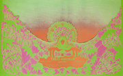
This may be Wallace-Cohen’s last poster for the Love Conspiracy Commune, dated a few nights after the Grateful Dead performed at Winterland and a few months before members of the commune were busted for running a meth lab.
It probably needs to be said here that in 1966 and ’67 San Francisco, the sight or mention of bare breasts was not that big of a deal, no matter what they were called by a doomed comedian. That was certainly true of the shows the Love Conspiracy Commune produced at the Whisky A-Go-Go, where topless cocktail waitresses filled orders for vodka tonics and Manhattans. During the two-week run of shows promoted by the commune, members of the Love Conspiracy would decorate the upper torsos of these waitresses in colorful body paint. “They were mostly girls from San Francisco State earning extra money,” Wallace-Cohen says. “One night when I was doing the light show, no one showed up to do the body painting. So I pitched in. There was this one girl named Felicia. She wanted her breasts to look like flags, so I painted them up. It was a wild time,” she concludes. “Goofy, crazy, wonderful.”
Wallace-Cohen’s next poster for the Love Conspiracy Commune advertised an evening at Winterland with the Grateful Dead, billed as The First Annual Love Circus, hence the psychedelic circus tent and giraffes in the center of Wallace-Cohen’s complex composition. “I think you had to be stoned to see it,” she says. “The colors were printed wrong,” she adds, “which made the lettering harder to read, but that also made it better.”
Today, Wallace-Cohen’s poster for this show is probably her most prized. A copy of the poster is owned by the Achenbach Foundation, the print-collection and paper-conservation arm of the Fine Arts Museums of San Francisco, and it marks the first time the Grateful Dead performed at Winterland, making it a favorite of Deadheads and rock-poster collectors alike. But on the night of March 3, 1967, the show almost didn’t go on when a Haight-Ashbury group called the Diggers picketed the show over the then-high price of $3.50 per ticket. For a while, the Dead refused to take the stage until enough of the Diggers had been admitted into the former ice rink for free.

A Haight-Ashbury group called the Diggers picketed the Grateful Dead show at Winterland, for which Wallace-Cohen designed a poster, objecting to its high ticket price of $3.50.
The Diggers were apparently onto something when it came to their distrust of the Love Conspiracy Commune. Two months later to the day, San Francisco’s finest arrested eight people associated with the commune at a home in the city’s tony Pacific Heights neighborhood—it turned out to be a front for a meth lab.
Lest it go without saying, Wallace-Cohen knew nothing about that side of the commune’s business practices, although the drug bust helped explain how the group was financed. Regardless, pretty much overnight, her role as the Love Conspiracy Commune’s in-houseboat poster artist came to an abrupt end.
Wallace-Cohen’s career as a poster artist, however, would flourish for another year, although not in San Francisco. “Through the Love Conspiracy Commune,” she says, “I had met a woman named June, who was the girlfriend of Matthew Katz [pronounced like Cates]. She and I hit it off, so she introduced me to Matthew. He saw some of my posters and hired me to design some for him.”

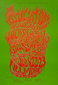
Wallace-Cohen’s first poster for San Francisco Sound in Seattle, November 17-18, 1967.
Katz had made a name for himself as the original manager of Jefferson Airplane, guiding them through the recording of their first album but fired by the time of its release. “Matthew didn’t last very long in San Francisco,” Wallace-Cohen remarks. “He was kind of brilliant at putting people together, but he didn’t have a clue how to handle them. He’d give a band a big house to live in near Haight Street and took care of them to some extent, but he was managing their money, and I guess he didn’t do a very good job of it. So they’d split.”
Katz split, too, heading for Seattle, where from November 1967 to March 1968, he produced roughly a dozen-and-a-half shows at the Encore Ballroom on Capitol Hill. Billed as the San Francisco Sound, the shows were headlined by bands Katz still managed, from San Francisco acts like It’s a Beautiful Day and Moby Grape to such Seattle groups as Tripsichord Music Box and Indian Puddin’ and Pipe.

Many of Wallace-Cohen’s posters for San Francisco Sound shows in Seattle relied on her hand-lettering and illustrating skills. These are from January and February, 1968.
Wallace-Cohen designed most of the posters and postcards for these shows—she may well have done them all—signing each one “Wallace Studio.” Completely unintentionally on her part, that new moniker kept most poster collectors and curators from connecting the dots between the work of Donna Herrick and the output of Wallace Studio, although a visit to Wallace-Cohen’s website would have quickly solved the mystery.
Initially, Wallace-Cohen’s San Francisco Sound posters continued in the vein of those she had designed for the Love Conspiracy Commune, in which chunky hand lettering was set against contrasting colors amid Art Nouveau-like squiggles that suggested endless locks of flowing hair. But by February 1968, Wallace-Cohen’s compositions began to embrace formal elements such as framing, borders, and symmetry, culminating in a glorious March 1968 poster resembling a stained-glass window that advertised a pair of shows by Moby Grape (see the first image at the top of this article). To be sure, her hand lettering and illustrations in early 1968 were suitably trippy for rock-concert audiences, but one can see her maturing as an artist, making choices that feel more confident and assured than just about anything she did in 1967.

Between December 1967 and February 1968, Wallace-Cohen’s layouts got somewhat more formal, though her posters retained her trippy imagery and inventive lettering.
Until recently, Wallace-Cohen had not seen her Seattle posters in decades. “My house in Novato burned down in the 1970s,” she says. “I lost everything, so until I received a copy of Scott McDougall’s book the other day, I’d totally forgotten about many of those posters.”
For the most part, thumbing through the pages of Split Fountain Hieroglyphics has been a pleasurable experience for Wallace-Cohen. “It’s opened up this little memory-lane thing,” she says, “which has been fun. It’s been a trip seeing that work again.” But the book also triggered a few memories that still make her bristle.
“I had gotten a Mexican divorce and married a guy named John Wallace,” she tells me with a sigh about the end of her relationship with her first husband and the beginning of her relationship with her second (there would ultimately be three). “He was a hippie carpenter who didn’t really know much about carpentry. Because he was unemployed during the time I was doing the San Francisco Sound posters, he wanted to try some himself. He thought he was artistic. I didn’t think so, but I let him work on a couple of posters. They’re in Scott’s book, and they’re awful. At one point, I think Matthew even said something to me about not letting John work on the posters anymore.” For the record, the poster identified as SFH 089 on page 68 of Split Fountain Hieroglyphics was lettered and designed entirely by John Wallace (“I hate that one, just hate it!”), while the piece labeled SFH 106 on page 82 features Wallace-Cohen’s lettering and drawings constrained within an objectively clumsy layout by her hippie-carpenter husband.

By February 1968, Wallace-Cohen’s layouts were more polished than anything she’d done before, reflecting, perhaps, the sense of confidence she was enjoying as an artist.
After her brief stint as a poster artist, Wallace-Cohen went on to have a full career doing display work for department stores such as Bloomingdale’s, where she rose to become the vice president of design and display. “I lived in New York for a while,” she says. “When I retired and opened an illustration and design studio back in Sausalito. I had a lot of contacts. I knew a lot of people who bought my work, which was great.” Today, a visit to her website reveals a number of recent Joseph Cornell-like constructions—Cornell being another artist bound to leave an impression after a visit to the Art Institute of Chicago—created from found objects, including the keyboard and hammers salvaged from an old piano.
Speaking with Wallace-Cohen, I couldn’t help but wonder what her life would have been like if a photograph of her in yellow vinyl boots and a miniskirt had appeared in LIFE magazine; if she had spoken with Jon Borgzinner about her aesthetic arc from abstract expressionism to psychedelia. Would fame, however fleeting, have made a whit of difference?
“The fact that I made all those posters in the ’60s had very little effect on what came after that,” Wallace-Cohen says flatly. “It was a wild ride, and I don’t regret any of it, but I moved on and haven’t really thought much about it since.”

In recent years, Wallace-Cohen has created a number of assemblage constructions. This one from 2013 is titled “My Last Piano.”
(To see more art by Donna Wallace-Cohen, please visit her website. To order a copy of Split Fountain Hieroglyphics, click here.)
 All-Night French Fries with T-Rex: Seattle's Trippiest Rock-Poster Artist Tells All
 Psychedelic Poster Pioneer Wes Wilson on The Beatles, Doors, and Bill Graham
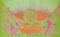 All-Night French Fries with T-Rex: Seattle's Trippiest Rock-Poster Artist Tells All
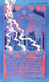 Rainy Day Psychedelia: Seattle’s 1960s Poster Scene Gets Its Day in the Sun
 Music and Concert PostersFor jazz fans, a poster of Chet Baker almost seems to come with its own sou…
 Mari Tepper: Laying it on the Line
 Nice Ice: Valerie Hammond on the Genteel Charm of Vintage Canadian Costume Jewelry
 How Jim Heimann Got Crazy for California Architecture
 Modernist Man: Jock Peters May Be the Most Influential Architect You've Never Heard Of
 Meet Cute: Were Kokeshi Dolls the Models for Hello Kitty, Pokemon, and Be@rbrick?
 When the King of Comedy Posters Set His Surreal Sights on the World of Rock 'n' Roll
 How One Artist Makes New Art From Old Coloring Books and Found Photos
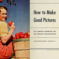 Say Cheese! How Bad Photography Has Changed Our Definition of Good Pictures
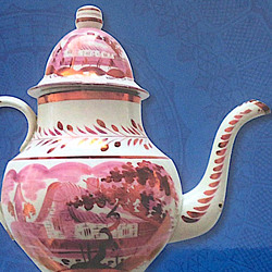 Middle Earthenware: One Family's Quest to Reclaim Its Place in British Pottery History
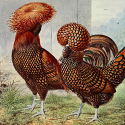 Fancy Fowl: How an Evil Sea Captain and a Beloved Queen Made the World Crave KFC
Leave a Comment or Ask a Question
If you want to identify an item, try posting it in our Show & Tell gallery.