Alex Renshaw discusses collecting Victorian and Edwardian period advertising antiques, including porcelain enamel signs. Based in Worcester, England, Alex can be reached through his website, Advertising Antiques, which is a member of our Hall of Fame.

Muratti’s New Ladies Flat 10 Cigarette Tin, 1900
How did I get started collecting advertising antiques? My dad was a lecturer and tutor in graphics and art from the 1960s onwards, and was into vintage automobiles and advertising, like vintage signs, pumps, and globes. So I spent the large portion of my childhood going to auto swap meets and antiques fairs, I think it all started from there.
The first thing I collected was old bottles. In one of the books I read as a child, there was an aqua green bottle and I thought it was great and I really wanted it, and we eventually found one at an antique fair.
In the UK (I think it’s the same in the states), when you go bottle digging, everything ended up being thrown in the old municipal dump. I’ve found a lot of bottles and enamel signs there. I also studied art and the theory of art in college and when I finished college I became a graphic designer.
Collectors Weekly: Are you interested in advertising antiques for the designs then?
Renshaw: Yes. The things I collect that have the heaviest impact on me are heavily branded; with a name or logo, as much graphics as possible and combined with period imagery such as Victorian or Edwardian dress and contemporary scenes from Victorian England. Anything that gives a sense of the period that it came from, I’m more excited by. From a graphic point of view, the earlier the better.
I only collect up through the Edwardian period. Once you start getting past the First World War you get more modern graphics and all sorts of type faces like Arial and Helvetica that don’t appeal to me. It has to be almost very high Victorian, elaborate fonts, very much like the styles of graffiti these days, the 3D letter and shape behind the lettering. When you look at the early lettering, you also look at it because it’s fantastic, whereas modern lettering just conveys the meaning, there’s no beauty in it. A lot of the advertisements now are very clean and modern.
Collectors Weekly: Were people more focused on the art during the Victorian period?
Renshaw: There were a lot of artistic styles. The artistry involved in producing the lettering and particularly the lithograph technique, produced many layers of color, especially on the tins, advertising cards, and enamel signs. The graphics were so labor intensive, the quality and time taken to produce them would just produce fantastic results. Then in the First World War materials were running low, and after the Second World War everything started losing color. There weren’t so many colors, everything was a bit cheaper quality, the artistry turned to a modern style and that’s one of the reasons it became boring.
From Art Deco onwards there was this austere cleanliness. If you compare Art Nouveau to Art Deco, they’re as far apart as you can imagine. I’m very into the Art Nouveau with the organic shapes of the lettering and graphics. It isn’t just a matter of the form, it should have beauty with it as well. Deco has more impact, less beauty.
Collectors Weekly: Do you still collect?
Renshaw: Avidly. I probably handle about 100 items a week. Anything from really small tins to ephemera, to large enamel signs off the railway siding. I came into the business of antiques with a view of getting away from the desk and having a more physical job. And I found out antiques can be quite physical. It’s not unusual in England to buy a collection of 50 antiques at a time, something like that will happen every 3 to 4 months.

Fry’s Chocolates Enamel Sign, 1920
England is a place where there is still just a huge amount of this stuff around. The way the geography works, you’re never more than 40 miles away from any accommodation and that’s been the case since the turn of the century. If you see the plans for my local town, during the Victorian time there were about 415 shops in a town of 33,000 people, and now there’s 60,000 people and probably only 100 shops. A lot of the old advertising stuff survived and I think that’s why it’s so collectible, especially the enamel signs. They used those for everything, they used to patch up sheds and coal holes, they used them to support fencing.
Collectors Weekly: What’s on your site?
Renshaw: It’s a complete free for all. It’s all the people collecting in the UK and across the world sharing information about their collection, current news (particularly fakes and reproductions) and giving advice. I wanted to create a place for collectors to share their collections and chat. It shows that collecting is worldwide.
Collectors Weekly: What’s the focus of your collection?
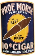
Renshaw: I particularly like anything to do with food or confectionary products, but will collect any advertising as long as it’s Victorian or Edwardian. I do like the food tins, such as Custard Confectionary packaging, any chocolate bars before the First World War, any rare and unusual tobacco tins. The problem with tins is that there are millions of them.
I look for condition, but also the different type and font designs that are really elaborate and intertwined with an image of a person, a ship, period people, or period forms of transport. With the food stuff, anything that shows cakes, trays of jellies, or anything that looks like you’d want to eat it. Anything that’s quirky too, I have fertilizer signs that have turnips on them, they definitely have an element of Andy Warhol to them, anything that’s really out of place, over-sized products.
Collectors Weekly: Tell us more about the art on the signs and tins.

Dandy Toffee Tin by Slade and Budlock Ltd. Dewsbury, England, 1920
Renshaw: They used the lithograph technique, different stones for each color, or there was a litho press. All the tins were originally flat metal and card signs would just be paper and they’d run it through the litho press, it’s very much like silk screening. Today’s tins aren’t as appealing because many of the paints used in the Victorian era contained ingredients like arsenic, lead, and uranium, and these days you can’t use stuff like that. If you look at the Victorian colors they’re very vibrant, pastel shades.
The Victorians were very keen on pastel shades, and it’s very hard today to get close to the colors they used. There was also a huge thickness because of all the layers of paint which gave it a 3D effect. Today everything is printed at the same time on a flat paper, so you can’t get the Victorian colors and feel.
“After the First World War, you get type faces like Arial and Helvetica that don’t appeal to me.”
In terms of the inspiration for the designs, it’s the same as today. We have this idealist way we want to live our lives, everything clean and nice and looking like life is easy, successful, and confident. Same concept, different era. They used the same idea of looking good and getting on in society, fitting in, and being healthy. The way they did it was slightly different, like if you want your house to look nice, you get a maid to do it. In the Victorian era there were butlers and maids and the products would put them on their advertisements so people would think the product would raise their social status.
The art itself was done by commercial artists, and there were many great ones. But many remained unnamed because being a graphic artist didn’t have the same status as being an oil painter. Some of the big names during the Edwardian era are Tom Browne and John Hassall, both terrific cartoonists. They captured the imagination and their work was used in a lot in advertising such as Fry’s Chocolates and Players Cigarettes. They became famous in their own right. But there weren’t many artists who were allowed to put their name on the work, they worked for graphic agencies or the sign manufacturers and they worked in teams.
Collectors Weekly: How were signs and other advertising items used during the Victorian and Edwardian periods?
Renshaw: One of the most popular places for posting signs, besides the outside of shops, was the railway. The railway had tons of signs and advertising. The stations had long station platforms with white picket fencing and all the walls were covered with signs and posters. They really went for advertising back then, it was big.

Robertson’s Golden Shred Marmalade Enamel Sign, 1910
A lot of today’s advertising techniques were developed in the Victorian period. Techniques such as using women to sell products, or just the idea that sex sells. There were very erotic and luscious ladies used in advertisements. And there were general “this will cure anything” ads. Today we have technology and I think that’s a big difference. But the essential principles were pretty much developed in the Victorian times.
Europe and the U.K. were different in their approach to design and advertising. The U.K. was closer to the U.S. in terms of signs, and posters. The differences got much bigger after the Art Nouveau period up until the First World War, with modernism beginning around 1910 to 1915. European artists were more abstract and broke away from the U.K. European advertising became a lot more abstract than the U.S. and the U.K. If you look at the signs from the 20s and 30s, the Europeans still used very vibrant colors in very abstract ways, which happened to a much lesser extent in the U.S. and UK. Europe embraced modernism more, where we were more restrained.
Collectors Weekly: What were some of the most popular advertising brands in the U.K.?
Renshaw: For general previsions, a lot of turn of the century brands are still recognizable today. The Mighty Lever Brothers are still a massive concern, producing anything from soap or kitchen cleaner. Heinz was huge and still is. Cadbury and Nestle, Lipton, some of the cigarette companies are still recognized like London. The more common the item was, the more popular the brand was. All the really common stuff from the First World War period, a lot of those companies are still going and still using the same trademarks and branding. For example, Coleman’s Mustard still has the bulls head logo, and the same color layout. The branding started at the turn of the century and it’s just continued. I have lots of items that have had the same tins and logos for over a hundred years.
Collectors Weekly: When did people start collecting advertising antiques?
Renshaw: Pretty early on. If you think of the Beatles in the 1960s, and Sergeant Pepper’s Lonely Heart, there’s this harkening back to the Edwardian Period. A lot of Victorian stuff was still around. It was about reaching it’s end, but artists started picking it up from the 1960s on. In terms of organized collecting of advertising items I think it was in the early 1970s that people started earnestly collecting and forming collector groups. A lot of it came from art students and schools. All these old shops were being knocked down so the students could find these items and use them to decorate their houses. A lot of people were getting inspiration from it.
You can’t write a price guide. As soon as you get it to a printer it’s out of date.
I think the 70s was the heyday for advertising collectors, a lot of the stuff was being given away for free. In the 80s, with the amount of money flying about, prices started going up. The most expensive enamel sign I ever bought was in 1984. The market has continued to change and today, without a doubt, there are more collectors than there ever were. Its moved from the artists to full-on professional collectors, especially after the bottle digging and every town got the bottle tip and started digging them up and from there you got the antiques fairs with Tiffany lamps and expensive buys. When you could get stuff for nothing, it was a working man’s hobby, free and available. Collecting had very humble beginnings and now it’s this international, class thing.
Collectors Weekly: What are the most sought after advertising antiques?

Goblin Soap Powder Packet Box, 1920
Renshaw: Porcelain enamel signs are the kings of the advertising world. They’re like a picture and they last and they’re very vibrant and colorful. There’s also enough of them about for everybody to collect them, that’s what’s made them so popular. They also produced so many of them, there’s new ones turning up every week.
I look for items everywhere I can, really. Friends, family, builders I see in the street. I buy off the net, eBay; people offer me stuff through my site. After you put out the word of what you collect people will come to you. And being online definitely helps. I advertise everywhere I can, go to every show I can and put a lot of time and effort into it.
The advertising antiques shows are getting smaller in number, but they are there. In the U.K. it’s a combination of bottle and collectors fairs. The bottle shows pretty much started all of this off, bottles and advertising grew hand and hand. There’s probably about 40 or 50 shows in the U.K. in a year, in all different places. I do think the availability of places to collect has gotten much smaller.
Collectors Weekly: Any recent trends in collecting advertising antiques?
Renshaw: Only that it changes very quickly. You can’t write a price guide because as soon as you get it to a printer it’d be out of date. A lot of these small specialist areas are run by a small group of active collectors and they change on a yearly basis. So prices can change drastically in a year. That’s one of the reasons I think advertising collecting is failing, because one year something is popular and something else is the next. I don’t think you should collect to invest unless you’re collecting across the board.
Collectors Weekly: Any resource books you’d recommend to new advertising collectors, or other advice?
Renshaw: Robert Opie has the world’s greatest collection of advertising, and his books are the primary resource for anything like this. At least get one, because they’re very good and the only ones available.
Also, don’t be scared to handle stuff. The more stuff you handle, the more likely you are to know what’s real and what isn’t. Go to shows and antiques fairs and handle as much as you can because the Internet can be a very deceiving place. If you’re starting from scratch the best thing to do is handle stuff and buy and sell. Never be afraid to sell and be a dealer and collector, there’s very few pure collectors today. If you’re collecting a known subject, I think you really need to deal to get a good collection.
In terms of clubs, there’s the Street Jewelry Society for advertising. There are no general advertising clubs in the U.K., but that Society is an enamel sign-collecting club and will show you just how popular these signs are to collect.
(All images in this article courtesy Advertising Antiques)
 Neon Lost and Found: Where New York City Still Burns Bright
 The Disappearing Art of Porcelain Signs
 Neon Lost and Found: Where New York City Still Burns Bright
 Sam Baker, Collector of Petroliana and Vintage Ford Cars and Signs
 Porcelain SignsFrom the 1880s until the 1950s, one of the most dominant forms of outdoor a…
 AdvertisingFrom colorful Victorian trade cards of the 1870s to the Super Bowl commerci…
 SignsAntique and vintage signs are highly sought after by collectors for their b…
 Mari Tepper: Laying it on the Line
 Nice Ice: Valerie Hammond on the Genteel Charm of Vintage Canadian Costume Jewelry
 How Jim Heimann Got Crazy for California Architecture
 Modernist Man: Jock Peters May Be the Most Influential Architect You've Never Heard Of
 Meet Cute: Were Kokeshi Dolls the Models for Hello Kitty, Pokemon, and Be@rbrick?
 When the King of Comedy Posters Set His Surreal Sights on the World of Rock 'n' Roll
 How One Artist Makes New Art From Old Coloring Books and Found Photos
 Say Cheese! How Bad Photography Has Changed Our Definition of Good Pictures
 Middle Earthenware: One Family's Quest to Reclaim Its Place in British Pottery History
 Fancy Fowl: How an Evil Sea Captain and a Beloved Queen Made the World Crave KFC
Hello,…I have a large picture that I am not sure what to call the make….it is enamel covered on wood….some of the features are raised wood (slim) cut outs with an enamel picture on top.that blends witht the scene..I know it is old because of the children in it…it is a farm scene…the rest is solid wood…
I hope you can help…It is a great old wall picture.
can you help me find information regarding an old sign that I believe came from the UK? It is metal and titled Tariff for Gibraltar Hackney Carriages.
It gives rates for service on a heavy metal sign, White face with black letters.
Thank you.
Stu Levey
I have a ca. 1905 tin Budweiser sign. It measures 13″ wide X 40″ tall. I has some rust and a few holes when it was found in St. Louis. The words on the sign, epicting a clear beer bottle are quite legible. I believe this sign is 1905, because of a conversation my brother had with the Anheiser Busch archivist in STL said that was the last year BUdweiser used a clear bottle. The central label on the bottle says, “Budweiser Lager Bier, gebraut (?) aus feinstein” The depeiction bottom of the bottle has a stylized AB with a small letter p. The band label reads, ” We guarentee that this beer is brewed especialy for our own trades according to the budweiser process of choicest Saazerhopsbest barley and rice. This beer is brewed in St. Louis and warraanted to keep in any climate……
I know that this sign is rare. The archivist said that they did not have a copy of it in their records.
I would of course like to know the value of the sign and an estimate of its maketability.
Thank you.
Hi,
I’m looking for info about the companies and designers who manufactured 1930s enameled petrol advertising signs. Please let me know if you can help.
Thanks,
Stuart
Hello all,
Has anyone found a really good solution for cleaning old porcelain enamel signs? I have a few that really need a good cleaning to take off dirt and some rust.
Thanks
Lyn
I have acquired a metal sign about 2×2 . It advertises Apartments with gas refrigeration. The sliding bar holds four pieces of metal that can slid in and out the numbers are 3 rooms. With functional sign for vacancy and no vacancies. It is made of metal with baked on porcelain finish. On the back of of one of the pieces it is a picture of a pretty maid advertisement. She is holding a cake, Im not sure if that is an advertisement for cake mix or maids. Top left hand corner had a red circle like a trademark , and it says maid, I cant make out anymore.
Any information you could give me would help so much.
We have an enameled sign – around 2′ round in a heavy metal bracket that hung from a wall. Sign reads “We Sell Crescent Ice Cream” – surrounded by a crescent moon, similar to the Crescent seasoning cans, except it is blue background (not red). It was found off Route 66 in southern California back in the ’70’s. Can you tell me anything about it?
i have some antique enamel signs in dire need of a clean up, any suggestions?
thanks
Hello. I am a journalist in France for yachting and I collect everything about lighthouses. I am writing a book about that. I have some tins from england . They have the design of a lighthouse. I try to get informations about : a money box (Dunmore and Son by Barclay and Fry, a candle box Field’s Ozokerit, a Slade’s Dandy Toffy for sweet. Can you help me. Best regrads.
I bought a 18″ x 24″ Starcraft Boats dealership tin sign in almost perfect condition at a Wisconsin auction resort years ago. It shows a small Starcraft boat with an outboard motor on it from the early 1950’s. Any info?
Thank you
i have a tin sign roughly 17×25 . it is a beer advertisement sign. it says Veritable Strasbourg biere speciale de la brasserie FISCHER. it has what looks like a boy sitting on a beer barrel drinking a huge mug of beer.there is a village and trees in the background.the boy is wearing a red vest with a bowtie and a fur hatand he has blond hair. it is in mint condition.i am wondering what it is worth or if anyone has any info on this piece.
We have a large porcelain sign: “We sell Crescent Ice Cream” (two sided), white lettering on dark blue background with a white and yellow crescent moon. Sign is approximately 2 feet in diameter and attached to a iron frame which would have attached to the side of a building. The logo is very similar to the Crescent spice cans, except the colors used (ble instead of red). Do you have any information about the Crescent Co., or the sign in general?
I have an object, a plaster horse which stands about 18″ high. It stands on a pedestal on which it says COLUMBIA HEALING POWDER. It is 100 years and belonged to my father who as a young man was a harness maker. The powder was used under a horse’s saddle or part of the harness. It has the original leather horse collar. It has some damage which I think can be repaired.
Looking for more infor. on a mirror advertisement for “Pepsodent” toothpaste made by “Stamford Art Mfg. Toronto, Ontario, Canada. The mirror advertisment states, “Pepsodent for Smiles That Conquer, Helps Gain Countless Friends and Unusual Popularity and Keeps Teeth Snow.White, Smiles Grown Dazzling Bright and a picture of a lady and man and a blue coloured circle with the tube of pepsodent in the middle of the circle. Seeking any infor. whatsoever on this mirror. Looks original, frame and mirror and also has the marking of the company that manufactured it in??? Thanks, Penny
I found an old tin paint varnish can from federal varnish company is there any information about this company?
I bought a large c 1.5m by 1m tin sign in France. It is an advertisement for Singer sewing machines. The colour is gone but the writing is “embossed” or stamped on. It needs cleaning as some paint has been spilt on it. Before I start has anyone any suggestions as to how I can clean it?
Love the robertsons marmalade jar enamel it just oozes richness and quality I too am an avid collector in 1950 it was about the only things that shined…
0
Love the green Robertson’s marmalade sign. I re live my childhood when I walk past my collection it’s just nice to see the beautiful enamel shine in the light. I love the quality and timelessness of the designs. Regards Brad