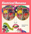
If it weren’t for hippies, 7Up, the clear lemon-lime soda pop many use to calm the stomach flu, might not exist today. In the late 1960s, just when the company was about to go out of business, brilliant advertising executives at J. Walter Thompson Company in Chicago pitched a complete rebranding of the soft drink. Declaring 7Up “The UnCola,” paper billboards posted above highways mere months before Woodstock in 1969 exploded with colorful and trippy cartoons of pretty girls, rainbows, sunbursts, flowers, and butterflies. Creatives at the agency mined the popularity of the Beatles’ psychedelic phase and appropriated the “peace, love, and understanding” zeitgeist of the youthful antiwar counterculture—all in the name of selling sugar water.
“7Up had to differentiate their product from ‘The Establishment’ colas they were competing with at the time, which were Coke and Pepsi.”
Apparently, it worked. Today, many people misattribute the images in this campaign, which lasted from 1969 to 1975, to Peter Max, who’s also been associated with the animations in the Beatles’ “Yellow Submarine” movie, which premiered in November 1968. (Max didn’t work on that, either.) He was one of many brilliant psychedelic artists who blindly submitted their work to the J. Walter Thompson Company for the UnCola campaign—though all of his submissions were rejected. In fact, much of the so-called “Peter Max look” actually originated at Push Pin Studios, an innovative New York City art and design group founded by Milton Glaser, Seymour Chwast, and Edward Sorel in 1954. Several 7Up billboard artists, including John Alcorn and Barry Zaid, studied under Glaser, who designed the swirling psychedelic poster for Bob Dylan’s “Greatest Hits” record in 1966.
The highway billboards, 21 feet wide and 10 feet tall, were made up of 12 paper panels, which were pasted up piece by piece. But 7Up wasn’t content to just hang them alongside freeways. The images were offered to college students as posters, as “Fallpaper” to cover their textbooks, and as the actual giant, 12-sheet, 10-foot-tall billboards. Dallas architect and collector Bob Treat—who can be found on eBay and Flickr—was one of the college kids attracted to the bold, colorful graphics on the paper billboards offered for a few bucks in a 7Up pamphlet. He bought one, using some of its panels as college-era wallpaper, and then packed it away for nearly 40 years before he was able to find another. Thanks to the Internet, in the last six years, he’s been able to acquire 25 of the 53 known UnCola billboards. That’s right, 25 of the 21-by-10-feet monstrosities. What does one do with so many highway billboards from the ’60s and ’70s? We called Treat at his home in Texas and asked him to explain his Un-obsession.

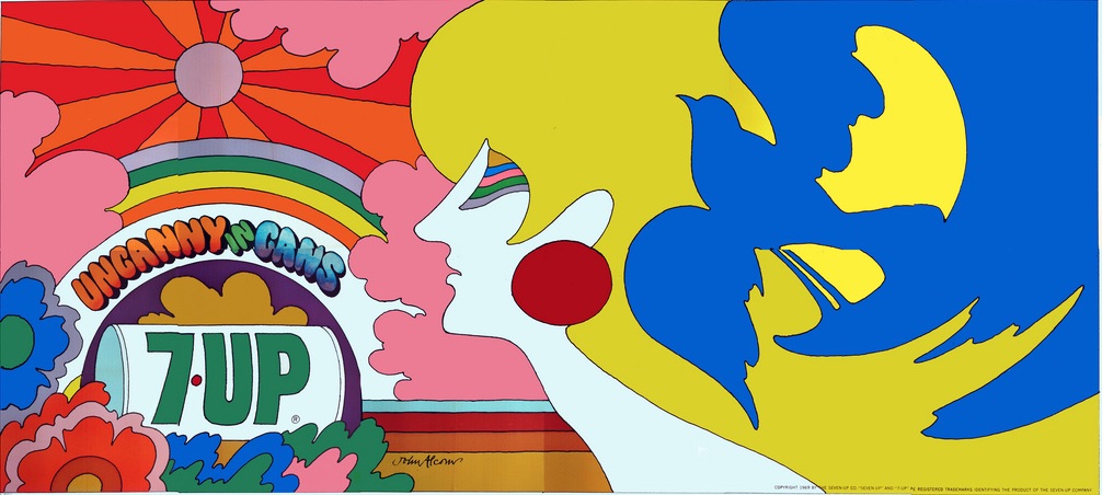
Top: John Alcorn’s UnCola billboard “Uncanny in Cans” has both “the girl with kaleidoscope eyes” and the peace dove of the antiwar movement. Above: Pat Dypold’s “Butterfly & Bottle” turns a soda bottle into a psychedelic butterfly. Both billboards would have been seen on the highways leading to Woodstock in 1969. (Courtesy of Bob Treat)
Collectors Weekly: How did 7Up’s psychedelic UnCola campaign come about?
Bob Treat: The UnCola campaign was a last-ditch effort to save 7Up in the late 1960s. They were on the verge of bankruptcy, so the company had to no choice but to do something totally different. The advertising artists and executives I’ve spoken to have told me that 7Up decided to go after the youth market. They also had to differentiate their product from “The Establishment” colas they were competing with at the time, which were Coke and Pepsi. The phrase “Un-American” often came up in association with the counterculture’s antiwar protests so the suffix “Un” struck a chord with the youth. To our parents, our music was like grating fingernails on a chalkboard. Rebellion was in the air, and J. Walter Thompson Advertising Company and 7Up took advantage of it, getting in line with the youth movement. It was a success. Within a couple of years of the first UnCola ad, their sales rose 30 percent.
The UnCola effort started in ’68, but I don’t think any advertising was produced until the spring of 1969. The bulk of it was issued in 1969, 1970, and ’71, and then tapered off by the middle of the 1970s. By then, they were just selling off inventory through poster offers and premium catalogs. To make the most of this collection, I only concentrate on that period, from 1969 to about 1975. I don’t collect 7Up stuff from the ’50s or from the ’80s, just this one little narrow niche.

In Kim Whitesides’ “Un & Un Is Too,” stand-ins for John Lennon and Paul McCartney make psychedelic magic with their 7Up-bottle guitars. This billboard was also posted in time for Woodstock in 1969. (Courtesy of Bob Treat)
The very first UnCola billboards—“# Un in the Sun,” “Butterfly & Bottle,” “Uncanny in Cans,” and “Un & Un Is Too”—were already lining the nation’s highways in early 1969. The Apollo 11 moon landing was on July 24, 1969 and the historic Woodstock music and art festival opened on August 15th, so these billboards could have been seen as hippie busses headed to the festival in New York. Then, in October, the company started selling sets of 4 “Fallpapers”—34-by-21-inch replica posters of their billboards. I’ve also acquired a 7Up “premium” booklet that offered UnCola-branded items, including toy 7Up dispensers, sweaters, shirts, hats, and patches—anything that they could put their product name on. The company even sold an UnCola vinyl album with counterculture rock music of the day.
For the UnCola campaign, the J. Walter Thompson Company (JWT) invited up-and-coming artists to submit creative designs. The client would then judge them without any names attached. If yours got selected, you got $2,000 to take it to the next level and finish the artwork. It’s hard to believe, but that was a lot of money back then. Pat Dypold was one of the most prolific UnCola artists, and she also created some of its most stunning billboards. She eventually married Bob Taylor, who was an in-house art director at JWT. At the time, she was a freelance artist, and even though her name was not put on the rough drafts, her art just kept getting selected by the 7Up client. She earned the gigs on her own.

UnCola billboard images also were used to produce advertising premiums such as beach towels and puzzles, like these items offered in a 1973 7Up catalog. Click here to peruse the whole catalog. (Courtesy of Bob Treat)
There’s a long list of artists whose billboard designs were selected and many of the artists have gone on to great fame in the graphics community: Milton Glaser (also known for the “I [heart] NY logo” and the “Mad Men” Season 7 poster; co-founder of Push Pin Studios), Seymour Chwast (co-founder of Push Pin Studios), Isadore Seltzer (Push Pin), John Alcorn (Push Pin), Barry Zaid (Push Pin), Kim Whitesides, Jacqui Morgan, Simms Taback (who created the first McDonald’s Happy Meal box, which is in Smithsonian, and received the Caldecott Honor for his children’s books), Skip Williamson (underground comix), Robert Abel (the 1982 “Tron” movie), Charlie White III (featured in the permanent collection at MOMA), John Craig, Ray Lyle, Heather Cooper, Nancy Martell, Roger Chouinard, Bob Taylor, Tom Kamifuj, Bill Bosworth, Ed George—and probably several others.
Milton Glaser is the guru of modern graphic design, and though well into his 80s, he’s still working and vibrant. He would probably disown his 7Up work today because he’s not a fan of helping to sell soda, but he did two different 7Up billboards. I have the only two copies of one of them, which is called “Like No Cola Can.”

This is not “The Yellow Submarine”! Instead, 1969’s “Wet Un Wild” shows a green 7Up bottle submarine, which was designed by Ed George at the J. Walter Thompson advertising company. (Courtesy of Bob Treat)
Collectors Weekly: How much of an influence was Peter Max?
Treat: I see his name associated with the billboard “Wet Un Wild,” because of its association with “The Yellow Submarine” animated movie the Beatles put out, based on their song, sung by Ringo Starr. There’s a big controversy around whether Heinz Edelmann or Peter Max did the original concept for that film. Max says that he developed the concept and it got stolen, while many other people say absolutely not. “Wet Un Wild” actually has a green submarine on a yellow background. Your eye doesn’t perceive it at first, but the sub is a green 7Up bottle. When you look at it, the first thing you’d think of is the Beatles’ “Yellow Submarine,” and then if you think Beatles, you think Peter Max.
But a lot of the style elements like the sunburst, or a sun with rays radiating out, go back to the Push Pin Studios, which Milton Glaser co-founded. His protégés at Push Pin Studios were drawing that sunburst pattern years before it was done by the 7Up artists. And they were doing some of the same psychedelic graphic elements you see in these billboards years before “Yellow Submarine” came out.

Bob Treat only has half of Pat Dypold’s 1969 billboard “Turn Un,” so he Photoshopped it with an image from a poster-offer page. The tagline—which references the “Turn On, Tune In, Drop Out” motto of LSD guru Timothy Leary—implies there’s something besides 7Up in that glass. (Courtesy of Bob Treat)
Collectors Weekly: Do you think 7Up was trying to make a deliberate connection to drugs like LSD?
Treat: Some of the billboards are, yes. One in particular, called “Turn Un,” which I only have half of, explicitly references LSD. It shows a 7Up bottle pouring out, tilted downward at a slight angle. Then the other half, which I’ve only seen on a thumbnail image, shows the soda turning into a pretty woman drinking out of a straw with the words “Turn Un,” in her hair. That tagline is a takeoff of the 1966 phrase by LSD guru Timothy Leary, “Turn on, tune in, drop out.” Just imagine seeing that billboard over a schoolyard today and what kind of uproar it would make.
Collectors Weekly: Do you think they were also trying to appeal to the ’70s ecology and health movements?
Treat: I’d say a little bit, yeah. UnCola didn’t have the caramel that gave colas their color, so they advertised 7Up as the cleaner and purer alternative. A billboard by Barry Zaid called “Un for the Good Old Summer Time” shows a little girl in a hammock surrounded by a pastoral scene, which was totally different from the psychedelic ads like “Turn Un.” During the mid-1970s, premiums focused on bicycles, which 7Up executives believed were going to be a big thing for people who wanted to pollute less and get healthy. In my billboard collection, you also see rainbows and hotdogs and blimps and submarines, a little bit of everything. I think they were just throwing anything against the wall to see what would be popular.
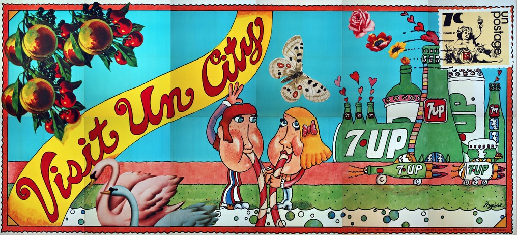
Just before he arrived at the University of Kansas in 1973, Bob Treat purchased this 1971 UnCola billboard, “Visit Un City,” by Pat Dypold. It was so big he could only hang the skyline on the upper right side in his off-campus housing. (Courtesy of Bob Treat)
Collectors Weekly: What initially attracted you to these billboards?
Treat: In 1973, after my sophomore year of college, a friend of mine handed me a pamphlet that offered huge 7Up billboards to the general public. I was attracted to the bright colors of the artwork, and so I bought one, called “Visit Un City.” When I moved into my off-campus housing at KU in Lawrence, Kansas, I put it on of the wall—actually only part of it, because it’s so huge. I probably picked “Visit Un City” because it was at a special price. The other billboards sold for $8.50, and this one was offered for $3.50.
“You could look up and see the bright colors, neat graphics, and the 7Up logo, and that’s all you needed to know.”
For the four years I was living off-campus at the University of Kansas, the billboard was, in effect, my wallpaper. My friends thought it was cool. It made a statement rather than hanging a little calendar-sized poster on the wall. I had something no one else had. It was massive. And at that, it was only half of it. I didn’t have enough room to hang the other half.
When I graduated, I boxed it up and pack-ratted it away. Decades later, in about 2000, I pulled it out to look at it again and I saw the name of the artist on it in script. I couldn’t even figure out what it said, whether the name was “Dybold” or “Dypold.” I started researching the artwork on the Internet, and I came up with no results, so I put the billboard back in the box. Another decade passed before I pulled it out and started searching again. Finally, a 2010 search uncovered an expired Craigslist ad offering three 7Up billboards in Florida. So I called half a dozen people with the same last name in the same area code until one of them said, “Yeah, that was me. I still have them.” I convinced my wife to let me buy them as a Christmas present for myself, and I thought, “So there were four of them.” I photographed the billboards and put the images online and kept looking on eBay and doing Google searches. Over time, I figured out there were actually around 53 of these billboards issued, and I’ve collected about half of them so far.

The 1973 UnCola poster offer, which encouraged young people to buy 7Up billboards for their dorm rooms or apartments. (Courtesy of Bob Treat)
Aside from the 21-by10-feet “Size A” billboards, 7Up reproduced the images in smaller posters as well. “Size B” is about 5 by 3 feet and considered a “subway size.” “Size C” was a standard 34-by-21-inch poster size, and “Size D” was more like a locker poster at 21 by 11 inches
More than half of the “Size A” billboards in my collection are one-of-a-kind. Generally, the rest are one of only two or three other known copies. For a very few images, like “Butterfly & Bottle,” nearly a dozen full-sized billboards have surfaced. I hope to collect a whole set of 53 unique UnCola billboards and document them in chronological order.
The reason they’re so rare is they were made of paper and meant to be disposable. The manufacturers didn’t have machines big enough to print 21-by-10-foot sheets, so they typically made each billboard in 12 panels at 43 inches wide by 59 inches tall. The workers would get up on the billboard catwalk and start with the lower-left-corner panel. They’d put some paste on the plywood or the billboard underneath it, stick on the first panel, and use a squeegee to get the air bubbles out of it. Then, they’d move on to the next panel to the right. They did the same thing across the top six panels. It was called a “rain-lap diagram” because it was designed so that rain or hail or snow would sheet off from top to bottom instead of water rolling underneath the paper—kind of like shingles on a roof. In 30 to 90 days, the paper would start to fade, and the next advertiser would come along. The workers would take the next billboard, maybe a Chevrolet ad, and paste right over the 7Up billboard. They would keep pasting over each billboard until the paper became too thick. Then they’d scrape all the billboards off, get down to the plywood, and start the whole process over again. They were meant to last 90 days at the most.

Pat Dypold’s “# Un in the Sun” billboard is one of four billboards that would have been hanging over highways as hippies made their way to Woodstock in 1969. (Courtesy of Bob Treat)
Collectors Weekly: So most of these were destroyed?
Treat: Yes, the process of putting them up destroyed them. Most of the ones that have been saved are from people like me, who bought them because 7Up was trying to get college kids to put them up in the dorms or off-campus housing where we lived, and in effect, saying, “This is cool.” Then hopefully your friends, thinking it was cool, would start drinking 7Up.
Collectors Weekly: What do you do with these billboards after buying them?
Treat: First, it takes a couple of days to flatten them because if you unfold the pieces too fast, they’ll rip at the seam. I’ll unfold each piece a half at a time. When they’re fully opened, I roll them this way and that way and in reverse, to the point where I can get them to lay flat. Then, I restore any rips with acid-free tape on the back. After that, I photograph them on a homemade vacuum table, which is basically a piece of pegboard with a Shop-Vac hooked up to it, which holds the paper flat. I photograph the billboards a panel at a time and then I Photoshop the 12 or 16 panels together into a collage. Finally, I convert the files into JPEG images and post them online. After that, I put the panels in storage, rolled up in acid-free paper, which is where they live.

1971’s “Un With the Show” is one of the billboards Bob Treat and his high school friends hung in the atrium of the University Plaza Hotel in Springfield, Missouri, for the Glendale High Class of ’71 reunion. The billboard, credited to Ray Lyle, features the same characters seen in 7Up’s 1971 “7Up Go On Out to the Lobby” movie intermission film. (Courtesy of Bob Treat)
Collectors Weekly: On your Flickr page, I saw pictures of a few hanging from a hotel atrium.
Treat: Oh, yeah. That was for my high school reunion in Missouri five years ago—Class of 1971. At the time, I only had five billboards. The atrium hotel hosting our reunion agreed to let us hang them over the balcony railings. I don’t know if they realized what they were agreeing to. That Friday, a group of us clipped the panels together with binder clips and stiff pieces of paper and hung them up. That was the background for our mixers and our breakfasts throughout the weekend. That’s probably the only time those particular billboards have ever been displayed in public before or since.
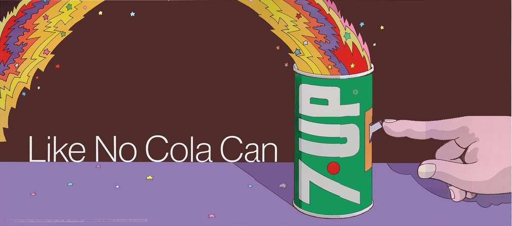
Psychedelic graphics guru Milton Glaser, co-founder of the Push Pin Studios, designed this 1971 UnCola billboard, “Like No Cola Can” in Pop Art style. (Courtesy of Bob Treat)
Collectors Weekly: Of the billboards you’ve collected, which are your favorites?
Treat: “Un & Un Is Too” by Kim Whitesides is awesome. It’s two guitar players, but their guitars are green 7Up bottles. If you look closely, you’ll see stars and tulips and flower petals flowing out of the guitars like music. The title is a riff on the 1964 Beatles song, “One and One Is Two,” and the guitar players are probably supposed to be John Lennon and Paul McCartney, as this came out when the Beatles were at the height of their popularity. I also love “Butterfly & Bottle” by Pat Dypold. The wings of the giant butterfly, whose body is a green 7Up bottle, are divided into four quadrants: The top left has stars and stripes, the bottom left a sunrise, the top right fireworks, and the bottom right big red flowers.
Most, like John Alcorn’s “Uncanny in Cans,” didn’t have many words on them. When they were on a billboard and you were driving by at 50 miles an hour, you didn’t have to read that it’s Joe Blow Insurance Agency before it’s time to get your eyes back on the road. You could look up and see the bright colors, neat graphics, and the 7Up logo, and that’s all you needed to know. You could connect with it in a flash and then get your eyes back on the road. I thought that was very effective.

In 1973, 7Up was testing out a new slogan, “See the Light,” and the company also believed bicycles were about to surge in popularity. Bill Bosworth and Tom Kamifuji came up with a billboard showing a rainbow striking off a rider, and then that image was used in premiums, like this bike cover. (Courtesy of Bob Treat)
But if you look at “Uncanny in Cans” a second time, and you look in the girl’s swirling yellow hair, you realize she has a blue peace dove in there, which was a popular symbol for the antiwar movement. Her eyes are multicolored, psychedelic eyes, which was a play on the Beatles tune, “Lucy in the Sky with Diamonds,” where they sing about “the girl with kaleidoscope eyes.” Each time you look at it, you see more detail.
“The suffix ‘Un’ struck a chord with the youth. Rebellion was in the air, and 7Up took advantage of it.”
Milton Glaser’s “Like No Cola Can” shows a 7Up can with a light switch and a finger flipping it on, while an electric rainbow shoots out of the top. He’s juxtaposing the miracle of electricity with the idea that opening this can will make something extraordinary happen. The tagline, “Like No Cola Can” says this is a very different kind of can. The simple Pop Art graphics are typical of his style. He doesn’t include the whole rainbow in the frame—it shoots out of the frame and drops back in.
The psychedelic rainbow trailing behind the bicycle on the “See the Light” billboard was pretty stunning, too. Bill Bosworth, who worked at JWT, actually gave me that billboard. He said that in the later years of the UnCola campaign, 1973-’74, the 7Up company thought bicycles were going to explode in popularity, so they also made plastics bicycle covers, which you’d put over your bike to keep the rain off of it. They made a pole with a 7Up pennant that you could put on the back of your bike. That was a safety measure designed so a car approaching from behind would see the flag flapping and give you a little more distance.

This 1975 billboard “It’s Delightful, It’s Delicious, It’s De-Lovely” promoting Sugar Free 7Up took inspiration from Jazz Age greats like Cole Porter and Josephine Baker. (Courtesy of Bob Treat)
The most unusual UnCola billboard is called “It’s Delightful, It’s Delicious, It’s De-Lovely,” and it’s probably one of the last ones produced, signed by a woman named Joanne. It advertises sugar-free 7Up, which they didn’t introduce until around 1973. The billboard shows a flapper girl, probably 9 feet tall, wearing a twinkly, sequined see-through slip dress with a long train behind it, surrounded by clouds dotted with starbursts. “It’s Delightful, It’s Delicious, It’s De-Lovely” was a 1930s Cole Porter song.
The last one I’d call out is “The Light Shining Over the Dark,” which is a boy and a girl dressed in angelic outfits and drinking through straws out of a central translucent bottle of 7Up. None of the other bottles in the other billboards are translucent. Through it, you can see the radiant starburst in the background. The ad executives didn’t create these taglines out of nothing. “The Light Shining Over the Dark,” for example, was pulled from the Bible. On my Flickr page, I explain the references. Even though they were going after the youth market, they didn’t ignore the parents. They subtly appealed to other age groups by putting in phrases and puns that older people would recognize. We didn’t get it, but our parents did.
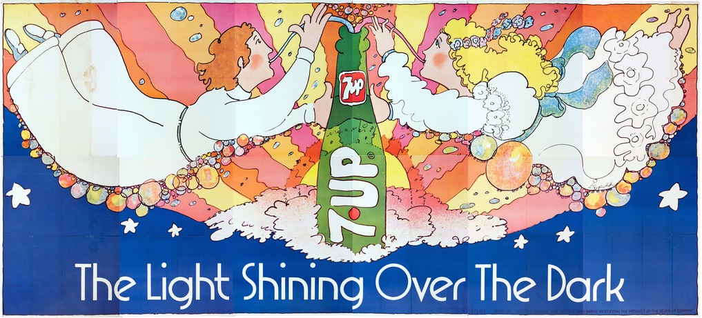
Pat Dypold’s 1971 billboard, “The Light Shining Over the Dark,” references the Bible and is the only Uncola billboard featuring a translucent 7Up bottle. (Courtesy of Bob Treat)
Collectors Weekly: It’s interesting that 7Up managed to appropriate a part of culture that was supposed to be anti-capitalist to successfully sell soda.
Treat: Lisa Simpson had a line that applies to this: “It’s very unconventional in a conventional sort of way.” The ad execs at the JWT Advertising Company were the Midwest Mad Men. They were working in the same era as the “Mad Men” TV show, but they just happened to be in Chicago. They were totally in lockstep with the youth culture. They weren’t behind it; in some cases, they were out in front of it. I’ve talked to some authors that have studied psychedelic art, and the influence of that art on the advertising. They agreed that the people at JWT knew what was going on in American culture and captured it.
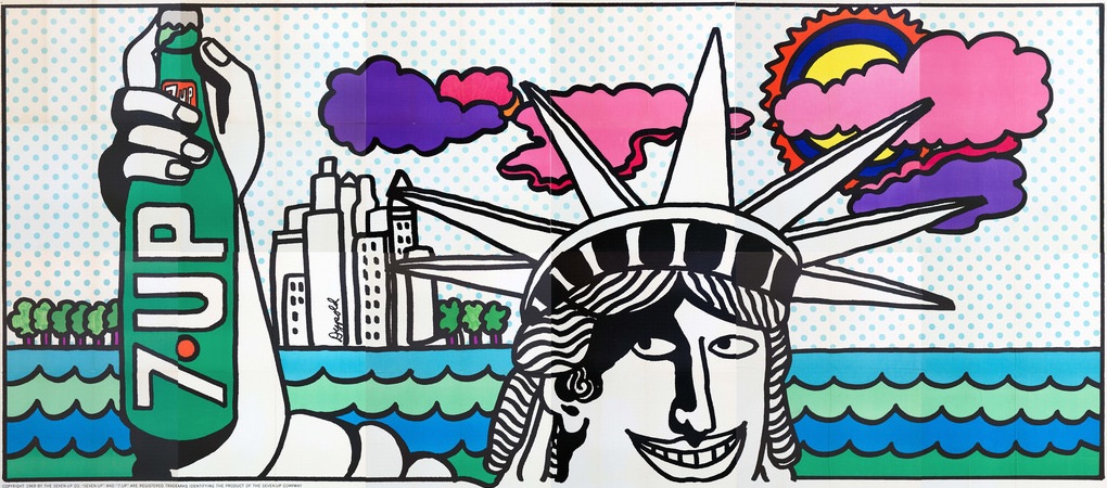
In 1969, the Salt Lake City establishment objected to this Pat Dypold billboard, “Lady Liberty.” They thought it was heresy to show the symbol of American democracy endorsing a product. (Courtesy of Bob Treat)
Collectors Weekly: Did the anti-establishment message cause any problems outside liberal urban bubbles?
Treat: Pat Dypold related this story to me: In one of her billboards, the Statue of Liberty holds a bottle of 7Up with a skyline in the background. When the billboard was hung up in Salt Lake City in 1969, the city fathers basically said, “Get that crap down,” and forced 7Up to remove it. It was considered un-American and blasphemous for Lady Liberty to be holding up and, in effect, endorsing a product. So 7Up didn’t put the copies of that billboard up all over the country. Then, the poster offer for the following year listed that billboard at the reduced rate of $3.50 because they had a bunch of them they couldn’t use. People working on the campaign were giving that billboard away at parties and to friends, because they had so many of them left over. Despite that, mine is the only remaining copy that I know of.
Matisse’s “Blue Nude III” inspired Pat Dypold’s 1971 billboard, “Matisse.” (Courtesy of Bob Treat)
Collectors Weekly: Do you think more billboards are going to surface?
Treat: I know of a few people who have some billboards that I don’t have copies of. There may be some industry insiders that may have one of each of these, but they haven’t dug them out yet. Or at least, these folks haven’t surfaced and made themselves known—let me put it that way. There may be bigger collections out there, but they may be holed up in a basement somewhere with silverfish crawling over them. Some of my billboards are in perfect condition because they’ve never been used. They’re just too big to do anything with. But even some of the unused ones have aged poorly because they’ve been in a wet, damp garage or laying over rafters. Very few of them have actually been hung up, even on a dorm wall. In my collection, very few of the billboards even have staple holes in them.

More Beatles-esque figures loom in Nancy Martell’s 1970 billboard “Hear No Cola, See No Cola, Drink No Cola,” which hangs in Shlomit Auciello’s rumpus room. Auciello is the author of Old Hippies: A Collective Memoir. (Via Shlomit Auciello’s blog)
Collectors Weekly: You’ve also collected some of the material about the campaign?
Treat: I’ve collected the “poster offers” that generally came out about once a year. They’d list 12 to 15 posters that they were offering in the various sizes. Acquiring these poster offers helped me figure out there were more than four different UnCola billboards. Comparing the 7Up poster offers from different years helps me date the billboards, particularly the ones I don’t yet have. The actual billboard panels are marked with code numbers like “69-1.” That means it’s the first billboard issued in 1969. With that numbering system, it’s easy to date them, but they changed it around 1971. For those later billboards, I have to use expiration dates on the poster offers to say, “All right, it was issued no later than this date.” So if the poster offer expired on December 31, 1973, I knew that it came out between 1969 and 1973.
Collectors Weekly: What do you plan to do with these billboards?
Treat: Over the next few years, I hope to flush out the other 25 or so that I don’t have. The time is right. There just aren’t that many in the world, and the generation that bought them is getting on in years. If they don’t pop out in the next 15 or 20 years, they’re probably not going to pop out at all.
I think I’m doing a pretty good job of gathering them so far. I started out with just one. Generally, I was able to build up this collection because somebody was cleaning out their deceased parents’ attic or basement. They’d come across an UnCola billboard and go, “What the heck is this?” and look it up online. I seem to be the only nutcase who’s collecting these, so they contact me and I’ll tell them exactly what it’s worth. I’ve been rescuing them from the trash heap one at a time.

Pat Dypold’s 1972 billboard “Un for All, All for Un” draws on three sources: Robert Crumb’s popular 1968 comic image “Keep on Truckin’”; characters from the “go to the lobby” cartoons shown at movies; and of course, the 1844 novel, “The Three Musketeers.” (Courtesy of Bob Treat)
Eventually, I’m hoping to organize a traveling museum exhibition—ideally around the joint 50th anniversary of “The UnCola” and Woodstock. In 2019, there will be major media hype over the events of the summer of 1969: the Moon Landing, the war protests, and Woodstock. Some museums will probably want to gather the clothing, album covers, and advertising of 1969, which this would play into. I think the nostalgia frenzy will open up some opportunities for a multimedia presentation that explains how the counterculture and advertising influenced each other. PepsiCo owns the rights to 7Up in the rest of the world, but in the United States only, the Dr. Pepper Snapple Group owns 7Up, and their headquarters is only 4 miles away from my office in Plano, Texas.
Someday, I’ll contact them and see if they want to put these images on their cans or sponsor museum exhibitions of the billboards. But I want to assemble enough of the collective body of work to make it worthwhile. I think these billboards are worth saving and have a story to tell.

Bob Taylor, the in-house art director at JWT advertising company, designed this 1970 dirigible-themed UnCola billboard, “Un Un and Away.” (Courtesy of Bob Treat)
 A Mad Day Out with the Beatles, 1968
 The Sources of Psychedelic Art? Drugs, But Also Picasso and the Fire-Bombing of Tokyo
 A Mad Day Out with the Beatles, 1968
 Advertising PostersMost vintage posters are trying to sell us something, be it a political can…
 7UpAs with many brand names from the early part of the 20th century, the origi…
 Mari Tepper: Laying it on the Line
 Nice Ice: Valerie Hammond on the Genteel Charm of Vintage Canadian Costume Jewelry
 How Jim Heimann Got Crazy for California Architecture
 Modernist Man: Jock Peters May Be the Most Influential Architect You've Never Heard Of
 Meet Cute: Were Kokeshi Dolls the Models for Hello Kitty, Pokemon, and Be@rbrick?
 When the King of Comedy Posters Set His Surreal Sights on the World of Rock 'n' Roll
 How One Artist Makes New Art From Old Coloring Books and Found Photos
 Say Cheese! How Bad Photography Has Changed Our Definition of Good Pictures
 Middle Earthenware: One Family's Quest to Reclaim Its Place in British Pottery History
 Fancy Fowl: How an Evil Sea Captain and a Beloved Queen Made the World Crave KFC
I can see why 7up had to go so hard on the advertising front; their actual product was/is ghastly. Gag. The artwork is beautiful though…
7up is delicious, Charlie. If you can’t say something nice, don’t say it at all.
Oh, yeah! I not only (vaguely) remember these billboards, I even still remember the jingle from one of the commercials:
It’s the nothing that makes it something
It’s what you miss that hits the mark
It’s what left out that leads us in
It’s the light showing out of the dark.
All for un
Un for all
7-Up the Uncola…
or something like that!
I know of a 7up billboard of this era available near me – how can I reach Bob?
Good article. Perhaps someone who read it can help with my 7up poster mystery. I have a 1970 Canadian version lithigraph in the show and tell section of the un un and away blimp, 930x600mm. Can anyone help me out with the history of the Canadian image?
I have a 7 UP billboard with this description….
30 sheet rain lap poster C-1973
Visit Un City Amusement Park DES
Form 71122
way
Maybe someone can help me with the 7up wet unwild poster I recently inherited. Not much info about it online.
Problem finding De-lovely 7up commercial. It’s probably a publishing issue, but for nostalgic reasons, please share link if available. I haven’t seen it since the 70’s.
Thanks
I have an original poster from the seventies been wrapped since so it is in mint condition of the flapper girl with the delicious logo i was going to throw it away is this something that is worth keeping?
If you have questions about 7Up billboards I’m happy to answer your questions.
-Bob Treat
btreat@swbell.net
Hi I’m looking to connect with Bob Treat about a 7-UP bill board poster I have that has never been put up. I’m looking to find it a new home and I had read in the article that Bob has collected 25 of them . Thank you for your time. John Carlotti.
Just picked up an approx 30”x19” plastic piece of 7up sunburst rainbow flowers. Think it came out of an old pop machine ? I’m a picker so looking to learn, value, and sell. Love all this cool content btw. Definitely appreciate my find more now. Think someone framed this and made it into lighted sign. Has nice green wooden frame..won’t let me ad pic
In the “See the Light with 7-Up!” commercial (1975), is that Elvis Presley along with Crosby Stills & Nash singing in the background? Does anybody know? I can’t seem to find any information about it!