
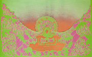
David Singer’s first poster for Bill Graham, BG-178, advertised performances by The Who, Santana, and Ike & Tina Turner. Image via David Singer.
One May morning in 1969, David Singer walked into the Fillmore West in San Francisco in the hopes of meeting Bill Graham. The day before, Singer had shown some of his photo collages to the acclaimed rock-poster artist and “Zap Comix” contributor Victor Moscoso, who’d been recommended to Singer by a printer they both knew. Should he turn his collages into greeting cards, Singer had asked? Perhaps they’d sell better as head-shop posters? Moscoso said he didn’t know much about greeting cards, and noted that respected head-shop poster publishers like Berkeley Bonaparte were going out of business. But Moscoso liked Singer’s work, so he suggested that Singer pay a visit to Bill Graham, who was commissioning a poster a week for the rock concerts he was producing at the Fillmore West, Winterland, and a couple of other venues. “He’s the only game in town right now,” Moscoso had remarked. And so off Singer went, to see if the notoriously busy and blunt-spoken rock impresario might deal him a hand.
“By San Francisco standards, Singer was kind of a square.”
The collages Singer hoped to show Graham that morning featured photographs Singer had cut from the pages of old magazines to create, as he would later put it, “visual poems.” One of the visual poems he was carrying in his fancy black-leather portfolio featured an ancient Greek statue standing before two horses grazing far off in the distance. Looming behind the tiny animals was an immense stone archway. For Singer, the orientation of the statue so that it was looking away from the rest of the collage symbolized the past, the living horses symbolized the present, and the archway positioned on a horizon that opened to sky and clouds suggested the future. Other collages in his portfolio were more like visual puns—how else to describe an endless field of red tulips, above which floated two pairs of lipstick-red lips?

While some of David Singer’s collages could be described as “visual poems,” this one, BG-180, is more like a “visual pun.” Image via David Singer.
Poems or puns, Singer’s timing turned out to be fortuitous. That same month, Graham had ended his relationship with artist Lee Conklin in a dispute over 50 bucks; one did not argue with Bill Graham about money. Many of the 33 concert posters Conklin had created for Graham since January of 1968 had featured the artist’s original drawings of naked figures trapped in bad-acid-trip dreamscapes, his fleshy worlds and the lost souls who populated them often assembled from disembodied breasts, noses, ears, fingers, and feet. Conklin’s work was kind of creepy, difficult to decipher, and totally cool, perfect for late 1960s San Francisco.
For Graham, the loss of Conklin was a minor inconvenience in a business where existential threats were routine, whether it was an overly inquisitive fire inspector or a prima-donna rock star. Besides, Graham had other artists in his stable. Foremost among them was Randy Tuten, an up-and-coming artist, who melded a sophisticated flair for graphic design with a psychedelic sensibility. In Tuten’s hands, a posterized painting from 1912 of a sinking Titanic, surrounded by old-timey lettering, became an unlikely advertisement for Creedence Clearwater Revival, while a photograph of an avocado adorned with goofy googly eyes was all Tuten needed to hype Led Zeppelin.

Immediately prior to David Singer’s arrival on San Francisco’s rock-poster scene, Fillmore West posters were designed by artists like Lee Conklin (BG-172, left) and Randy Tuten (BG-174, right). Images via Fine Arts Museums of San Francisco and Randy Tuten.
All things being equal, Tuten’s assignments should have skyrocketed after Conklin’s departure. But then David Singer showed up, which shouldn’t have mattered, because in May of 1969, no one would have pegged Singer as the guy who would eventually create more rock posters during Bill Graham’s heyday than any other artist.
By San Francisco standards, Singer was kind of a square. Sure, he was an aspiring artist, but his life history—a childhood in rural Pennsylvania, a stint in the Navy as a radio operator, a middling career doing marketing for shipping companies and wineries—was hardly preparation for following in the footsteps of Wes Wilson, Alton Kelley, Stanley Mouse, Rick Griffin, and Victor Moscoso, the giants of San Francisco’s psychedelic rock-poster scene. To make matters even more difficult for himself, Singer’s aesthetic sensibilities leaned toward Surrealism, with perhaps a splash of Dada, but his work was definitely not psychedelic. As for Singer’s medium of collage, that choice seemed downright creaky.

Rock promoter Bill Graham, who, as a child, was sent to the safety of the United States during World War II, wore a Star of David. Throughout his life, he was a supporter of Jewish causes. Image via Down in the Groove.
But Singer had been directed to Graham, and to Graham he would go. “I knew where his office was because I had been to Fillmore West many times,” Singer tells me during one of numerous interviews we conducted at his home, along with countless other less-formal conversations. “Bill had a receptionist named Marushka Greene, photographer Herbie Greene’s wife. Her desk was in front of Bill’s door, so you couldn’t just waltz into his office, even though the door was open. So, I walked up to Marushka and explained that I wanted to show my artwork to someone. She said, ‘You’ll have to show it to Bill.’” From her side of the desk, Greene could turn her head to see that Graham was on the phone—it would have been unusual if he wasn’t—so she punched a button on her intercom and called for Pat Hanks.
“By 1966, Singer’s uninspiring career path seemed a stark contrast to the city’s burgeoning music scene.”
At the time, Pat Hanks was Bill’s right-hand man, trusted enough to run interference for the boss when artists showed up with their portfolios hoping to get a shot at designing a Fillmore poster. That happened a lot. Designing a poster for Bill Graham was no guarantee that an unknown artist would become the next Victor Moscoso, but that was certainly the hope.
“Pat was backstage somewhere,” Singer continues, “but eventually he came out.” Apparently, Singer was a novel sight for Hanks. “He looked me up and down,” Singer recalls. “Back then, I had fairly short hair and didn’t wear the normal hippie attire. Plus, I was carrying this beautiful black art case, really professional looking, that was filled with my collages.” Hanks asked Singer to follow him to the other side of the big room outside Graham’s office. The two men walked together until they reached a door. Hanks opened it. “Inside was a smaller room, maybe more like a big closet,” Singer remembers, “and he said, ‘You can leave your artwork in here.’ And as I’m standing in the doorway, looking into this room, I see it’s filled with portfolios. I couldn’t believe it. There must have been 40 of them in there.”
It was, in short, the room where the pipe dreams of would-be rock-poster artists went to die.

This Singer poster, BG-182, features one of the 12 original “visual poems” selected by Bill Graham in May of 1969. Image via David Singer.
“A lot of them were really hippie-looking portfolios,” Singer says, “made of two pieces of cardboard tied together, decorated with paisley designs—stuff like that. I said, ‘You mean here, leave my artwork here?’ And he said, ‘Well, Bill only looks at artwork when he needs another artist, and this is where we keep it.’ I said, ‘I can’t do that. I won’t have anything to show anybody else.’ While we were talking, Pat kept looking at my black art case, until finally he asked, ‘What do you have in there?’ So I opened it up and pulled out several collages. He said, ‘Well, that’s pretty interesting. How many do you have?’ I told him I wasn’t sure, but that it was probably about 20. He said, ‘Wait here,’ took two of the collages, and walked all the way back across the room into Bill’s office. In a minute or two, he poked his head out through the doorway and waved his hand, motioning me in.”
Singer had been invited into the inner sanctum, a stranger off the street without a resume, reputation, or appointment. Once inside, Graham needed no introduction. “He knew I knew who he was,” Singer says of his first meeting with Graham. “Everybody knew who he was. Before a show, Bill would walk up and down the line of people waiting out front and talk to them, and he always introduced the bands. He ran his club. He was in charge. Everybody recognized Bill Graham.” But Graham did not know Singer. “I remember that he asked me my name,” Singer says, “but I hesitated, being uncertain what to tell him, as I was not sure what last name I’d want to put on my artwork if it was ever published; it was Holsinger back then. He was interrupted by a phone call, and after he finished, I motioned toward the ‘Star of David’ dangling from a chain around his neck and said, ‘My name is David.’”
“Bill told me that the No. 1 consideration was to get my artwork to the printer on time.”
Holding Singer’s collages, which were pasted onto thin cardboard and protected by a tissue-paper flap, Graham got straight to business. “How many do you have in there?” he asked, echoing Pat Hanks’ question and gesturing at Singer’s black portfolio. Again, Singer said he wasn’t sure. “Why don’t you put them up around the room?” Graham suggested. “Bill had a sofa in his office, a table, and a couple chairs,” Singer says, “so I leaned them on the sofa, the chairs, and the table legs, folding the tissue over the top of the cardboard so he could see them.”
Once Singer had arranged his work as best he could, Graham got up from his desk, walked around the room, and gave Singer’s collages a good, long look. “I was pretty impressed,” Singer remembers. “He pulled up a chair in front of each one and really looked at them. Every once in a while he’d glance over at me and then back at my collage. I’m sitting there thinking, ‘Jeez,’ because he hardly said anything. At one point, he asked if I minded if he moved them around. I said that was fine, as long as he only touched the cardboard, not the image. He switched them around for awhile until eventually he’d lined up the 12 he liked best, stacking the rest in a pile. All of this took like 15 or 20 minutes. Finally, he walked over to the doorway and said, ‘Marushka. Hold my calls,’ and closed the door. Then Graham sat back in his chair, turned to Pat and said, ‘What do you think? My summer series of posters?’ Pat, who worked for Graham, wasn’t about to argue, but he seemed to like them, too. ‘Oh, yeah, Bill, they’d be great.’”

During the summer, when school was out, Bill Graham ran shows six nights a week rather than four. He called these shows his summer series. This calendar was printed on the back of the postcard version of David Singer’s first poster for Graham.
At this point, Singer still wasn’t entirely sure what the phrase “summer series of posters” meant. “I didn’t understand what he was talking about,” Singer admits. “So when he said, ‘Could you do the summer series?’ I just said, ‘Sure.’”
Unbeknownst to Singer, Graham had just finished booking 12 weeks of concerts from the middle of June until early September. Each of those weeks would need a poster, and each of those posters would be packed with information. Normally, Graham ran shows on Thursday through Sunday nights, but during the summer, when lots of high-school and college students were on vacation, he could pack the Fillmore West with crowds on Tuesdays and Wednesdays, too. That meant that in a single week, Graham might step up to the stage microphone and introduce, say, The Who on Tuesday through Thursday, June 17-19, Santana on Friday, June 20, and Ike & Tina Turner on Saturday and Sunday, June 21-22. In fact, those are the actual names of the headliners and performance dates on David Singer’s first poster for Bill Graham, the one with the collage of the statue, the two horses, and the archway.
All of those dates and names, plus those of the supporting acts, had to be hand-lettered, which is why at one juncture in his closed-door conversation with Graham, “Bill looked me straight in the eye,” Singer says, “pointed at me, and asked, ‘Can you do hand-lettering?’ I said, ‘Yeah, I can hand-letter.’” Singer was telling the truth, although he had never done hand-lettering on the scale Graham had in mind. But his answer seemed to satisfy Graham, who leaned back in his chair again and repeated the phrase that was increasingly giving him comfort: “My summer series of posters.” As for Singer, he was privately freaking out. “I was thinking, ‘What have I gotten myself into?’”

This David Singer poster for a Moonalice show at Slim’s in 2009 is one of more than 120 the artist has designed for the band. Image via Moonalice.
The answer was a career that continues to this day: Among other accomplishments, since 2007, Singer has designed more than 100 posters for a band called Moonalice. Who knows whose paisley-decorated cardboard portfolio Graham and Hanks might have rescued from poster purgatory if Singer hadn’t knocked on Bill Graham’s door that morning.
Ironically, David Singer did not set out to become a rock-poster artist, hence his initial questions to Moscoso about greeting cards and head-shop posters. “I didn’t really see myself doing ballroom posters,” is the way Singer explains it to me, “ballroom” being a reference to the concerts promoted by Chet Helms at the Avalon Ballroom from 1966 to 1968 and by Graham at the Carousel Ballroom, which was the name of the Fillmore West before Graham took over the lease from Jefferson Airplane and the Grateful Dead in the summer of 1968. But Singer was intent on giving a career as an artist a try. That’s why, a few months before his meeting with Graham, Singer had quit a good-paying job in marketing to force himself to give it a go—his fancy portfolio, the one that had caught Hanks’ and Graham’s eyes, had been a good-luck parting gift from his previous employer.

David Singer originally proposed a variation of this design for a 1969 Rolling Stones poster, but Bill Graham gave the assignment to Randy Tuten. In 1972, when the Stones returned to the San Francisco Bay Area, Graham asked Singer if he still had his 1969 artwork. He did, and the result was this poster, BG-289, for four shows (two on each date) at Winterland. Though not noted on the poster, Stevie Wonder opened. Image via David Singer.
The charmed portfolio worked. After designing his first 12 posters for Graham in the summer of 1969, Singer would go on to produce another 55, which means Singer is responsible for more posters in the first and most-collected numbered Bill Graham poster series than any other artist. Included in that total is the last poster in the series—No. 289 for a Rolling Stones concert at Winterland on June 6 and 8, 1972—as well as Singer’s masterpiece for the Fillmore West’s closing week, June 30 to July 4, 1971. Surrounding that poster’s central collage of a cat appearing to dance on a sleeping dog before a grainy photo of Saturn and an ominous pair of feline eyes, Singer hand-lettered the names of 17 bands, five light shows, the venue, the dates, the words “Closing Week,” and the legend that crowned the top of just about every Bill Graham concert poster, “Bill Graham Presents in San Francisco.”
Singer’s “Closing Week” poster also featured a pair of decorative, bookended bird-like shapes on the left and the right. “When people ask me about the birds, I explain that their origin is from the Pennsylvania Dutch art that I grew up with,” Singer tells me. “But I wasn’t making that connection at the time. Things like that would just sort of bubble to the surface because they’re what I grew up with.”

When the Fillmore West closed in 1971, there had been no time to print a poster beforehand, so this Singer poster, BG-287, was printed after the show. It was presented to Graham as a surprise by Singer at an exhibition of the artist’s work several months later. Image via David Singer.
The source of his innate iconography was rural Pennsylvania, where Singer was born and raised. Like the artwork he produced for Bill Graham, Singer’s early years are a collage, composed not of images cut from old magazines but of family members stepping out of and into his life.
Born in 1941 in Bethlehem, Pennsylvania, as David Richard Carol, Singer’s dad was a musician named William Zboyovsky, who changed his name to Rudy Carol because it was a better name for a performer. Singer didn’t know his father because Carol left Singer’s mother, Ruth, when Singer was barely a toddler, and he never saw him again. Tragically, Ruth died when Singer was 4, leaving him in the care of Ruth’s older sister, Dorothy, and her husband, Galen Holsinger, who lived in Quakertown, half an hour south of Bethlehem. Singer was formally adopted by Dorothy and Galen and refers to them as his parents (he similarly refers to their daughters, Dorice and Linda, as his sisters), but when it came time for him to decide how to sign his first rock poster, he elected to shorten the name he grew up with, David Holsinger, to David Singer.

David Singer (center), with his mother, Ruth, behind him and his grandmother, Meme. Singer’s mother died of cancer by the time the boy was 4 years old.
Three of Singer’s most formative art influences came from this extended family. “My mom’s mother, my grandmother, who we all called Meme, had a sister named Flossy,” Singer says. “She and her husband lived in Allentown, which is just up the highway from Quakertown. We’d go visit them sometimes, like at Christmas. Flossy would always dig into her closet for toys and stuff for us kids.”
The objects that made the biggest impression on Singer were Flossy’s scrapbooks. “I remember them very clearly,” he says. “Her idea of a scrapbook was to have, say, a double page, or spread, that was filled with pictures of dogs she’d cut out of magazines. She’d cut out nothing but dogs for those two pages, paste them down, and then you’d turn the page and it would be all cats. The next page would be something else. Whenever we went to Flossy’s, I always asked to look at her scrapbooks. She had a whole bunch of them.”

David Singer, circa 1940s, Quakertown, Pennsylvania.
Flossy’s scrapbooks were such an inspiration to Singer that he became a self-described “magazine freak.”
“I started cutting cartoons and picture out of magazines, as a boy and into my early teens,” Singer says. “My mother found one collection of sexy women, and threw them out. But I was not deterred. I loved magazines, and had some really good collections. Everything vanished, though, when our house was renovated while I was away in the Navy.”
Singer’s adoptive mom, Dorothy, also made an impression on the young artist. “Dorothy had been to art school,” Singer recalls. “There were paintings around the house—landscapes, houses, flowers, and so forth—but it wasn’t until I discovered her easel and paint box in a corner of the attic that I understood that the paintings in the house were made by her. She never talked to me about it. Apparently, she’d dreamed of being an artist but settled for being a housewife and school teacher instead. Maybe it was because of her lack of success that she didn’t encourage me. A few decades later, when I sent home a bunch of my Fillmore posters, she was stunned, but what really impressed Dorothy is when I sent her an article about how Bill Graham had given a full collection of Fillmore posters to the Smithsonian.”

The home where Singer grew up featured a storefront where Singer’s adoptive father, Galen Holsinger, conducted business. Singer helped Galen strip furniture and make deliveries.
The third influence was Galen, who was an upholsterer. “We had a storefront in a part of our house where he’d do business,” Singer says. “His workshop was out back in an old, two-story chicken coop that he’d totally cleaned out. He could bring any old sofa back to life. One of my jobs in his upholstery shop was to strip the sofas down to their wood frames. It was dirty work. Then Galen would build them back up again. Sometimes, if the wood itself was bad, he’d replace it with another piece. He was a real craftsman.”
Another of Singer’s jobs growing up was to help Galen make deliveries, and this is where Singer got his early education in Pennsylvania vernacular art. “We ended up in the houses of people who had a lot of money,” Singer explains. “Quakertown is in Bucks County, parts of which are very wealthy. Some of the houses we delivered to were filled with antiques, so I’d wander around the house and take it all in. Galen would say, ‘Don’t touch anything, just look.’ So I looked. That’s when I was introduced to Pennsylvania Dutch art, the painted hex signs, the lettering.”

The first time Singer saw the Everly Brothers in the late 1950s, music posters looked like this (left). Years later, in 1969, Singer was asked by Bill Graham to create an Everly Brothers poster, BG-184, of his own. Image on right via David Singer.
Pennsylvania is also where Singer’s interest in music started, music being the pervasive soundtrack to any good rock-poster artist’s career. Perhaps because of the DNA he inherited from his musician father, Singer always sought out music, beginning with the live concerts he attended with his teenage friends in the 1950s. “I graduated from high school in 1959,” he says, “so between ’54 and ’59, or thereabouts, I saw Bill Haley and the Comets, Fats Domino, Bobby Darin, and the Everly Brothers. Later, when I was doing posters for the Fillmore, Bill Graham gave me the lineup for two upcoming posters and one of them featured the Everly Brothers. I remember thinking, ‘Holy mackerel. I saw the Everly Brothers when I was a kid!’”

David Singer, circa 1950s, Quakertown, Pennsylvania.
As a kid, Singer doodled extensively. On the one hand, it was a precursor to his eventual career as an artist, but it was also an activity that came from the vague sense of alienation he felt growing up. His parents, Dorothy in particular, avoided speaking with him about his biological father and mother—it took decades for Singer to get the whole story. “I lived a fairly normal small-town boyhood,” Singer begins, “but I always felt out of place. I became quite a wild kid, a bicycle nut, a long-distance runner, raising hell with other boys, drinking beer. We got into a lot of trouble toward the end of high school. My parents didn’t know what to make of me. I was a real juvenile delinquent. It was only after I left home and got far away from Quakertown that I began to sort things out. Joining the Navy helped a lot.”
After high school, Singer’s first major adventure beyond the boundaries of “greater” Quakertown was to attend Penn State University, about three hours to the west. “It was a huge school, with thousands of students from all over the country and around the world. I felt completely lost. I didn’t know who I was or what I wanted to do. I thought, ‘What the hell am I doing here?’ I was totally confused because my life was still this big mystery.”

For David Singer, a small-town kid from Quakertown, Penn State University, where he attended collage for a year, seemed impossibly huge. This is what registration day looked like in the mid-1960s. Image via Penn State University Archives.
Fortunately, Singer found a kindred spirit named Mike, who lived in the same dorm. “We used to hang out, talking about this and that, commiserating. At one point, we both decided, ‘Why don’t we give our parents a break so they don’t have to pay for this anymore and join the Navy?’ So we hitchhiked to State College, the name of the town just outside of Penn State, and found the recruiting office. We talked with the recruiters a couple of times before we signed up to make sure we got into the right boot camp. There were two Navy training centers, one up in the Great Lakes region and one in San Diego. We wanted to go to San Diego. That would get us to California, as far away from Pennsylvania as possible. At the end of my first year of college, I went home and told my parents, ‘Well, you don’t have to pay for my college next year because I joined the Navy. I’m leaving in two weeks for San Diego.’”
This was startling news to Galen and Dorothy. “It freaked them out,” Singer admits, “especially my mother, God bless her.” Dorothy wanted her son to study engineering. “She used to come up to me and whisper, ‘Engineering. Think engineering.’ I’d say, ‘Why?’ and she’d say, “Because you’re good at math and you’d make a lot of money.’ But I had absolutely no interest in engineering. I couldn’t see myself carrying a slide rule everywhere. I still like math and geometry, but it’s the forms and number symbolism that interest me.”

Portrait of the Artist as a Young Seaman: David Singer, circa 1962.
And so, just like that, in 1960, Singer left Pennsylvania for basic training in California. Mike met him there, but after boot camp, the two friends were sent in different directions. They would reconnect at the end of their tours.
“I made high marks in Morse Code training at the radio school in San Diego,” Singer says, “so they put me in charge of 12 guys and sent us to Okinawa, where the Navy had an air station with a communication center. They put us on a troop ship with like a couple thousand Marines, Navy, Army, and Air Force guys. The living spaces were filled with tiers of bunks, three or four high. Oh, man, what a trip.
“Once we got to Okinawa,” Singer continues, “we went to communications central, where I gave our orders to the officer in charge. The officer looked through the sheets of paper and said, ‘Who’s Holsinger?’ I said, ‘That’s me, sir.’” The officer walked Singer out the front door of the building, pointed to the top of a hill with four big radio antennas, and told him that would be his new home. “It turned out great, as I was always on duty alone and could monitor those four radio channels for messages and read during my watch, especially at night. I did a lot of reading on Okinawa. I did a lot of SCUBA diving, too.”
After almost a year and a half in Okinawa, Singer’s next assignment was as a radio operator aboard the USS Interpreter, which was stationed in San Francisco Bay. “That’s how I came to San Francisco,” he explains. “Aboard ship, I monitored a teletype network with a system called RAT for ‘Radio Teletype.'”

Postcard of USS Interpreter (AGR-14), the ship David Singer was assigned to from 1962 to 1964. When it was not at sea, the Interpreter was stationed in San Francisco Bay.
It was during this period, probably beginning in 1962, that Singer rented his first apartment in San Francisco. “Along with a couple of Navy friends, I rented a place up on Eddy Street,” Singer recalls. “It was an old Victorian building that was like something out of a Hitchcock movie. That way, when we were in port, we’d have a place to hang out.” During Singer’s time aboard the ship, the USS Interpreter would be out at sea for a month or five weeks at a time, but they’d be in port for two-week stretches. “I’d had a locker downtown,” he says, “in one of the military clubs. But this was our own apartment.”
Then one day in 1964, Singer noticed a new message coming over the RAT. “It said that anybody who was an enlisted man from certain states could leave the Navy four months early. I read it a couple times to make sure I had read it right.”
He had, but life as a civilian immediately presented challenges. “My life was churning in that era,” Singer says. “At one point, I drove across country and toured around for a bit before settling back in San Francisco. I lived in my car for several months, parking in a different place each night so I wouldn’t be too visible. My backseat was my bed. ”
Singer also tried to get into art school, to see if his high-school doodling and fascination with Pennsylvania Dutch art might lead to a post-Navy career. “I went to Los Angeles to meet the admission directors of several art schools. They all turned me down.” At the time, the rejections must have been disappointing, but Singer believes it probably worked out for the better in the long run. “I think my success was partly due to not going to art school,” he says.

One of Singer’s boring, design-adjacent jobs was to keep track of schedules for the P&O-Orient Line, and deliver those schedules to the designers who would create promotional materials like this.
Eventually, Singer got a job and a place to live in San Francisco. “Within a couple of years,” he says, “I’d had a bunch of downtown jobs, regular jobs where I had to wear a shirt and tie at work.” But by 1966, Singer’s uninspiring career path seemed a stark contrast to the city’s burgeoning music scene, in which rock concerts were regularly presented at the Fillmore Auditorium—the precursor to the Fillmore West, for which Singer would do so many posters—and the Avalon Ballroom, as well as at venues such as California Hall and Longshoremen’s Hall.
“I knew all about those venues,” Singer says. “One of the reasons I got into them was because I was working downtown.” For most of his pre-rock-poster-artist career, Singer worked in the strait-laced Financial District, where “Mad Men” in snappy suits gossiped about their secretaries over three-martini lunches. This was not Singer’s scene, but the Fillmore and Avalon were, and they were just a bus ride away. “When I got off work on Friday nights, I’d usually go to the Fillmore or Avalon. Sometimes on Saturdays, I’d go to the other one, and then if one of the two shows really blew my mind, on Sundays I might go back again.” One band that Singer often saw twice in one weekend was Quicksilver Messenger Service. “I loved Quicksilver,” he confirms. “By the time I got into work on Monday mornings, I would still be kind of spinning,”

One of Singer’s favorite bands was Quicksilver Messenger Service. In June and July of 1970, he designed these two posters—BG-239 and BG-242—for the group’s shows at the Fillmore West. Images via David Singer.
From the sound of it, the music was a welcome distraction from his corporate design-related jobs. “They were really boring, and there was no future in them,” he says. “All I had to look forward to was maybe becoming an art director at some corporation. I’d make more money, but it would still be boring. The only things from a design perspective that were exciting and happening at that time in San Francisco were the ballroom posters and what you’d see in the head shops.”
A good example of boring was his job at P&O-Orient Line. “I was the assistant to the art director, and it was a struggle to even get as far as that,” he continues. “All I did, really, was keep track of the schedules for all the P&O ships. I’d go back and forth all the time between P&O and freelance designers. That introduced me to a lot of graphic artists in their graphic-arts studios.”
Seeing those studios got Singer thinking more seriously than ever about making his own work, although, as he states earlier, he didn’t set out to make ballroom posters. “I remember walking past FLAX Art Supplies in San Francisco one day. This was when they were downtown. Outside the front door was a drawing table. I thought, ‘Well, if I’m going to get into making my own stuff, I better get a drawing table.’ Since it was on sale, I bought it. I’ve been using it ever since.”
Whenever he could, Singer would linger at the graphic-arts studios he’d visit while he was delivering P&O schedules, picking up whatever scraps of knowledge he could from the designers while they worked.
“There was this one place that had two guys constantly working away at their drawing tables,” he says. “I’d occasionally get to watch them take the photostats of text that had been typeset, cut them up using T-squares, and design the travel brochures. I’d just stand around, watching, talking, asking a few questions.”

Singer also worked for Fromm & Sichel, the marketing and distribution arm for Christian Brothers. As at P&O, his role was to manage creative assets rather than to be creative.
In fact, Singer had received a similar unofficial education in design as a kid back in Quakertown. “In my early teens, I was a paperboy for the ‘Quakertown Free Press,’” Singer says. “Down in the basement of the building was this monster press that would print the newspaper. They had a guy who would set the type in hot lead, and upstairs they would put together all the type and pictures, the layout. I used to hang out and watch these people do their work. At the time, it never occurred to me that any of this would ever have anything to do with me.”
In its own convoluted way, it was Singer’s work for P&O that started him down the path to rock posters. As would be the case on the day he met Bill Graham, Singer happened to be in the right place at the right time. In this instance, the catalyst was a printing salesman, who suggested Singer jump ship for a company called Fromm & Sichel, the marketing and distribution arm for Christian Brothers wines. Singer agreed to a lunch meeting. “They were just knocking down the martinis, which was not my thing,” Singer says. “But I took the job because it paid more and I would have my own office.”
By this point, the Summer of Love had come and gone. It was somewhere in 1968, and like a lot of people, David Singer was feeling anxious about what he was doing with his life, even as his boss at Fromm & Sichel was trying his best to paint a picture for him of a future with Christian Brothers. “We went up to the winery a few times,” Singer recalls. “He was priming me, but the more he primed me, the more I wondered if I really wanted to do it. It was all organization work, management. There wouldn’t be anything to do with graphics or anything creative. That sort of work was done outside.”

George Hunter’s design for the cover of It’s a Beautiful Day’s first album was the catalyst for David Singer to see the band at the Fillmore, after which he quit his day job to try and make it as an artist.
It was on the outside that Singer was introduced to George Hunter, who had recently left one of San Francisco’s first rock bands, the Charlatans, and started his own graphic-design business, Globe Propaganda.
“I had been talking with a designer we worked with at Fromm & Sichel,” Singer says, “telling him about how I was going to these concerts and asking him what he thought about the concert posters that were being created for the shows. He said, ‘You’ve got to talk to this guy down the street.’”
Singer took his advice and walked over to Hunter’s offices on a lunch hour. “He was the first person I met in the rock-poster world, which is interesting because George did the first rock poster,” Singer says. Along with bandmate Mike Ferguson, Hunter had designed the so-called “Seed” poster for the Charlatans’ residency at the Red Dog Saloon in Virginia City, Nevada, in the summer of 1965.
For the Charlatans, Hunter had basically designed the band, from their Victorian and Edwardian attire to the look of the posters advertising their shows. Globe Propaganda was no different. “Everything in his suite of offices, including what he was wearing, was from the 1920s or turn of the century,” Singer remembers. “It was like walking into a time warp. There was George wearing his 1920s-or-before clothing. The magazines on the coffee table were from the ’20s; the old-fashioned phone was a candlestick. I didn’t know what to make of it.”

A crowd waiting to get into the Fillmore West was a common sight at the corner of Market and Van Ness. Singer designed the poster for the 1970 show on the marquee, which advertised Fleetwood Mac, Buddy Mills, and Albert Collins.
Amid all of this, one object in particular caught Singer’s eye—an album cover that Hunter had just designed for a band that would soon rival Quicksilver in Singer’s esteem, It’s a Beautiful Day. “When we were talking, I asked him what he’d done recently. That’s when he showed me the It’s a Beautiful Day album cover.” For the cover, Hunter had taken a painting by L. Kent Hollister, which was actually based on a similar painting by American Impressionist Charles Courtney Curran, and combined it with an old Columbia Records font.
“I had never heard of It’s a Beautiful Day,” Singer says, “but then about a month later, It’s a Beautiful Day was at the Fillmore. At the show, I had this epiphany when they were playing their big hit, ‘White Bird,’ with the lyric, ‘White bird must fly or she will die.’ The music took me away, plus the light show had this white bird appearing to fly around the auditorium. As I was watching the light show and listening to the music and lyrics, I thought, ‘I’ve got to start doing something of my own.’ I may have gone back to see them again on Sunday night. On Monday morning, I walked into my boss’s office and quit.”
By this point, Singer was very familiar with the work of the San Francisco poster artists, maybe too familiar. “I had looked at a lot of Stanley Mouse’s posters,” Singer says, “as well as Alton Kelley’s and Victor Moscoso’s. I was trying to be original, but everything I was coming up with was too similar. My earliest poster designs looked like knockoffs. Eventually, I realized that I had to do something really different.”

This poster for a residency by Cleveland Wrecking Company at the Sojourner Inn in Jackson Hole, Wyoming, is Singer’s only published poster prior to his work for Bill Graham. Image via David Singer.
Singer returned to his childhood interest in magazines and collage, the interest that had been kindled by his great-aunt Flossy’s scrapbooks with all their pictures of cats and dogs. “I had been living in a place up on Frederick Street for a couple of years,” he says. “It was about three blocks up from Haight Street. It had a hardwood floor, so I took all the furniture out of the living room, scrubbed the floor clean, set out my boxes of pictures I’d collected, and started working on the floor. It was a nice, big, flat surface for collaging. I had a couple of file boxes filled with pictures that I had cut out over the years, but as I started collaging, moving the pictures around on the floor, I realized I needed more.
“I started hounding all the magazine stores in San Francisco,” Singer continues. “I found a place called McDonald’s on Turk Street. It was filled—the basement, the main floor, the balcony—with piles and piles of magazines, very unorganized, dusty, and dirty. I used to spend half a day in there. I got friendly with the guy who ran the store, so I’d just roam around, find a stack of magazines, sit down, and start going through them. I remember the day that I found the tulips picture, the one in the Johnny Winter poster. When I saw it, I knew I would use it in something.”
At the end of these scouting sessions, Singer would pay for the stack of magazines containing images he thought he could use and then head back to his Victorian flat on Frederick Street, where he’d cut them out and start collaging. “I didn’t know exactly what I was trying to do,” he says. “I was just feeling my way into it. I hadn’t done collages before, not like that, anyway. I did know that I wanted the collage to look like one image, so that you could get into it visually as if it was a single, cohesive scene. I ended up with a whole pile of collages that I liked, and those are the ones that I showed Victor Moscoso, and then Bill Graham.”
Which brings us back to that May morning in 1969, about six months after Singer quit his job at Fromm & Sichel to see if he could make it as an artist. After Singer agreed to do the summer series and convinced Graham that he knew how to do hand-lettering, Graham picked up his phone and motioned to the door. “He said, ‘You wait outside. I’m calling the printer.’” Singer remembers.

David Singer worked closely with Levon Mosgofian, who ran Tea Lautrec Litho and printed all of Bill Graham’s posters beginning in the summer of 1967.
By Singer’s reckoning, an hour or two passed before Levon Mosgofian showed up. Mosgofian ran Tea Lautrec Litho, which had been printing all of Bill Graham’s posters since 1967. “Levon looked at my collages and said, ‘Well, these are different,’” Singer recalls. “Then he turned to Bill and said, ‘He wants to make the whole poster a collage?’ Bill said, ‘No, there’s got to be room for the lettering somewhere.’”
Graham was mostly concerned about the cost. “He knew it would be more expensive to print in four colors, rather than two or three,” Singer says, “but Levon thought he could get Bill a deal on the prepress work.” In fact, that first day, it was still an open question whether Graham would want to pay for four-color printing. In the end, Mosgofian found a prepress company that agreed to gang-separate the first 12 collages on two sheets and then cut them up, rather than doing individual, and costly, prepress work for each poster, one at a time.
That small efficiency was enough for Graham to eventually give Mosgofian the green light. But on that first day, when Singer accompanied Mosgofian to Tea Lautrec Litho, there were still important details to nail down. For example, before Mosgofian could get a quote on the separations (the pieces of film that would break Singer’s collages into their component colors for printing), he needed to know how much of each 14-by-22-inch poster would be devoted to Singer’s collage.

The last of Singer’s summer-series posters, BG-190, has a smaller collage than the others, but the Art Deco lettering remains the same. Image via David Singer.
“I went home and pondered on it for a few days,” Singer says. “I came up with the idea of putting ‘Fillmore West’ at the top of every poster, all 12. That way, I’d only have to do that lettering once. I also decided to do the same style of lettering on all the posters. It was kind of an Art Deco font; I loved Art Deco.” Other standard elements were a border at the bottom for the band names and making just about all of the collages the same height, allowing the width to vary. “Levon liked that idea because then the separations could be smaller. And when Bill saw my lettering on my first two posters, he was ecstatic because he could read it so easily, and he liked having ‘Fillmore West’ at the top of the posters. He really liked that.”
Other than picking out those first 12 collages, Graham gave Singer very little direction. For example, Graham told Singer that it didn’t matter to him which of Singer’s collages was printed first, second, or 12th, so the choice of pairing collage imagery with band names was up to Singer. But Graham did care how those bands were represented on the final posters.
“Bill had a small pad of paper,” Singer recalls, “that he used for writing down all the lettering that needed to be on a poster. I still have some of those pieces of paper. He’d start with the bands. The size of the headliner would be listed at 100 percent, the next one would be 70 percent, and 50 percent below that. Sometimes he’d specify that both the second- and third-bill acts should be at 70 percent. All the rest of the information would be at the bottom of the piece of paper—the light show, the dates, that sort of thing. He told me, ‘It’s very important that everything is spelled correctly.’”
Oh, and there was one more thing: “Bill told me that the No. 1 consideration was to get my artwork to the printer on time,” Singer says. “That was ahead of everything else; that was the law.”

To make ends meet during his years making Fillmore posters, Singer sometimes hawked “Berkeley Barb” newspapers on the streets of San Francisco. As an artist, he also designed a few covers for the “Barb.” This collage is the original artwork for one of those covers. Image via David Singer.
Even after the format of the posters had been decided and the cost of the gang-separations had been approved, there was still one small detail Singer and Graham had not discussed.
“We hadn’t talked about money yet,” Singer says. “When I saw Bill again a week or two later, I finally asked him what he was going to pay me. He said, ‘I’ll pay you what I pay all my other poster artists, a hundred dollars a poster.’ I thought, ‘A hundred dollars a poster? That’s not a lot.’” In fact, it was so little, Singer had to take on a side hustle to make ends meet, selling “Berkeley Barb” newspapers on a street corner in the Financial District where he had once worked. Singer knew that being a poster artist for the Fillmore would not be especially lucrative, but he hadn’t expected the pay to be that bad.
“I was too intimidated to ask for more,” Singer explains. “I did most of my Fillmore posters for a hundred dollars each, that was the going rate at the time, but Bill was well aware that he was giving me more than money. He was giving me a chance to get my artwork out there, to have a career. So it was a gift, in a way. I really liked Bill.”
Other artists in Graham’s stable may not have been so pleased with the promoter and his new poster artist. “I think Randy Tuten was a little bent that I had suddenly grabbed 12 posters,” Singer says. “But when I went in to see Bill that first time, I didn’t know that was going to happen. It was a fluke.
“I met Randy after I started doing posters for Bill,” Singer continues. “He didn’t take to me too much at first. We get along great now, but we were from different worlds. I went to Quakertown High School in a little town in Pennsylvania. Randy went to Hollywood High. The first time I visited him at his studio, I felt like I was in no man’s land. He was much more sophisticated than I was in many ways.”

David Singer and Randy Tuten collaborated on this poster, BG-196, for Bill Graham. Tuten did the design and lettering, and Singer provided the collage. Image via David Singer.
It was during a visit to Tuten’s studio, shortly after Singer had completed his summer series, that an opportunity for the two artists to collaborate presented itself. Tuten was working on a poster for four shows featuring Joe Cocker, Little Richard, and The Move. “He was finishing the lettering on the side panels but the center was still blank,” Singer remembers. “I said, ‘What are you going to put in there?’ He wasn’t sure, so I offered to do a collage. I went back to my place and came up with a collage of a woman’s head surrounded by a halo of radiating arms. When I brought it back to Randy, he liked it. It solved his problem.”
With the summer series behind him, Graham had gone back to his practice of spreading assignments among various artists. The first two after Singer’s run were given to Tuten, followed by a pair to an illustrator named Greg Irons, who had recently returned to San Francisco from London, where he’d worked as an animator on “Yellow Submarine.” Irons’ posters for shows by Chuck Berry and Country Joe and the Fish were followed by two more Tuten posters, including the one for Joe Cocker that he and Singer ended up working on together. “Bill Graham always gave out the assignments two at a time,” Singer says. “It made everything easier for him, and saved on production and printing costs.”
Singer would not get another assignment of his own from Graham until December, when he would do four posters in a row, two at a time, beginning with a poster for four nights with the Grateful Dead, Flock, and Humble Pie, whose members at the time included a young, hotshot guitarist named Peter Frampton.

This Grateful Dead poster, BG-205, is generally considered to be an anti-drug poster. It’s also noteworthy because the Dead did not play the last show of the four-night run, having suffered through a traumatic day at Altamont. Image via David Singer.
The poster is famous for two reasons. First, it’s one of only a very few by Singer with a direct reference to drugs—the ominous, blood-red foreground is littered with loose Seconal capsules. The poster’s other claim to fame has to do with one of the dates on the poster, December 7, 1969, which is not only the anniversary of the Japanese attack on Pearl Harbor in 1941, but also the same day as the ill-fated concert at the Altamont Speedway in Northern California.
The Dead were supposed to play at Altamont in the afternoon as one of numerous openers for the Rolling Stones, after which they planned to head back to San Francisco for their evening show at the Fillmore West. But there was so much violence at Altamont, the band decided not to play at all, hoping the Stones would go on early to bring an end to the unfolding nightmare. The Stones didn’t take the hint, preferring to wait until the sun had set so that the filmmakers they’d hire to shoot a documentary of the Stones’ 1969 U.S. tour would be able to get dramatic shots of the band performing under stage lights. Instead, the filmmakers captured footage of an audience member being stabbed to death only a few yards from the stage. In the end, the Dead didn’t play at the Fillmore that night, either.
In terms of the poster’s visual content, drugs had long been a part of the San Francisco music scene. So-called psychedelic drugs such as LSD were positioned as doorways to enlightenment, which they often were. But so-called “hard drugs” had turned lots of kids into speed freaks and junkies.
For his part, Singer experimented plenty—“I tried just about everything at one time or another,” he says—but he had always been a light hitter, even in high school. “I’d drink a glass of beer, and I’d feel tipsy. My friends used to tease me because I had such a low tolerance for alcohol. Later on, in San Francisco, I always kept my drug use to a minimum. I got into grass and hash and light drugs, but I never really got into pills or coke. I didn’t like them.”
Singer’s negative associations with hard drugs dated from his Navy days, when he and some buddies were renting that old Victorian on Eddy Street. “I got to know the guy downstairs who managed the building,” he says. “which means I also crossed paths with the people who lived in the basement. When I first saw them, they totally creeped me out. It didn’t take long to find out that they were all heroin addicts. I said to the manager, ‘They look so old,’ and he said, ‘Heroin ages you, don’t do it.’ I wasn’t about to. He scared me off.”

This poster, circa early 1970s, advertises the only joint show of work by Singer and Sätty. Image via David Singer.
Drugs would eventually play a role in Singer’s friendship with Sätty, a fellow collagist who Singer met shortly after he started making posters for Bill Graham. “His real name was Wilfried Podreich,” Singer said. “Sätty was the German spelling of Seti I, the famous Egyptian pharaoh. Wilfried had played this figure in a school play, so all of the kids in his class started calling him Sätty. He took the name for his artwork.”
According to Singer, Sätty’s damaged childhood helped him realize how damaged his own had been. “I didn’t get it when I was a kid,” Singer admits. Still, their upbringings could not have been more different. “Sätty grew up in Bremen, Germany, during the war. After the Allies bombed Bremen and most of it burned to the ground, he grew up in the rubble. He never recovered from that, really.”
The two collagists met some time after Singer had finished his first 12 posters for Bill Graham, probably in the fall of 1969. Singer was visiting a print shop, trying to drum up some non-Fillmore business for himself, when he first encountered a Sätty piece in person. “It was made out of etchings rather than magazine photographs,” Singer remembers, “and it was about double the size of a Fillmore poster.” Singer was familiar with Sätty’s smaller collages that were starting to appear in “Rolling Stone” magazine, but he was impressed by the detail in an actual example. Singer was so taken with Sätty’s work that the printer gave him Sätty’s phone number, sensing that the two would have a lot in common. “I called him out of the blue and told him who I was. He said, ‘Oh, yeah, I’ve seen your posters around,’ and he invited me over.”

Singer only collaborated on a few Fillmore posters with Sätty, including this one, BG-271. Image via David Singer.
Sätty’s studio was in an old building in the North Beach neighborhood of San Francisco, the part of town where the Beat scene had taken root in the 1950s. “He worked in a storefront at street level—there was a door to the side that went up to some apartments upstairs. He had left the downstairs door open so I knocked and walked in. Sätty was sitting in a chair snipping pictures. He always had a box full of paper that he was cutting out. He offered me a chair, and we talked for about half an hour, just getting acquainted.
“Then, all of a sudden,” Singer continues, “a big drop of water fell from the ceiling and landed with a splotch almost right between us. We both looked up at the water that was about to form another drop on the ceiling, and then at the puddle that was starting to form on the floor. Sätty put down his work, jumped up, and ran out to the side door that led to the apartments. I followed him up the stairs and into the first apartment. That’s where we found some guy moaning on his bed, high on heroin. He’d turned the faucet on in the bathtub, and now the water was overflowing onto the floor, from the bathroom into the apartment’s little kitchenette. Sätty freaked out, but he turned the water off, pulled the plug in the tub so the water would drain, and then ran around the room grabbing every bit of fabric he could to soak up the water. And all the time, he’s screaming at this guy on the bed, ‘Get up! Get up!’ until he finally comes to and says, ‘What’s happening?’”

Singer made this poster for his solo exhibition in 1971, where he also presented Bill Graham with BG-287, the poster he created for the closing week of the Fillmore West a few months earlier. Image via David Singer.
That was quite a first impression for Singer, who helped Sätty mop up the water in the junkie’s apartment for the better part of an hour, before making up an excuse to leave. “About a week later,” Singer continues, “Sätty called me up and said he’d like to come over and see me. He showed up with his wife, Mary, a real nice lady. He said, ‘Look, I’d like to apologize for what happened. It was out of my control.’ Then he asked me if I wanted to rent that apartment above his studio. Sätty had gone to the landlady and complained like crazy. He made an arrangement with her that he would manage the building and get people in there who were responsible. I moved in, and lived there about five years. I did most of my Fillmore posters in that apartment. Another poster artist, Mark Behrens, lived in the back.”
Singer and Sätty became good friends, collaborating on posters for Bill Graham, as well as on other projects. “Every morning we’d go for coffee at a place a couple blocks away,” Singer says. “We’d cut out pictures together.” The two also scoured used-book stores. “Somewhere in a back room of every bookstore, usually on a bottom shelf, there’d be a whole bunch of books in German that were filled with old etchings for his collages. Most people in San Francisco couldn’t read these books because they were in German, so he could buy them up pretty cheap.”

Singer (left) and Sätty (right) in the early 1970s.
For Singer, magazines were still his preferred source of images, and now that he had a regular flow of assignments from Bill Graham, he was running out of raw materials. That changed when he got a call from a bookstore he frequented about a customer who had offered the store a huge cache of magazines. The store didn’t want them, but thought Singer might. “She had a long, narrow basement that ran the whole length of the building,” Singer recalls of the woman who was trying to get rid of her magazines. “Along one side of the room, from front to back, were stacks of them, waist-high. It was amazing. She said her father had subscribed to everything—’Life,’ ‘Look,’ ‘Fortune,’ ‘Time’—and never threw anything out. This was his whole collection. She had just sold the house, so she needed to get rid of them.” It was an enormous haul, and best of all, the price was within Singer’s budget: a few signed Fillmore posters and a promise to haul the magazine away.
Singer had a friend with a station wagon; half-a-dozen or more trips later, the magazines had all been moved. “I think it took me about three or four years to get through them all,” he says. In fact, chopping up magazines became an evening ritual. “I would sit in my apartment, take an hour or two to watch the news or some dorky show on TV, and go through six or seven magazines, slicing out the pictures until I had stacks and stacks of images to work with. Often, I’d read the articles, too, so it was like a second education. For example, I learned a lot about World War II.”

Another Singer-Sätty collaboration, this one to support the presidential candidacy of George McGovern, who ran unsuccessfully against Richard Nixon in 1972. Image via David Singer.
An offshoot of that education turned out to be deeply personal. “Through Sätty, I came to realize what made the people I grew up with so distant,” Singer explains. “It was basically because they were German. We had fought two World Wars against Germany, so most of the people I grew up around in Pennsylvania were trying to be as un-German as possible. To do that, they suppressed their backgrounds, kept quiet, and were very reserved.”
This helped explain why his adoptive parents, Dorothy and Galen, didn’t want to talk about Singer’s abandonment by his father or the death of his mother: He realized that their reticence was at least partly due to an overall pattern of behavior they’d adopted as a protection mechanism.
Sätty treated his childhood traumas and general sense of German guilt by self-medicating with the plethora of drugs that were widely available at the time. When Singer met him, Sätty was not wantonly self-destructive, but, Singer says, he was headed in that direction. “He had an amazing pharmacopoeia. If his stool was tight, he took something to loosen it. If it was loose, he took something to tighten it. If he had headaches, he had something for that. He had all kinds of uppers and downers and painkillers of all types. He wasn’t into heroin or anything like that when I knew him, but he did get heavily into PCP. I took PCP with him once just to see what he was experiencing—it felt like I had almost left my body. It was unbelievably powerful stuff. After I had that experience, I thought, ‘Man, this guy is doing this stuff practically daily. He must just be floating.’ Eventually, Sätty chased everybody who cared about him away because he got weirder and weirder. Everybody in the building left, including me. PCP is awful stuff. He destroyed himself on drugs and died in what had been my apartment.”

This Singer poster, BG-213, is one of only a few Fillmore posters not to have the words “Bill Graham Presents in San Francisco” at the top. Singer put the line in the lower-middle portion of the poster, and much to Graham’s consternation, shortened “Francisco” to “Frisco.” Image via David Singer.
Sätty’s self-destruction, though, was still a few years away. In the meantime, as the 1960s were turning into the 1970s, Bill Graham was keeping David Singer busy. “After the summer series,” Singer says, “Bill sometimes went back to two- or three-color posters to save money. Some of those were by his wife, Bonnie MacLean, who often gets overlooked when people are talking about San Francisco rock posters. Bill was struggling back then, running back and forth between New York and San Francisco a lot, trying to keep the Fillmore East going. Occasionally, he’d call me from New York to change a band name on a poster or to add something, like he did with the Aretha Franklin poster—at the last minute, he called to have me add the words “Recording Live At Fillmore West.’ He didn’t do a lot of art directing, but he did let me know what he didn’t like. One time, to save space, I put ‘Bill Graham Presents in Frisco’ in the middle of two posters. He called me afterward and said ‘I don’t like Frisco. Don’t do that again.’ I didn’t, but for Bill, it was more important that I’d delivered the posters to the printer on time.”
After the four posters he designed for Graham in December of 1969, Singer got five more assignments in January of 1970, including the two that he would mistakenly label with the word “Frisco,” followed by another dozen or so assignments that would keep him cutting and pasting through the spring. In retrospect, Singer is happy with most of those posters, “but there were some that I don’t care for much now and wish I’d had more time to plan them out, especially the color scheme.

For his Aretha Franklin poster, BG-272, Singer placed his hand-lettering on top of a Jim Marshall photograph of the Queen of Soul. At the last minute, Graham had Singer add the words “Recording Live at Fillmore West.” Image via David Singer.
“The first one I did in that spring of 1970 group was for a show with the Grateful Dead and Taj Mahal,” he continues. “It featured a little man running across the top of a mushroom, with an arched doorway against a background of outer space. The ‘mushroom man,’ people call it. It became one of my most iconic posters. The poster historian Eric King told me that artists don’t get to choose their iconic posters; the collectors do. I hadn’t really thought about it that way, but everybody wanted that poster. They still do. I wished I’d grab an extra hundred of them back in the day.”
This was a highly formative period for Singer, who was learning the tricks of his new trade by practicing his craft day in and day out. One arcane but revelatory bit of knowledge came at a prepress house called Circus Litho, which did most of the film work for Tea Lautrec, Graham’s printer. Because Singer’s source images were all cut from the pages of magazines, their colors were formed of small dots. Singer wondered why the incredibly sophisticated camera at Circus Litho, which was used to make prepress film of Singer’s collages, didn’t simply pick up all those dots, thus distorting the color of his images since the posters Tea Lautrec printed also laid down a matrix of dots to produce their color.

The so-called “mushroom man” poster, BG-216, is one of David Singer’s most collected and iconic Fillmore designs. Image via David Singer.
In fact, the camera would have picked up the dots in Singer’s collages were it not for a clever and deceptively simple trick on the part of the technician running the camera at Circus Litho. Because the camera moved forward or backward to focus on whatever was being shot, it was secured to a heavy iron frame that sat on a pair of metal tracks. “The guy would kick the iron frame at the same moment he clicked the camera,” Singer explains, “so that the photograph he was taking would blur just a hair. That would blur the dots in the collage, so you didn’t end up printing dots on top of dots. He showed me how he did it.”
That perfectionist’s curiosity, along with Singer’s habit of producing readable posters that always made it to the printer on time, endeared Singer to Bill Graham, and vice versa. “He had a photo of me on a wall, I think it was taken by Jim Marshall, and seeing it always surprised me,” Singer says. “Sometimes I’d peek in his office and say, ‘Hey, Bill,’ and a couple times he’d say, ‘Hey, come on in.’ I remember one time when I did that, it must have been after Janis Joplin died in 1970, he said, ‘Sit on the sofa,’ and then he came over and sat next to me. He’d never done that before. He said, ‘Tell me about your life,’ and I told him about this and that. He was very interested. Then he launched into this whole thing about how happy he was to hear that I was doing well because so many people he knew had destroyed themselves on money, drugs, or one thing or another.”

In a poster Singer created for an exhibition about the life of Bill Graham, originally presented at the Skirball Cultural Center in 2015, Singer repurposed elements from a collage he did in the early 1970s. Image via David Singer.
Graham’s affection for Singer may have had spiritual underpinnings, too. “I said something to him once about his necklace,” Singer recalls. “He always wore a Star of David.” In fact, although he would not talk about it much until later in his life, Graham, a German-born Jew, had escaped occupied France and was raised in the United States—his mother died in Auschwitz, as Graham likely would have, too, if he hadn’t been spirited away to safety. “I’d been reading about what the symbol meant, studying it a bit, so we got to talking about it. He never said anything directly to me about my religion, but I got the impression that he thought I was Jewish. Singer, after all, is a very common Jewish name.”
As it turns out, Singer’s biological father, William Zboyovsky, another important Bill in Singer’s life, was Jewish, although Singer was raised Lutheran by his adoptive parents, Dorothy and Galen. Whatever the reason for their connection, in the end, Singer would design a total of 75 posters for Graham, the last being for a show by Paul McCartney at UC Berkeley in 1990, about a year and a half before the rock promoter died tragically in a helicopter accident in 1991. By then, Singer had finally learned why his biological parents had parted ways, and why his father may have thought it best to never attempt to see his son again. But that, as is often the case when talking about the life of David Singer, is another story.

 All-Night French Fries with T-Rex: Seattle's Trippiest Rock-Poster Artist Tells All
 Was Levon Mosgofian of Tea Lautrec Litho the Most Psychedelic Printer in Rock?
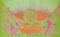 All-Night French Fries with T-Rex: Seattle's Trippiest Rock-Poster Artist Tells All
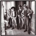 Hippies, Guns, and LSD: The San Francisco Rock Band That Was Too Wild For the Sixties
 Music and Concert PostersFor jazz fans, a poster of Chet Baker almost seems to come with its own sou…
 Rock RecordsAs music genres go, rock is unquestionably the sloppiest. How else to descr…
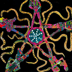 Mari Tepper: Laying it on the Line
 Nice Ice: Valerie Hammond on the Genteel Charm of Vintage Canadian Costume Jewelry
 How Jim Heimann Got Crazy for California Architecture
 Modernist Man: Jock Peters May Be the Most Influential Architect You've Never Heard Of
 Meet Cute: Were Kokeshi Dolls the Models for Hello Kitty, Pokemon, and Be@rbrick?
 When the King of Comedy Posters Set His Surreal Sights on the World of Rock 'n' Roll
 How One Artist Makes New Art From Old Coloring Books and Found Photos
 Say Cheese! How Bad Photography Has Changed Our Definition of Good Pictures
 Middle Earthenware: One Family's Quest to Reclaim Its Place in British Pottery History
 Fancy Fowl: How an Evil Sea Captain and a Beloved Queen Made the World Crave KFC
Singer was the best of the lot in those days. I used him myself for one or two covers for Organ Magazine. Super guy and an amazing eye and talent. Great discipline too. Glad to see this article and only wish I still had my personal copies of Organ but they were destroyed in the Paradise California Camp Fire late last year.
Glad to see you’re still standing, Singer.
an important artist, thanks for this article but what really blew my mind is his typography.
Truly unique and innovative. I wonder if he has created any type fonts based on his Fillmore posters?
I remember Singer’s work for the Fillmore West back in the 70’s. I was just entering an art school on the east coast and visiting San Francisco in the summer before fall. Everyone loved his art – and looking at them again in this article I realize how timeless they still are. And very beautiful.
Superb article, Ben Marks, about a singular artist! Excellent journalism. The people and places weave in and out of personal memories of an avant garde theater family, collaborating with Sätty for our “Roll Over Alice” performance multimedia projections, working for many BGP shows and at Winterland Productions where much BGP poster art was stacked for sale. The technical info re printing techniques is very reminiscent of our little theater family’s struggle for color on our street flyers on our limited printing budget! Without Singer’s creative resources and Bill’s budget, we would create the text with Letraset, photocopy onto bright colored paper and then hand print the header text with red markers! And now, years later, David Singer, your Skirball poster strikes a very emotional chord. Thanks so much for the memories!
First class article! So much to comment on but I’ll make it short. Mr. Singers talent bordered on brilliant. I was an East Village kid so the Fillmore East was my playground for three years.
Used to see Bill Graham often, after the late shows, and another amazing human being who went through hell but survived and made his mark on both coasts. Finally, Ben Marks, you fit perfectly in this compliment filled post because you’re writing is second to none. Thanks again.
A first-class piece on a fine artist. One who’s given me enormous pleasure of the last – gulp – 45 years. For I saw some of David’s posters in an exhibition of Fillmore posters within a week or two of setting foot in San Francisco for the first time, in the mid-70s. Thanks to Ben and his poster shop on Columbus, many have been on my (now, English) walls ever since. So too has the beautiful poster David did for my cookery school at the time, on Crete. I’ve never forgotten him. Nor shall I ever stop thanking him from afar for the privilege of witnessing him at work, and the joy his work has given me. It still does, every day. Thank you for such a good article on a very special man.
Amazing article about a truly amazing artist.
I worked for BGP management back in the
early 1990’s, just before Bill’s passing. :(
Happy to report I just bought a First printing
of Mr. Singers’ first Fillmore Poster – The Who/
Santana image which leads this fine article !
For me, David’s clean design, & easy to read fonts
are much more pleasing to the eye than the so-called
BIG 5 Fillmore artists. Thanks again for this stellar read. :)
As a nine year old, I remember seeing the BG Fillmore posters by David Singer posted in shops and they captivated me then and sparked curiosity in me that remains to this day having many BG Fillmore posters lining my music room. Thank you David for creating such fabulous works that influenced a young boys mind. Your art drew me in to the art and to the music.
Was most fortunate to meet with David in the City (Potrero Hill-San Francisco) back in the early to mid 70s’ … he gave a neat tour of his graphics art studio and we hung out with a mutual set of friends. I of course had no real idea how awesome he was as a legend, only that I knew was that his art work was from another universe altogether …
A great piece of storytelling the subject matter of which, unusually, itself actually provided the illustrations. That’s pretty cool! Singer’s personal creative journey very much embodies “the road less traveled” that many of us now aging hippies felt compelled to take decades ago while flying the banner of born-to-be-wild individuality and chanting that little known biblical passage, “Yea, though I may fumble and bumble and stumble in my purple haze of confusion/consternation, I will fear not evil police state nor will I ever punch a clock or otherwise sell my soul to the system for filthy value coupons.” Sure, it’s been “a long, strange trip”, but now in 20/20 retrospection I can now declare with all certainty, “It sure as hell wasn’t boring!” Thank you, Ben, for a very welcome magic carpet ride back to a bygone era when people still dared to experiment with their lives and have fun simply for sake thereof. Power to the people, right on!