
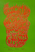
When the phrase “San Francisco rock posters” is uttered in certain circles, most people picture bold blocks of psychedelicized Art Nouveau lettering, a skeleton crowned by a garland of roses, shimmering collisions of equiluminant colors, and a flying eyeball peering through a burning ring of fire. That describes the most iconic work of the so-called Big Five poster artists—Wes Wilson, Alton Kelley, Stanley Mouse, Victor Moscoso, and Rick Griffin. But as good as those artists were (in the case of the late Griffin and Kelley) and are (in the case of the rest), it took more than just five artists to create all the posters and handbills required to publicize all the concerts produced during these years. In addition, if it weren’t for the career pressmen at companies such as Bindweed Press, Cal Litho, West Coast Litho, and Tea Lautrec Litho, the drug-fueled dreams of some of these artists might never have seen the light of day.
“One of the best pressmen in the business was Levon Mosgofian, who owned and operated Tea Lautrec Litho.”
Recently, I was invited to curate an exhibition of San Francisco Bay Area rock posters at the San Francisco International Airport, whose SFO Museum produces more than 50 shows a year across 25 exhibition spaces for the 44 million travelers who pass through the airport annually. My qualifications for this incredible honor are essentially a love of rock posters since I was a kid, membership on the board of The Rock Poster Society as an adult, and a collection of maybe 400 pieces, which is paltry compared to the holdings of most of the collectors who supplied posters to the show. Thanks to their generosity, I was able to organize “When Art Rocked: San Francisco Music Posters, 1966-1971,” which features about 160 posters, along with another 100 or so postcards, handbills, tickets, and other scraps of ephemera from the era. A smaller companion exhibit of 1960s fashion and design, curated by SFO’s Nicole Mullen, is located conveniently nearby.
I won’t rehash the exhibition’s searingly insightful curatorial conclusions here—you can read some of what I had to say by visiting the show’s website or, better yet, by heading out to SFO’s International Terminal, day or night, between now and the end of March 2015 (the exhibition can be found in matching, 45-foot-long display cases before you pass through security, on the way to gates A and G). If you make the trip, you’ll see many posters and handbills commissioned by Bill Graham and Chet Helms—who promoted some 500 shows between them at the Fillmore, Fillmore West, Avalon Ballroom, Winterland, and other venues—as well as pieces ordered by other impresarios promoting concerts on less-storied stages around the Bay Area.

Top: Levon Mosgofian at Tea Lautrec Litho, circa 1970s. Above: “When Art Rocked” is on view at San Francisco Airport’s International Terminal through March 2015.
The sheer number of concerts held during those years created an enormous demand for eye-catching graphic art. Accordingly, scores of artists knocked on the doors of Graham and Helms, hoping to achieve even a fraction of the fame, if not fortune, that was being enjoyed by the Big Five. David Singer, who would go on to create more posters for Bill Graham than any other artist, was part of that second wave. I’ve had the pleasure of knowing Singer for a few years now, and when I asked him once about how he got his foot in the door, he recalled that on his first visit to Graham’s office in the spring of 1969, he saw dozens of portfolios left by would-be poster artists in the hopes that Graham might have a moment to give them a glance. Fortunately for Singer, he was given an audience with the great man, who purchased a dozen designs from him on the spot.
Getting your art seen by a concert promoter was obviously a formidable hurdle, but for many artists, an even bigger one awaited. It was one thing to execute a drawing or, as in Singer’s case, to compose a collage, but at some point, the artwork had to be readied for the offset lithographer, whose job was often to make sense of the drawings or scraps of paper artists would sometimes dump in their laps.
As a rock-poster collector, I’ve always found that handoff from artist to printer to be one of the most interesting aspects of the form. Many of the artists working between 1966 and 1971, talented though they were, did not know the first thing about offset lithography, the dominant printing technique of the day. In this light, the unsung heroes of San Francisco’s rock-poster scene may have been the printers. Sure Graham and Helms wrote the (small) checks, and the ideas belonged to the artists. But with a few notable exceptions (Wilson had a small offset press, and Moscoso taught stone lithography), most poster artists of the era had no formal training in the printing techniques used to disseminate their work. As a result, career pressmen were often unsigned collaborators, teaching artists how to get the most out of a medium they absolutely had to understand if they were going to make it as poster artists.

Preparators at SFO ready a Grateful Dead poster, designed by David Singer and printed by Tea Lautrec Litho, for display in “When Art Rocked.”
One of the best pressmen in the business was Levon Mosgofian, who owned and operated Tea Lautrec Litho. Though he passed away in 1994, Levon’s son, Denis, who worked at the press briefly in the mid-1960s and then again from 1972 until 1982, heard many of the stories of Tea Lautrec’s glory days from his dad. On the occasion of the exhibition at SFO, Denis kindly agreed to share a few of his dad’s recollections with me.
“That was the same paper Birds Eye used for its frozen-foods packaging.”
According to Denis, Lev, as many called him, did not exactly set out to be the most psychedelic lithographer in history, but he was opened-minded enough to seize the opportunity when it presented itself. Beginning with a June 1967 Fillmore poster designed by Bonnie MacLean for a concert featuring the Jim Kweskin Jug Band, the Peanut Butter Conspiracy, and The Sparrow (which became Steppenwolf in 1968), Tea Lautrec printed every Bill Graham concert poster between 1967 and 1971, more than 200 in all. Tea Lautrec also printed Bill Graham concert posters throughout the 1970s, for shows headlined by the likes of the Rolling Stones, The Who, Pink Floyd, Paul McCartney, and the Grateful Dead. Some of these posters are among the most collected and coveted in rock.
“My father went to work in about 1946 for Neal Stratford & Kerr, which was an old-time, full-service reproduction and printing shop on Sansome Street in San Francisco,” Denis begins. “They offered everything from typesetting, art, and design all the way to full binding. You could bring in your idea or artwork, or they would do the artwork for you, and you could walk out with a fully finished product, whatever it was—a book, a poster, a brochure. He worked there for a long time, eventually becoming the lead pressman.”

The David Singer section of “When Art Rocked,” on view at SFO through March 2015.
Denis worked at Neal Stratford & Kerr for about a year while his dad was there. “I was at the plant in ’65 and ’66,” Denis recalls. “I ran the stationery department. Then I got word that the plant was going to go out of business, so they laid off everyone in my department. A year, year-and-a-half after that, everybody in the rest of the company knew the plant was going to close.”
Before it closed its doors, Neal Stratford & Kerr began printing jobs for its most famous client, Bill Graham. “Around early 1967,” Denis says, “maybe late 1966, some ‘hippie artists,’ as they were described to me, came in. They were looking for a new printer to replace the one Bill Graham had been using.” Joe Buchwald, who was also a pressman at Neal Stratford & Kerr, had been the connection to Graham because of his son, Marty Balin, whose band, Jefferson Airplane, regularly played at Graham’s Fillmore Auditorium.
“They walked in the front door of Neal Stratford & Kerr,” Denis says, “and the boss, Jerry Stratford, sent them round back, where my dad took care of them. Once Neal Stratford & Kerr started to do work for Graham on a regular basis, Jerry, who was a truly nice guy, a good employer, went to Lev and said ‘Look, I’m having a little trouble with the long-haired hippies. They come in barefoot, and we have all our other clients up there. I was wondering if you could handle them?’ And Lev said, ‘Yeah, I like working with them. Why don’t you bring them in through the loading dock, and I’ll take it from there.’ Eventually Bill Graham started to come by to check on things, and that started their relationship.”

Tea Lautrec Litho had two Miehle 29s. The one shown above was the more reliable of the two, so it was used when registration and color were critical.
Though welcome, this new business from Graham wasn’t enough to keep Neal Stratford & Kerr from closing, which it did later in 1967. But before it stopped its presses entirely, the company had to finish up a few projects for clients, as well as to settle accounts with its remaining employees. “My old man was owed some money,” Denis says. “He hadn’t taken any overtime in the final year or two of Neal Stratford & Kerr. He’d say, ‘Just hold it for me, and at the end, you can give it to me.’ So when it finally came time to pay him off, he said, ‘You know what? I don’t want the money, but I would like that press and that press, that light table, that folder, and that cutter.’ And they said, ‘Absolutely, take it!’ And he said, ‘Well, I also need a place to set up,’ so they gave him a section of the building behind the loading docks where the paper would come in. It was 1,000 or 1,500 square feet. That was Tea Lautrec Litho, and Bill Graham was his first customer.”
“The sheer number of concerts held during those years created an enormous demand for eye-catching graphic art.”
As serious poster collectors know, the first posters Levon printed for Graham are credited to Neal Stratford & Kerr, since that was the name of the company that actually printed them. “My father wanted to call the business Toulouse-Lautrec Lithography because Henri de Toulouse-Lautrec was his lithographic idol. Lev really liked his work, and Lautrec was the first guy to apply the four-color lithography process to posters. But somebody said to him, ‘Well, the Toulouse-Lautrec family is probably still around, so I don’t think you can do that,’ so he changed it to T. Lautrec Litho.” That name actually appears on the last of the Neal Stratford & Kerr posters printed by Levon for Graham, suggesting that Jerry Stratford was quite happy to see his lead pressman get his new company off the ground.
Of course, as we know today, T. Lautrec did not stick, either. “A few years later, David Singer said ‘Lev, you need to change it to Tea.’ ‘Tea’ is an old slang term for marijuana. It went back to the jazz age, and I remember hearing it in the ’50s when I was coming up. At that point, my father was like 60 years old—he had never smoked a joint in his life—but he was a very open-minded guy, and T. Lautrec became Tea Lautrec. I always thought that was a pretty cool thing for him to do.”

Levon Mosgofian at Tea Lautrec Litho’s Chief 22, which was used for small work when color was not especially critical.
For a few years, things went swimmingly in the back of 1025 Sansome. “It was a very good operation,” says Denis. “There was a loading dock, where you could ship and unload paper—it was pretty easy. But then the main part of the building was taken over by what looked like an antiques dealer, who started giving my father a hard time. Lev was a pretty easy guy to get along with. He was back in the corner printing, having nothing to do with this big antiques place—they had their own entrance and everything. He couldn’t figure it out; they just kept harassing the shit out of him, and finally, it got kind of nasty. Turned out the antiques thing was a drug front. The whole thing was a way to funnel and launder money for drugs. So, that’s why, in 1969, he ended up moving to 41 Sheridan across town.”
Even though Denis missed the heyday of the Bill Graham era at Tea Lautrec, he received regular reports. “My dad used to bring posters home and show them to me, whether it was when he was at Neal Stratford & Kerr or when he started working for Bill Graham. I wasn’t a fan,” Denis recalls with a slight wince. “I’d say, ‘Give ’em to our younger cousins, they can draw on the backs.’ I’m sure I did that with a BG-74,” he says, citing the series number of a rare poster for a Bill Graham-produced Jefferson Airplane/Grateful Dead concert in Toronto that routinely fetches five figures today. “So, yeah, I was aware, but I wasn’t really that dialed in to it.”
After a few years in Los Angeles, where he worked in a steel mill, built machinery, and began to raise a family, Denis returned to San Francisco in 1972. He hadn’t planned on going back into the printing business, but his dad was looking for a stripper, the person who works at a light table to meticulously position the film negatives of a poster so it can be can be made into the plates from which the final image will be printed. “I said, ‘I don’t know how to strip,’ and he says, ‘You can go to school.’ He thought my skills were transferable because I could read blueprints and had a lot of mechanical abilities. And so I went to apprentice school for several years and learned the job by being expected to do pretty much whatever was required. I liked it.”

Levon Mosgofian (center, left) with his first and most important client, Bill Graham (center, right), on the occasion of Lev’s 70th birthday in 1977. Above Lev’s head and to the left is a poster by David Singer for a Who concert in 1973.
At Tea Lautrec, Denis worked alongside Monroe Schwartz, who had been his father’s apprentice, and Joe Buchwald, who also stayed on with Levon after Neal Stratford & Kerr closed. “It was mostly Lev, Joe, and Monroe. Later, my father hired Dennis Daly, a good pressman out of the union hall—Tea Lautrec was a union shop. There was also a presswoman named Karen Mae and another woman named Marne Samuelson, who came on in a pre-press capacity. That was the core of the crew, although they weren’t all there at the same time.”
Levon’s relationship with Joe was especially close. “Joe Buchwald became a family friend,” says Denis. “At dad’s memorial in 1994, Joe got up and said, ‘You know, we were best friends—we go way back. If we were gay, we would have been lovers.’ My father had died at age 86 and Joe was maybe 76 at the time. It was great.” Joe Buchwald died at the age of 94 in 2012.
Pressmen made Tea Lautrec the premier rock-poster printer of its day, but they needed machinery to work their magic, which is where the printing presses Levon had traded for his overtime wages came in. “We had two Miehle 29s,” Denis says, referring to a type of one-color offset printing press made in Chicago (the number refers to its maximum printing dimension in inches). “One press was better than the other, so anything really critical you’d put on the number-one Miehle—it held better registration, it could get better color, it was just more reliable. Presses can be the same exact model, but they’re just machines, so they can print slightly different. We also had a 22-inch press, which we used for small work when color registration wasn’t challenging.”

The posters in “When Art Rocked” are organized by artist, theme, and geography. This section deliberately features posters by artists other than the Big Five such as Randy Tuten, Robert Fried, Norman Orr, Greg Irons, and Mari Tepper (work by Wilson, Kelley, Mouse, Moscoso, and Griffin can be found elsewhere in the exhibition).
More important, though, than the mechanical virtues of Tea Lautrec’s number-one Miehle was how the pressmen used it artistically. “A one-color press is a whole different ball game than a two-, four-, or six-color press,” Denis says. “The essential difference, at least back when I was still in the trade, was that on a one-color press, you could lay down more of your initial color than you could on, say, a four-color press. If you are running one color at a time, then you can lay down more yellow, which is what we always started with, and then more magenta, which was our second color, to keep them balanced—every color had to be balanced. Yellow was very difficult. If you put in too much yellow, then you’d have to add more red, which meant more cyan. It was a challenging process.” Bottom line? There was generally a lot of ink on a Tea Lautrec poster.
The paper, of course, is the other essential puzzle piece of offset lithography, or any printing, for that matter. From December of 1968 until July of 1971, when the Fillmore West closed, almost all Bill Graham posters were printed on a slick, glossy stock that was about 10-mil thick. It was sturdy, and had what Denis describes as “good holdout,” which meant the paper did not absorb too much ink, giving the images on Bill Graham posters visual pop. In contrast, many of the early Avalon Ballroom posters were printed on vellum, which absorbs more ink than a glossy stock. “You can’t run as tight a dot structure on your separations if you are printing on vellum,” he says. “Instead of, say, 150 dots per inch you might do 120, because on vellum the dots will expand because the paper absorbs the ink. It’s called dot gain—you don’t want that.” In contrast, coated stock allows a pressman to print an image in greater detail, with sharper edges, corners, and lines.

The Tea Lautrec Litho sign that hung outside the shop’s second location is still in the Mosgofian family.
Just as Denis admits that back in the day he wasn’t “dialed in” to the artwork on the rock posters his father was printing, he was also not a fan of the slick, glossy stock for which Tea Lautrec was so famous. “I like an uncoated stock,” he says matter-of-factly. “I like the ‘tooth,’ the feel you get with vellum or an uncoated sheet of index paper. It’s harder to get a soft feel on a coated sheet.” Denis may be in the minority on that. In fact, there was quite a bit of demand for the glossy paper Tea Lautrec used for Bill Graham posters. “You know what that paper actually was?” he asks a bit mysteriously. “That was the same paper Birds Eye used for its frozen-foods packaging. Ultimately, my father was getting it by the carload.”
In the end, though, everything came down to the pressman’s relationship with the artist. “My father loved what he did,” Denis says, “he was a teacher. He really liked working with the artists. He would come home energized by what he had been doing all day long. He liked to help people figure out how to get what they wanted. Frankly, he did stuff that no printer would do nowadays. I remember working on a couple of things with Singer. We’d stop the press, take it off, rearrange something, make a different plate, put it back on, try it in a different color—all to see what worked. Nobody does that. That means you lost the plate, you lost the make-ready, you lost the paper, you lost time, you gotta do it again, and everybody who’s working is getting paid full time. But, you know, we did that kind of stuff. We did it a lot.”
 The Poster Art of David Singer
 Psychedelic Poster Pioneer Wes Wilson on The Beatles, Doors, and Bill Graham
 Rainy Day Psychedelia: Seattle’s 1960s Poster Scene Gets Its Day in the Sun
 Music and Concert PostersFor jazz fans, a poster of Chet Baker almost seems to come with its own sou…
 Mari Tepper: Laying it on the Line
 Nice Ice: Valerie Hammond on the Genteel Charm of Vintage Canadian Costume Jewelry
 How Jim Heimann Got Crazy for California Architecture
 Modernist Man: Jock Peters May Be the Most Influential Architect You've Never Heard Of
 Meet Cute: Were Kokeshi Dolls the Models for Hello Kitty, Pokemon, and Be@rbrick?
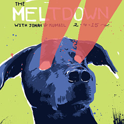 When the King of Comedy Posters Set His Surreal Sights on the World of Rock 'n' Roll
 How One Artist Makes New Art From Old Coloring Books and Found Photos
 Say Cheese! How Bad Photography Has Changed Our Definition of Good Pictures
 Middle Earthenware: One Family's Quest to Reclaim Its Place in British Pottery History
 Fancy Fowl: How an Evil Sea Captain and a Beloved Queen Made the World Crave KFC
Hi there. Nice article, but why do I not see any of Bonnie’s posters in the exhibit? She certainly deserves a place among the other artists. As Eric King once remarked: “If Bonnie had had a dick, it would have been the Big Six”. Thanks, Perry Bonnie’s section of the show had not been installed when I took these photos. – Ben
As usual, great job Ben! I would love to see you do an article on a similar subject – The Bindweed Press and Frank Westlake. The posters and handbills that he printed really set theses wheels in motion.
Ben – nice article, but you have failed to answer your own question, as posed in the title? What of the German printer at Cal Litho? And those others who produced the Avalon Ballroom posters? We know a lot about Bill Graham’s friend Mosgofian, but virtually nothing about any of the other printers.
I was partner with Jim Melvin at Melvin/Halton Typography at 9th & Howard.
We set type for Jerry Stratford and did the typography for biz card and stationery that Jerry designed for Levon. Most of the Graham posters were all art, but we set what type was required for many of them. Visited Levon with my sons on one occasion and he “visited” with them like a “loving favorite grandpa” explaining how posters were produced and then giving them some “samples”. I can imagine that Levon is in a great place now, and still playing poker on Saturday nights with his close friends.
I have a lithograph called Rainbow spacelight by Jurgen Peters. It says Tea Lautrec Litho, San Francisco on the bottom and Jurgen Peters 1981 on the bottom. Is this worth anything? It is framed in perfect condition.
In 1967-68-69 I worked above Tea Lautrec Litho at Precision Printing Plates.
I frequently stopped by the shared loading dock and would wander in to the press area. At Precision we made duplicate plates for advertising and originals for the corrugated industry. When I’d come in they would be printing or setting up. As they would register and get the ink right they would run sheets, adjust then punch the start run and throw out the adjusting sheets. I’d grab those full sheets, 10 tickets, 5 postcards and 2 posters take them up stairs and cut them on our paper cutters. Sold some tickets, kept some posters and some sheets with wash colors and finish.
Great memories. That really started my collection of posters.
When Denis and Seth closed out the Tea Lautrec shop on Sheridan, I bought that Chief 22 shown above. Great photo!
One thing about Bindweed Press, Frank Westlake didn’t just do offset printing. Some of his poster work was showcard-style letterpress from wood type and halftone photoengravings.
I found a numbered and signed Ken Perry work. (60/86 Iris in a jar) I came across info that said some of his work was printed at Tea Lautrec. Do you know if this is true? Yes, that is true! -Eds
Thank you for the generous article here. I know very little about the technical issues discussed here, but I sure have great fondness for the posters of the great era of San Francisco rock.
Sadly, Americans these days have overall reached a ditch when it comes to popular expression compared to then. And all the posters produced for centuries. I would not want to have to “explain” it to a lot of Americans these days. They simply don’t get it and what it represents for the respective communities.
Great article!
I was a friend of Rick Griffin’s in the eighties and I remember him talking fondly of going to the printer to collaborate on of all of his posters during the time when so many of his masterpieces of color and design were created. It’s nice to hear such a detailed history of at least one of the main men of whom he was speaking. Thanks so much for the story.
On a side note, I have the original art and the hand-cut color separations Rick did for a record project of mine and wonder if anyone on this thread is operating one of those kind of presses these days; maybe Eric Holub on the actual Chief 22? I’m planning on doing a re-issue of that project and would love to use Rick’s original separations to do it. Eric or anyone else interested?
Great article Ben!
Wonderful article! Does anyone know what became of Frank Westlake of Bindweed Press? I had read that he left San Francisco and moved to England where he printed variant copies of posters done previously under his Bindweed Press imprint. Did he remain in england
What is the link for this full article?
https://www.collectorsweekly.com/articles/was-levon-mosgofian-the-most-psychedelic-printer-in-rock/
Hi. I have a Tea Lautrec Litho numbered print (250/500) from an artist named Steven Cieply that depicts the historic City of Paris building, with “San Francisco” and “1896-1980” also printed on the artwork. I have not been able to find anything about this artist online, but I do know that the building was torn down for a Neiman Marcus department store in 1980 — and the “poster” nature of the art suggests it might have been a commissioned work for mass distribution. Do you have any idea where I might be able to find out more about this artwork? I acquired it while living in San Francisco in 1986. Thanks
There’s an exhibition about Tea Lautrec Litho in San Francisco right now through Nov 21, 2021. You might send them a note with a photo and ask them to forward it to Levon’s son, Denis. https://haightstreetart.org/blogs/news/grand-legacy