
For people who did not live in the United States during the 1930s and ’40s, the most familiar depictions of those decades come from two notoriously unreliable sources. First, there are the movies, in which Fred Astaire and Ginger Rogers, Humphrey Bogart and Lauren Bacall, and a scattering of Marx Brothers sing, dance, solve who-done-its, and make us laugh until our sides ache. Despite the inherent artificiality of Hollywood motion pictures of that era, especially during the 1930s, we can still glean what life must have been like by observing the details behind the coiffed and costumed stars—from the Art Deco furniture in a swanky New York City apartment (“Swing Time,” 1936) to the modest skyline of postwar San Francisco (“Dark Passage,” 1947).
The second unreliable sources are linen postcards, which were published in the hundreds of millions from 1931 to 1950 and offer an even more revealing glimpse of the United States during those years, even though the aesthetic of these mass-produced pieces of paper was in many respects more contrived than the celluloid fictions projected onto thousands of silver screens. The America depicted on linen postcards was just about always surreal in color and exaggerated in perspective. It didn’t matter if the subject was a natural wonder, a cityscape at night, the exterior of a hotel, the interior of a restaurant, or a hulking industrial facility. Linen postcards made everything look larger than life and, well, a bit tarted up, not unlike all those movie stars mugging for the camera beneath their thick layers of makeup.

Above: Curt Teich, circa 1899. Courtesy Lake County (IL) Discovery Museum, Curt Teich Postcard Archives. Top: Santa Fe’s Super Chief locomotive, 1940. Courtesy University of Texas Press.
Just as Hollywood used grease paint and scenery to goose reality, the linen postcard had its own bag of tricks, as Jeffrey L. Meikle explains in Postcard America: Curt Teich and the Imaging of a Nation, 1931-1950, published in 2016 by University of Texas Press. Meikle knows that to 21st-century eyes, the hyper-vivid appearance of linen postcards seems at once weird and quaint. Accordingly, he explains why this is so, revealing in the process, often in painstakingly technical detail, the secrets of the linen postcard.
To this end, Meikle focuses the bulk of Postcard America’s 520 pages on the so-called General Motors of the genre, Teich & Co., which published some 45,000 different linen-postcard subjects in the course of just two decades. At the head of this postcard colossus was a German immigrant named Curt Teich (pronounced ‘tike’), whose Chicago company benefitted greatly from the imagination and drive of an equally intriguing character named G.I. Pitchford, a Teich & Co. “sales agent” who sold Teich postcards to distributors throughout the western and southwestern United States.
There’s nothing in Curt Teich’s German childhood at the end of the 19th century to suggest a prescient predilection for hyperreal postcards. But Teich was able to ply his trade as a printer in the new world because he had been born into the family business in the old. After a falling-out with his printer father at the age of 18, Teich bought himself a one-way steerage ticket aboard a steamship bound to the United States, arriving in New York in 1895 without so much as a suitcase under his arm. Making his way to Chicago, where his older brother had settled a few years earlier, Teich opened his first print shop in 1898, coincidentally the same year the price of postage for mailing a postcard was set at a penny. At the time, letters sealed in envelopes cost two cents to send through the U.S. Mail, creating an instant market for this less-private mode of communication. Not coincidentally, perhaps, Teich soon decided to make his name in postcards.

Teich & Co. postcards lack the subtlety of postcards produced by Detroit Photographic Co., such as this quiet view of Charleston’s Magnolia gardens. Courtesy Marc Walter/Taschen.
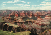
At the beginning of the 20th century, the most admired name in postcards was the Detroit Photographic Co., whose Phostint postcards were made using Swiss lithographer Hans Jacob Schmid’s Photochrom process to achieve their colorful effects. Many of the Phostints published by DPC were mechanically colorized versions of photographs shot by William Henry Jackson during 1870s geological surveys of the West, which made them perfect souvenirs for 20th-century railroad tourists visiting Fred Harvey restaurants and hotels at newly accessible destinations like the Grand Canyon. The sales through Harvey properties alone made DPC a postcard powerhouse in the century’s first decade, but World War I was not kind to the firm, and by 1924, the failing company’s inventory of some 40,000 negatives was sold off.
As it turns out, Detroit Photographic Co. had invested heavily in printing technologies and techniques that were about to become obsolete. Teich, arriving on the scene just a bit later, had not pursued the time-consuming and costly stone-lithography processes favored by DPC, leaving him open to the opportunity of high-speed, high-capacity, offset lithography, wherein machines inked paper via durable zinc plates rather than comparatively fragile stone ones. In 1910, the Walter Scott Company of Elizabeth, New Jersey, manufactured Teich’s first offset-printing machine, which Teich and his main pressman, Frank Hochegger, customized so it could be attached to a mechanical paper feeder.

Teich’s first offset press was made in 1910 by the Walter Scott Company. Courtesy Lake County (IL) Discovery Museum, Curt Teich Postcard Archives.
Having achieved speed and volume—the Scott press was large enough to handle sheets of paper holding up to 32 postcards at a time; subsequent presses would print sheets holding more than 100—Teich began to fine-tune the quality of the images themselves. One of his breakthroughs, achieved incrementally during the 1910s and ’20s, was to reduce the amount of black ink on his postcards. Black was the base color, Meikle writes, so using less of it opened up the image, “allowing more of its value to be carried by colors rather than shading.” The result was a brighter, more vibrant image, but Teich’s motivation to cut back on the black ink was not purely aesthetic; rather, he needed to trim every fraction of a second he could—wherever he could—in order to keep up with demand. As it turned out, all this mechanization was also profitable, making green one of the most important colors in the Teich linen-postcard rainbow.
By the late 1920s, Meikle told me when we spoke recently, Teich & Co. was “churning out cards that, at a glance, were similar in palette to those of the Detroit cards, but were obviously much more cheaply produced. If you look at the Teich cards closely, you can see they are not as convincing. A lot more effort went into the Detroit cards than the Teichs.”

This Teich postcard of Black Rock Beach on the Great Salt Lake used two source photos, one of the Utah destination itself and another of a row of bathing beauties taken at Miami Beach. Such collages were not uncommon at Teich. Courtesy University of Texas Press.
Replicating the soft, moody quality of DPC postcards, though, was not what Teich & Co. was after. In the Roaring Twenties, just about everything, postcards included, needed to be as flashy as the sequins on a flapper’s dress. Subtlety was for losers.
Sometime after 1927, Teich learned of a new ink from France that was being touted for its rich and brilliant hues. Teich & Co. cards already had a reputation for being bright and brassy. Could this new ink make them even more so?
Teich wouldn’t find out until after the stock market crash of 1929, which slowed orders to a trickle. Now Teich & Co. needed to give customers a new reason to part with a penny for its postcards. At first, Teich tried printing the new ink on the company’s regular postcard stock, but the colors soaked deep into the paper, leaving the image on the surface dull and faded. And so, as he had done numerous times before, Teich started tweaking, this time introducing a textured paper into the printing mix.

Teich sales agent G.I. Pitchford had this postcard-size color chart printed so his clients could choose the colors they wanted on a postcard the company was about to print for them. Courtesy Robert I. Pitchford.
“The idea,” Meikle writes in Postcard America, “was to create a greater surface area through miniscule ridges and valleys, and thus greater exposure to air after the ink’s transfer to the paper, thereby enabling faster drying.” The ridges and valleys were achieved by embossing the paper to give it texture. Simply put, more ink on the surface meant more color there, too.
Concurrently, Teich dialed back the amount of black ink used even more than he had in the 1910s and ’20s, making the vibrant colors of his new ink even more prominent. By 1931, he had his formula, which he introduced to the world as the “C. T. Art-Colortone,” the highfalutin name Teich trademarked for what most of us now know as the linen postcard.
In a happy bit of serendipity, the embossed and textured paper that had originally been employed to compensate for the high-absorption properties of a new type of ink had a corollary benefit—it resembled a painter’s canvas, giving each C. T. Art-Colortone postcard the feel of a 5½ by 3½ inch work of art. But fostering art appreciation, says Meikle, was probably not Teich’s intent.
“There’s really no way of knowing what went through people’s minds at Teich & Co. when they were developing this concept,” Meikle says. “I honestly don’t think they were aiming at the big aesthetic shift they almost immediately realized they had achieved. I think the motivation was economic.”

The retouching department at Teich & Co., circa 1930s. Courtesy Lake County (IL) Discovery Museum, Curt Teich Postcard Archives.
While the recipe of ink and paper had an enormous impact on the look of a finished C. T. Art-Colortone, these postcards became pocketsize masterpieces thanks to the work of 20 or so artists employed by Teich & Co. Based in Chicago, where they worked at rows of desks bathed in light from a wall of windows, these “retouchers” would use everything from mechanical airbrushes to precision sable-tipped brushes to clean up, color, and sharpen details on source photos that were often stupefyingly dull upon arrival.

G.I. Pitchford. Courtesy Robert I. Pitchford.
One of the steadiest suppliers of such source photos was G.I. Pitchford, a sales agent for Teich & Co. It was Pitchford’s job to sell postcards, a task he was, by all accounts, extraordinarily good at. For him, though, source photos, accompanied by detailed instructions for the retouchers, were an essential component of his success—Meikle estimates that perhaps half the cards produced for Pitchford’s territory were based on Pitchford-supplied source images. After all, as his region’s sole sales agent, traveling his vast territory by car, Pitchford had plenty of opportunities to pull over to the side of the road and snap of photo of a vista, building, or scene he thought—nay, knew—would make a profitable postcard.
In Postcard America, Meikle goes deep on this unsung hero of the Teich postcard empire, describing Pitchford’s stomping grounds, which included the West Coast from Washington down into Mexico, plus Idaho, Utah, Nevada, and Arizona; the California homes his high salary allowed him to purchase in tony San Marino and exclusive Lake Arrowhead; and his fondness for cameras. This last trait led to a steady stream of photographs bound for Chicago.

Source photo for Mt. Lemmon Road postcard by G.I. Pitchford. Courtesy Robert I. Pitchford.
One example of how Pitchford’s instinct for profit was combined with the artistry of the retouchers can be found in a 1940 postcard titled “Mt. Lemmon Road, near Tucson, Arizona.” Upon first glance, Pitchford’s black-and-white source photo, shot the same year the card was published, is unremarkable. In the foreground we see his 1940 Buick sedan parked next to a saguaro cactus, its needles glistening like a spiky halo in the southwestern sun. Ahead of the car, the road angles to the right before bending sharply to left, hugging the curving topography of an inclined ridge. And way off in the distance, in the upper-left corner of Pitchford’s picture, is Tucson, or so we are told in Meikle’s book—the city itself is impossible to see with the naked eye.
What Pitchford’s photograph lacks in technical prowess it makes up in composition, and that was all the retouchers in Chicago needed to produce a postcard worthy of the C. T. Art-Colortone trademark. Thus, the road in the final postcard is a deep rusty red, as were so many unpaved roads in the Southwest in those days, while the cactus-strewn hillside is ablaze in color, as if caught at peak bloom after a particularly wet winter. The “effect of the sun shining thru the needles,” as Pitchford had described the cactus in a note written on the frisket—the sheet of tracing paper protecting his photograph from damage—is preserved, just as the sales agent had specified.
Importantly, the retouchers did more than just follow orders. Pitchford’s Buick is now cropped at the car’s trunk, giving it the illusion of movement that the original photo lacks. As for the sky, alluring bands of orange and turquoise have replaced the gray haze of Pitchford’s black-and-white. The result is an obvious, fabulous fake, but definitely something you’d want to mail to a friend.

Final Mt. Lemmon Road postcard from 1940. Courtesy University of Texas Press.
Sometimes Pitchford’s source photos were built from multiple images collaged together to create something more. In fact, it was a Pitchford collage of at least seven images from various sources that led to one of Teich’s most famous postcards, also from 1940, of a Santa Fe Super Chief train chugging though a Southern California orange grove, a pair of snow-capped peaks in the background.
Contrasting the collage with the final postcard tells us a lot about how Pitchford and the retouchers in Chicago worked. To begin, we notice that Pitchford has flopped the main image of the train, so that it appears to be traveling from right to left. Flopping the image has flopped the lettering on the locomotive’s face, which means the backwards Santa Fe logo would have to be corrected by the retouchers. According to Meikle in Postcard America, Pitchford spelled this out explicitly on the frisket, but other suggestions such as “fix up the sky” showed the sales agent’s faith in his Chicago colleagues. Without being asked to, they also added a few oranges to the foreground of the trees, improving upon the original.

G.I. Pitchford used seven photos for the collage that would become the source for one of Teich & Co’s most popular postcards (see image at top). Courtesy University of Texas Press.
The reliance of Teich & Co. on people like Pitchford to provide source images is very different from the Detroit Photographic Co. model, in which the black-and-white photographs of highly accomplished photographers—and nothing less—were used as the sources for its Phostints. But just like DPC’s demise in 1924, Teich & Co. would get its comeuppance, too, by clinging to its C. T. Art-Colortone technology for just a little bit too long, allowing competitors such as Colourpicture and Dexter Press, both of whom had embraced Kodachrome color transparencies early, to take control of the postcard business once dominated by Teich.
Today, of course, hardly anyone buys postcards, unless they are a collector or have purchased a postcard for its nostalgia value. The cameras in our phones and services such as Instagram make it simple and cheap to send friends and loved ones the sorts of greetings that used to be scribbled on the backs of postcards.
“Postcards are basically dead,” Meikle agrees with an almost audible shrug. “I might get one or two a year, and I certainly don’t send them anymore. Cell phones and social media have finished, once and for all, the long process of postcards becoming defunct.” That’s not the sort of Hollywood ending we’ll look back upon one day with a great deal of fondness, but it’s the ending nonetheless.

Between 1920 and 1930, the number of passenger cars in the United States rose from 8 to 23 million, which may explain why so many postcards of roads were produced by Teich & Co. Courtesy University of Texas Press.
(To learn more about linen postcards, pick up a copy of Jeffrey Meikle’s Postcard America: Curt Teich and the Imaging of a Nation, 1931-1950 If you buy something through a link in this article, Collectors Weekly may get a share of the sale. Learn more.)
 Zen Nouveau: New Year's Greetings from Early 20th-Century Japan
 In Living Color: The Forgotten 19th-Century Photo Technology that Romanticized America
 Zen Nouveau: New Year's Greetings from Early 20th-Century Japan
 When Postcards Made Every Town Seem Glamorous, From Asbury Park to Zanesville
 Linen PostcardsLinen postcards were printed in the United States from the 1930s until the …
 PostcardsPostcards, sometimes spelled out in two words as "post cards," emerged duri…
 Mari Tepper: Laying it on the Line
 Nice Ice: Valerie Hammond on the Genteel Charm of Vintage Canadian Costume Jewelry
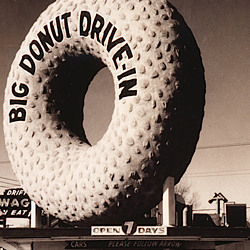 How Jim Heimann Got Crazy for California Architecture
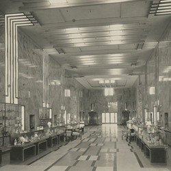 Modernist Man: Jock Peters May Be the Most Influential Architect You've Never Heard Of
 Meet Cute: Were Kokeshi Dolls the Models for Hello Kitty, Pokemon, and Be@rbrick?
 When the King of Comedy Posters Set His Surreal Sights on the World of Rock 'n' Roll
 How One Artist Makes New Art From Old Coloring Books and Found Photos
 Say Cheese! How Bad Photography Has Changed Our Definition of Good Pictures
 Middle Earthenware: One Family's Quest to Reclaim Its Place in British Pottery History
 Fancy Fowl: How an Evil Sea Captain and a Beloved Queen Made the World Crave KFC
The Santa Fe post card looks almost exactly like an earlier white border version of “The Golden State Limited” by M. Kashower out of Los Angeles with a steam locomotive on it.
I wonder if he borrowed ideas too?
In my family, we still send postcards!
While much less popular than they were in their heyday, they aren’t “dead” yet as a form of communication and remembrance.
Does anyone else collect automobile related postcards? I have accumulated about 60,000 of them in about fifty topics from advertising, arcade, bus, customs, dealerships, emergency vehicles, gas stations, greetings etc.
Thanks for sharing the gallery, it was nice collection and bring back memory.