
Randy Tuten’s poster for Led Zeppelin, April 24-27, 1969, Fillmore West and Winterland, was an update of an assignment for a class in college. Via Randy Tuten.
When the origin stories of San Francisco’s “Big Five” rock-poster artists of the 1960s are told, they usually include Wes Wilson’s epiphany upon seeing an exhibition of Viennese Secessionist posters, whose lettering style he would embrace as his own; Stanley Mouse and Alton Kelley’s appropriation of a 1913 illustration of a rose-crowned skeleton, which the duo repurposed for a Grateful Dead poster; the influence of Southern California surf and car culture on Rick Griffin; and the oft-repeated fact that Victor Moscoso was the only one of the bunch who had any formal art training, whose rules he systematically ignored.
“San Francisco was always in the back of my mind when I was living in Los Angeles.”
In contrast, Randy Tuten, one of San Francisco’s “Other Five”—a Grateful Dead-derived term I just coined for Tuten, Bonnie MacLean, Robert Fried, Lee Conklin, and David Singer—found his inspiration in beer bottles. “Beer-bottle labels had great graphics,” Tuten tells me, referring to the intricate lettering, decorative borders, and bold imagery on the paper labels glued to the sides of beer bottles during the pre- and post-Prohibition years. Tuten was also a fan of fruit-crate labels from the first half of the 20th century, monster-movie posters from the 1950s, and travel posters from the same era, particularly those promoting shipping lines and vacations to exotic, tropical isles. “Anything that looked good influenced me,” he says.
Pre-Prohibition beer-bottle labels and ’50s travel posters may seem worlds apart, but the aesthetics of all sorts of advertising art made their way into Tuten’s work. In particular, his posters for San Francisco rock promoter Bill Graham in the late 1960s were incredibly eclectic, featuring a sinking Titanic framed by turn-of-the-century revival-meeting lettering one week, a googly-eyed avocado the next.

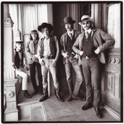
Tuten often paired vintage lettering styles with black-and-white photos. Left: Creedence Clearwater Revival, May 22-25, 1969, Fillmore West and Winterland. Right: The Band, April 17-19, 1969, Winterland. Via Randy Tuten.
Like a lot of artists, Tuten was one of those kids who was always drawing. As early as his years at Joseph Le Conte Junior High School in Los Angeles, and throughout his time at Hollywood High, Tuten would doodle lettering in other kids’ notebooks and on their binders. “I’d start with the name of the school,” he says, “and then elaborate on that.” This early focus on lettering and ornamentation would serve him well later in life, although it wasn’t like Tuten had a precocious sense of what he wanted to be when he grew up. “I never thought I would end up being an artist,” he says.

Randy Tuten, Hollywood High School yearbook photo, 1964.
More likely, Tuten found the time he spent lettering and absorbing the logic of the ornate flourishes of advertising art to be an escape from an unhappy home, where Tuten, an only child, did his best to stay out of the way of his alcoholic father, Harold. “I had very little to do with him,” he says of his dad. Tuten was closer to his mother, Shirley. “If my mother hadn’t gotten married, she probably would’ve been a bohemian beatnik artist.
“She always backed me up, 100 percent,” he adds. “I remember one time being called into the principal’s office. They were kicking me out of school, probably for cutting classes, but it could have been any number of things. So they called her in, and told her, ‘Randy has let the school down,’ and she said, ‘Well, I think the school has let Randy down.’ So, she encouraged me as much as she could, but eventually, she became an alcoholic, too, because he was an alcoholic.”

The Streamline Moderne architecture of Tuten’s high school may have left a subliminal impression on the young artist. Via The Living New Deal.
Amid all this, Tuten expanded his self-taught skill sets by gaining real-world experience. “In the early ’60s, when I was still at Hollywood High, and then into my time at Los Angeles Valley College, I got a job with a magazine publisher named Ed Schnepf, who ran Challenge Publications. He would eventually develop motorcycle magazines and titles like Air Classics and Sea Classics, which were all about airplanes and ships, but when I started working for him, he was doing girlie magazines. I used to do magazine layouts for him. I was also the guy who hand-painted panties and bras on the pictures of the women, because at the time you couldn’t show everything, or at least Ed didn’t think he could.”
Tuten’s years at Challenge would prove invaluable when he began designing posters for Bill Graham, whose printer was Levon Mosgofian of Tea Lautrec Litho. “I already knew some production techniques,” Tuten says, “so by the time I started doing posters for Bill and bringing my artwork to Levon to get them printed, my stuff was camera-ready.”
How Tuten got to San Francisco—the city where he was born before his family moved to Los Angeles—is another story, recounted in drug-soaked detail on his website. “I literally road tested the stuff after I picked it up in San Francisco,” Tuten writes of the acid trips he took while traveling between San Francisco and Los Angeles in and around 1967. “Hitchhiking back to LA in the middle of the night, I’d encounter all kinds of animals—bears, owls, wolverines, cows. At the time, I wasn’t sure if they were real or imagined.”

Tuten lived about five blocks from the Fillmore West, seen here about a year and a half after Tuten began designing posters for the venue’s promoter, Bill Graham.
“San Francisco was always in the back of my mind when I was living in Los Angeles,” Tuten tells me. “In ’67 and ’68, I used to go back and forth between the two cities a lot, either driving or hitchhiking. Finally, around the beginning of ’68, I moved back to San Francisco permanently.”
His first home was in his grandmother’s garage. “Her name was Pat Ward, my mother’s mother. She was a Republican, and one of those people who was very conservative and drank too much. I think it was only two or three months before I found my own place at 55 McCoppin Street, about five blocks from the Fillmore West.”
That turned out to be a prime location for Tuten because the posters created to advertise concerts at Bill Graham’s Fillmore West, as well as those at the Family Dog’s Avalon Ballroom a dozen or more blocks up Van Ness Avenue, were the reasons why Tuten had decided to finally leave L.A. and settle in San Francisco. Tuten was especially taken by the work of rock-poster artists Stanley Mouse, Alton Kelley, and Rick Griffin. “Mouse, Kelley, and Griffin influenced me a lot,” Tuten says. “I hadn’t thought of doing rock ‘n’ roll posters until I saw their work.”

Tuten designed this poster for a Canned Heat show at Winterland, presented by the Family Dog on October 31, 1968, but within a few months he’d be working for Bill Graham. Via Randy Tuten.
Because his rock-poster heroes were closely aligned with the Avalon, Tuten knocked on that venue’s door first. “I went there for a good year, probably half of ’67 and half of ’68,” Tuten recalls. “I’d show them my stuff, and they’d say, ‘Very nice, we’ll let you know.’ Every time I brought them new drawings, it would be the same thing: ‘Very nice, we’ll let you know.’ But they never let me know.”
For the record, Tuten did receive one poster assignment from the Family Dog at the end of 1968 for a Halloween show at Winterland featuring Canned Heat. But it was too little too late.
“I got so disgusted with them putting me off,” Tuten continues, “that I went to see Bill Graham. I just walked into the Fillmore West one day and made an appointment. When I met him a day or two later, within five minutes he’d hired me to do four posters.”
As Tuten remembers it, that first meeting, probably in November or December of 1968, was mostly talk rather than a dog and pony show like the one David Singer would experience in May of 1969. “Maybe I took him a drawing or something,” Tuten says, “but I really just wanted to talk with him first.”

Tuten’s earliest posters for Bill Graham revealed his fascination with modes of transportation, from ocean liners to trains. Left: Grateful Dead, January 2-4, 1969, Fillmore West. Right: The Jeff Beck Group, April 10-13, 1969, Fillmore West. Via Randy Tuten.
Surprisingly, the notoriously detail-oriented impresario didn’t give his new artist a lot of direction. Instead, trust would characterize Tuten’s working relationship with Graham for more than two decades.
“He’d give me a scribbled piece of paper with the acts on it,” Tuten says. “He wouldn’t say that the headliner lettering had to be at 100 percent or that the opener had to be at 50 percent, or any of the sort of specific direction common in the advertising world. He pretty much gave me free rein to do what I wanted. I’d show him a sketch and tell him what I was thinking about. Sometimes we’d elaborate on it together, but I’d say easily 95 percent of the time he accepted what I had in mind.”
Tuten’s first poster for Bill Graham advertised performances at the Fillmore West by the Grateful Dead, Blood Sweat & Tears, and Spirit on January 2, 3, and 4, 1969. The poster combined Tuten’s drawing skills (a red doorway; a black-and-white bus stop), his interest in collage (a photo of the RMS Queen Mary in dry dock looms over a picturesque bay), and his fondness for Rick Griffin’s lettering style.

Tuten designed all of the posters for Led Zeppelin concerts produced by Bill Graham. Left: Country Joe & the Fish, January 9-11, 1969, Fillmore West. Right: Led Zeppelin, November 6-8, 1969, Winterland. Via Randy Tuten.
The Queen Mary should have been a clue of things to come; subsequent posters from 1969 would feature trains, bridges, gears, and more ships. “I always had an affinity for ships and trains, buses and cars, pretty much anything mechanical,” he says. “I saw beauty in those things, even though they weren’t necessarily designed to be beautiful.”
A car would dominate Tuten’s second poster for Graham, which advertised three Fillmore West shows presented a week later, on January 9, 10, and 11. The opening act was Taj Mahal and the headliner was Country Joe and the Fish, but it is the second-bill act on Tuten’s second poster that makes it valuable—Led Zeppelin. Created in collaboration with his friend Bill Bostedt, a.k.a. Daddy Bread, and featuring a photograph of the chrome grille on a 1946 Lincoln taken by a friend of Daddy Bread’s named Peter Pynchon, the poster is famous for memorializing Led Zeppelin’s first show in San Francisco, as well as a rare example of the band getting anything other than top billing.
“When I started working for Bill Graham,” Tuten says, “I learned pretty quickly that the band names were more important than the artwork. If I did a nice piece, that was all fine and dandy, but it was the band name that made the poster collectible.” In fact, Tuten designed a lot of Led Zeppelin posters that have since become quite collectible. “Rick Griffin ended up doing most of the Jimi Hendrix posters for Bill,” he says. “I ended up doing all of the Led Zeppelin posters. It wasn’t planned that way. It was just an accident.”

For the first printing (left) of this Janis Joplin poster, March 20-23, 1969, Fillmore West and Winterland, the printer forgot to print the yellow. The second printing (right) shows the poster as Tuten designed it. The photo of Joplin is by Jim Marshall. Via Randy Tuten.
Another such accident a few months later is dated April 23 through 27, when Led Zeppelin headlined two weekend-night shows at a spacious old ice arena called Winterland, as well as a pair of weeknight appearances at the cozier Fillmore West. For this landmark run—the encore for the Winterland show on April 26 treated fans to the first live performance of the band’s future smash hit “Whole Lotta Love”—Tuten updated a poster he’d designed for a class in college.

The college class project that inspired Tuten’s famous Led Zeppelin poster.
For that assignment, Tuten and his classmates had been asked to create a menu for a fictitious restaurant; Tuten had named his Avocado Club. On the menu’s cover, he positioned a photograph of an avocado, goofily adorned with a pair of googly eyes, below the restaurant’s name, which he spelled out in an arc of fat, blocky letters. Tuten’s poster for Led Zeppelin was almost identical, save the deeper green color of the background, a new Peter Pynchon photograph of a new avocado, and a few rows of lettering at the bottom listing supporting acts and show dates.
What Led Zeppelin thought of Tuten’s avocado poster is anybody’s guess, but the band’s lead singer, Robert Plant, reportedly used the poster as a good-natured punchline in 2008 during an impromptu visit to the original Fillmore Auditorium, which, it must be noted, Led Zeppelin never played. Standing in the venue’s legendary poster room, gazing up at Tuten’s avocado poster, Plant wondered aloud, in mock complaint, why all the other bands that played the Fillmore got amazing psychedelic rock posters for their shows, ‘but all we got was a fucking avocado!’

Tuten was occasionally given photographs of performers to incorporate in his posters. The Rolling Stones photo was shot by Ron Rafaelli, but the name of the David Bowie photographer is not known. Left: Rolling Stones, November 9, 1969, Oakland Coliseum. Right: David Bowie, October 27-28, 1972, Winterland. Via Randy Tuten.
Tuten’s third Led Zeppelin poster for Graham may be his most collected. Featuring a black-and-white photo of a blimp in a blood-red aircraft hangar, the poster advertises three more 1969 shows, all at Winterland, on November 6, 7, and 8. Opening acts were supposed to be the Bonzo Dog Band and Roland Kirk, but after the poster had been printed, the Bonzo Dog Band canceled, replaced by Isaac Hayes, while Roland Kirk only played the first night. Also noteworthy is the fact that November 7 was the U.S. release date of “Whole Lotta Love” as a single.
All of these elements—Tuten’s strong imagery choices and compositions, the details about the shows themselves—certainly contribute to the poster’s value, but the collectibility of the poster may also be due to Tuten’s hand-lettering at the bottom, which simply notes that the Rolling Stones would be playing the Oakland Coliseum on November 9. Posters with the words “Led Zeppelin” and “Rolling Stones” on them are as scarce as they come; this may be the only one.

The poster on the left was mistakenly printed in magenta instead of red. Photo by Peter Pynchon. The Doors poster is one of two by Tuten to use the same PR shot of the band. Left: Mike Bloomfield & Friends, February 6-9, 1969, Fillmore West. Right: The Doors, July 25, 1969, Cow Palace. Via Randy Tuten.
Tuten designed the poster for that Stones show, too; it’s dominated by a photograph of the band posing in a London alley for rock photographer Ron Rafaelli. That particular photograph had been supplied to Tuten by Graham, but other Tuten posters incorporating portraits used everything from standard publicity shots of performers to photographs taken by Peter Pynchon. One such poster was for a show featuring Mike Bloomfield and Friends, The Byrds (post-David Crosby, pre-Gram Parsons), and a blues group called Pacific Gas & Electric. For that poster, Pynchon took a photograph of a Berkeley poet named Marina, who would become Tuten collaborator Daddy Bread’s first wife.
“That horrible pink poster came about when I told the printer I wanted it to be red,” Tuten says. “Red is made up of magenta, a certain amount of yellow, and a little bit of black. Well, when I said ‘red’ to the printer, for some reason he took it to mean ‘magenta,’ and magenta, I’m sorry to say, is just pink.”

Information sheets from 1971 (left) and 1973 (right). Via Randy Tuten.
A poster for The Band’s first live appearance as something other than a backup combo for Ronnie Hawkins or Bob Dylan turned out much better. Its top half is filled with black-and-white publicity photos of the quintet’s members, whose faces hover above bold red letters that appear to be bursting forth from the center of the composition, with yellow-filled perspective lines added to give the lettering weight and dimension. Other Tuten posters to make good use of photographic portraits include a pair of Doors posters half a year apart, each of which used the same publicity photo. In the fall of ’69, Tuten created a rare horizontal poster for Crosby, Stills, Nash, and Young, consisting of a row of PR shots of each band member, as if their faces were splashed across a billboard (that metaphor was a Bill Graham suggestion). And a post-Big Brother and the Holding Company poster for a Janis Joplin show at Winterland combined Tuten’s Rick Griffin-style lettering with a Jim Marshall photograph.
By 1970, with David Singer getting an increasing share of the poster assignments from Bill Graham, Tuten needed another steady gig. He found a new stream of work, if not a lot of money, by designing a string of one- and two-color posters and handbills for the Family Dog, which had given up the Avalon Ballroom at the corner of Van Ness and Sutter for a less expensive venue at a run-down amusement park called Playland-at-the-Beach; the decrepit, beloved landmark would be torn down in 1972. Tuten’s work for Family Dog on the Great Highway, as the former arcade for slot-car enthusiasts was known, is heavy on hand lettering, vintage photos of ocean liners, locomotives, and fighter jets, and both vintage and contemporary portraits, including another photograph of Daddy Bread’s future first wife.

Left: Country Joe & the Fish, March 13-15, 1970, Family Dog on the Great Highway. Right: Youngbloods, March 27-29, 1970, Family Dog on the Great Highway. Via Randy Tuten.
Around the same time, Tuten expanded his client list beyond San Francisco by creating posters for a music hall in Marin County called the Euphoria, the Selland Arena in Fresno, California, and a handful of venues from Portland to San Diego. Meanwhile, back in San Francisco, Tuten returned to doing work for shows at Winterland, although initially not for Bill Graham.
“Paul Baratta, who had been Bill Graham’s right-hand man, broke away from Bill in 1970 to produce shows at Winterland,” Tuten tells me. “He had struck a deal with Kodak to supply photographs for posters, so I was hired to do the lettering, leaving blank spaces in the design for the Kodak photos. I never knew in advance which photos they were going to use,” he adds. “Some of the final posters I liked, some of them I thought were just terrible. But, you know, when you’re an artist, actor, or anything on the creative side of things, sometimes you’re just happy to have the work.”

In 1970, Tuten began doing posters for clients other than Bill Graham. Left: Ike & Tina Turner, June 27, 1970, Euphoria. Right: Chambers Brothers, November 27-28, 1970, Winterland. Via Randy Tuten.
More work arrived in 1971 from Bill Graham. Posters, of course, but also a text-only information sheet listing a couple weeks of shows starring John Mayall, J. Geils Band, Johnny Winter, Dave Mason, Chicago, and Grand Funk Railroad. Venues included the Fillmore West, of course, but also Winterland (whose lease Graham had reclaimed from Baratta) and the San Francisco Civic Auditorium, a historic 1915 venue that now bears Bill Graham’s name.

This information sheet was the first poster produced after the closing of the Fillmore West in July 1971. Via Randy Tuten.
After the Fillmore West closed on the 4th of July, 1971, Tuten continued to produce information sheets in various sizes for Graham. As records of the enormous diversity and quality of acts that were coming through San Francisco in the early 1970s, they’re startling documents. Consider one poster (also printed in smaller sizes for use as a postcard and a handbill) listing all the Bill Graham-produced shows in the San Francisco Bay Area between September 13 and December 13, 1971. Headliners ranged from Led Zeppelin to the Allman Brothers, Black Sabbath to Alice Cooper, Gordon Lightfoot to Donovan. Reading Tuten’s chunky black lettering, we learn that Pink Floyd played Winterland in mid-October, The Who were big enough to fill the Civic Auditorium two nights in a row a couple of months later, and if you wanted to see “Jesus Christ Superstar” at the Oakland Coliseum, Graham would be happy to sell you a ticket to that, too.
For Tuten, the lettering work he did for Graham in the early 1970s, as well as for clubs like the Keystone Korner in Berkeley, was good work as opposed to a come-down from designing posters with color and imagery. “Lettering was what I liked to do,” he says. “When I was decorating binders and notebooks in high school, sometimes I’d put little drawings in there, but it was all about the lettering. I enjoyed doing that in the early days. I still do.”

In the mid-1970s, Tuten collaborated with Stanley Mouse and Alton Kelley on posters for the Rolling Stones, July 15-16, 1975, and Wings, June 13-14, 1976. All shows were at the Cow Palace. Via Randy Tuten.
The 1970s also brought Tuten a number of “traditional,” if that’s even the right word, poster opportunities, allowing him to collaborate with two of his rock-poster idols. The first of these was his 1975 poster with Alton Kelley and Stanley Mouse for a pair of Rolling Stones shows at the Cow Palace, a 16,000-plus capacity arena just south of San Francisco that Graham used for big acts such as Donovan, The Doors, Eric Clapton, and The Who. A year later, Tuten collaborated again with Kelley and Mouse on a poster for Wings, Paul McCartney’s post-Beatles band, again at the Cow Palace.
For Tuten, the collaborative process for these posters was pretty simple. “I’d go up and visit Kelley and hang out with him for the evening,” he says. “We’d drink some wine, smoke a little pot, and get in a groove. Then we’d talk about what we wanted to do, all the while making little drawings and sketches of what it might possibly look like.” Eventually, tasks would be divvied up and camera-ready artwork would find its way to Tea Lautrec Litho.
Tuten’s best-known posters of the 1970s were also born of collaboration, this time with his longtime friend Daddy Bread. Both were designed in 1977 for shows at the Oakland Coliseum, where Graham produced his popular Day on the Green concerts (yes, Tuten did most of the posters for those shows, too). The first was for Pink Floyd on May 9 and 10. Riffing on the cover of the band’s latest album, “Animals,” Tuten imagined a giant inflatable pig floating above the clouds, the towers of the Golden Gate Bridge poking through the fog in the distance. For Tuten, the poster’s destination-oriented design was an homage of sorts to the postwar travel posters he so loved.

Tuten’s most collected collaborations with Daddy Bread may be these two posters from 1977 for Pink Floyd, May 9-10, and Led Zeppelin, July 23-24. All shows were at the Oakland Coliseum. Via Randy Tuten.
The other famous poster from 1977 was for—you may have already guessed it—a pair of Led Zeppelin shows, on July 23 and 24. Designed and painted with Daddy Bread, it depicted an enormous retro-futuristic dirigible hovering over a stark, science-fiction streetscape, a red planet aglow in the star-filled background.
In retrospect, it’s tempting to see the black blimp as a manifestation of the arrests, injuries, and all-around negative energy that characterized Led Zeppelin’s last tour of the United States. Tuten couldn’t have predicted any of that, nor the specific incident in Oakland on July 23, when three members of the band’s entourage, including their manager, as well as the band’s drummer in a separate incident, beat up a member of Graham’s staff so badly that he had to be hospitalized. Graham waited until the band completed its show the following day before having the four served with assault charges—they eventually pleaded no contest. After the show on July 24, though, things got even darker when singer Robert Plant got word that his 5-year-old son had died suddenly of a random illness. The rest of the tour was promptly cancelled.

Randy Tuten, 1985, at an exhibition of rock posters at Ben Friedman’s gallery in San Francisco. Photo by Roger Wyan.
Tuten would have his own serious medical crisis not too many years later. “In the ’70s,” he begins, “probably from ’74 on, I was doing a lot of cocaine. By the time I had my stroke in 1984, I was kind of getting off the cocaine thing, but I had been doing other drugs and drinking a lot. I never smoked cigarettes, so I had that going for me. Having a stroke,” he adds, “was kind of like getting really high, except you went further out and lost all consciousness.”
In a weird way, the stroke may have saved Tuten’s life. “I guess you could put it that way,” Tuten allows, “although I don’t think of it like that.” What definitely aided his recovery was the support he received from his friends, including Rick Griffin, who visited Tuten at St. Helena Hospital in the Napa Valley—Tuten was there for more than a month—and suggested they work together at Griffin’s studio in Southern California once he was able.

After recovering from a stroke, Tuten worked with Rick Griffin on a poster for the South Bay Surf Band Reunion, October 25, 1986, Alpine Village Clubhouse. Via Randy Tuten.
Tuten wouldn’t recover enough to take a bite of that carrot until 1986. “The first thing we did together,” Tuten recalls of his collaborations with Griffin at the artist’s studio in Santa Ana, “was a poster and handbill for a surf band reunion. It was just a little Griffin drawing of a surfer with lettering above and below, and only one color. Then we did the cover for Jefferson Airplane’s “2400 Fulton Street” album, which was very colorful. And we collaborated on a R.E.M. poster for a show in Memphis.”
Through these collaborations, which sound more intense than his laid-back brainstorming sessions with Alton Kelley, and less organic than his work with his old pal Daddy Bread, Tuten learned how different the artistic process can be. “When Rick designed posters, he had to know what was going to be in each corner of the poster before he could start,” Tuten tells me. “We would have these big arguments. I’d say, ‘Between the two of us, if we can’t figure out what to do when we get to the bottom of the poster, we probably shouldn’t be doing this.’ But Rick needed to know in advance exactly where and what everything was going to be. The thing is,” Tuten adds, “when you work through a design, you always think of other stuff to do, so in the end, the design changes anyway.”

After Bill Graham, his girlfriend, Melissa Gold, and their helicopter pilot, Steve Kahn, were killed in a crash, Tuten was asked to create a poster for the show to honor their memories. Laughter, Love & Music, November 3, 1991, The Polo Fields. Via Randy Tuten.
After the death of Bill Graham in 1991, Tuten continued to design scores of posters for Bill Graham Presents, which was producing shows at the original Fillmore Auditorium, The Warfield, and Shoreline Amphitheatre. Gems from this period include his 1994 poster for Johnny Cash and his Boz Scaggs triptych from 1997. In one case, Tuten dusted off a rejected design he’d made in the late 1960s for the Avalon Ballroom and turned it into a Country Joe & the Fish poster. In another, he repurposed a design from the late 1970s that had been intended for a Barbra Streisand poster (Graham never secured the diva’s booking) for a performance by Pete Townshend of The Who.
“I had kept the design around,” Tuten says, “so when they asked me to do a Pete Townshend poster, I thought it would work perfectly. Whit Clinton did a really nice drawing of Townshend in a black suit for that poster, but when I showed the design to the folks at Bill Graham Presents, they said, ‘Can we put him in a gold suit?’ I said, ‘Well, he’s not really Elvis. He’s more like England’s Bob Dylan.’ So, I pushed to keep it conservative.”

Believe it or not, this poster had originally been designed for Barbra Streisand. Whit Clinton did the drawing of Pete Townshend, April 30, 1996, The Fillmore. Via Randy Tuten.
Tuten had long-since learned to push back when given feedback he didn’t agree with. “I never had a problem with anyone saying anything to me about a design,” he says. “If it was a good idea, I was all for it. But if it made the piece look stupid, then I would say something. A lot of times,” he confesses, “clients would tell me exactly what they wanted. I would go home and try to do whatever it was they had suggested, but I could see that it was going to look terrible—that it was a bad idea and a bad design. So, more than often than not, I’d just do something that I thought looked good. And when I delivered the work, the client would usually say, ‘Wow, it’s just what we had in mind, thank you!’ Most of the time, it wasn’t even close to what they’d had in mind, but it was good, so they liked it.”

Tuten says the name of the headliner on this triptych should be read like “Bond, James Bond.” Boz Scaggs, October 3-17, 1997, The Fillmore. Via Randy Tuten.
In 1998, Daddy Bread passed away, and by 2000, Tuten had started working on a computer, making him a relative latecomer to digital technology. “The triptych for Boz Scaggs and all those posters I did in the 1990s, they were all airbrushed and painted. It was an intense and incredible pain in the ass, but the posters looked great. Some of my later stuff, after 2003 or so, was all colorized on the computer. But here’s the thing about doing jobs on a computer: They’ve got to be designed off the computer, with your hands, on a drawing board using paper and pencil. Then you can scan the design into the computer and finish it there. The computer sees things the human eye can’t,” he adds. “If you were to take some of my older posters and scan them into a computer, it would look like a gorilla did it. Also, nowadays, you can change everything so easily, it’s just ridiculous. The higher-ups who have hired you end up second-guessing you all the time because they know they can.”

Left: Johnny Cash, September 26, 1994, The Fillmore. Right: Jackie Greene, March 21, 2009, The Catalyst. Via Randy Tuten.
Fifty years later, Tuten is still striving to make a poster that’s immune from second-guessing, that prompts the same sort of honest, agenda-less responses as the ones he earned from his classmates, whose notebooks and binders he’d fill with lettering and doodles back when he was a kid growing up in L.A. Today, for Tuten, those classmates have become legions of music fans, not just of Led Zeppelin, the Rolling Stones, the Grateful Dead, or any of the hundreds of other bands whose names grace Tuten’s posters, but of Tuten’s posters themselves.
“That’s why I’m still doing this,” Tuten says. “Every week, I get emails from people saying, ‘We’ve admired your work for years, thank you very much.’ Sometimes, when I’m working at 3 or 4 in the morning on a poster and wondering what the hell I’m doing, it dawns on me that I’m at least making some people happy on some level. That’s why I still kill myself over every job.”

 Hippies, Guns, and LSD: The San Francisco Rock Band That Was Too Wild For the Sixties
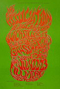
 How a Small-Town Navy Vet Created Rock's Most Iconic Surrealist Posters
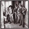 Hippies, Guns, and LSD: The San Francisco Rock Band That Was Too Wild For the Sixties
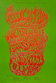 Psychedelic Poster Pioneer Wes Wilson on The Beatles, Doors, and Bill Graham
 Music and Concert PostersFor jazz fans, a poster of Chet Baker almost seems to come with its own sou…
 Mari Tepper: Laying it on the Line
 Nice Ice: Valerie Hammond on the Genteel Charm of Vintage Canadian Costume Jewelry
 How Jim Heimann Got Crazy for California Architecture
 Modernist Man: Jock Peters May Be the Most Influential Architect You've Never Heard Of
 Meet Cute: Were Kokeshi Dolls the Models for Hello Kitty, Pokemon, and Be@rbrick?
 When the King of Comedy Posters Set His Surreal Sights on the World of Rock 'n' Roll
 How One Artist Makes New Art From Old Coloring Books and Found Photos
 Say Cheese! How Bad Photography Has Changed Our Definition of Good Pictures
 Middle Earthenware: One Family's Quest to Reclaim Its Place in British Pottery History
 Fancy Fowl: How an Evil Sea Captain and a Beloved Queen Made the World Crave KFC
Great article! I wish I’d had this for reference for my book “Dreams Unreal: the genesis of the psychedelic rock poster”, released last January by UNM Press.
Truly beautiful art and a great story… Thank you for sharing!! ????