
Close your eyes and run your fingertips gently across the surface of a screenprint, and you can feel the layers of ink squeegeed there. Hold the sheet up to the light and look at it horizontally, and you can actually see those layers, rising and falling like pancaked mesas and valleys in some sort of psychedelic Southwest. That’s what people mean when they say screenprints are tactile, when they wax poetic about the medium’s dimensionality, when they talk about its smell.
“Scantily clad women and rock posters will always be a winning combination.”
Smell? “I’ve had this discussion many times with many different artists and collectors,” says artist and screenprinter Jeff Wood, who’s created countless limited-edition, rock-‘n’-roll screenprints for Widespread Panic, the Allman Brothers, Umphrey’s McGee, and numerous other bands. “Everybody knows when they’ve opened one of my poster tubes because I use UV inks, which have a very distinct smell compared to water-based or solvent-based inks.” To borrow a line from a song by the jam-band Phish, each ink, you might say, has its own olfactory hue.
This month, a gorgeous new book called Poster Children explores the world of rock posters, if not their smells, by following the evolution of Athens, Georgia, band Widespread Panic’s rock posters over the past 25 years, from the cheap photocopies stapled to telephone poles in the dead of night to the handmade screenprints that routinely spark bidding wars on eBay. Along with those of Phish, Dave Matthews, and Pearl Jam, Widespread Panic’s posters are among the most sought after on the scene today, thanks in no small part to its stellar stable of artists, whose ranks include Wood, Chuck Sperry, Marq Spusta, and Emek.

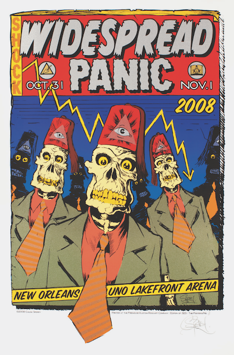
Top: Jeff Wood’s cover for “Poster Children” will be released as a limited-edition screenprint. Above: Marq Spusta’s poster for Panic’s Halloween 2010 run in New Orleans.
In fact, “Poster Children” is more than just a handsome record of one band’s extraordinary rock-poster output (400 images are reproduced in the book). It’s also an instructive case study of the rock-poster world, chronicling not only the art form’s evolution from photocopies in the ’80s to offsets in the ’90s to the screenprints of the past decade, but also the two dominant aesthetics of screenprinted posters, illustration and graphic art. Thumb its pages and you can see the differences at a glance, as well as the nuances within each. Illustrations, at least in the world of Widespread Panic, can range from dense and meticulous compositions of unicorn skulls or wooly mammoths to playful riffs on comic-book art. Screenprints that are described as graphic can take their inspiration from Saul Bass movie posters, a New York City subway map, or even mid-20th-century Modernist art.
Obviously rock-concert posters predate Widespread Panic. Most people associate them with the 1960s, when music promoters, particularly in San Francisco and Detroit, produced offset lithographs for shows at such venerable venues as the Fillmore, the Avalon, Winterland, and the Grande Ballroom.
In many ways, the poster art of that era was an extension of album art, which has been a visual expression of music since at least the 1950s, when the graphic-rich album covers created by Blue Note and other labels seemed to echo the cool, edgy sounds of the music pressed into the vinyl disc inside. Similarly, album art for rock bands in the 1960s was meant to send a signal to fans, like a secret handshake for those in the know (if you didn’t think Martin Sharp’s trippy album cover for Cream’s “Disraeli Gears” was cool, you probably weren’t going to dig the band’s music). Posters frequently did the same thing, even if their often-indecipherable lettering gave show promoters fits (unlike the screenprints of today, which are considered commemorative pieces since they are sold at the event, concert posters in the ’60s were intended as advertising to get people to the show).

Chuck Sperry’s screenprint for Widespread Panic’s spring 2013 tour is one of his and the band’s most widely collected posters.
Most of today’s screenprint artists see themselves as a part of this visual continuum. For some, the connection to 1960s offsets goes even deeper. “When Rick Griffin was producing his work in the ’60s,” says Wood of the late universally acclaimed master of the psychedelic rock poster, “he was doing a four-color process by hand-cutting his plates right off his ink drawings. They’d burn the printing plates from his hand-cut stencils, which makes it a rudimentary form of screenprinting, except it was done on a litho press. Of course, the final posters didn’t feel the same—they were flat, and the inks were litho inks—but it was essentially the same technique. I think that’s one of my attractions to Rick’s work, knowing that he was basically separating an image into layers in the same way I do for a screenprint.”
Often imprecisely called silkscreens, screenprints began to gain ground on offsets in the 1980s and ’90s, when artists like Art Chantry, Frank Kozik, COOP, Mark Arminski, Mike King, Gary Houston, and Emek began screenprinting limited-edition posters for bands such as Nirvana, Pearl Jam, Soundgarden, the Flaming Lips, and Phish. By the end of the 1990s, with the exception of Pearl Jam, the jam-bands had become the biggest champions of rock posters, and within the last decade, as can be seen in “Poster Children,” the screenprint has become the big dog of the rock-poster world.
Not coincidentally, the late-’80s rise of the screenprinted rock poster occurred at the same time as the shift from LPs to CDs, which squeezed artwork designed for 12-inch album covers onto 5-inch CD cases. Similarly, the recent explosion of the screenprint has coincided with the loss of even that small bit of real estate. Now that music is measured in megabytes and downloaded to devices that fit in our pockets, the rock poster has become one of the last ways for bands to represent themselves and their music visually.

Emek’s first Panic poster, released in 2002 for the band’s show in Los Angeles, was printed in a run of 132, plus more than a dozen variants on different colors of paper.
Screenprints have the additional luster of being an old-school printing technique, whose labor-intensive process and handmade nature gives the medium an artisanal aura. According to artist Chuck Sperry, the appeal of a screenprint is similar to that of a small-batch brewery. “In the restaurant world,” he says, “there’s this huge movement toward artisanal products, food that is organic, handmade, small-batch, limited. Everything in today’s world is getting unified into these monolithic distribution networks, except for the areas where human hands are still important. A screenprint is a small scale hand-produced thing.”
“The rock poster has become one of the last ways for bands to represent themselves and their music visually.”
Rock-poster collectors can generally find hand-produced screenprints at the concerts of bands who make it a practice to tour regularly, even when it’s not in support of a new album. In turn, the sheer volume of concerts collectively performed by these bands has afforded greater numbers of artists than ever the opportunity to hone their craft. Nor are they just pulling enough screenprints for a given show. By agreement with the bands that commission their designs, most artists reserve a portion of their posters for themselves to sell directly to collectors at poster events and online. Screenprint collectors are especially keen for the variant versions of a show’s poster, available in boutique quantities ranging from the single digits to the teens. In hindsight, it seems obvious that the limited-edition screenprint poster would become the crown jewel of the concert merch table, and that the artists who designed them would eventually be able to earn a decent living by selling their best stuff to their best customers.

Panic bassist Dave Schools did the band’s art in the early days. This flyer is from 1986.
The Panic poster program has been a key contributor to this ecosystem of music fans, artists, and collectors, but naturally it had far humbler beginnings, starting with the scruffiest of all rock-poster formats, the 8 1/2-by-11-inch photocopy.
Widespread Panic co-founder and bassist Dave Schools remembers well those ancient evenings when he used to create the artwork himself for many of his band’s early flyers, “obviously,” he says with a laugh, remarking on his artistic talents. “The mid-’80s was the height of the DIY era,” he recalls. “You went to Kinko’s in the middle of the night when your buddy was working and ran off 150 free handbills and stuck them up all over town, usually in the shadows, trying not to get caught.” Later, like other bands, Panic would rely on promoters to produce the posters to get the word out about their shows. “To see how far posters have come since then, and how celebrated they are now, has been quite a journey for me.”
Poster artist J.T. Lucchesi, whose work could be described as big-impact illustration, has shared much of that journey, beginning his almost 25-year relationship with the band as a fan. “My first Widespread Panic show was in Atlanta in 1990,” he recalls. “I had to get my dad to get me in because they were playing bars at the time and I was under age.” By 1992, when he and an equally enterprising friend were already running their own T-shirt print shop, Lucchesi began following the band around, selling unlicensed Widespread Panic-inspired shirts in the parking lot to fellow fans before and after the show. “We would give the band and their crew like two dozen of our shirts,” he says, “so we kind of got on good terms with them.”

Over the years, promoters produced their own Panic posters, such as this one by Matt Runt for a gig at The Warfield in San Francisco.
Meanwhile, the band was noticing that its fans were increasingly interested in the posters created for its shows. “When we started playing shows at the Warfield in San Francisco,” says Schools of Panic’s shows there in 1996 and 1997, “Bill Graham’s people would pass out these posters for free to the crowd after the shows. We’d be like, ‘Why is everybody leaving so quickly at the end of the last song?’ And then we realized it was because that’s when they were giving away the posters in front of the theater.”
Around the same time, in the late 1990s, a friend of Lucchesi’s, a fellow parking-lot vendor and T-shirt printer named Greg Hewlett, approached the band’s management company, Brown Cat, to see if he and Lucchesi could print and design a poster for the band, which was already starting to do more of its own work rather than relying on promoters to do it for them. The timing was right. “Panic was totally into it,” Lucchesi says.
According to Lucchesi, Hewlett converted a T-shirt press into one that would print posters, and they were off to the races. “We were kind of doing it as a lark, just to get free tickets and work for a band we liked,” Lucchesi remembers. “It was a side project, really, because we both had our own T-shirt printing companies. But as we did more work for them, the relationship built.” In addition to designing posters, Lucchesi ended up working for the band for three years as an in-house artist “doing T-shirt designs, web art, stuff like that.” After taking a break for a few years, coinciding with the birth of his son, in 2007 Lucchesi made a press for himself in his garage, and has been designing and printing a few posters a year for the band ever since. So far in 2013, Lucchesi has created four.

J.T. Lucchesi’s made his first poster for the band in 1998. It sold for $15 and was printed in a run of 200. Today you’d be lucky to find copy for under $250.
Jeff Coriell, who has seen about 200 Panic shows since 1992 and has collected perhaps 150 Panic posters, remembers Lucchesi’s early work. “I didn’t buy a lot of the ones he did back then,” Coriell says. “I preferred the fan art in the parking lot over the official posters. Now, though, as I’ve become a collector, I’ve come to appreciate J.T.’s older work a lot more than I did at the time, and often I’m trying to find posters of his for shows I attended.”
That can be an expensive undertaking. For example, according the ExpressoBeans.com, which is the go-to website for rock posters, that first J.T. Lucchesi screenprint sold at the venue (the Lakewood Amphitheater in Atlanta) for just $15. It was printed on thick poster stock in an edition of 200. Since then, copies have averaged above $250, and in the past six months the average price has topped $300. Those numbers reflect the activity of buyers and sellers, mostly on eBay, but Lucchesi likes to keep things in perspective.
“I’m not as big as guys like Jeff Wood,” he says. “And I’m sure there are some people who hear that I’m doing a poster for a show and go, ‘Oh god, where’s the Emek, where’s the Sperry, where’s the Spusta?’ But everybody likes different things. From a collector’s point of view, I like the variety. For the band, I think it’s better for them to use as many different artists for their posters as they can because, you know, a lot of different people like a lot of different styles.”

In 2005, Grammy Award-winning designer Chris Bilheimer was brought in to give Panic posters a more graphic look.
Widespread Panic, whose nightly set lists are as unique as their posters, took that advice to heart. Jeff Wood designed his first Panic poster for a promoter in 2000, while his first official posters for the band came in 2002 (two of the four posters he helped produce that year were collaborations with artist Jeral Tidwell). That was also the year Emek joined the Panic family, which by then included such illustration-leaning artists as Billy Perkins, Charlie Hardwick, and Haywood Thomas.
After the band’s 2004 hiatus, though, the illustration aesthetic was dumped when Grammy Award-winning designer Chris Bilheimer (he was R.E.M.’s art director and has designed every Green Day album cover since “Nimrod”) was brought into the Panic fold to give the band’s poster program a cleaner, more graphic look. For many Panic poster fans, the years that followed were long ones.
“They wanted a change,” says Bilheimer, “so I started hiring poster artists I liked. They were more from the indie rock-poster scene than the jam-band scene, people like The Heads of State and Jeff Kleinsmith, who’s the art director for Sub Pop Records. It didn’t really work,” Bilheimer concludes.

In 2005, Bilheimer began to hire designers such as The Heads of State to create Panic posters. The result was often a shock to fans who had come to expect illustration-driven designs.
“The poster business is a strange animal,” says Wood, who has been friends with Bilheimer for years, is a longtime admirer of his work, and was one of the artists whose illustration-rich work temporarily fell out of favor. “There are designers like Kleinsmith and Bilheimer who are very graphic-oriented, and then there are the people who are good at illustration. Well, the Panic fans weren’t very receptive to a lot of the graphic stuff. They were beautiful, absolutely gorgeous posters, but certain bands lend themselves to certain looks. With Panic, the fan base just loved the heavily illustrated work.”
Fortunately for Wood, he was too busy to give the changes at Panic much thought. “I was doing a lot of my own stuff for Phish, Gov’t Mule, and the Allman Brothers,” Wood says, “plus I was printing the majority of Chris’s designs for Panic. For a while, I had about four employees working at the studio—a couple people printing, a couple people handling the shipping. It was more of a full-blown printing operation back then. Now I’m a one-man show.”
Panic’s Dave Schools is also a defender of the years when illustration took a back seat to graphics. “Chris has done some amazing pieces,” Schools says flatly. “There’s one he did of the Washington Monument, which he turned into a broken sword, with the hilt buried underground. Sometimes he runs into a little resistance from the kids, but I think he nails it. A lot of things that we in the band like might not necessarily fit the mold of what our overall fan base likes,” he adds. “There’s no accounting for taste.”

This Bilheimer image from 2007 is one of bassist Dave Schools’s favorites.
For his part, Bilheimer is philosophical about the tastes of the concert-going public. “I’m pretty isolated and don’t get a whole lot of feedback,” he says, “so I really don’t know. But yeah, I’ve definitely noticed that there’s been a shift towards more highly illustrative, dense images. The truth is I was surprised that Panic fans liked my simple graphic stuff in the first place. I never felt like what I did totally fit in, but I’ve been enjoying watching it shift and change.” Today, Bilheimer continues to design posters for Widespread Panic (“I’ve probably done 60 or 70 total,” he says), and he designed “Poster Children,” which features a cover by Jeff Wood.
“Frankly, posters are kind of a pain in the ass.”
In 2007, Panic’s graphic-art experiment ended, and Wood was invited to design a poster for a show in Raleigh, North Carolina. But the poster he created the following year for a concert at Red Rocks in Morrison, Colorado, is considered his breakthrough. “After that, they started asking me to do more designs,” he says, “and that was the beginning of the neo-tribal look I do for them now.” That was also the year illustrator and comic-book artist Matt Leunig did his first Panic poster, and in 2008, illustration came on even stronger, thanks to contributions from Marq Spusta and Chuck Sperry, both of whose careers have risen since they hitched their wagons to Widespread Panic’s star.
Of the two, Spusta’s success with Panic fans is probably more surprising. His style is not as muscular as Wood’s or Sperry’s, his imagery not as littered with skeletons as Emek’s. Instead, Spusta excels at sweetly weird, mutant creatures populating fantasy landscapes, as if lifted from the sorts of children’s storybooks one might imagine LSD guru Timothy Leary would have read to his children. For Schools, that first Spusta poster has remained a favorite. “It was like ‘Mary Had a Little Lamb’ as a shepherdess, and the lambs are flying up in the air, their eyes all crazy. I really liked that one.”
Chuck Sperry’s first Widespread Panic poster was a commentary on the 2008 stock-market-created recession.
That was in April of 2008. By Halloween, Spusta had created two more posters for the band. Chuck Sperry’s first Panic screenprint was for the Halloween show itself, an overtly political portrait of the Wall Street monsters whose greed had pushed the nation into its worst economic crisis since the Great Depression. For that poster, Sperry conjured a group of skeletal “Voodoo Masonic Zombies,” as he calls them, leering from the cover of a comic book, a plunging stock-market graph behind them.
Sperry was also in charge of what remains Panic’s largest run of screenprints, a 2,000-edition, seven-color, 17-by-29 inch poster for the fall 2011 tour, whose image was inspired by a Widespread Panic-performed song called “Geraldine & The Honey Bee.” For Sperry, the logistics on that one remain fresh.
“It was one color a day for a week,” Sperry remembers. “I have four racks, each of which holds 200 posters. We’d fill those things like three times a day. It was ridiculous.” Just chasing down the raw materials for a job of that scale was a challenge. “I went through 4 1/2 gallons of silver metallic ink alone, which was just one of seven colors. It was like a Toyota pickup truck full of ink. And then there was the paper: My suppliers were going, ‘Dude, what are you making?’ The paper stack was chest-high. But I got to do this really cool thing with the bee’s wings,” he adds. “After I printed the black, I laid down a clear gloss that had pearl essence and iridescent pigment in it, so that it really looked like an insect wing. It came out rad.”

Brad Klausen, who is probably best known for his work for Pearl Jam, created this Panic poster for the band’s 2009-2010 New Year’s Eve shows.
Today, within and even outside Panic-poster circles, Sperry is probably best known for the series of four female muses he created for the band from 2009 to 2011, each one representing a different season. In 2013, Sperry also designed two Panic posters based on a female figure called “Thalia,” whom Sperry has also screened as a fine-art print.
“Chuck’s ladies are amazing,” says Schools. “There’s a New Year’s Eve one he did that’s just outrageous.” A lot of other poster collectors appear to agree. “The prices on some of his posters are crazy. A complete set of the Sperry ‘season’ ladies from a few years ago goes for a couple thousand dollars,” Schools marvels, and that’s just for a set of all four posters from the regular editions, whose runs ranged from 325 to 625 signed-and-numbered copies. If you want a complete set of all the variants, of which there are a dozen or more and whose editions run as small as three, well, you could be looking at five figures, if you even managed to track them all down.
In part, the allure is due to Sperry’s growing reputation as an artist, although scantily clad women and rock posters will always be a winning combination. But the current appeal of Sperry’s work also lies in the nature of screenprints themselves, which invite us to reach out and touch them, to get close enough to tell whether the ink is UV, water-based, or solvent—close enough, even, to sense the artist’s soul.

Fans thought this May 2010 Jeff Wood poster was a commentary on the BP oil spill that had begun the month before, but Wood actually drew his design before the spill, making it an eerily prescient image.
“I spend a lot of time standing at that press, touching those posters, working them over,” says Wood. “There’s nobody in the studio but me. So I think some of my energy is transmuted into each sheet of paper. There’s a piece of me in every one of these posters that go out. It’s much more like a painting than a four-color print that just goes through a press running a million miles an hour and pops out the other end.”
Rock-‘n’-roll screenprints also exemplify the special relationship bands like Widespread Panic, Phish, Dave Matthews, and Pearl Jam have with their fans.
“These bands have whole communities following them,” says Spusta. “They’re seeing 10 or more Widespread shows on a single tour, traveling around and having an experience with their friends. Since each show is a little different with a unique set list, the poster helps define that memory for people.”
“Music is very personal,” agrees Emek. “The experience the fans share, the tribal-gathering aspect, the energy between the audience and the band: It’s all much more than just a commercial venture.”

A.J. Masthay is one of the few so-called “parking-lot” artists to make the jump to the official merch table. This linocut is from 2010.
“Bands like Wilco and artists like Jack White who produce tons of posters,” says Bilheimer, “do it because they’re dedicated to the art form and love posters as much as the collectors. You don’t make a ton of money on posters because they’re limited editions. With T-shirts, if they sell out you just make more. Unlike T-shirts, posters are easily damaged when you are out on tour. Frankly, posters are kind of a pain in the ass. So I don’t think bands do posters out of a mercenary commercial interest. I think they’re dedicated to the form.”
Sperry also believes screenprints are more appealing to bands that are hands-on versus those that leave everything to promoters and managers. “I’m noticing a trend lately,” he says, “with bands like Edward Sharpe and Cake. I’m starting to work more closely with the musicians. It’s a do-it-yourself attitude. I mean, look at what Pearl Jam went through with Ticketmaster, where they just went, ‘You know what? We’re going to do all this ourselves.’ I think Widespread Panic and a lot of other bands have the same impulse to run their own show.”
And for bands that want to do posters right, part of the bargain is the willingness to sign off on concepts, and then basically get the hell out of the way.

Emek’s screenprint for the band’s all-acoustic Wood Tour.
“I’m more excited to draw when a band just lets me do my thing,” says Emek. “With Widespread Panic, they’ll just throw something out there, like ‘This is our Wood Tour,’ or, ‘We’re playing Red Rocks. When you hear that, what comes to mind?’ And then they let me run with it. So they give me very general input, but it’s enough for me to just come up with whatever I want to, and then I get excited to draw it.”
“We used to be a lot more involved in the process,” Schools admits, “until we realized we were just too many cooks. Now, sometimes a design will slip through the vetting process, or maybe an artist just misses and it’s not a popular poster. Maybe the graphic sensibility didn’t appeal to the demographic that night, who knows? But in the end, it’s better to just let the artists have their freedom. As a musician, God knows I don’t want anyone telling me how to do my thing.”


 The Storybook-Psychedelic Rock Posters of Marq Spusta
 Good, Clean Fun: This Rock Star Parties Hard (with Hot Wheels and Wacky Packs)
 The Storybook-Psychedelic Rock Posters of Marq Spusta
 Was Levon Mosgofian of Tea Lautrec Litho the Most Psychedelic Printer in Rock?
 Posters and PrintsPosters and prints enjoy a number of obvious similarities. For example, bot…
 Mari Tepper: Laying it on the Line
 Nice Ice: Valerie Hammond on the Genteel Charm of Vintage Canadian Costume Jewelry
 How Jim Heimann Got Crazy for California Architecture
 Modernist Man: Jock Peters May Be the Most Influential Architect You've Never Heard Of
 Meet Cute: Were Kokeshi Dolls the Models for Hello Kitty, Pokemon, and Be@rbrick?
 When the King of Comedy Posters Set His Surreal Sights on the World of Rock 'n' Roll
 How One Artist Makes New Art From Old Coloring Books and Found Photos
 Say Cheese! How Bad Photography Has Changed Our Definition of Good Pictures
 Middle Earthenware: One Family's Quest to Reclaim Its Place in British Pottery History
 Fancy Fowl: How an Evil Sea Captain and a Beloved Queen Made the World Crave KFC
Here’s my favorite WP print!
http://www.toddslater.net/detail/Prints/widespread-panic/
Very nice and informative article. Can’t wait to see the book
Thank you
Eye opening history lesson!
Widespread has always been an innovator in promotion. In the summer of 1989 when the band was virtually unknown outside of their home base in Athens, Ga., they played regularly at the Old Post Office bar on Hilton Head Island, S.C. The band distributed button pins that said simply, “PANIC.” The button garnered the interest of the island’s summer college crowd and a following of fans from 30 or more colleges was forged.
Galerie F in Chicago is devoted to the art of screenprints/gig posters, they’re an awesome source to browse. http://www.galerief.com/
How did the editor miss the first / original poster artist for Panic? Flournoy Holmes did at least ten covers for them and a countless number of posters over the years. Check out his web site here- http://www.flournoyholmes.com
This is where it all started for Panic in regards to their visual image.
Great collection! Here are some of our favorites
http://www.creativepile.com/2012/07/27/emek-concert-poster-designs/