


Posted 4 years ago
 scottvez
(977 items)
All images used for research/ educational purposes.
I posted this a few times and it was deleted.
While the product MAY be harrach, I see some glaring differences that would have to be explained:
"Some observations/ comparisons in the photos and line art:
In both your photo #1 and the catalog page of #3, the top connection of the handle is on the top section of the pitcher. In the line art the top of the handle is very clearly shown attached to the middle section of the pitcher.
Additionally-- a question on photo #4. First and fourth items in the photo show the decor applied with a "barber pole" orientation. Are there examples shown in the Harrach book with the decor applied straight (parallel to the base) as shown on the pitcher in photo #1? I do see the two tumblers with a slight barber pole application."
Any thoughts? Again, it MAY be harrach, but no valid case was made in the posting.
See my follow up comment in order to access the "live example" photograph and understand numbering of the above jpgs.


Original posting is available here:
https://www.collectorsweekly.com/stories/283083-move-over-phoenix-theres-a-new-harrach?in=activity
scott
Not harrasment nor trying to be unpleasant-- just asking questions about what can be observed in the photographs.
Actually the funniest aspect of the posting is that someone would deride empirical research ("certain methods of empirical research simply do not add up") and then in the SAME posting employ empirical research/ observations that simply do not add up!
scott
My observations and questions were also deleted and referred to as harassment; a cheeky game; boorish argumentative toxicity, a rant, a complaint…. I contend that my comments were on-topic, respectful, and were well within the forums guidelines….. In light of being repeatedly deleted, I will comment here.
My deleted comments only addressed questions and observations regarding the posted claims. I would also be remiss if I did not point out that the poster in question enthusiastically decries empirical research relating to Welz as nonsense, yet it seems it can be employed to further her own opinions…. Poorly I might add.... An Interesting position to take.
My position is not that the set is not Harrach, nor is my position that the set is Phoenix. My position is that the evidence presented to make the claim of Harrach simply does not effectively support that claim with robust evidence. There are too many questions that remain when looking at the images.
In relationship to the line art being used to claim the production is Harrach and not Phoenix, I observed the following points:
Where the pitcher appears to have a lobed body, the line art only seems to portray a flat paneled body and not lobed. It is my experience that if the line art represented a lobed body, the line where the top and sides/bottom region of the pitcher merge would reflect those curves necessary to accurately reflect that design feature. What I observe in that line art is a drawing which seems to reflect a paneled pitcher, but not one with lobed sides. At a minimum, I would be of the opinion that much more evidence would be necessary to declare the pitcher in question to be Harrach based on the Harrach archive drawing.
I questioned whether this was taken into consideration, or was the variation simply discounted as inconvenient? The other position could be that Harrach simply did not produce accurate line art, but my experience with their production and their line art, is that would not be an accurate position to take.
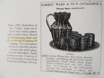
The image of the pitcher set in the other post, can be compared to line art of the same set in a Montgomery Ward catalog. In this case, the line art shows the lobed exterior quite clearly. I would be quite surprised if the Harrach design books did not show lobed features on a pitcher clearly. It can be done with a simple slightly curved line.
In this linked image, we see the pitcher set, the wards ad, and the Harrach line art. I believe that a leap to declare the pitcher to be Harrach is not supportable, based on this evidence. These being the only images available, the proportions of the pieces in the images are different enough that it would certainly require substantially more information before declaring the pitcher to be the same as the line art by Harrach, while being able to support that claim with strong empirical evidence.
http://www.kralik-glass.com/CW/PitcherComparison.jpg
I also asked if there are additional products shown in Montgomery Ward catalogs which can be shown to be Harrach in origin, or if this set is the lone example. The OP refused to answer that question, and simply deleted it.
I also agree with the observation that the handle attachment point is different in the Harrach line art than it is in the ad and the actual glass.
In this last linked image, I have taken one section of the line art of the pitcher depoicting what I see as a “Panel”, and modified it to add the type of slightly curved line we would typically see repeated in these types of drawings, to indicate that the body of the object has a lobed exteriors I do not think this glaring difference in the line art can simply be ignored to declare a match. The left side of the image is modified, the right side is not.
http://www.kralik-glass.com/CW/HarrachLineArt.jpg
Empirical research can be painstaking work, and these types of simple observations are important things to pay attention to if using the methodology to make attributions. They may seem minor to some, but they are not. They are the difference between presenting supportable and robust work, and making unsupportable claims.
Thanks, appreciate the additional observations/ analysis of the glass.
Agree empirical research can be painstaking work.
Details matter: SAME and SIMILAR have far different meanings when it comes to supportable attributions.
As this example illustrates: quick, superficial analysis leads to more questions than answers and questionable attributions.
scott
I would also add that in the Harrach volume being used, the colors of Burgundy and/or Oxblood are not mentioned as the colors available for Missouri. The colors mentioned are Rosa, Violett, and Aquamarin (pink, violet, and light blue). In order to attribute the Oxblood color to the Missouri line in light of the color not being mentioned, I would think that at a minimum, one would need to find a known Harrach shape in the decor in the Oxblood color. To assume that it is theirs because it resembles it, but is in a different color is not research.... it is wishful thinking....
Again, I am not commenting on whether the maker is Harrach or Phoenix. I am simply commenting that the methodology being used and claimed to be empirical research (the thing that is being claimed that Phoenix author did incorrectly) is lacking in what has been done to support the argument.
In the case of empirical research, the supporting evidence has to be substantially greater than normal to insure the claim is correct. Even with that work, there is always a possibility of a mistake. I do not see that level of work here at all. I see a myriad of unanswered questions and discounted observations.... The line art from Harrach being the largest Achilles heel.
Showing the pitcher in a recognizable Harrach decor...... That would be a good place to start..... Or showing the Oxblood version of the decor on a known Harrach shape..... That would be a good step also. Comparing the pitcher to a line art drawing it does not match well, and then claiming that the decor is being seen in a color not mentioned by Harrach, and not shown in the book being referenced is not really compelling evidence.... A book I would mention, that is a reasonably comprehensive compilation of Harrach knowledge.
In spite of claims in this forum to the contrary, if this were about Welz, the work to attribute it to them would be substantially more comprehensive than this, and questions and observations would not be deleted and avoided..... or written off as the rantings of someone who is doing it to simply be unpleasant.
Disagreement is only unpleasant to those who can't, or do not want to, support their own opinions. Questioning informatioin is what people that want to learn actually do.... Don't tell me you are right.... Show me why you are right..... I say it over and over and over and over again in this forum, and have for many years now.
Most do, and some others just act like it is an insulting imposition.....
Thanks for looking artfoot, vetraio and fort.
scott
Thanks much vinyl and valentino!
scott