Since the early 1990s, Portland artist and graphic designer Gary Houston has been hand-pulling screen-printed concert posters for everyone from David Byrne and Patti Smith to Willie Nelson and Wilco. In this interview, Houston explains the sources of his images, the techniques he uses to create them, and how the content of his posters often relates to the attitudes and approaches of the musicians and bands he depicts. For more information about Houston’s posters, visit voodoocatbox.com.
My dad liked Charlie Russell, the Western artist, so we had a few of his prints around the house. I always drew, even as a little kid, and I remember enjoying the way Charlie Russell signed his name next to that little buffalo skull. I don’t know if that made a heavy-duty impression on my work, but I know I liked it.

He was also a member of a barbershop quartet, which I always thought was as hokey as can be. I was pretty young then, and I found that early rock ’n’ roll stuff, like the Everly Brothers, kind of boring. What lit my fire, though, was when I heard the Beatles. It was probably in the fourth grade. That was it. Then the Rolling Stones hit: I liked them because they were dirtier, nastier.
By the time I was in junior high, the whole psychedelic thing was happening. I remember sitting in my bedroom in Wichita, looking at pictures of Grace Slick in “Life” or “The Saturday Evening Post.” They would do little articles on the San Francisco scene and I just fell in love with all the images, with the Art Nouveau quality of the posters, the reverse curves, the colors, all that stuff.
I eventually made some music posters in Wichita, and then a few more when I lived in Kansas City, mostly because I just enjoyed doing it. They were usually 11-by-17-inch one-color flyers that were printed at the local copy center and then posted on a telephone pole.
After I’d been in Portland, Oregon, a while, I kind of got back into it. An artist named Mike King and I were monkeying around with his images—taking an 11-by-17-inch flyer, expanding it into four or five colors, enlarging it, and then printing it as a limited edition.
From 1988-on, I had a design studio with a couple of other partners. We did a lot of screen printing for things like trade shows, the Oregon Museum of Science and Industry, the Oregon Historical Society, a lot of walk-the-line stuff. For example, we would screen print “you-are-here” signs—things that were kind of artistic, but not really artistic.

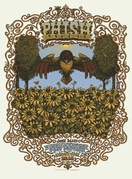
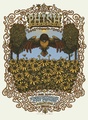
Houston has produced almost a dozen different posters for Wilco.
Posters were a way to be a little bit more creative. I’d always been a music junkie, so doing music posters just seemed like a natural. The psychedelic stuff from the 1960s was long gone but punk rock had kept posters viable. It wasn’t the same thing, but they were still amazing. I still have Gang of Four posters and things like that in my flat files from those days.
I’ve always listened to jazz. I’ve always listened to blues. I’ve always listened to punk rock and rock ’n’ roll. To me it’s all rock ’n’ roll, or rhythm and blues, or whatever you want to call it. I don’t draw a lot of distinctions. To me, it’s all the music of America.
For example, the Grateful Dead were a psychedelic band, but they were also cosmic cowboys. They stepped onto and off of different plateaus because that was all part of who they were. That’s one of the things I like about being American. We’ve got all of these ingredients. We can listen to something and say, “That comes from New Orleans, this comes from Bakersfield, this is the sound of Akron or Seattle.” But it’s all pretty much rock ’n’ roll, if that makes sense.
Collectors Weekly: How important is it for you to like the music of a band or a musician that you’re creating a poster for?
Houston: It’s very important because to me it has to come from the heart. So let’s say, hypothetically, if I want to do a poster for—just picking a name at random—Elton John. Not going to happen. If it’s someone like, say, John Doe of X, I’ll jump on the John Doe but I could care less about Elton John. Of course, that’s just me.
Obviously turning down work doesn’t pay the bills, and I’m trying to be a little less egotistical about things at this point in my life because I think a lot of music definitely has merit, even if maybe it doesn’t have merit for me. I’m not trying to speak for all poster artists, but I need to have some affinity for the music made by the person or band I’m trying to portray.
Collectors Weekly: As a viewer, can you appreciate a music poster if you don’t care for the musician?

One of Houston's favorite pieces by a fellow artist is this Jewel poster by Alexandra Fischer.
Houston: Oh, yes. What always blows me away is when people only buy posters of musicians they like or shows they’ve been to. To me, that’s like requiring a painting to be in a certain color and a certain size because it’s got to fit behind the couch. If I really like something and it speaks to me on a myriad of levels, what difference does it make? Maybe it’s going to force me to go out and listen to something that maybe I’m not hip to. It’s all about looking at something and being completely knocked out.
Case in point: Alex Fischer’s Jewel poster, the one that Chuck Sperry printed. That’s an amazing piece. Am I a big Jewel fan? She’s okay. Do I like that poster? Yes, it’s remarkable. Am I stoked that I have a copy of it? Yes, I am, because it’s so beautiful. When I first saw it, I just felt like, well, there are times when I look at stuff and just get weak in the knees. That’s one of those pieces where the craftsmanship is there, and it’s such a beautiful piece. I had to have one of those. Alex nailed it, amazingly.
Collectors Weekly: You’ve mentioned screen-printing a few times, but what other techniques do you use to create your work?

Scratch work gives a poster the feeling of a woodblock print.
Houston: Well, I basically use four different techniques. I do a lot of scratch work, which is like making a drawing except it’s on a piece of scratch board, a clay-based illustration board with black on top of it. When you draw on scratch board you’re taking away rather than adding. I tend to start with my lightest areas and then work from there. The thing I like about it is that they’re small, so I can drag them around with me, at home or wherever. When they get enlarged, they take on that woodblock or linoleum block kind of feel.
I’ll also ink things, which still entails actual drawing. There are other times when I’ll just do a drawing and enlarge it to the size I want and then put it on a light table and cut everything out of Rubylith film, which is what I use for my color sets. But I’ll do all my line art by cutting. And if you want a reference, go online and look at, say, Los Lobos #4. All of that is hand-cut except for two small lines of type. I think there were seven hits of color on that one.
Sometimes I’ll take my Rubylith and use it like a frisket, using an airbrush to do splatter so I can make blends—not like a split fountain but more from a mechanical standpoint. I’m putting visual information on what will be used as the film, so when I burn my screens I’ve got those positive and negative areas where ink can pass through.
Collectors Weekly: I’m guessing there’s a Photoshop step at some point?
Houston: Yes, but I’m too stupid to know about that part of it, so I give it to my studio assistant, Hailey Poyser, and she takes it from there. Hailey does all my computer stuff, so she’s my saving grace.
Collectors Weekly: You’ve mentioned scratch board, drawing, and Rubylith. What’s the fourth technique?
 is based on a World War I image (right).")
Houston's poster for Massive Attack (left) is based on a World War I image (right).
Houston: If I’m in a pinch, I’ll take, say, an image from a Dover book, one where there aren’t any copyrights, and I’ll just play with that. There’s a great little book from like the 1530s by Hans Holbein the Younger called “Dance of Death.” Its imagery has to do with the idea that no one’s exempt from death, and there are times when I’m like, “Okay, we’ll just enlarge this image and go from there,” which is really down and dirty. It’s not like I want to boast about that because we’re just kind of stealing.
On the other hand, sometimes the images are just so strong. Like the recent Massive Attack poster. It has a real emotional quality to it. I’d seen the source image from World War I for years and thought, “Whoa, I need to cut that out at some point, use it for something.” I liked the fact that the last Massive Attack record was titled “Heligoland,” which is an island in the North Sea off Germany that was utilized in World War I and World War II.
So that one seemed to make sense. Their record dealt with a place associated with World War I, and the image was from the same era. I added the dove. The question for the viewer is, which is the attack? Is the dove the attack or are the bayonets the attack? There’s a certain amount of ambiguity about that one that I kind of enjoy.
Collectors Weekly: How did you get into Pacific Northwest Native-American imagery?

Native-American imagery is a favorite of Houston's, as seen in this poster for Bob Weir's band, Ratdog.
Houston: Well, when I lived in the Midwest and did drawings and fine art, I appropriated a lot of Plains Indian imagery in my work. There’s a wonderful naïve quality to that work. When I moved out here and began looking at the Northwest Coast stuff, it was like getting hit with a sledgehammer. It’s so graphic, with this very exacting symmetry, but at the same time it’s abstract. And I love the fact that the Northwest Coast artists are woodcarvers, printmakers, and jewelers. They’re working in both two and three dimensions. It just blew my socks off.
I like the idea that in the Southwest, Coyote was the trickster and did all this stuff for the people. Along the Northwest Coast, it was Raven who played that role, bringing sunlight to the people, putting the stars in the sky. I enjoy the whole storytelling aspect of it.
I like all the symbols in Northwest Coast art, too. I’ve always used religious and Native American symbols in my work. Rick Griffin used symbols to shock, but I think in this day and age, it takes a lot to shock people. So I don’t use symbols for their shock value. I just think there are symbols that we all are so in tune with. When it comes to symbols, I don’t think I’ve created any of my own. Mostly I just steal.
Collectors Weekly: Your work is often quite humorous, too. For example, where did that Blasters poster come from?
Houston: Well, I read “Mad” magazine as a kid, but that poster was a joke for the band’s manager. Remember Rick Griffin’s poster that he did for the English band Man, with Alfred E. Neuman on it? Well, that was the same guy who was managing the Blasters. So I did a Spy vs. Spy poster for the Blasters kind of as a joke. I don’t know if he even noticed, to tell you the truth. I thoroughly enjoyed it, though. If no one else got it, I’m fine with that.
Collectors Weekly: How did the Portland Waterfront Blues Festival posters come about?
Houston: Up until 2001, when we were asked to do it the first time, different people had been producing the poster. The event is kind of a community affair, and the big ad agency here in town, Wieden+Kennedy, had done it for like three years. To me the blues are nasty, they’re gritty, but they’re full of redemption and all of this other stuff. I wanted to bring some of that into the imagery, so the first one had Robert Johnson, the devil, and the crossroads—the classic blues creation myth.

This 2001 image for Portland's Waterfront Blues Festival depicts Robert Johnson's fabled meeting with the devil at the crossroads.
When we were asked to do the poster again the following year, I thought, “Well, let’s continue on with this little narrative.” By year four, it struck me that, “Okay, just because you sell your soul to the devil doesn’t necessarily mean it’s a done deal.” So in 2004, Robert’s floating in between angels and demons. So he’s like in purgatory, but instead of playing his guitar, he’s cradling it. I’m working on my sketches for this year, 2011, and I’m revisiting the crossroads. So I’m kind of coming back around to that because I like the mythology, the mystical qualities—the hoodoo or whatever you want to call it.
Funny story: That first year, they gave us a booth to sell my stuff. I remember these two women coming up to the booth, and they were kind of indignant and snippety about the fact that there was a devil in the poster. They said, “There’s a devil in this poster, and we don’t think that’s just kosher, but we’ll take two.”
I enjoy it when people get a little up in arms. Most artists, I think, want to elicit some kind of response. Obviously we want people to like what we do, but it’s okay if they don’t. The part that’s really sad is when people are indifferent. I would rather have somebody read me the riot act than to just walk by and say, “Oh, okay, whatever.” When you’ve touched a nerve with people, that’s great. It’s okay for them to jump up and down and get all bent out of shape and pissed off, and it’s good for the artist to hear it.
Collectors Weekly: When do you decide to make a portrait?

Some posters, such as this one for a Jakob Dylan concert, are like portraits.
Houston: Sometimes it’s a fallback position, but other times it just seems like the way to go. When I was asked to do Jakob Dylan, I just saw it my head. I wanted him to be large, and for the guitar to be almost there but not totally there. Same thing with that Jorma Kaukonen piece.
One of the posters I’m still stoked about is the last Steve Earle piece. I love that one. Like many of the portraits, it’s a scratch-board piece. Working on the scratch board produces a very elastic quality, like painting. It’s all about the gratification of line.
The thing I like about the Steve Earle is that it’s just this slash and burn. I was looking at different pictures of Earle and thought, “He looks so much like a street person.” I really wanted that part of his persona to be conveyed.
For Earle, it’s all about the music. He’s not going to go out on stage in a sequined Nudie suit. He’s going to go out in a T-shirt, a pair of boots, a pair of jeans, and that’s all that it’s about.
Collectors Weekly: Where did the red, white, and blue come from for Patti Smith?

Patti Smith is an American voice for peace, so Houston's poster for one of her shows reflects that.
Houston: Well, I definitely wanted to put an upside-down American flag on there. In her hand, if you look, there’s Islamic calligraphy for “There’s one God but God,” and she’s also got a dove. That’s a piece where everything is hand-cut from Rubylith and then hit with airbrush speckle and whatnot. I kind of wanted to make a political statement, but at the same time I’m not trying to speak for her.
She has always, to a certain degree, been a voice of discontent. So I didn’t think she would get upset if we put an upside-down American flag, a signal of distress, on her poster. And yes, I think we’re in distress. If I can’t say we’re in distress, then what good are all our freedoms?
There’s a whole legacy attached to making posters, a history going back to the W.P.A. era and way beyond, that’s more than, “Oh, dude, I get to make a Ween poster.” To a certain degree, big deal, you know what I mean? It’s okay that we get to do this, but it’s also okay to get something in there to make people think about the fact that there are people in need.
Maybe I’m a little bit on my high horse, but if we’re going to do this, it carries some responsibility with it. I have no problem making something for somebody to sell at a merch table, but at the same time maybe we can also get people to think about other things.
Collectors Weekly: Would you say you have a political or social agenda?

Everyone loves Ringo!
Houston: No, not really. Take the poster of Ringo. That’s a very cheerful kind of image because he strikes me as a very cheerful kind of guy. In the Beatles, he was really overlooked compared to the other folks in that band. It just struck me as he probably developed this wicked sense of humor that just won’t quit. He probably has no financial worries, whatsoever, so he works for peace. And I’ve always loved his drumming.
So with Ringo, the idea was to just put a big smile on his face and have him flash the peace sign, which he always does. It’s nothing earth shattering or anything like that. But it just seemed to fit who he is.
Similarly, the Flatlanders poster happened after I saw something on Oregon Public Broadcasting. I can’t remember the name of the photographer, but he would do all of these panned shots of landscapes—very, very wide. I saw that and thought, “That’s a Flatlanders poster.”
To me, that was a no-brainer. Being from the Midwest, even back when I was in sculpture classes and stuff, we would have shows where we were all referred to as flatlanders. There’s a certain amount of pride associated being from that flatland kind of landscape.
People always say Montana is Big Sky Country. I don’t know. It seems to me that Kansas is really Big Sky Country, where you can look off to the horizon to forever and see storm clouds coming or whatever. People say, “I drove across Kansas and it was so flat and I was so bored.” But I look at that same landscape and think it’s so beautiful.
Collectors Weekly: Who are some of the poster artists who’ve influenced you the most?
Houston: Well, Rick Griffin is still a hero. I always enjoyed Alton Kelley for his sense of humor and the way he put things together. Stanley Mouse, of course, just never ceases to amaze. Mouse is probably one of the best draftsmen on the planet. Have you ever seen his pencil drawings? No one draws the way Mouse does. I’m a fan, a huge fan. I like David Singer’s stuff, too—he takes a very nice intellectual approach to what he does.
I also think Mike King does amazing things, especially with typography. EMEK never ceases to amaze, and Paul Imagine is incredible. I also like Mig Kokinda from Austin—he does everything with stencils and rattle cans, just incredible. Who else? I know there are just tons of people. As soon as I hang up, I’m going to think about like 30 different people I should have mentioned.
Collectors Weekly: Let’s not forget your Wes Wilson homage.

Houston's homage to 1960's poster artist Wes Wilson.
Houston: Yes. You know his stuff a mile away. Wes didn’t mind that we kind of rode his coattails on that Joss Stone poster. I thought he might get kind of a little bent out of shape, but he seemed to be okay with it.
Let’s see, the Ames Brothers stuff is great, same thing with Brad Klausen. I love Klausen’s new book, too.
There’s tons of good stuff stuff. I’m always blown away by what Chuck Sperry and Ron Donovan are doing. Their printing is incredible. Todd Slater’s stuff is so amazing, and I like Guy Burwell.
The thing I like about music posters is the fact that there are people in every city doing this and making a little name for themselves. So I like the fact that there are so many people out there, keeping this whole poster thing alive. And we’re building upon the sorts of craft traditions in printing that I was talking about earlier—the W.P.A. stuff, informational posters, and the rest. Once upon a time printing was a respected livelihood for a lot people. I’m glad it still is.
Collectors Weekly: How do you feel about people who buy rock posters and then flip them on eBay?
Houston: To be quite honest, I don’t really pay much attention to it. It seems to me that their heart’s not in it, it’s all about the pocketbook. It seems to me that if I want something, I should want it because I like it. I wouldn’t want to get something only because I know that down the road I can likely double what I paid for it, you know what I mean?

The name of Steve Martin's band inspired the imagery on this poster.
Besides, I’ve made certain pieces that are my favorites, but I can’t even give them away. And I’m just like, “Wow, what’s wrong with this picture?” For example, my Charlie Sexton poster. That piece knocks me out. It’s just scratch board, a guy, and a guitar, but I love what happened with that one. When Charlie saw it, all he wanted to talk about the van Gogh museum and how the poster reminded him about being in the van Gogh museum in Amsterdam, which was so cool. I’m totally stoked that he related to it, and I’m really happy with it, but I still have a bunch of them.
But every once in a while somebody will come up to me at a show and say, “Did you bring any Charlie Sexton posters?” That makes my day, that somebody wants something besides a Death Cab for Cutie poster or something Grateful Dead-related. You know they’re not going to flip it and double their money on it. So that makes me happy, but I kind of have a 12-year-old’s mind.
Collectors Weekly: What are you working on right now, besides the next Waterfront Blues Festival piece?
Houston: I’m working on some Social Distortion stuff, as well as a bunch of logos and stuff for the Grateful Dead Archive in Santa Cruz. I keep telling myself I have to make a list because I know I’m going to wake up one morning and somebody’s going to call and say, “Where is it?” I’m working on a thing for Amos Lee. I really don’t know that much about him, but I’m working on it anyway.
Collectors Weekly: Do you have like a bucket list of bands or musicians you’ve always wanted to make a poster for?

One of Houston's favorite posters is one he created for Charlie Sexton.
Houston: Of course. I think we all do. I’d love to do a Keith Richards poster, but I’m sure everybody on the planet would want to do that. There are also bands that I really enjoy doing anything for that are probably still part of my bucket list, and we’re still doing stuff together. Wilco, for example: I like those guys a whole bunch.
I know it sounds silly, but I prefer doing stuff for maybe some of the unsung heroes, people like David Bromberg, people like Dave Alvin. We all want to jump on the bandwagon because it pays the mortgage, but I think it’s more fun to do stuff like the Charlie Sexton because you know your heart’s in it, and that’s the part I really relish, if that makes any kind of sense.
I like doing Richard Thompson stuff just because he’s so damn good. He actually got a review in “Rolling Stone” for the last record, and I think it ended with the line, “He’s 61 years old and he can still kick your ass.” I’d like to do a little more jazz work, and we haven’t done a reggae piece for a while.
Here’s one last little story for you. I did a lecture at Western Oregon University the other night; there were quite a few people in the gallery. This little old lady raises her hand to ask a question and she says, “So did you ever get to hang out with Israel Vibration?” And I looked at her and said, “Excuse me?” This woman is someone’s grandmother, and she’s like, “Did you ever get to hang out with Israel Vibration?” So I said, “Well, no, I didn’t.” And she goes, “I just love them.”

 The Storybook-Psychedelic Rock Posters of Marq Spusta
 The Storybook-Psychedelic Rock Posters of Marq Spusta
 War and Prosthetics: How Veterans Fought for the Perfect Artificial Limb
 Music and Concert PostersFor jazz fans, a poster of Chet Baker almost seems to come with its own sou…
 Mari Tepper: Laying it on the Line
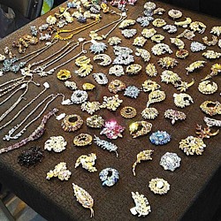 Nice Ice: Valerie Hammond on the Genteel Charm of Vintage Canadian Costume Jewelry
 How Jim Heimann Got Crazy for California Architecture
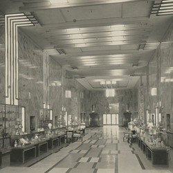 Modernist Man: Jock Peters May Be the Most Influential Architect You've Never Heard Of
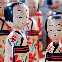 Meet Cute: Were Kokeshi Dolls the Models for Hello Kitty, Pokemon, and Be@rbrick?
 When the King of Comedy Posters Set His Surreal Sights on the World of Rock 'n' Roll
 How One Artist Makes New Art From Old Coloring Books and Found Photos
 Say Cheese! How Bad Photography Has Changed Our Definition of Good Pictures
 Middle Earthenware: One Family's Quest to Reclaim Its Place in British Pottery History
 Fancy Fowl: How an Evil Sea Captain and a Beloved Queen Made the World Crave KFC
Leave a Comment or Ask a Question
If you want to identify an item, try posting it in our Show & Tell gallery.