Berkeley, California-based David Lance Goines talks about what makes an effective poster, the history of poster design, the influence of Japanese woodcuts, and the importance of simplicity. He can be reached via his website, http://www.goines.net.

Acme Bread Company – 1989
I don’t collect posters. I don’t collect anything. I started making posters one at a time by hand in high school just for specific events, basically got going when I was a freshman. I still make them today, but they’re printed on a printing press now. I’ve made 221 posters, not including the ones I did in high school. Fundamentally, I believe that in order to be effective as opposed to artsy and not really effective at all, a poster has to be extremely simple.
The Shepard Fairey posters for Obama, for example, are going back to a Russian constructivist feeling – very simple, one word or very few words, a strong central image, very limited number of colors, immediate graphic appeal. Within these constraints, posters can’t really change that much.
If you look at some of the publications like Graphis or Print magazine, a lot of their posters are not really posters. They’re complicated. You can’t immediately figure out what they’re about or who they’re appealing to. You may call those posters if you wish, but they don’t serve the function of a poster. One of the difficulties in this is that we have a lot of people moving around very quickly. They don’t have time to take their eyes off the road or analyze complex data, so the poster has to be made simple in order to work.
I think the Obama posters are an outstanding example of a modern political poster that proved highly effective and probably contributed substantially to Obama’s success. It does everything a poster is supposed to do. When you get away from that, the poster becomes less effective. I wouldn’t really call it a poster anymore; maybe a broad sign, which is something where you stop and look at it and read it.
Michael Schwab’s work, for example, is outstanding; very simple, very graphic. It makes immediate sense, has extremely limited use of color and one or two very simple words. My work as a poster designer is paying really close attention to what works. I live in Berkeley, which has a lot of people walking around or on bicycles. Most of my posters were done for local businesses, although some are done for businesses outside of Berkeley. They follow the basic rules of a poster, which is that it should have a strong central image, limited use of color, and a simple, immediately intelligible message. They can have more interesting things going on, so you can look at it for a longer time, but it adheres very closely to those simple principles.
The Shepherd Fairy poster is a very good poster, and he has followed all the basic rules. There’s one about a half a block away from me up in a window and I can see it quite easily. I can understand the message immediately, and that’s exactly what it should do.
Collectors Weekly: Through the years, have posters kept up this trend of minimalism?

Charcuterie Pig-By-The-Tail – 1973
Goines: If they’re effective, they have. If you start drifting away from that, you also start drifting away from the effectiveness. For example, the iPod posters are very good. They have an established style. If at first you don’t realize that this black figure with the little white strings coming out of it is an iPod, the next time you see it, you will know. They’ve stayed within that same format. They haven’t changed it. It conveys everything that you’re supposed to convey without words. It’s impossible to imitate, which is good. More complex posters or posters that have poor color combinations or tiny type just don’t work. They’re just a waste of everybody’s time and money.
If a poster has a whole bunch of crap on it, you ignore it, or if the type is too small or the lettering is hard to read. The light in the Bay Area Rapid Transit stations, for example, is not very good, and you can’t get close to the posters because they’re on the other side of the track, so if the type is too small or it’s a poor combination of colors – for example pale green on white – you just ignore it. It may look great on your computer screen, but come on, guys. I’m not 21 years old and I’m not looking at it on a computer screen. I’m looking under very poor light, and I want something that I can immediately figure out. I don’t want to have to read it and think about it. That’s not what a poster is for.
The Citibank billboards are pretty good. They’re all typographic. They give you a little something to think about, but the message comes across really fast. The Got Milk? posters and billboards are good. I think billboards should be included in posters. Some of them don’t make sense. They’ve got too many words on them. Remember, I’m doing 60 miles an hour, and I do not have time to gaze lovingly at your billboard in rush-hour traffic. I shouldn’t really take my eyes off the road at all. A fraction of a second – maybe half a second, maybe a quarter of a second – is about all the time I can give you for your poster or I’ll get killed. When I look at my speedometer, I’m endangering my life. Needless to say, I’m not going to be gazing at billboards very much.
Collectors Weekly: Where did the minimalist influence in posters come from?

Bay Area Rapid Transit System – 1974
Goines: In the 1850s, Commodore Perry entered Japan for the first time, and by 1860, effective Japanese art hit the Western world. In the 1870s, the great railway projects of Europe and America had been completed or were nearing completion, and this created the need for advertising, something that had never happened before.
The principles of the Japanese woodcuts were adapted by the father of the poster, Jules Cheret. If you look at his posters from before he saw Japanese woodblock prints and after, you would think they were from a different planet. The simplicity of the strong, central image, the minimal use of colors, the integration with image and text, and the minimal use of perspective are all integrated into his posters. He set the trend. Everybody thereafter who did a poster paid attention to the same exact source, which was Japanese woodblock prints.
The techniques taken from those prints are extremely obvious. It’s outside of the tradition of Western fine art. In fact, it has nothing to do with the tradition of Western fine art. One of the problems with modern posters is people who come from fine art schools and try to integrate fine art principles in the posters. They just don’t work. You have to use graphic arts principles, which are not related to fine art principles. They have nothing in common. Take your whole fine art tradition of poster designing and throw it away because it’s no damn good. Follow the masters of the 19th century, like Jules Cheret and Julius Klinger. The Shepard Fairy stuff is very influenced by Russian constructivism like El Lissitzky, for example. If you look at Lissitzky’s posters, these posters are designed for people who can’t read and write. These are powerful influences. Get away from those powerful influences and you get away from effective posters.
Collectors Weekly: Will this minimalist trend keep going into the future?

Mirage Gallery – 1980
Goines: If you want posters to be effective, yes, of course, you have to do it that way. There is no difference between Fairy’s poster for Obama and a Ludwig Hohlwein poster for a war loan in 1918. These posters are following the same rules. They look the same, they feel the same, and they have the same degree of effectiveness. If you go back to the 1890s, you can find posters that look just like what Fairy did. If you go back to the 1870s, you start seeing the very fast evolution of the poster.
Of course, there’s an infinite number of ways to do anything, which is one of the reasons I enjoy one of my clients, Chez Panisse, for whom I’ve done about 37 posters. It’s the same restaurant. It’s not like anything new is happening, but I do a poster for them every year, and I really like the variations. I have another client, Berkeley Horticulture Nursery, for whom I’ve done four posters now. It’s all growing plants and your relationship with plants. I can do a poster for them every year from now until the day of my death and it would never get boring.
But they still follow the same basic principles. They involve the viewer. The viewer looks at it and has to figure something out for himself, but it doesn’t demand any more than a fraction of a moment. One of the most recent posters I just did was for the Fillmore Jazz Festival. It’s got a picture of a guy playing the piano and a piano keyboard above him and the word “jazz” in big letters. If you’ve got a little more time, it says “Fillmore Jazz Festival.” That’s all it says. It doesn’t tell you where. It’s doesn’t tell you when. It doesn’t say go. It doesn’t tell you what it costs.
If you want more information, you can find it elsewhere. The poster is not the place for that information. If you want to figure out what’s going on in the poster, you can look at it more, but I would say that you would get an entire message in maybe a tenth of a second, maybe less if you’re fast. You can take it in all at once and not think about it ever again, or you can say, “Wait a minute. This has got some interesting stuff going on.” You can look at it if you want to, but you don’t have to. I don’t demand that you look. I’d give you the whole message in much less than a second.
Collectors Weekly: Are your designs inspired by the Japanese woodblock prints?
Goines: Everybody’s designs are inspired by the Japanese woodblock prints. I’m inspired by people who are inspired by the Japanese woodblock, but ultimately we’re all dealing with the same concept. Nobody who’s done an effective poster has done anything but be inspired by Japanese woodblocks, even if they don’t know it.
Collectors Weekly: Have you noticed certain eras that people seem to get excited about when it comes to vintage posters?
Goines: The 1920s and the Art Deco era definitely have a different emphasis. If you look at posters done in 1930, you can say, “Yes, these were done in 1930. I can definitely tell.” If you look at posters that were done in the 1960s or in the 1990s, yes, you can tell. If you take 10 posters a year from 1870 to 2008 and put them all together, you would definitely see changes. But what happens with poster artists – since they’re not fine artists and they don’t have to get all excited about being original, just effective – is they’re constantly going back and drawing from earlier examples. It’s almost impossible sometimes to tell if it’s a poster done in 1918 or 2008.
Collectors Weekly: What are fine art posters used for? Do people use them?
Goines: I don’t know. I suppose they do. You pick up Graphis magazine, which comes out every year, and you’ll see the majority of posters aren’t posters. You don’t know what the message is. Teeny-weeny type, lots and lots of words, complicated, confusing images; no, it’s not a poster, I’m sorry. You can call it a poster if you want to, but that doesn’t make it a poster.
“When people buy my posters and put them on their walls, they’re not thinking about them as advertising.”
You look at Michael Schwab’s work or my work and you think, “Are these people clearly not related at all?” The park service posters that Michael Schwab’s done, for example, are incredibly effective. They’ve got one or two words, and they’re predominantly black with one or two interesting colors and people really like them. They don’t say, “I’m so smart and you’re so dumb that you can’t figure out what I’m doing.” That’s not what you want to say with a poster. You want to say that you’re some guy and this is hope. Once you’ve seen one of those posters, you know exactly who it is.
Collectors Weekly: What was going on in the ‘70s and ‘80s with posters? In the ‘60s they had those Fillmore music posters.

Carousel Animals – 1984
Goines: Those were a big change. There are a lot of complicated things going on with those posters, and they were extremely effective for what they were. The attempted integration of photography into posters didn’t work too well. A photograph tells you too many complicated things, and it’s not very graphic. Sometimes a photograph is effective and useful, but usually for telling you that this is something real, whereas a drawing, is not going to say “This is real.”
That’s really a significant difference between a drawing and a photograph. A drawing can simplify things and can make a greater graphic impact. The ‘70s was a low point culturally on pretty much every level – music, clothes. Think of disco music and polyester bellbottoms. It was a low point, but there was some good stuff coming out. If you go back and look at old print magazines or old communication art magazines, you can see that there was some good stuff out there, but there was also a lot of confusion about what was effective and what wasn’t effective.
When you take the psychedelic style and try to transfer it over to selling automobiles or cigarettes, it really doesn’t work. And so there was a lot of confusion about what worked and what didn’t. Simplicity doesn’t mean boring; it means effective and interesting.
The Swiss Style also had a very strong effect on posters, and basically it was corporate identity. There were corporations that tried to do advertising, which was a very different thing from advertising your neighborhood pub or a rock ‘n’ roll concert. Trying to take corporate identity techniques and applying them to ordinary things just doesn’t work.
All the good stuff carries over to today, and of course a lot of bad stuff does, too. Not everybody agrees with my point of view about posters. What I do for a living is make posters, but there are a lot of other people out there besides me.
Collectors Weekly: Did you start out with the same style in high school?

University of California School of Optometry – 1979
Goines: It’s pretty much the same. I’m surprised. I have a few of those images, but not very many. I remember what they look like, but I only have one or two examples of things that I did. I did them all by hand and I only made like three of something, or maybe even just one. It was a lot of work.
Now I use a printing press and lithography. Albert Einstein has a famous quote, which is, “You should make everything as simple as possible but not simpler.” When you make things too simple, you make it boring. You want something that communicates instantly, but then if you take a second look, you can be entertained. Imagine seeing the jazz festival poster at the BART station. You’d say, “Jazz. Cool. Fillmore Jazz Festival. Cool. That’s right around me. Maybe I’ll go. Where is it? I don’t know. It doesn’t say on the poster. Who is that in the poster? I don’t know. He looks like an interesting person.” You can have a dialogue with the poster if you’re waiting for the train or you can just glance at it, see the word “jazz,” see an image of a guy playing the piano.
I did a poster for the University of California School of Optometry. It’s a picture of a bunch of animals, and they’re designed like an eye chart. Because an eye chart is such an iconic thing that we all understand, you immediately realize that this is an eye chart, except that it’s animals. It’s fun. I had two nieces who were extremely young and they couldn’t read. I thought, “well, how do you test their eyes?” So I did silhouettes of animals, and they just get smaller and smaller and there are more and more animals, so it starts with a really big animal at the top and ends up with insects at the bottom.
The more you look at it, the more amusing it is, and then at the bottom in little letters, it says “University of California School of Optometry.” It does what it’s supposed to do, but it can provide you with entertainment if you want to take the time. You don’t have to be involved with it. You can just look at it immediately and know what it is and immediately know what it’s for.
Engaging the viewer is the second task. For example, when you go to listen to live music, if there’s nobody there, what’s the point? The viewer is as important as the performer. If you go to a huge hall with a symphony orchestra and there’s nobody there listening, what’s the point? If the music involves you, if it interests you, if you click your fingers or rock your body back and forth or want to sing in along with it or if you just want to lay back and listen to it and let it wash over you, you are involved. The degree to which you become involved is the degree to which the music is effective, but if you only are entertained by it.
If you listen to Britney Spears, her music is entertaining, right? It’s not deep. It’s not profound. It doesn’t have to be. Whereas if you listen to, say, Bela Bartok, it’s still entertaining, but you can get into it on a level that you probably can’t get into with Britney Spears. I listen to Bartok again and again, because each time I get something out of it. The music isn’t giving me something; I’m giving the music something. The music, it’s just a recording, come on. It’s never going to change. There’s nothing new that’s going to come out that piece of music. A good piece of art creates a new audience every time you look at it.
Other paintings you look at again and again and you just disappear; for example, Edward Hopper in the 1930s. You get lost in those paintings. You can just look at a Lissitzky poster for hours. There’s so much of you that they’re bringing out, but it’s all about you the viewer, you the listener. There’s a reason that the Last Supper is so popular. It’s really cool. You look at it again and again and you see these things, and you think new things and you think new thoughts.
I don’t put posters in the same category, but you do immediately get something out of it just like a piece of music that you may not even be listening to. You might be doing the dishes and have some music going on, or you might be having a candlelit dinner with your boyfriend with music in the background. You’re not listening to the music, but it is there and it’s there for a reason. It provides a background. Sometimes you might listen to the same piece of music, and now you’re really listening. It’s the same piece that was going on in the background while you’re having a candlelit dinner where you weren’t paying the slightest attention to it. It serves different jobs, different tasks, and good music can serve all of these tasks.

San Francisco Mime Troupe – 1970
When people buy my posters and put them up in their walls as decoration, they’re not thinking about them as advertising. They’re just saying, “This is really a nice image,” but it’s still advertising whatever it was that it was advertising. The Fillmore Jazz poster is still advertising the Fillmore Jazz Festival even though it’s over with. But you can have it as decoration, and it can make your apartment pretty, or you can think it’s really important and say, “Wow, this is advertising an important event that I want to go to.” It doesn’t matter. The poster’s never going to change. It’s only you that’s going to change. The more it lets you change with it, the better it is.
I have this piece of Britney Spears’ music and I’m never going to have to listen to it again. You don’t want Britney Spears music playing quietly in the background at a candlelit dinner. You don’t want Britney Spears music blaring into your ears while you’re really thinking about it. It serves a purpose. But think of Thelonious Monk. You can really listen to that music, or you can just have it playing in the background. Either way it works. If you try to analyze it, it won’t work, because it brings something out of you personally that isn’t really in anybody else.
When I listen to Dave Brubeck from the 1960s, it isn’t old-fashioned music; it’s is real, live, happening music to me. It’s not out of date. Whereas if you listen to some of the rock n’ roll music from the 1960s, you say, “I was a teenager then and it was fun being a teenager,” but it doesn’t have that staying power. It wasn’t meant to do that. I’m not criticizing them. If you’re listening to Miles Davis’ Sketches of Spain, which I believe played on a permanent soundtrack in the late 1950s and early ‘60s that is completely engraved in my head, it’s still a great piece of music. It had something for the 17-year-old and it had something for the 63-year-old. Good posters should do the same thing.
(All images in this article courtesy David Lance Goines of http://www.goines.net)

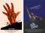 Mondo: The Monster of Modern Movie Posters
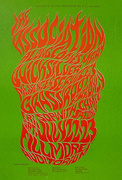
 A Quiet Voice in the Noisy World of Rock
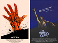 Mondo: The Monster of Modern Movie Posters
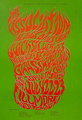 Psychedelic Poster Pioneer Wes Wilson on The Beatles, Doors, and Bill Graham
 Posters and PrintsPosters and prints enjoy a number of obvious similarities. For example, bot…
 Mari Tepper: Laying it on the Line
 Nice Ice: Valerie Hammond on the Genteel Charm of Vintage Canadian Costume Jewelry
 How Jim Heimann Got Crazy for California Architecture
 Modernist Man: Jock Peters May Be the Most Influential Architect You've Never Heard Of
 Meet Cute: Were Kokeshi Dolls the Models for Hello Kitty, Pokemon, and Be@rbrick?
 When the King of Comedy Posters Set His Surreal Sights on the World of Rock 'n' Roll
 How One Artist Makes New Art From Old Coloring Books and Found Photos
 Say Cheese! How Bad Photography Has Changed Our Definition of Good Pictures
 Middle Earthenware: One Family's Quest to Reclaim Its Place in British Pottery History
 Fancy Fowl: How an Evil Sea Captain and a Beloved Queen Made the World Crave KFC
I have a Barnum and Bailey poster that I found in my attics home. It has a gold/red full clown in it with a large tent on the bottom with a green background. Bottom left of this poster print it reads P-5 —–1917. Where can I appraise this poster to see if it has any value? I reside in GA. Thank you.
Best Regards,
Rob LoMonaco